… Not exactly the message you want your customers inferring from your website's Thank You Pages, is it?
Thank You pages are effective opportunities to demonstrate appreciation towards your leads, prospects, and customers for taking a desired action — and even potentially convert users or increase sales through additional CTAs.
Here, we'll explore six different purposes of a Thank You page, along with six stunning examples of Thank You pages to inspire your own designs in 2021 and beyond.
Let's dive in.
What is a Thank You page?
Your customers and leads see your Thank You Page immediately after completing a form or making a purchase on your web page. It acts similarly to a confirmation email — except viewers don't have to choose to open it.
Think of a Thank You page as both the last step in your conversion process and the first step for customer retention.
The Thank You Page presents a prime opportunity to turn a lead into a customer — or a customer into a brand advocate. The best way to do this? Make the next step(s) in the buyer or user journey:
- … Obvious and clear
- … Immediate
- And exciting or desirable.
What is the benefit of a Thank You page?
Think of it this way: you may never have an easier, more natural opportunity to give a customer something that pleasantly surprises them and precisely fits what they want.
How do you know what your customer wants? They just told you exactly what they want, by following a call-to-action on your site.
After someone follows the CTA on a landing page, take them to step two in their journey before they click away. Show customers you're ready to deliver value time and time again.
For instance, if a customer makes a purchase on your site, use the Thank You page as an opportunity to add value through additional resources or content — which will build trust and delight customers.
Alternatively, you might use a form Thank You page as an opportunity to provide leads with next steps. If the lead downloaded a Social Media Calendar ebook, the Thank You page can list out alternative social media resources you'd like to provide.
To see this in-action, let's explore Thank You page examples, next.
Thank You Page Examples
1. Purpose: Contact Form Completion
Confirm to your customer that they completed their intended action successfully – and remind them what you will (and won't) do with their information. Build trust and let them know you're on their side.
Let consumers know you're interested in delivering value … and won't be emailing them just for the sake of it.
This is your best chance to convince consumers your brand is different, and it comes long before they run across one of your messages in their inbox.
Best Contact Form Thank You Page
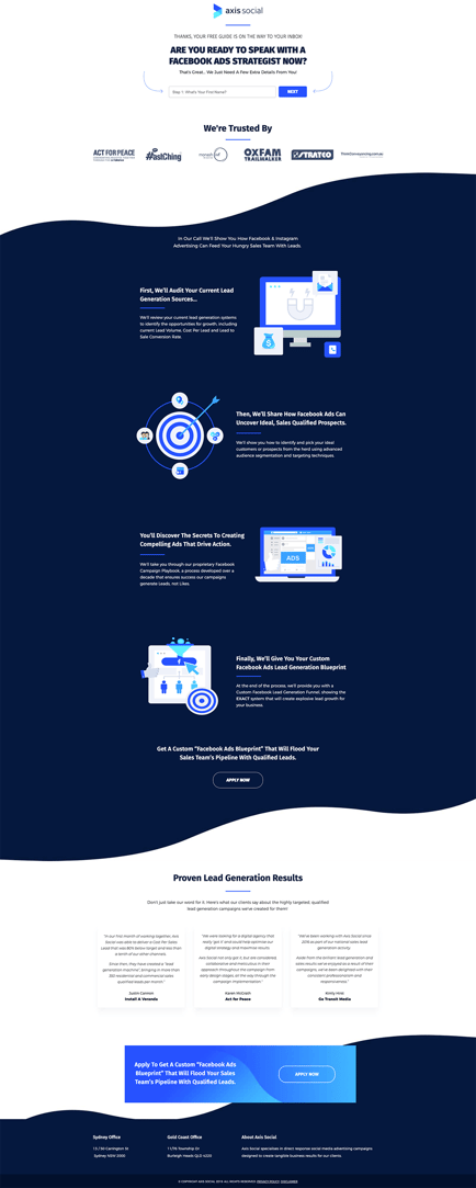
Axis Social tells a big, layered story on their Thank You page for new contact form sign-ups. Thanks to careful layout and crisp design, they manage to push their primary CTA while also reinforcing social validation and trusted partners.
2. Purpose: Downloadable
You likely have an ebook or other lead generation downloadable send automatically via email. However, it's still best to offer a download link to the originally-requested item right on your Thank You Page, as well.
This can keep your customer engaged on your site and increase the likelihood they'll open and engage with your materials right away.
Best Thank You Page for Downloadables
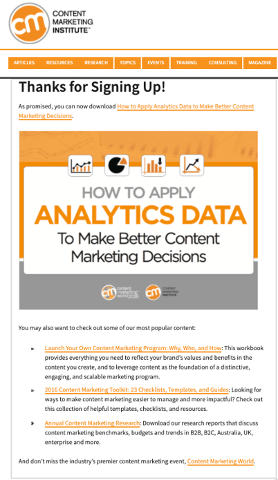
The Content Marketing Institute incorporates both native download links and curated suggestions for additional on-site content into their Thank You Pages. (It's almost like they do this kind of thing for a living …)
3. Purpose: Purchase Confirmation Pages
The post-sale confirmation page is an often-missed opportunity to surface similar, related, or complementary products.
To increase effectiveness, you'll want to customize these recommendations with an aligning offer — such as a coupon, rewards program, etc.
If customers can create an account with your site, but also have the option of checking out as a guest, the confirmation page is also a great opportunity to prompt a free account creation.
Best Purchase Thank You Page
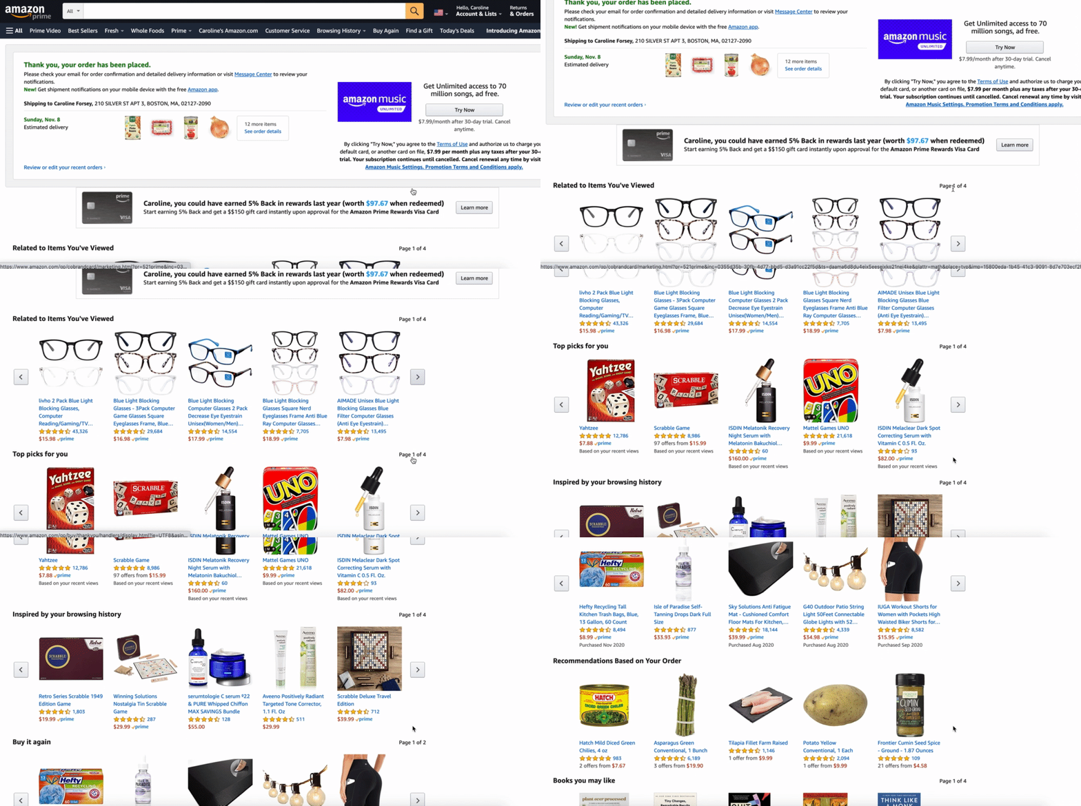
Few companies can even begin to approach the level of customer data that Amazon collects, stores, and leverages across their businesses. This quality of information – and the company's essentially limitless supply of items and store listings – makes the purchase confirmation page incredibly effective (and, as a consumer, quite difficult to resist).
4. Purpose: Appointments and Reservations
When you've got someone newly signed up for an appointment, the Thank You Page provides a ready-made opportunity to expand or extend the conversation with them. Encouraging viewers to follow or engage with your organization on social is a natural next step.
Best Thank You Page for an Appointment or Booking
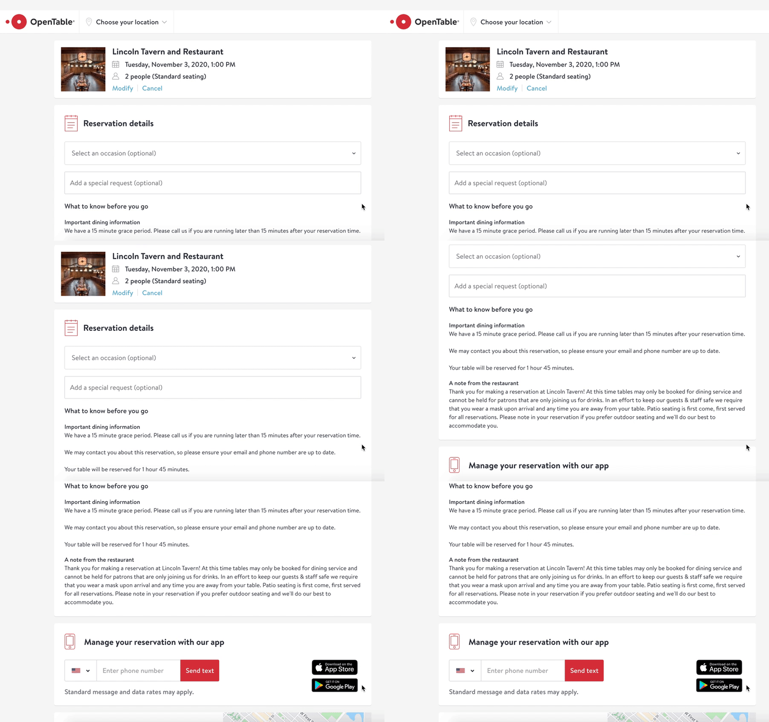
OpenTable incentivizes users to download the app once they've made an appointment so they can track and modify changes from within the app itself. The Thank You page also includes helpful notes about what to know before arriving at the restaurant.
5. Purpose: Account Creation Thank You Pages
This is a prime opportunity to usher your lead seamlessly into your onboarding or account setup process.
You'll want to make it so easy they don't even think about clicking away.
You know how hard you had to work to get them to this point in the first place. Why not capitalize at the start by moving them a step or two along in your retention lifecycle journey?
Best Account Creation Thank You Page
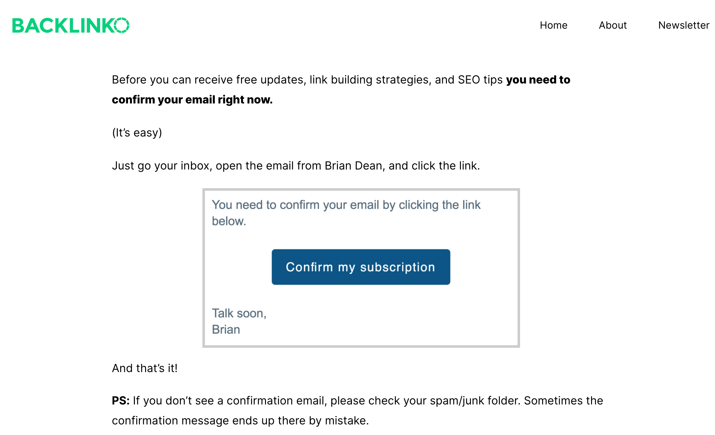
Backlinko goes above and beyond in laying out the next steps for their leads. They've infused their page's messaging with urgency, but also friendliness and approachability.
6. Purpose: Donation Thank You Pages
A donor isn't ‘buying' a product in the same way most other customers are, but they're undoubtedly looking for some element of reassurance, affirmation, appreciation, or — at the very least — some confirmation that their contribution is making a positive impact and being well spent.
For nonprofits, political campaigns, and other donor-soliciting sites, use the Thank You Page to provide a window into each donation's impact, right from the start.
Additionally, it never hurts if you can anticipate and answer questions about your efficacy before they're even asked.
Best Donor Thank You Page
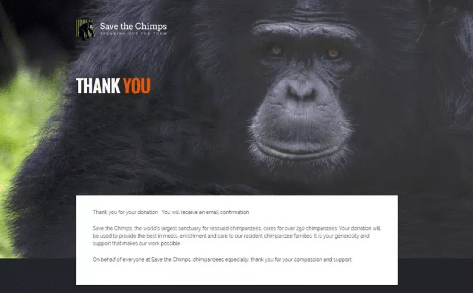
Save the Chimps nails the impact of storytelling on their donor Thank You page, putting the chimps — the organization's beneficiaries — front-and-center.
The 6 Best Thank You Page Examples of 2021 was originally posted by Local Sign Company Irvine, Ca. https://goo.gl/4NmUQV https://goo.gl/bQ1zHR http://www.pearltrees.com/anaheimsigns
No comments:
Post a Comment