2020 was — in a word — unprecedented.
The only thing nearly as unprecedented as the events of the year itself? The number of times 2020 was described as "unprecedented."
With the conclusion of a year unlike any other, it's natural to seek out new looks and approaches.
Desires for new and different –– but also reassuring and less overwhelming –– experiences will exert significant influence over customer appetites in 2021, including in visual communications and graphic design.
Here, let's dive into the graphic design trends you'll see in 2021. Plus, what design techniques you'll want to avoid.
2021 Graphic Design Trends
Current graphic design trends for 2021 offer opportunities to update your brand's aesthetic, earn customers' attention, and unlock greater results.
These trends fall into three dominant themes or moods: socially-conscious design, dissonance, and optimism.
Within each theme, there are a number of design techniques and styles you're going to see artists and brands employ.
You're going to want to see this –– and not just because it means 2020 is over.
1. Socially-Conscious Design
Design and culture are integrally connected. Designer and author Robert L. Peters makes it clear where he thinks real change begins: "Design creates culture. Culture shapes values. Values determine the future."
To strive for a better future, it helps to visualize it.
Social unrest and movements for anti-racism have captured national attention, and every brand and business has to take notice and evaluate where they stand.
Socially conscious design gained traction throughout the past year, and it's poised for even greater impact in 2021. Within the theme of socially conscious design, key trends include authentic representation, sustainability, and celebrating diversity and imperfection.
2. Authentic Representation
Nike's instantly-iconic ad featuring Colin Kaepernick exemplifies the push for authenticity and design that includes diverse voices and perspectives.
After widespread protests following the killings of George Floyd and Breonna Taylor in 2020, Nike spoke up again, unveiling "For Once, Don't Do It" – subverting the brand's instantly-recognizable tagline.
You'll continue to see brands pushing boundaries in 2021 when it comes to creating authentic, meaningful, and deeply powerful content over more superficial designs.
3. Diversity and Imperfection
The trend to more socially-conscious design aligns with broader cultural pushes to make all forms of media more diverse, inclusive, and affirming of all our various identities and imperfections.
DesignStudio applies these values and approaches in their authentic, intentionally 'imperfect' rebrand for insurance company Getsafe. 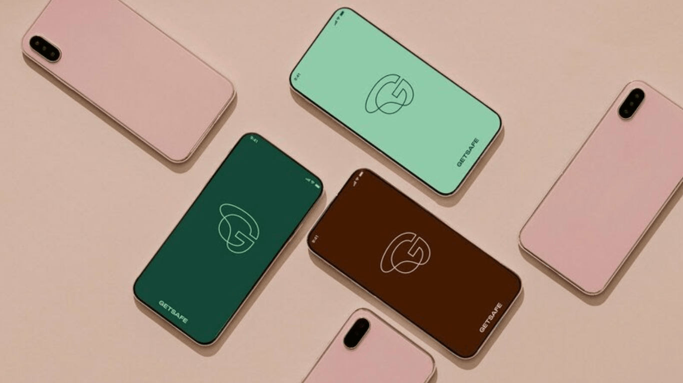
4. Sustainability
Sure, humans had a rough 2020, but the Earth didn't fare much better.
And with all our time spent indoors, we had ample time to cultivate awareness (okay, anxiety) about climate change and other environmental issues. This –– plus the near-universal experiences of cabin fever after a year filled with pandemic-related lockdowns –– has sustainability featuring prominently in graphic design in 2021.
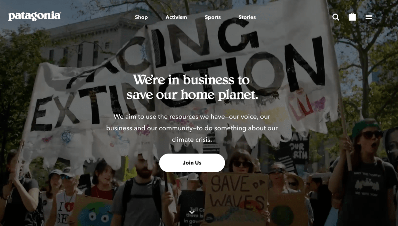
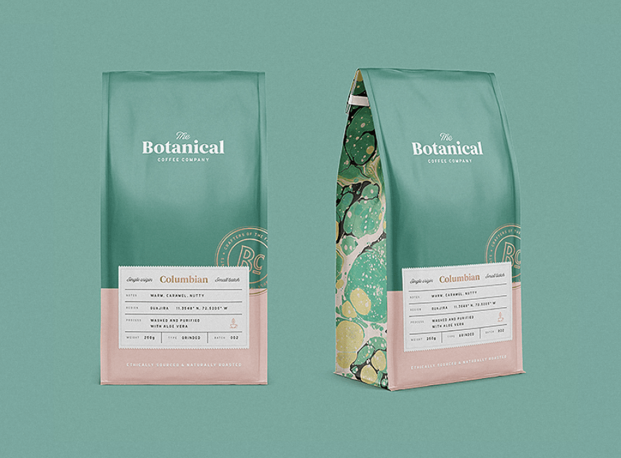
As consumers think about waste and their environmental footprint more than ever before, brands dealing in physical goods are especially sensitive to potential tension. Expect to see more and more packaging designs that emphasize sustainability through natural iconography, neutral color palettes, and eco-conscious materials.
5. Natural and Manufactured Juxtaposition
Global lockdowns have disrupted our connections to our environment.
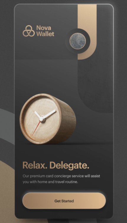
Graphic design is leaning into this tension through regular juxtaposition of the natural and the manufacture, earth and metal, organic and inanimate.
Gucci played with all of these themes when launching their Gucci Bloom fragrance, creating a gamified virtual experience for visitors to explore an animated garden:
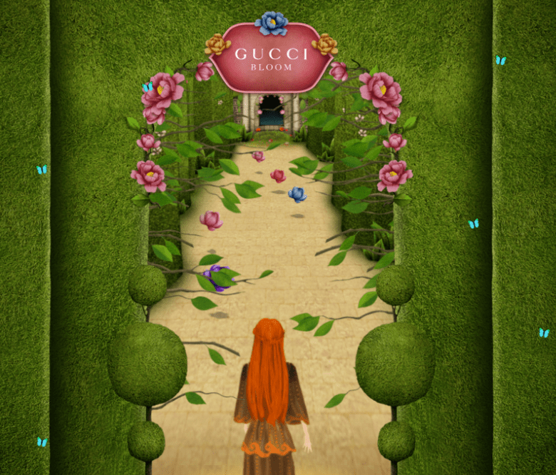
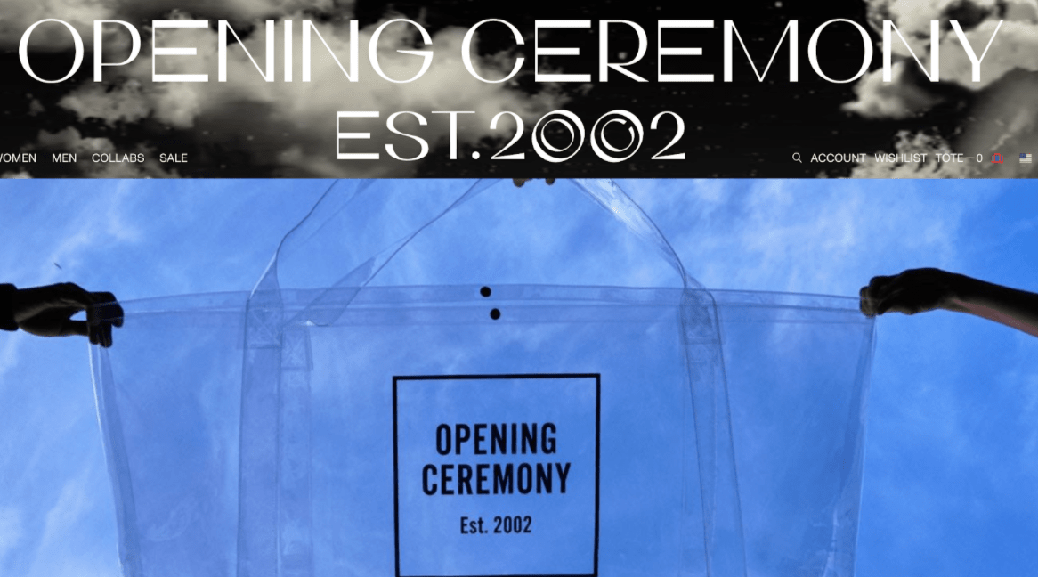
Exploring contrasts and intersections between these forces is especially appealing for spaces hardest hit by the pandemic. Industries like fashion and travel will emphasize elements conveying solidity and technological progress while also reinforcing connections to nature through floral and herbal patterns, cheery hues, and blue skies.
These elements bring a sense of destination, movement, and outdoor exploration –– even when there's nowhere to go.
6. Color Trends in Graphic Design
Socially conscious design is interesting and impactful –– but it's also mentally demanding. As people have found themselves spending more and more time at home grappling with monumental and unfamiliar stressors, tastes in color have shifted to hues that are proven to reduce anxiety and promote a sense of ease.
Unsurprisingly, organic and natural shades can provide welcome respite for people who stare at walls and screens all day. For best results, move past standard browns and greys. Understated oranges and teals evoke warmth and comfort, while providing more energy and optimism than their more drab neutral peers.
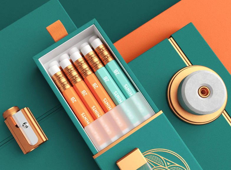
These color trends are influencing interior design for homes and workplaces, as luxury paint brand Farrow & Ball reports.
Gone: dramatic accent walls and high contrast color schemes. In: calm and muted tones.
For paint companies, at least, pandemic-related quarantines have them seeing another earth tone: green. Revenue for Farrow & Ball, for instance, was up 20% compared to a year prior.
7. Dissonance
While some design currents aim to push society forward or distract from all sorts of stress we're under, other impulses in graphic design reflect our chaotic, tumultuous present moment.
Designs that embrace uncertainty often appear relatable to people living in unpredictable circumstances.
8. Color Blur
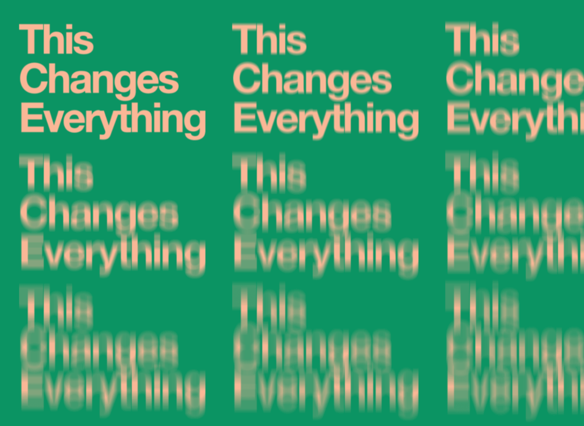
One trend playing up the theme of dissonance melds color and texture by adding grains and/or gradients. Such blending or layering adds depth and tactility to rendered or printed images.
With darker, brighter color schemes, color blur adds a level of broodiness, implying a depth of emotion and feeling, as well as a sense of three-dimensional space.
For a more disconcerting effect, pair a color blur or gradient with distorted text, as well.
9. Outsized Typography
Another dissonant trend in graphic design intentionally misplaces typography in ways that defy expectations and flout design conventions. Images cut off or obscure portions of text or unpolished elements disrupt sleek designs, among other glaring "errors" that catch the eye.
Exaggerated sizes and violating conventional hierarchies, this approach plays with both scale and alignment – two of the basic elements of graphic design. The effect: arresting and memorable.
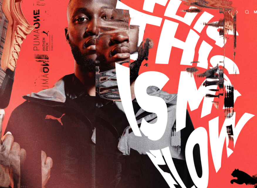
Designer Danielo Silveira's designs for Puma "This is My Flow" uses these concepts with visually stunning results.
Hype and buzz-focused streetwear brands employ these techniques with a studied nonchalance, leaving the uninitiated viewer feeling off balance –– and rewarding their die-hard fans for being in the know.
10. Surrealism
"The real is intertwined with the surreal, and in no year was that more deeply felt than in 2020" — 99designs.com
I feel this. Don't you?
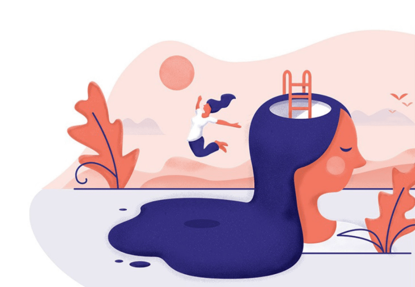
Considering how mixed up –– and messed up –– day-to-day life often seems, it's no wonder graphic design is exploring imagery that bends the edges of reality.
What does that mean, if you're not a Salvador Dali-afficionado or modern art critic? Well, you should probably prepare yourself to make sense of more images like this one:
11. Optimism and Reassurance
You're not alone if you're yearning for reassuring, optimistic visual experiences.
The third and final big theme in graphic design for 2021 reflects a common desire for brighter, more familiar, comfortable days.
12. Retro-futurism
Retro-futurism represents the first trend within this broader inclination towards optimistic design in 2021.
No, this isn't another new sub-genre of music known only to the most avant-garde of your college dorm mates. Retro-futurism refers to designs that take symbols and approaches from the past and present them "mashed up with elements of the imagined future."

Think: NASA's worm logo and "space-age" designs. These forms, originating in the forward-looking decades around the first moon landing. This type of design manages to feel both new and familiar at the same time. It reinforces humanity's confidence in the potential of technology and interstellar flight.
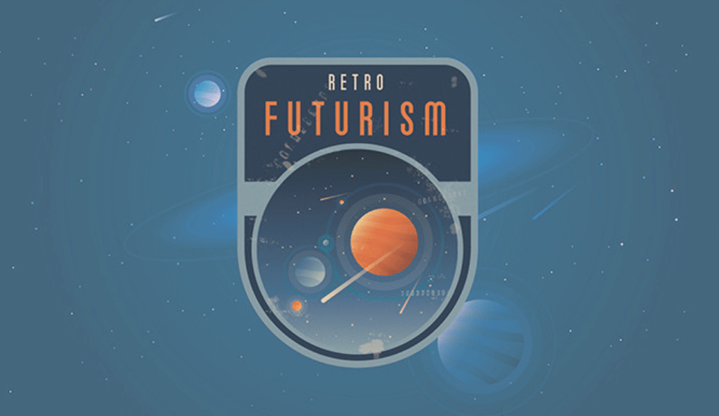
Yes, nostalgia promises to do well in 2021. Colors and shapes that seem both vintage and tech-inspired blend reassurance with a sense of progress.
13. Symbol Revival
In an environment where so much is routinely challenged or called into question, graphic design offers key tools to connect with the universal and the uniquely human elements within us all. Carefully-chosen and constructed symbols possess this potential –– for communication that transcends language.
The simple, powerful imagery of a square peg fitting into a round hole makes a strong statement in the brand identity Pentagram's Paula Scher designed for the Mental Health Coalition.
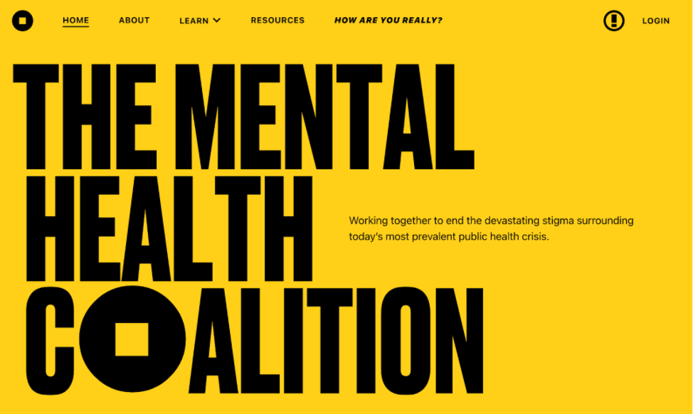
Here, a symbol typically used to connote exclusion or ill-fittedness is reclaimed as a visual metaphor for inclusivity and acceptance. It's socially conscious, reflective, and also calling the viewer towards a better future –– and you can look forward to much more graphic design like in in 2021.
Graphic Design Trend to Avoid: Faking Authenticity
The 'trend' you definitely want to avoid: swerving away from allyship to co-opt complex and painful issues as if they're just more trends to copy.
Nike, Glossier –– these brands had already taken proactive anti-racist stances, embracing this as a prominent part of their identity. They can speak authentically about related events and issues.
Many chose to amplify or echo similar messages to reflect their own values or affirm a call for change. This is well and good. Opportunism? Not so much.
In short: make sure your design accurately, and authentically, reflects your values.
(If you decide to reexamine your values, more power to you –– but work on your values first, and hold off on pressing 'send' on some trendy graphic.)
How to Keep Up with Graphic Design Trends
Designers gravitate towards visually-driven platforms like Instagram, or Behance — Adobe's proprietary social media platform geared to showcase creative work. Instagram, as the most visually-driven of the ubiquitous social media platforms, offers a wealth of opportunities to observe, learn from, and keep up with graphic design trends.
You can easily see broad trends and also drill down into specific skills or minutiae of the field through keyword searches and following hashtags. Interested in hand-lettering styled after 1950's tattooing? You've come to the right place.
YouTube is also an invaluable resource for designers of all stripes and skill levels. You may never make it out from the rabbit hole of top 10 lists, design techniques, and how-to guides –– but you sure will learn a lot while you're down there.
Pick a Timeless Design to Ensure It Lasts
Before you go and apply all the 2021 graphic design trends in making delightful and chaotic – but somehow calm and reassuring and progressive –– imagery, there's one word of warning to take with you. Employ trends sparingly and with care, or risk becoming a quickly-outdated caricature.
This is especially true in logo design, where you'll need to avoid looking outdated –– and perhaps even worse to constantly change your primary branding. Go for something modern, but timeless, and make design decisions with your organizational values in mind.
Strike this balance well to benefit and learn from 2021 trends while not putting yourself on course to need a rebrand in 2022.
What to Expect from Graphic Design in 2021
In 2021, graphic design will continue to both draw inspiration from and exert influence to change culture. Perhaps it will be as tumultuous and unpredictable as 2020 (although we can certainly hope not).
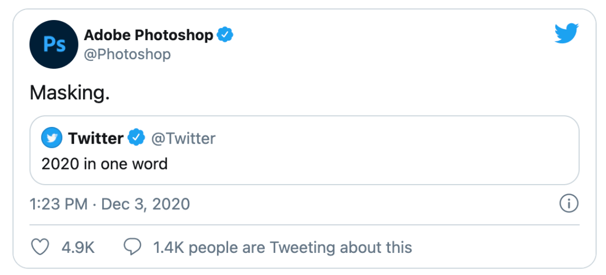
One thing about 2021 is certain, though. For the foreseeable future, Adobe's Photoshop team deserves credit for calling the trend most likely to carry over from 2020 into the new year:
13 Graphic Design Trends to Use in 2021 — and Two to Avoid was originally posted by Local Sign Company Irvine, Ca. https://goo.gl/4NmUQV https://goo.gl/bQ1zHR http://www.pearltrees.com/anaheimsigns
No comments:
Post a Comment