Wouldn't it be great if creating infographics was as simple as writing regular old text-based blog posts? Unfortunately, making visual content like this usually takes a lot more time, effort, and let's face it -- skill -- than the written word. Usually.
But considering the popularity and effectiveness of visual content in marketing today, you can't just afford to throw in the towel.
That's why we decided to take all the pain and suffering out of infographic creation. Seriously -- don't give up just yet. You, too, can create infographics that are professional-looking, high-quality, and completed in under an hour. I'm going to prove it. First things first:
Then, all you have to do is provide the content to use inside them. Easy as that. In fact, I'm going to show you just how easy it is to make your own infographic by demonstrating with one of our 15 infographic templates in PowerPoint (pictured above). Then, I'll explain exactly what I did so you get a sense of how easy it really is.
How to Make an Infographic
- Identify the audience for your infographic.
- Collect your content and relevant data.
- Choose your desired infographic template.
- Download your template to PowerPoint.
- Customize your infographic.
- Include a footer with your sources and logo.
- Add an embed code and Pinterest button, and publish it.
1. Identify the audience for your infographic.
Infographics don't sell themselves on design alone. You need to deliver "info" that's just as compelling as the "graphic," and to do that, you need to know the audience your infographic intends to reach.
According to Harvard Business Review, there are five possible audiences that can change how you choose and visualize your data: novice, generalist, managerial, expert, and executive. Start by comparing your infographic's ideal reader with one of these five audiences -- which one applies to your reader?
When thinking about the data you want to visualize, let the five audiences above dictate how advanced your data will be. A "novice" audience, for example, might need data whose meaning is more obvious at first blush. An "expert" might be more interested in getting into the weeds of your numbers and posing theories around them. An "executive" has more in common with a novice audience in that they only have time for the simplest or most critical information, and the affect it'll have on the business.
2. Collect your content and relevant data.
Using the audience you've chosen above, your next step is to organize all the content and data you'll use in the infographic. You can either collect third-party data or use your own original data. If you use third-party data, just be sure you properly cite your sources -- just like in any other good piece of content.
- Choosing your data: Compelling data needs to be "comprehensive" enough to give your readers proper context around the data you're presenting. For example, a spike in website traffic from one month to the next doesn't mean much -- until, say, you reveal that traffic was on a steady decline over the previous three months. Suddenly you have a story of how you were able to reverse a downward trend.
- Organizing your data: When collecting your data, make sure you know what story you want to tell through this information. Data for the sake of data won't add value to your infographic at all.
- Citing your sources: To keep your infographic uncluttered by a ton of different source URLs, a great way to cite your sources is to include a simple URL at the bottom of your infographic that links to a page on your site. You can also list the individual stats used in your infographic, and their sources -- such as the landing page to the full offer on which you're basing this free infographic.
That way, your infographic looks clean and professional, yet people will still be able to access the sources no matter where the infographic gets shared or embedded. It may also even drive visitors back to your site.
3. Choose your desired infographic template.
Your next step is to choose an infographic template appropriate for representing that data. The important thing is to choose a template that specifically works for the type of data set/content you want to present. As you saw pictured above, you can download our 15 infographic templates in PowerPoint and choose whichever template you'd like.
Some of your template options in the offer linked above include a timeline, flowchart, side-by-side comparison, and a data-driven infographic. Here are some basic ideas for choosing an infographic template that suits the story you want your data to tell:
- Side-by-side comparison infographic: This infographic design can help prove the advantage of one concept over another, or simply explain the differences between two competing entities.
- Flowchart infographic: This design is perfect for presenting a new workflow for your organization, or how a linear or cyclical process works across your industry.
- Timeline infographic: This design can tell a chronological story, or history, of a business, industry, product, or concept.
- Graph-based infographic: This design is suitable for content creators publishing a high volume of data and statistical information, making it a good fit for expert-level audiences, too.
- Image-heavy infographic: This design caters to content creators who are trying to reveal trends and information from shapes, designs, or photography -- rather than just numbers and figures.
4. Download your template to PowerPoint.
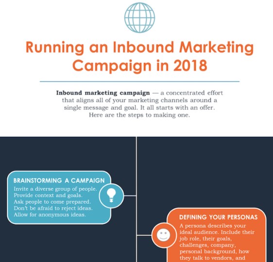
For the sake of time (remember, our mission is to create an infographic in under an hour), I'm going to create an infographic based on a compilation of steps and best practices we put together in our guide, How to Run an Inbound Marketing Campaign in 2018. For this, I've picked the "World's Greatest Timeline" infographic template from our collection of infographic templates, which is helpful for my data set since it will allow me to outline each step of the campaign creation process in order.
 5. Customize your infographic
Obviously, this is the most time-consuming part -- but it's also the most fun. Simply come up with a catchy title, plug in your data/content, and adjust your font sizes and formatting. Feel free to switch up the graphics and colors, too, so they're relevant to your brand and the data you're providing. To customize the look of the infographic even more, you might add or change up the colors or font styles.
In this example, you'll notice that I've inputted my text and changed the font colors to HubSpot's signature orange and dark blue:
You're not limited by what the template includes, either. You can use the tools in PowerPoint's software to create bar graphs, pie charts, and other visuals to support your data. (Note: Download our free infographic templates for a cheat sheet for using PowerPoint's various features and tools.)
6. Include a footer with your sources and logo.
Finally, I included a link to my source (which can be found here), as well as the HubSpot logo so people know who created the infographic if it gets shared in social media or embedded on other websites -- which is definitely something you want, since one of the main benefits of creating infographics is their shareability.

7. Add embed code and a Pinterest button, and publish it.
The only thing left to do is to publish and promote your awesome new infographic. As I mentioned earlier, we recommend using your blog to publish it (including your list of sources), including a Pinterest button for visitors to easily "pin" your infographic on Pinterest, and create and add an embed code for visitors to share it on their own websites and blogs, as we did above.


Share This Image On Your Site
<p><strong>Please include attribution to blog.hubspot.com with this graphic.</strong><br /><br /><a href='https://blog.hubspot.com/marketing/create-infographics-with-free-powerpoint-templates'><img src='https://blog.hubspot.com/hs-fs/hubfs/free_infographic_template_custom-1.png?t=1519094621186&width=1138&height=3412&name=free_infographic_template_custom-1.png' alt='free_infographic_template_custom-1' width='660px' border='0' /></a></p>That's it! This whole thing took me under an hour to put together -- much shorter than it would've taken me if I'd started from scratch (not to mention more professional looking... and less expensive than hiring a designer).
That's it! This whole thing took me under an hour to put together -- much less time (not to mention more professional looking) than it would've taken me if I'd started from scratch. Plus, it's less expensive than hiring a designer and using the resources you might want to save for larger campaigns.
Editor's note: This post was originally published in May 2020 and has been updated for comprehensiveness.
How to Create an Infographic in Under an Hour [+ Free Templates] was originally posted by Local Sign Company Irvine, Ca. https://goo.gl/4NmUQV https://goo.gl/bQ1zHR http://www.pearltrees.com/anaheimsigns
No comments:
Post a Comment