When it comes to designing or redesigning a website, it’s easy to get hung up on the aesthetics. Does that shade of blue look right? Should the logo be on the right side of the screen, or left? What if we put a giant animated GIF in the middle of the page?
However, in a world where folks have more than 1.8 billion websites they can potentially land on, you need to make sure yours is not just a pretty face. It should be designed for usability, how easy your website is to use, and user experience (UX), how enjoyable it is to interact with your website.
Now, you could spend years studying the ins and outs of these disciplines But for the sake of giving you a jumping-off point, we've assembled a list of the fundamental guidelines and best practices you can apply to your next website redesign or website launch. Then, we’ll review 10 features you’ll need on your site to put these recommendations into practice. Let’s dive in.

1. Simplicity
While the appearance of your website is certainly important, most people aren't coming to your site to evaluate how slick the design is. They want to complete some action, or to find some specific piece of information.
Therefore, unnecessary design elements (i.e., those which serve no functional purpose) will only overwhelm and make it more difficult for visitors to accomplish what they're trying to accomplish.
From a usability and UX perspective, simplicity is your best friend. If you have all the necessary page elements, it’s hard to get too simple. You can employ this principle in a variety of different forms, such as:
- Colors: Basically, don't use a lot. The Handbook of Computer-Human Interaction recommends using a maximum of five (plus or minus two) different colors in your design.
- Typefaces: The typefaces you choose should be highly legible, so nothing too artsy and very minimal script fonts, if any. For text color, again, keep it minimal and always make sure it contrasts with the background color. A common recommendation is to use a maximum of three different typefaces in a maximum of three different sizes.
- Graphics: Only use graphics if they help a user complete a task or perform a specific function (don't just add graphics willy-nilly).
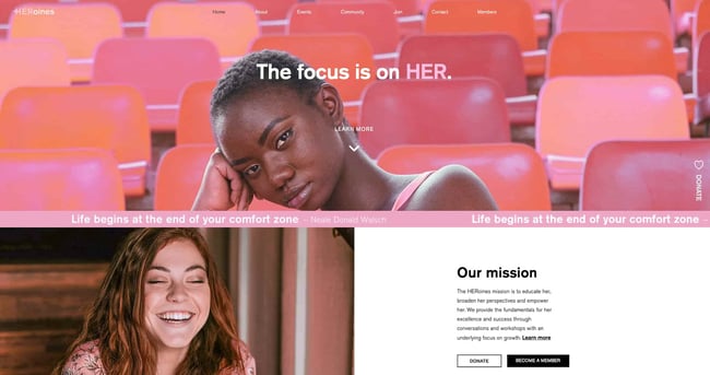
Here's a great example of a simple but effective homepage design from HERoines Inc:
Image Source
2. Visual Hierarchy
Closely tied to the principle of simplicity, visual hierarchy means arranging and organizing website elements so that visitors naturally gravitate toward the most important elements first.
Remember, when it comes to optimizing for usability and UX, the goal is to lead visitors to complete a desired action, but in a way that feels natural and enjoyable. By adjusting the position, color, or size of certain elements, you can structure your site in such a way that viewers will be drawn to those elements first.
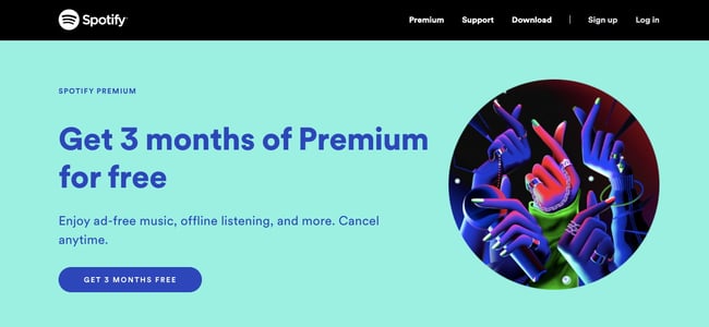
In the example below from Spotify, you can see that the main heading “Get 3 months of Premium for free” sits atop the visual hierarchy with its size and page position. It draws your eye to their mission before anything else. This is followed by the "Get 3 Months Free" CTA, which prompts action. Users can click this CTA, or scan the menu items above for more actions.
Image Source
3. Navigability
Planning out intuitive navigation on your site is crucial to help visitors find what they're looking for. Ideally, a visitor should land on your site and not have to think extensively about where to click next. Moving from point A to point B should be as frictionless as possible.
Here are a few tips for optimizing your site's navigation:
- Keep the structure of your primary navigation simple (and near the top of your page).
- Include navigation in the footer of your site.
- Consider using breadcrumbs on every page (except your homepage) so users remember their navigation trail.
- Include a search bar near the top of your site so visitors can search by keywords.
- Don't offer too many navigation options per page. Again, simplicity!
- Include links within your page copy, and make it clear where those links go.
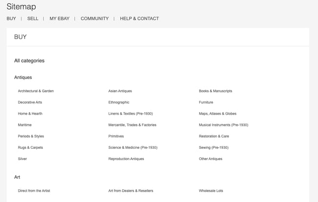
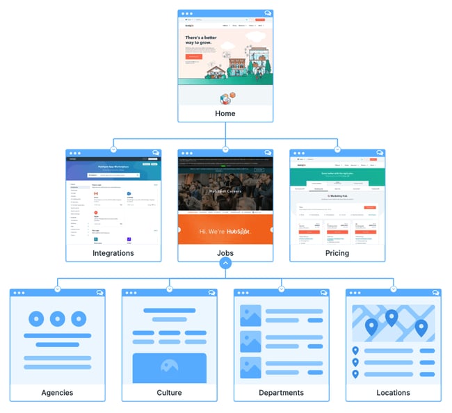
- Don't make users dig too deep. Try making a basic wireframe map of all your site pages arranged like a pyramid: Your homepage is at the top, and each linked page from the previous forms the next layer. In most cases, it’s best to keep your map no more than three levels deep. Take HubSpot’s site map, for example.
Image Source
One more pointer: Once you've settled on what your site's main (top) navigation will be, keep it consistent. The labels and location of your navigation should remain the same on every page.
This leads us nicely into our next principle...
4. Consistency
In addition to keeping your navigation consistent, the overall look and feel of your site should be similar across all of your site's pages. Backgrounds, color schemes, typefaces, and even the tone of your writing are all areas where consistency has a positive impact on usability and UX.
That's not to say every page should follow the same layout. Instead, create different layouts for specific types of pages (e.g., landing pages, informational pages, etc.). By using those layouts consistently, you'll make it easier for visitors to understand what type of information they're likely to find on a given page.
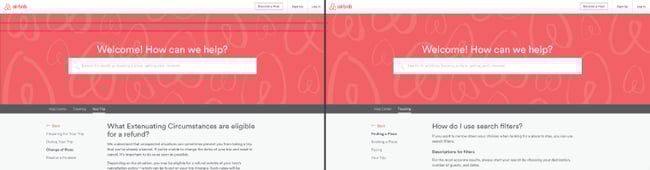
In the example below, you can see that Airbnb uses the same layout for all of its "Help" pages, a common practice. Imagine what it would be like from a visitor's perspective if every "Help" page had its own, unique layout. There would probably be a lot of shoulder shrugging.
Image Source
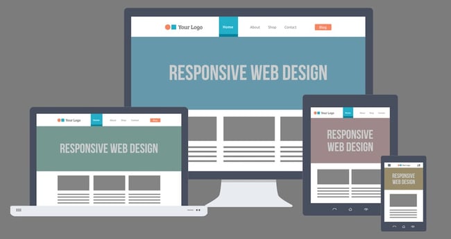
5. Responsivity
According to Statista, 48% of page global views were from mobile devices like smartphones and tablets. And according to our research, 93% of people have left a website because it didn’t display properly on their device.
The takeaway here: To provide a truly great user experience, your site has to be compatible with the many different devices that your visitors are using. In the tech world, this is known as responsive design.
Responsive design means investing in a highly flexible website structure. On a responsive site, content is automatically resized and reshuffled to fit the dimensions of whichever device a visitor happens to be using. This can be accomplished with mobile-friendly HTML templates, or by creating a special mobile site.
Ultimately, it's more important to provide a great experience across different devices than look identical across those devices.
Image Source
Alongside mobile-friendliness, it’s worth your while to test your website’s cross-cross browser compatibility. In all likelihood, you’ve only viewed your site on one web browser, be it Google Chrome, Safari, Firefox, or something else.
Now is the time to open your pages on each of these browsers and evaluate how your elements appear. Ideally, there won’t be much difference in presentation, but you can’t know for sure until you see for yourself.
6. Accessibility
The goal of web accessibility is to make a website that anyone can use, including people with disabilities or limitations that affect their browsing experience. As a website designer, it’s your job to think of these users in your UX plan.
Like responsiveness, accessibility applies to your entire site: structure, page format, visuals, and both written and visual content. The Web Content Accessibility Guidelines (WCAG), developed by the Web Accessibility Initiative and the World Wide Web Consortium, set the guidelines for web accessibility. In a broad sense, these guidelines state that websites must be:
- Perceivable: Visitors are aware of the content on your site.
- Operable: The functionality of your website should be possible in different ways.
- Understandable: All content and alerts can be easily understood.
- Robust: Your website is usable across different assistive technologies, devices, and browsers.
For a deeper dive into this topic, see our Ultimate Guide to Web Accessibility.
7. Conventionality
A big challenge in web design is balancing originality with your expectations. Most of us are expert internet users, and there are specific conventions we’ve grown accustomed to over time. Such conventions include:
- Placing the main navigation at the top (or left side) of a page.
- Placing a logo at the top left (or center) of a page.
- Making the logo clickable, so it always brings a visitor back to the homepage.
- Having links and buttons that change color/appearance when you hover over them.
- Using a shopping cart icon on an ecommerce site. The icon also has a number badge signifying the number of items in the cart.
- Ensuring image sliders have buttons users can click to manually rotate slides.
While some might opt to throw these out the window for the sake of uniqueness, this is a mistake. There’s still plenty of room for creativity within the constraints of web conventionality.
Let’s briefly consider another field of design, architecture. Building codes are put in place so that folks can easily and safely inhabit spaces. An architect doesn’t complain about these codes or violate them because, aside from legal repercussions, they assure safety and comfort of guests. It doesn’t matter how dazzling the building looks — if you trip on uneven stairs or you can’t get out in a fire, you might prefer to stay outside.
In the same way, you can craft a memorable experience while meeting user expectations. If you violate what users anticipate, they may feel uncomfortable or even frustrated with your site.
8. Credibility
Sticking to web conventions lends your site credibility. In other words, it increases the level of trust your site conveys. And if you're striving to build a site that provides the best user experience possible, credibility goes a long way.
One of the best methods to improve your credibility is to be clear and honest about the product or service you're selling. Don't make visitors dig through dozens of pages to find what it is you do. Be up-front on your homepage, and dedicate some real estate to explaining the value behind what you do.
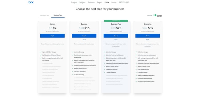
Another credibility tip: Have a pricing page, also linked on the homepage. Rather than force people to contact you to learn more about pricing, list your prices clearly on your site. This makes your business appear more trustworthy and legitimate.
Here's an example of an effective pricing page from the Box website:
Image Source
9. User-Centricity
At the end of the day, usability and user experience hinge on the preferences of the end-users. After all, if you're not designing for them, who are you designing for?
So, while the principles detailed in this list are a great starting point, the final key to improving the design of your site is to conduct user testing, gather feedback, and implement changes based on what you've learned.
And don’t bother testing usability by yourself. You’ve already invested a lot of time into your design, which brings your own biases into the equation. Get testers who have never seen your site before, the same as any first-time visitor.
Here are a few user testing tools to get you started:
- Website Grader: Our free tool evaluates your website based on several factors: mobile, design, performance, SEO, and security. It then offers tailored suggestions for improvement. You can learn more about Website Grader in our dedicated blog post.
- Crazy Egg: Track multiple domains under one account and uncover insights about your site's performance using four different intelligence tools -- heat map, scroll map, overlay, and confetti.
- Loop11: Use this tool to easily create usability tests -- even if you don't have any HTML experience.
- The User Is Drunk: Pay Richard Littauer to get drunk and review your site. Don't believe me? We tried it.
For even more helpful options, see our list of the best user testing tools.
Hopefully, these guidelines are useful in informing the structure of your web pages and website as a whole. But, how does one put these guidelines into practice? Let's take a look at some actionable best practices you can follow during the design process.
1. Select a typography that’s easy to read and skim.
Typography refers to how type — meaning letters and characters — are arranged and presented on the page. Since website typography affects not only how we read but how we feel about text on a web page, it’s important to pick carefully.
Ideally, you want a typeface that is:
- easy to read
- easy to skim
- accessible to all users
- legible across multiple devices and screen sizes
You also want it to match the look and feel of your brand. For example, the luxury fashion brand Burberry refreshed its logo for the first time in 20 years in 2018. It replaced the old serif typeface with a bold, all-caps, sans serif typeface and dropped the knight emblem. The result is a simpler and more modern-looking logo that’s easier to read on any screen — and that reflects changes in the company to become more transparent and appeal to a younger generation.

Image Source
2. Choose a color scheme that suits your brand.
Like typography, color can affect not only how we understand and interact with content, but how we feel about it. Your color scheme should therefore check off the same boxes as your website typography. It should:
- reinforce your brand identity
- make your site easy to read and navigate
- evoke emotion
- look good
Buzzfeed, for examples, uses the primary colors yellow and red to grab users' attention and get them excited about the content. It reserves the use of the primary color blue — which is associated with trust — exclusively for links and CTA buttons. Both emotions are ideal to evoke for a media site.
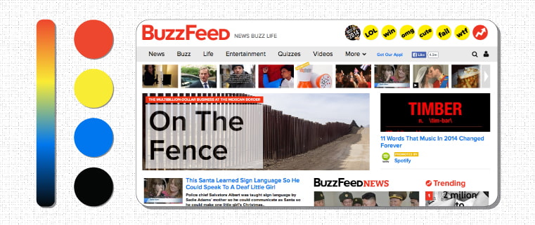
Image Source
3. Use white space to break up text and other elements.
Whitespace refers to the negative areas in any composition. Whitespace provides users with visual breaks as they process a website’s design or content, which is not only aesthetically pleasing. By minimizing distractions, whitespace makes it easier for users to focus, process information, and understand what it’s important.
That means you can use whitespace to avoid causing information overload or analysis paralysis — and to emphasize important elements on the page. This might help persuade users to take a specific action, like sign up for a newsletter, shop your latest collection, and more.
For example, Eb & flow Yoga Studio uses whitespace to lead users toward a specific action: to sign up for three weeks of classes. Notice that whitespace doesn’t mean the absence of color or imagery. Instead, it means that every element on the page is positioned strategically, with lots of space in between, to avoid overwhelming or confusing visitors.

Image Source
4. Use texture to add personality and depth.
Resembling a three-dimensional, tactile surface, web textures aim to replicate the physical sensation of touch with another sensation — sight. They’re a great design alternative to solid color backgrounds, particularly if you want to add personality and depth to your site.
Take a look at the texture on the homepage for the Santa Barbara-based restaurant Mony’s Tacos below. It looks like chalk drawn on a blackboard, doesn’t it? I don’t know about you but I can almost feel the chalk on my fingers just from looking at it. It's the perfect look for a restaurant that aims to be California's preferred Funk Zone choice for Mexican delights.
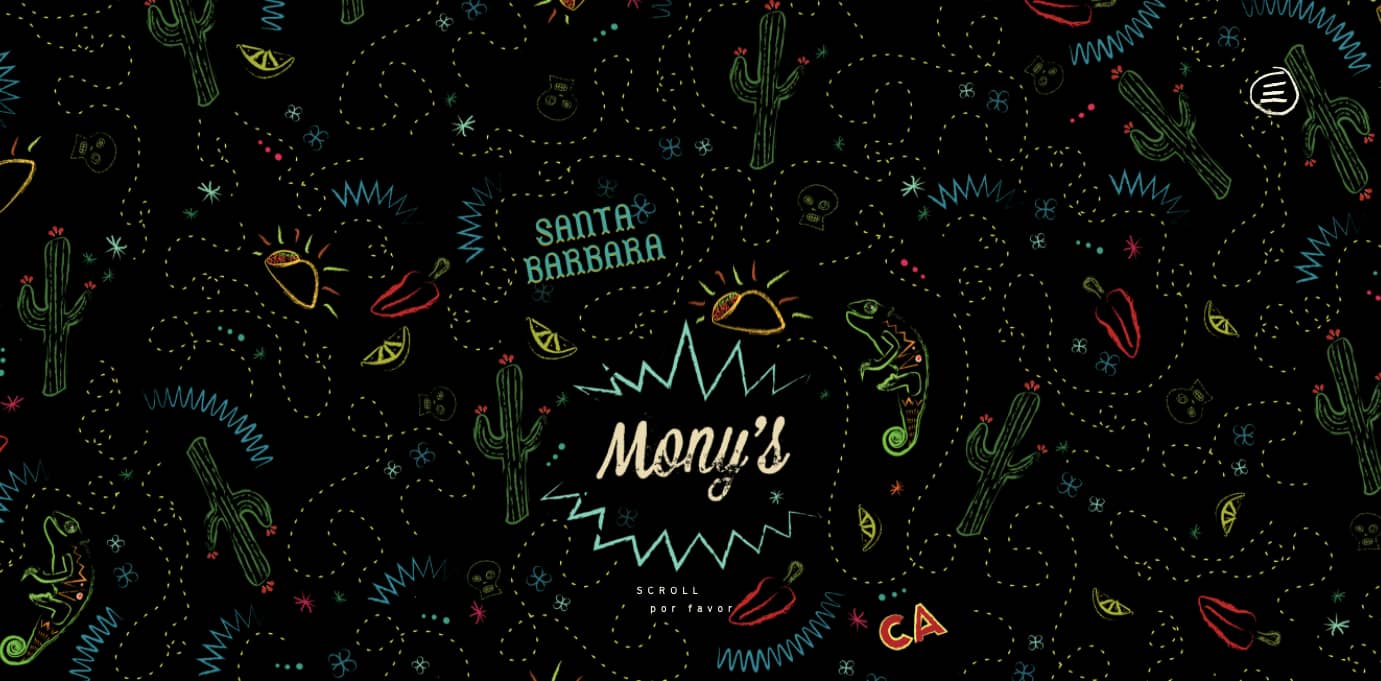
Image Source
5. Add images to engage and inform readers.
Striking a balance between text and images is essential in website design. Incorporating visuals can make your content more informative, engaging, and memorable. You’ve probably heard the statistics that people remember only 20% of what they read, but 80% of what they see? While the exact percentages are debated, the basic idea isn’t. It’s easier for some people to learn and process information visually.
Here's a unique example of breaking up text with images from a cosmetic company's website. This shows how endless the possibilities of incorporating imagery into your website design are.
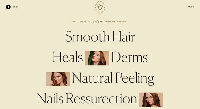
Image Source
6. Simplify your navigation.
Navigation is one of the most important design elements on a website. It impacts whether visitors arrive on your homepage and browse, or click the “Back” button. That’s why it’s important to keep it as simple as possible.
Many websites opt for a horizontal navigation bar. This navigation style lists the major pages side by side and is placed in the website header.
Take the navigation bar on Blavity as an example. The sections featured include three content categories — “News,” “Op-Eds,” and “Lifestyle” — as well as links to their submission page and sign-up page. This provides visitors with easy access to the pages they’re likely looking for. Other nav items are placed in a dropdown menu labelled "More" so they're still easy to find but not cluttered into the top-level navigation. Finally, the navigation bar is sticky so visitors won’t have to scroll up and down the page to browse the site.
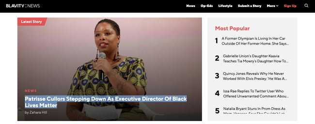
Image Source
7. Make your CTAs stand out.
CTAs are elements on a web page, advertisement, or another piece of content that encourages the audience to do something. The call to action could be to sign up, subscribe, start a free trial, or learn more, among many others.
You want your CTAs to pop in your website design. To make that happen, consider how you’re using color as well as other elements like background color, surrounding images, and surrounding text.
Square provides an excellent call-to-action example. Using a single image to showcase the simplicity of using their product, Square uses bold typography to also show how unique and future-oriented their product is. Against this dramatic backdrop, the blue "Get Started" CTA awaits your click.
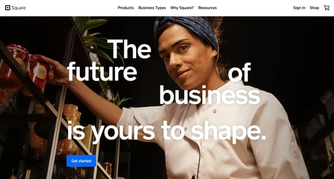 Image Source
8. Optimize for mobile.
We’ve already discussed how important it is for your website to be responsive. But since mobile devices accounted for 59% of organic search engine visits in 2021, we’re doubling down on how important it is to design your website to be mobile-friendly. That might mean altering or removing some elements that would clutter smaller screen sizes or negatively impact load time.
For an example of one of the best mobile website designs, compare Etsy’s homepage on desktop vs mobile. On desktop, you’ll see a navbar with categories. Hovering over each category will reveal a dropdown menu.
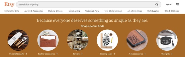
Image Source
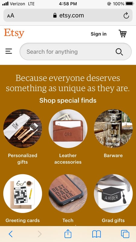
On mobile, this collapses behind a hamburger button, which improves the appearance and performance of the mobile site. You'll also notice that the images are larger — perfect for tapping with your finger on a mobile screen.
9. Limit the options presented to users.
According to Hick’s Law, increasing the number and complexity of choices will increase the time it takes for a person to make a decision. This is bad news in website design. If a website visitor is presented with too many options, they might get frustrated and bounce — or they might pick an option you don’t want, like abandoning their cart. That’s why it’s important to limit the number of options presented to a user.
For example, a visitor landing on the homepage of Shawn Michelle's Ice Cream will have three options: to learn more about the company, the flavors, or the ingredients. But instead of presenting all three options at the same time, they are presented one at a time in a slider. This is a great example of implementing Hick’s Law in UX design. 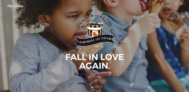
Image Source
Now we understand the principles and best practices that should guide you throughout the design process. In the next section, let's run down the essential page elements that you should strongly consider including in your design plan.
1. Header and Footer
The header and footer are a staple of just about every modern website. Try to include them on most of your pages, from your homepage, to your blog posts, and even your “No results found” page.
Your header should contain your branding in the form of a logo and organization name, menu navigation, and maybe a CTA, and/or a search bar if well-spaced and minimal. On the other end, your footer is where many users will instinctively scroll for essential information. In your footer, place contact information, a signup form, links to your common pages, legal and privacy policies, links to translated versions of your site, and social media links.
2. Menu Navigation
Whether it’s a list of links across the header or a tidy and compact hamburger button in the corner, every website needs a guide for navigation positioned at the top of at least your homepage and other important pages. A good menu limits the number of clicks to reach any part of your website to just a few.
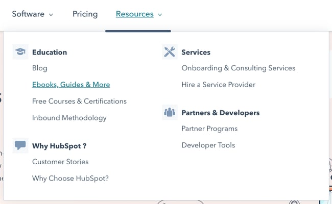
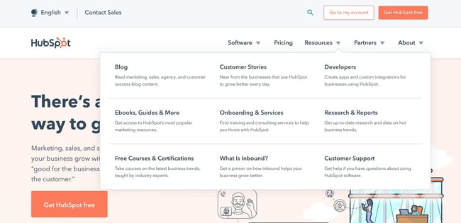
To reduce clutter, you might consider making some or all menu options a dropdown menu with links within it, as can be seen on HubSpot's homepage.
3. Search Bar
In addition to menu navigation, strongly consider placing a search bar at the top of your pages, so users can browse your site for content by keyword. If incorporating this functionality, make sure your results are relevant, forgiving of typos, and capable of approximate keyword matching. Most of us use a high-quality search engine every day, be it Google, Amazon, YouTube, or elsewhere. These all set the standard for your own site search.
4. Branding
Remember the conventions we’ve discussed? One that you see practically everywhere is a logo in the top left corner. On first landing, many visitors’ eyes will instinctively shift to this region to check they’re in the right place. Don’t leave them hanging.
To reinforce this notion, incorporate your company branding into every element you add, piece of content you post, and color scheme you create. That’s why we recommend establishing brand guidelines if you haven’t already — check out our style guide for a reference.
5. Color Palette
Color choice plays a major role in your site’s usability and UX as well. This decision tends to be more subjective than other requirements in this list. But, like everything else we’ve discussed, try to simplify — limit your color selection to 3-4 prominent colors at most.
Starting a color palette from scratch can be surprisingly difficult the first time. We seem to intuitively pick up on which colors work well together and which don’t, but we stumble when trying to pick from the infinite combinations available.
The solution? Try a color palette that’s been shown to work on other websites. Take influence from your favorite sites, and see our list of our favorite website color schemes to get started.
6. Headings
Headings are key to establishing the visual hierarchy we discussed earlier, especially on text-heavy pages. As users skim your pages what you need, a clear and to-the-point heading alerts readers to stop scrolling after finding what they want. Use only as many headings as there are distinct sections of your page, as too much blown-up and bolded text will dampen this effect.
7. Clear Labels
Whenever a user takes an action on your website, it must be obvious exactly what they’re doing and/or where they’re going. All buttons should have clear text or an icon to precisely and concisely signal their purpose. The same goes for in-text links and widgets (simple interactive elements, like dropdowns and text forms).
For example, a button linking to a pricing page should just read “Pricing” — anything beyond that (e.g., “See our prices”, “Check out the pricing page for a deal”) is superfluous. A search bar/button only needs a search glass icon (🔍), and perhaps also the word “Search”, to denote its purpose.
User testing can be a major help here. While you yourself know what all of your interactive page elements do, the same can’t be said for a new user. Testing will give valuable insight into what users think your labels mean beyond your own perspective.
8. Visuals and Media
When incorporating static images, gifs, videos, and other media into your pages, remember to be consistent and intentional in your choices. These elements will draw attention over most other text and will likely stay in users’ minds, so choose wisely.
Here’s just one example of effective media on a homepage. Notice how every image complements the page aesthetic and supports the offer of personalized fitness training with results.
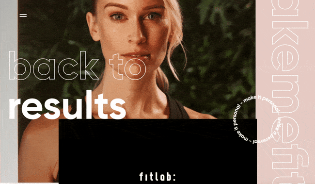
Image Source
Also, all images and videos should be optimized for search engines and include descriptive alt text for accessibility.
9. Calls to Action (CTAs)
Having a pleasing website is great, but how do you know whether your visitors are actually doing what you want? Are they engaging with your content? This is where CTAs come into play.
A CTA is any page element that prompts user action. The action could be adding a product to a card, downloading a content offer, or signing up for an email list. Make your CTA elements prominent in the visual hierarchy (remember our Spotify example), but not intrusive or distracting like many click-through ads tend to be.
If you need ideas for sleek CTAs that drive more conversions, see our CTA examples list.
10. Whitespace
As mentioned above, sometimes it’s about the elements you don’t include. After reading these guidelines and requirements, you may feel tempted to stuff your pages with all the bits and bobs needed for a flawless UX. Don’t forget that your viewers need room to digest all this new info, so give your elements room to breathe.
But, how much whitespace should you have? That’s another personal call, and varies from site to site. So, user testing is handy here as well. What are people focusing on? Do they feel overwhelmed with the density of content? Once again, it all ties back to our first guideline, simplicity.
Design that Puts Users First
Indeed, web design is largely subjective — your website’s look and experience isn’t going to please everyone. However, there are also tried-and-true UX principles that, when carefully considered and incorporated, help visitors feel more at home.
According to Amazon Web Services, 88% of website visitors are less likely to return to a website after a poor experience. And how could you blame them? We’ve surely all been there.
So, as a final bit of usability/UX wisdom, start caring more! Imagine yourself into the shoes (or, more accurately, browser windows) of your visitors, and keep them in mind every step of the design process.
![Blog - Website Redesign Workbook Guide [List-Based]](https://no-cache.hubspot.com/cta/default/53/4b5bb572-5d0e-45b8-8115-f79e2adc966b.png)
 9 Guidelines & Best Practices for Exceptional Web Design and Usability
 was originally posted by
Local Sign Company Irvine, Ca. https://goo.gl/4NmUQV https://goo.gl/bQ1zHR http://www.pearltrees.com/anaheimsigns
![Download Now: 150+ Content Creation Templates [Free Kit]](https://no-cache.hubspot.com/cta/default/53/5478fa12-4cc3-4140-ba96-bc103eeb873e.png)


![→ Download Now: SEO Starter Pack [Free Kit]](https://no-cache.hubspot.com/cta/default/53/1d7211ac-7b1b-4405-b940-54b8acedb26e.png)


