Ever click on a website, take one look and say "Hm, that's going to be a no" while you look for the exit button?
For me, it's usually because of three reasons: the site looks outdated, crowded, or hard to navigate.
Bad design can keep your target audience from gaining any interest in your brand.

That's why it's important to understand the key design principles that will help you draw your audience in, keep them on the page, and generate conversions.
Here's an easy guide on a specific design principle: visual hierarchy. We'll cover all the elements that contribute to visual hierarchy and look at good and bad examples.
Visual hierarchy affects what you look at and focus on in a design, whether it's an image, graphic design, or web design. It's a key player in ct (i.e., how information is organized and displayed for easy understanding and navigation) and can greatly impact the user experience (UX).
When thinking about visual hierarchy, you want to ask yourself a few questions:
- What do we want to draw attention to?
- What actions do we want our users to take?
- Where does the eye naturally go to and where do they land?
Asking these questions will help you use the principles outlined below to create a clear visual hierarchy.
What constitutes bad visual hierarchy?
When it comes to visual hierarchy, there's a golden rule: If every element appears important, nothing will seem important.
Visual hierarchy serves as a way to rank the information you're consuming. If there is no way to differentiate between the elements, that is considered poor hierarchy.
Take this example:
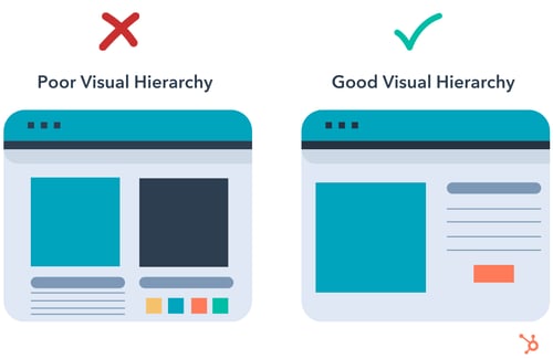
On the left, there's a lot much going on. The two main elements are the same size, there are many different colors. It makes it hard to know where to look. Your eyes glaze over everything, creating some uneasiness and lack of direction.
On the right, your eye is automatically drawn to the main blue box on the left, then naturally goes to the elements on the right before landing on the orange call to action (CTA).
A poor visual hierarchy:
- Confuses the user.
- Makes it unclear where to look.
- Creates a bland design.
Instead, create a visual structure that facilitates understanding and guides the user.
1. Consider reading patterns.
When designing, you want to note your target audience's natural eye patterns.
Across all cultures, we read top to bottom. However, there is some variation in how we read horizontally. Western cultures tend to read from left to right, while some Semitic and Indo-Aryan languages, such as Arabic, Hebrew, and Urdu are read right to left.
With this in mind, it impacts how we scan and understand designs. For instance, Western users usually follow an F or Z reading pattern.
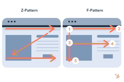
Knowing this information will help you design projects that convert, particularly in landing pages.
2. Users notice bigger elements more easily.
Size plays an important role in visual hierarchy. It's one of the main ways to rank elements in a design.
Take this example from Netflix.
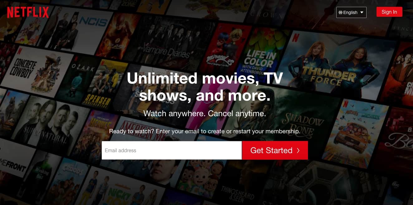
The first thing you'll read when looking at this image is "Unlimited movies, TV shows, and more."
Then you'll read the next line, and then the next before you explore the other elements on the page.
Size signifies importance. The bigger an element is, the more attention it draws, and then more likely you'll look at it first.
As you design your webpage, consider what you want your audience to look at first and use that to guide your strategy.
3. Color and contrast draw the eye.
The second principle to keep in mind is color.
We know that color can evoke emotion and can have certain cultural and social connotations. Just look at logos by industry, and you'll notice a trend. Food brands tend to have reds and yellows, while financial institutions tend to be in blue.
In design, color is great at drawing attention.
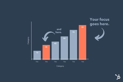
In the example above, you'll see that the elements that stand out the most are in orange. It's only after looking at them that you'll scan the other elements on the page.
On a website, you can use this to draw focus to your CTAs.
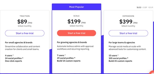
In the example below, the CTA that stands out the most is in the middle. The brand likely wants users to choose this option. The other CTAs are still visible but muted compared to the orange.
To create the most visual impact with color, use it sparingly. That will make the elements stand out more, as seen in the above example.
4. White space creates emphasis.
White space refers to the empty space within a design.

Sometimes, there is a desire to fill the space with as many elements as possible. However, this goes back to the concept of importance: If they all seem equally important, none of them are perceived as important.
This is why adding white space to your web design is key in pulling in your visitors.
Apple is also well known for its use of white space.
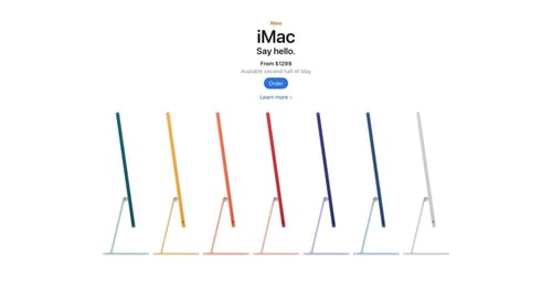
The brand offers a simple user interface, which creates more emphasis on the elements on the page. Apple's use of white space also reflects a brand's identity.
5. Proximity and repetition create unity.
When you put several elements together, it tells the user the concepts are related.
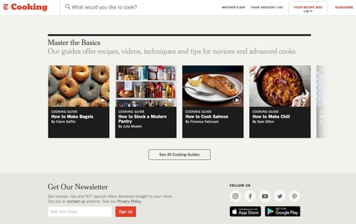
This design offers many examples of proximity.
Take the elements under "Master The Basics." By having these boxes all grouped closely together, the visitor can understand they fall within the same category.
The same goes for the icons under "Follow Us." If the icons were all spread out randomly on the page, it would be difficult for users to understand their purpose.
If you're not sure how to group certain elements, you can employ certain UX research strategies, such as card sorting, to group elements based on your audience's expectations.
Examples of Good Visual Hierarchy
1. Visme.co

Visme.co has a striking pop-up that encourages users to sign up for their newsletter.
The brand successfully uses white space, color, size, and contrast to make key elements stand out. You'll also notice that the elements are designed following the Z-pattern, making it more likely that users will convert.
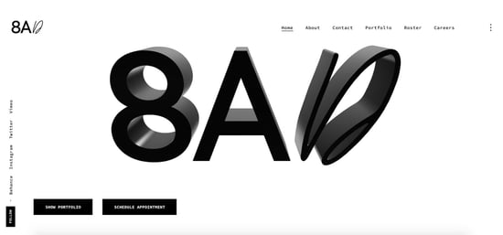
2. Studio 8AD
In designing their website, this brand leverages white space to focus users' attention on three key elements: the image and the two CTAs located on the bottom left.
3. Predominantly Black
This brand offers a great example of proximity to create visual hierarchy. 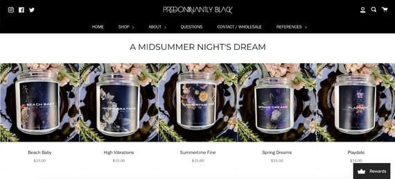
By organizing all products under the main title and leaving little space in between, visitors quickly understand that these products fall within the same category.
Visual hierarchy is all about ranking your elements by order of importance. Once you narrow down what you want to focus on and consider your audience's needs, you can create designs that produce the desired impact.

A Non-Designer's Guide to Visual Hierarchy [Best Practices + Examples] was originally posted by Local Sign Company Irvine, Ca. https://goo.gl/4NmUQV https://goo.gl/bQ1zHR http://www.pearltrees.com/anaheimsigns
No comments:
Post a Comment