Getting lost sucks. It doesn’t matter if you’re in a city or a corn maze, the ambiguity of not knowing where you are and what could happen next can make you break out in a cold sweat.
Website visitors feel the same way when they land on a jumbled website. Nearly one in two people leave a website after visiting just one page. We don’t have a lot of time to make a good impression on a user, and with a poor site architecture, you’re guaranteed to increase bounce rates.
It’s critical to structure your site in an intuitive and easy-to-navigate way to retain your audience’s attention. If you don’t, they’ll bounce in seconds. And if people leave your website because your user experience is messy, search engines won’t think highly of you, either.
If you need help structuring a website that will engage an audience and rank on Google, we’ve got you covered. We’ll teach you what website architecture is, why it’s important for UX and SEO, and how you can develop a sound architecture for your own website.
Without question, your website structure plays a critical role in retaining users and boosting conversions.
Implementing a website structure helps you design your website for the user experience. You might have the most amazing content, but if users can’t find it, they’ll leave for a competitor’s site.
A typical website structure looks like a rooted tree graph, in which the home page is the root. The pages that are linked out from the home page are branches, and from there, each page has additional branches sprouting from it. These branches then link to each other.
Here’s what that typically looks like:

Why is website structuring important?
A sound website architecture strengthens your website’s user experience. When you structure your website in an intuitive way, users can seamlessly find the information they’re looking for.
Plus, when your user experience is strong, your search engine rankings will be, too. Users will spend more time on your website and link to your web pages, which are both heavy indicators that your brand creates quality content.
Furthermore, a solid website architecture:
- Helps search engines effectively crawl your website.
- Encourages deep site navigation by providing more pages for users to visit.
- Distributes “page authority” more equitably, so that a page isn’t left out.
- Strengthens topical authority because of the strong internal linking structure between related or similar topics.
- Increases conversions by making it easier to find products and lead-generating content.
Let’s take a look at a few best practices you should keep in mind when designing your site’s architecture.
1. Create a simple top-level navigation menu.
First, don’t provide too many top-level menu items. Second, be sure to deliver the content that’s promised based on the menu item’s name.
For instance, if your users click on the "Email Marketing" tab on your blog’s homepage, they expect to be directed to a list of email marketing posts. From this page, you also need to design a simple navigation path back to your blog’s homepage and your website’s homepage.
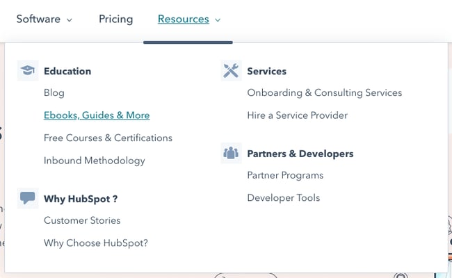
Check out an example below from our own website:

The menu is divided into three simple menu items: Software, Pricing, and Resources. Under the “Resources” tab, users can find different resources that are divided into different designations.
Don’t make your users think too hard. A hard-to-navigate website will have a high bounce rate. Users don't want to waste time trying to find information on your site. If they do, they’ll just leave. So practice empathy and provide an intuitive web experience.
2. Keep your URLs simple and user-friendly.
No user wants to read an URL like this:
example.com/store/rackets/default.aspx?lang=en&category=98a20
It’s important to create user-friendly URLs. Most CMS systems, such as CMS Hub and WordPress, automatically create a user-friendly URL based on your page’s title. It will usually read as follows:
example.com/page-title
You can also create subdirectories that are easy to follow.
example.com/topic/subtopic/page-title
Tip: While subdirectories are helpful from a UX standpoint, they aren’t required to reflect your site’s architecture. Internal linking matters more than URL structure. That means that you can can structure your URLs as follows:
example.com/topic
example.com/subtopic
example.com/longtail-keyword-one
example.com/longtail-keyword-two
You simply have to connect them to each other and to their parent pages with internal links.
3. Model your website architecture after the top players in your industry.
Your customers are used to the website architecture of major brands in your industry, so if you run an ecommerce store, analyze how Amazon structures their website and emulate them. Your website will seem more familiar and, in turn, easier to navigate.
4. Keep your website consistent.
Your website’s navigation format, design principles, and link displays should all follow a consistent pattern. Keeping these elements the same will keep your users on your site longer because it'll be easier for them to quickly navigate to new pages and click on links.
5. Implement the pillar-cluster internal linking model.
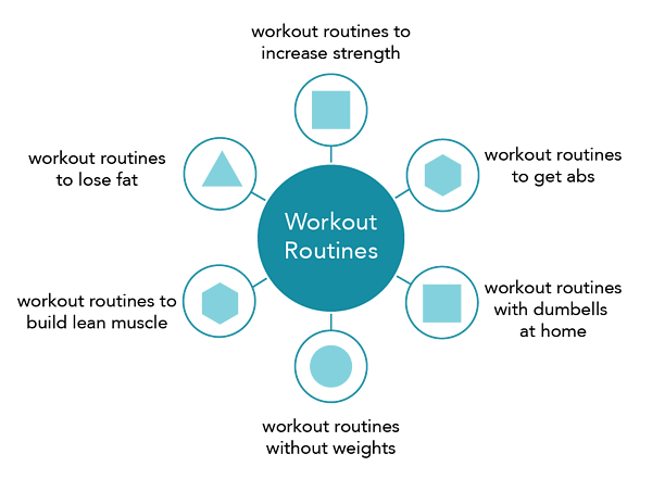
In the pillar-cluster model, you have a parent page (the pillar) linking out to child pages (the cluster). These child pages then link to each other, creating a cluster.
This model makes your internal linking structure clearer and effectively directs users to other pieces of relevant and useful content. When users come across an internal link on your website, they should immediately understand which piece of content the link will direct them to and why that content is linked from the page they’re currently on.
Here’s what a pillar-cluster linking strategy looks like for a blog about workout routines.

The lines represent internal links.
One internal linking caution you should exercise, though, is not stuffing keywords into your link’s anchor text. This is called black hat SEO, and to prevent it, Google has created specific algorithms to punish this kind of behavior.
6. Provide access to most of your website’s pages in 3-4 clicks.
Even if your website has a million pages, the architecture should allow users to start from the homepage and end up on any page within three to four clicks.
To do this, design a top-level navigation that can direct users to your website’s main categories. Then, from each of your website’s main category pages, make sure they can click-through to all the sub-category pages.
7. Use breadcrumbs.
After internal linking, breadcrumbs are the ultimate way to show your website’s architecture. These links show a page’s parent pages all the way to the home page. They’re typically placed above the page’s title and have arrows showing the path to the current page.
Here's an example from Best Buy:

You can add breadcrumbs to your CMS Hub website by creating an advanced menu module. If you run your website on the WordPress CMS, we’ve written an easy tutorial on how you can add breadcrumbs to WordPress.
8. Create an HTML and XML sitemap.
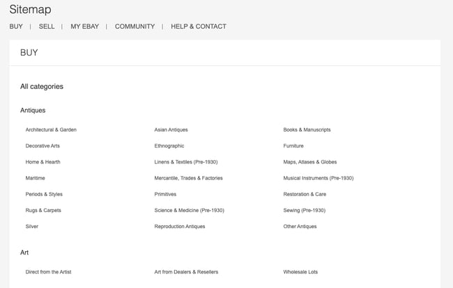
A sitemap is a document that lists out all of the crawlable pages on your website. It’s exceedingly important for website architecture because it shows your structure in a readable, crawlable format.
An HTML sitemap is user-facing and has the same design as the rest of your website. It’s typically designed for users who can’t find a certain page and who’d benefit from seeing a list of all of your pages.
Here’s eBay’s HTML sitemap as an example:

An XML sitemap is designed primarily for search engine crawlers. They list all of the URLs in a plain-text format. If your site is on WordPress, you can use a sitemap plugin to create both an HTML and XML sitemap.
Upgrade Your Website Architecture and Improve Your SEO
Your website’s architecture is incredibly important for both user experience and SEO. With a solid website structuring strategy, you’ll improve dwell time and entice users to consume more of your content. That means more conversions down the line, improving your ROI and increasing revenue at your company.
Editor's note: This post was originally published in October 2018 and has been updated for comprehensiveness.
What is Website Architecture? 8 Easy Ways to Improve Your Site Structuring was originally posted by Local Sign Company Irvine, Ca. https://goo.gl/4NmUQV https://goo.gl/bQ1zHR http://www.pearltrees.com/anaheimsigns


No comments:
Post a Comment