When you're focused on creating a meaningful, persuasive presentation, it's easy to overlook the cover page. But giving that first page of your deck a little more love can actually go a long way towards grabbing your audience's attention early on and setting the tone for the rest of your presentation.
A stunning presentation cover page can intrigue your audience into wanting to know more and increase engagement with the information you’re presenting. On the other hand, a lackluster slide, or even the lack of one, can dampen audience enthusiasm for your presentation, and maybe even your own.
You've put so much work into your presentation -- why waste that valuable real estate on the first slide of your deck?
In this post, we'll cover the basics of creating a presentation cover page that's informative and attention-grabbing. Let's dive in.
What's included in a presentation cover page?
A good presentation cover page accomplishes three simple things:
- It introduces the topic with a straightforward title.
- It introduces you (and your organization, if applicable)
- It sets the tone of your presentation.
Title
We probably don't need to tell you this one, but your presentation cover page should be centered around a title. And ideally, a title that's straightforward, descriptive, and simple. If you're finding it hard to keep your title short, add a subtitle (in smaller print) to clarify what you'll be speaking about.

Speaker
Next, identify the person (or group) who will be giving the presentation. In some cases, this will be as simple as including your own name, and in others, you'll want to include your company name, logo, department, or other identifying information. As a general guideline, you'll need less identifying information if you're giving an internal presentation.
If your audience is mainly folks outside of your company (or there are plans to distribute your deck externally) you'll typically want to include more information to identify your company clearly.

Tone
A successful cover page sets the "tone" of your deck -- but what does that really mean? The colors, imagery, fonts, and placements of different elements on your cover page all create a specific visual style that the rest of your deck should follow.
A well-designed page conveys a sense of professionalism and preparedness that a simple monochrome text slide simply cannot. Even if you're not a design expert, you need to pay attention to the aesthetics of your cover page. Fortunately, it's easier than ever to find free, professional-looking presentation templates without needing a degree in graphic design. Whatever you choose, it's important to remain relevant to your presentation (and, if applicable, your company's branding).
We'll explore a few examples of cover pages below so you can see how different elements converge to set the tone for a variety of different presentations.
Presentation Cover Page Examples
Below, we've compiled a number of presentation cover pages that succeed in different areas. Remember: there's no single perfect format for a presentation cover page, but hopefully, you get some inspiration from this list.
Setting An Emotional Tone
The right presentation page can set an emotional tone as well as a visual one. This presentation cover page for a nonprofit conveys a mission-driven approach to protecting nature, with a well-selected, relevant image, and a call-to-action directly in the subtitle. (Photo by Andy Køgl on Unsplash)

Focusing on a Photo
You don't need to overcomplicate the format of your cover page, especially if you have a great photo to use as a full background image. A simple stock photo here provides a clean backdrop for this presentation on remote work. Just make sure your title text is legible over any background photo you decide to use. (Photo by Corinne Kutz on Unsplash)

Leading With Your Brand
Even if you're the central speaker for a presentation, it might make more sense to highlight your team or brand on your cover page, instead of including your own personal information (you can always include your own contact info at the end of your deck for follow-up questions). Context (if you're speaking at a particular event or annual meeting) can be important to highlight as well on your cover page.

Go Minimal
There's a big difference between a cover slide you didn't put much thought into and a slide that makes good use of whitespace and leans on strong copy. Sometimes, the best way to lead an audience into your presentation is to create space for a little mystery.
If you're giving a more casual presentation or a pitch that doesn't need to follow a particular format, consider going the minimal route and opening with a simple cover page slide that asks your audience a question (one that you of course plan to answer).

Set a Purpose
Many presentations include an agenda slide directly after your cover slide, but that doesn't mean you can use your cover slide to set a clear purpose upfront. Consider using your subtitle to explain a more robust (but still simple!) description of what you'll cover.
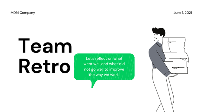
Presentation Cover Page Templates
Instead of creating your presentation cover page from scratch, using a template can take much of the work out of the process. Check out these websites for templates that you can use for your presentation or for inspiration to create your own designs.
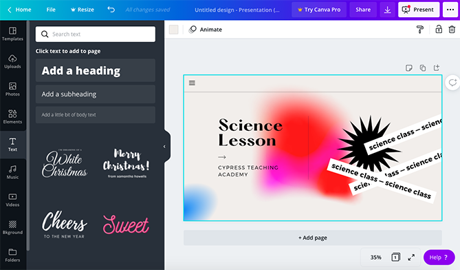
Canva
A tried-and-true favorite of many marketing teams, Canva offers up a wide selection of modern, drag-and-drop presentation templates with truly unique cover pages. If you're on the hunt for a cover page that looks like you hired a graphic designer to create it just for you, Canva is a good place to start your search. Canva offers both free and paid options.
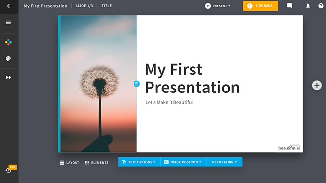
Beautiful.ai
Beautiful.ai has an intuitive, highly-customizable presentation builder that allows you to import your own visual elements directly from your computer or a Dropbox folder. Like Canva, they offer a number of free and paid template options (with great cover pages). Their biggest differentiating feature is their (frankly, very cool) adaptive AI technology, which intuits how you're trying to design a slide and makes changes automatically to suit the direction of your project.
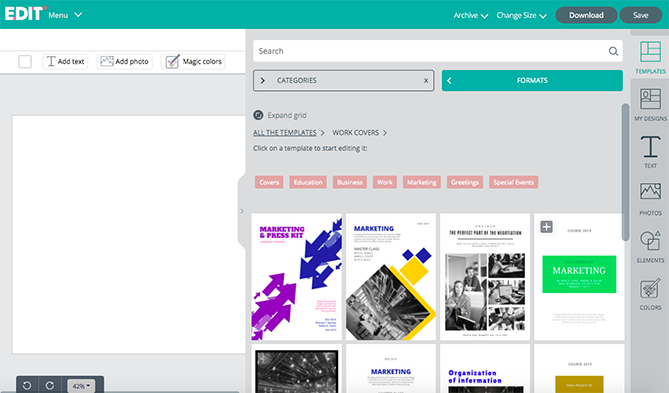
EDIT
For a completely free option with cover page starter template to suit a wide range of different projects across different formats, check out EDIT. Their online tool is specifically designed to create cover pages in a simple, easy-to-use interface.
Visme
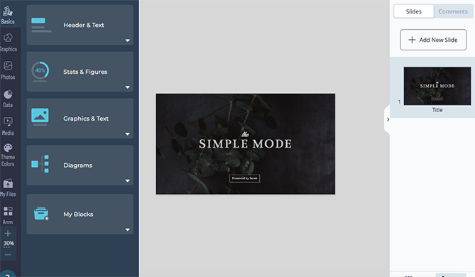
Another highly-customizable template source is Visme, which gives users the ability to select a starting template from their (expansive) library and customize elements in a simple web editor.
VectorStock®
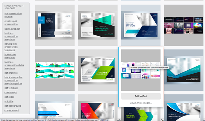
VectorStock® has a massive selection of PowerPoint presentation cover page templates for purchase if you're looking for something that's ready to plug and go without the need for customization (beyond adding your own name and title, of course).
First Impressions Matter
For better or worse, audiences will judge a presentation by its cover page. Because of this, it’s vital that you give your cover page the care and attention that it deserves. Ultimately, a cover page isn't simply a placeholder, it’s a vital component that can drum up interest for your presentation. The best part is that with the tools available online, you don’t have to be an artist to create a stunning presentation cover page.
The featured image on this post was created using a Canva template.
How to Create a Stunning Presentation Cover Page [+ Examples] was originally posted by Local Sign Company Irvine, Ca. https://goo.gl/4NmUQV https://goo.gl/bQ1zHR http://www.pearltrees.com/anaheimsigns
No comments:
Post a Comment