Think about the last time you flipped through a confusing instruction manual. Where does that piece go? How do these parts fit together? If the instructions are subpar, you get frustrated and wind up looking for an explainer video some random person posted online.
If we can follow the storyline, we understand. If not, we get lost in the chaos. Information design aims to avoid confusion by presenting data in a way that’s easy to understand.
As a marketer, information design makes it simpler to share complex ideas — whether you're distributing an annual report or getting buy-in for a new campaign. In this post, we'll walk through the basics of information design, how to put it to use, and the tools you need to start applying it to your work.
Information design is integral to everyday life. For example, we follow a recipe to whip up a meal or navigate a museum using signs and exhibit explanations. When used effectively, it can help people complete a task, solve a problem, understand complex data, or follow a set of directions.
You may be thinking that information design sounds a lot like data visualization. While both are tied to graphic design and a core set of design principles, key differences set them apart.
| information design | data visualization |
| Tells a story, which gives the data purpose. | Presents raw data in a visually appealing way but doesn't provide purpose. |
| Uses logic and patterns that are easily understood by an audience. | Allows viewers to make their own conclusions, and aims to spark a specific reaction. |
| Provides conclusions, so the viewer doesn't have to make their own assumptions. | Constantly evolves as new data becomes available. |
| Examples: How-to infographics, instruction manuals, or analytics reports that provide conclusions or predictions. | Examples: Analytics dashboards, demographic graphs, or performance charts. |
Confused? You're not the only one. The nuances between the two can be challenging to discern. The main thing to remember is that information design is about effectiveness and function, while data visualization is more about visual appeal and aesthetics. Both enhance a viewer's ability to comprehend data, but only information design weaves storytelling into the mix.
Luckily, a set of principles exists that will help you turn complex information into attractive, coherent content.
Information Design Principles
Most fields have a set of guidelines to keep processes clear and consistent. For example, writers follow style guides, engineers adhere to code standards, and information designers practice design thinking.
Design thinking is a process for creative problem solving that puts people first. Like UX design, which considers the users' needs above all else, information design principles are human-centered and give designers a process to follow. The goal is to ensure people don't feel overwhelmed or confused as they navigate information.
While the principles are listed in a particular order below, know that this process isn't always linear. You may have to repeat a step or jump back and forth between two to clarify information. Like all guidelines, you have to find what works for your situation and intention.
1. Empathize.
It's essential to understand a problem before creating the solution. That's why the first step in information design is about setting aside any assumptions so you can focus on users and their needs.
Start by getting curious. Ask questions, observe your audience's behaviors, engage people in conversation, and empathize to understand their true motivations or problems. Use interviews, surveys, focus groups, or polls to learn what solution people really need. The aim is to understand how people may interact with the final design to make it as effective as possible — but know the design will only be as good as the information you collect.
2. Define the core problem.
Once you've collected information from your target audience, you need to synthesize it and define the core problem to be solved. Ideally, you center it around the people you're aiming to help instead of your own needs.
For example, say you want to create a product page for a new portable speaker that your company will release. You may say, "We want to hit our sales goal, so we need to make a product page that's focused on converting people into customers." Instead, think about your customers and redefine the problem as, "People are looking for a speaker that can go anywhere, have great sound, and last for years."
Defining the problem with your audience in mind changes the way designers, writers, and marketers approach the solution. And it often sparks creative ideas, which leads right into the next stage.
3. Ideate and brainstorm.
Not all ideas have the same impact. That's why it's essential to encourage everyone involved in the information design process to flex their creativity in this phase.
Give your tried-and-true brainstorming techniques a go, but don't be afraid to experiment with new methods. Techniques like mind-mapping, brainwriting, free association, S.C.A.M.P.E.R, and storyboarding can stimulate ideas. Get as many ideas as you can for both the design and the story right from the start.
Once you've condensed your ideas down to a carefully curated list, map out your story outline to get a feel for how people will interact with and understand your design. This outline will serve as the foundation for the first iterations.
4. Prototype your ideas.
You likely landed on one or two strong ideas for the story and design. The prototype phase is where you expand upon those ideas to identify the best possible solution.
Prototypes are typically low-cost, simplified iterations, so don't spend all of your resources perfecting the first version. Instead, focus on the visual hierarchy to make your story stand out. Then, before moving on to the next step, share the prototype with people involved in the project to make sure the information is accurate, precise, engaging, and easily understood.
5. Test your designs.
When your design is robust enough to explain your idea, it's time to share it and collect feedback. Send it to teammates within your company who may provide insight or gather a group of people in your audience.
Take note of everyone's reactions. Are they confused by the storyline or design? Do they know what steps to take? Is the information clear and accurate? Do people read or watch to the end?
Give people a few days to sit with the prototype and gather feedback. When you feel you have enough information, make any necessary tweaks. You may have to repeat this step multiple times because, often, the feedback inspires you to redefine the problem and rethink your story.
Information Design Examples
While there's a particular way to approach information design, the design possibilities are near endless. Let's look at some ways it's used in business and marketing to help spark your ideas.
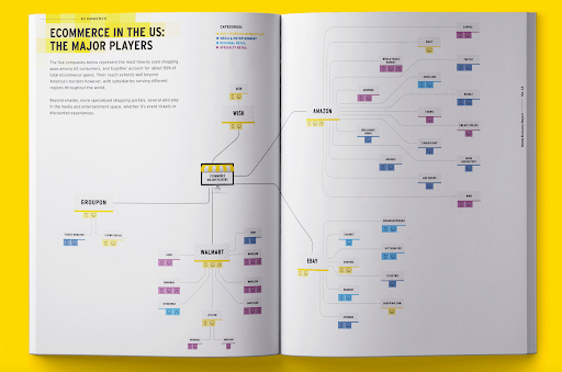
1. Media Economy Report Vol.13, Bureau Oberhaeuser
Industry trends don't have to be a bore. This report from MAGNA GLOBAL acts as a thought leadership piece to share insights on where the eCommerce industry is heading and how the customer experience is changing. A blend of copy and well-designed graphics gives an overview of forces affecting the industry, highlights key takeaways, and provides predictions on how eCommerce will evolve.
2. Advanced Keyword Research Tutorial, Brian Dean
Information design can go beyond written content. This explainer video from Backlinko gives life to the standard "how-to" post with a visually appealing design, animation, and clear instructions. If you want to experiment with content beyond blog posts, infographics, or reports, a video may be just the content for your next information design project.
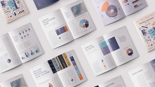
3. The Deal Machine, Elisabetta Calabritto
Mergers and acquisitions require a lot of research, but this design makes reading about the challenges companies face downright enjoyable. It's an excellent example of how information design isn't just about interpreting charts and visualizing studies—it also incorporates graphic elements that delight the eyes. Large quote blocks, relevant images, and color influence how people comprehend information, so make sure to consider the visual flow when creating your design.
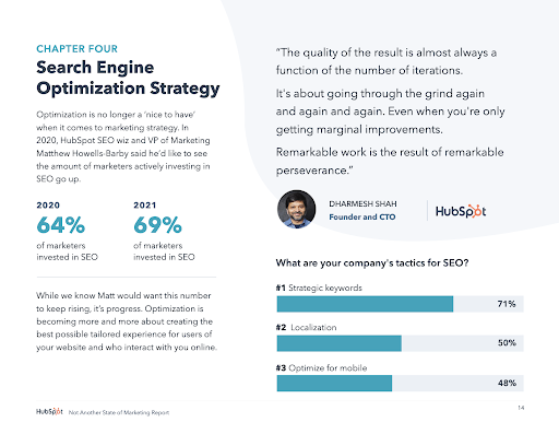
4. Not Another State of Marketing Report, HubSpot
Marketing is constantly evolving, and people need to keep up with the latest trends, strategies, and stats. HubSpot knows this. Their annual report reflects their industry expertise, with chapters dedicated to each marketing niche. Need to know the latest SEO strategies? Skip to Chapter Four. This example is a lesson in knowing your audience, providing the data they need, and packaging it up in a design that's easy on the eyes.
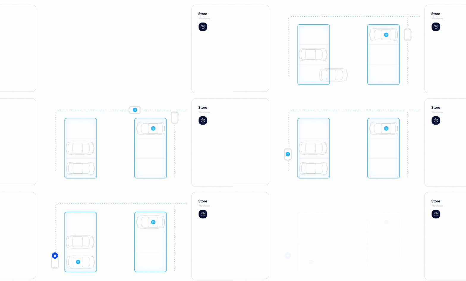
5. Click & Collect: Reinventing Online Grocery Experience, Netguru
Case studies are necessary for educating your audience and providing proof that your product or service works. Netguru did a great job creating a case study that's simple to scan and fun to scroll through. Interactive graphics catch your eye and explain how the product works. But my favorite moment had to be learning how the automated guided vehicles work.
Information Design Tools
Everyone has their favorite tools, whether it be for note-taking, project management, graphic design, or content management. If your specialty is marketing, the following tools can help you put together cohesive, attractive content — without having to learn complex software.
Certain tools are more intricate than others, though, so loop in your design team if necessary. They are the experts, after all! Here are some valuable tools to consider:
- Canva: A graphic design platform that is simple for non-designers to quickly get the hang of to create presentations, infographics, reports, and more.
- Visme: Ideal for both experienced designers and newbies, this graphic design platform gives a variety of templates so you can create videos, infographics, documents, charts, and graphics.
- Crello: Full of trendy templates, Crello is a graphic design tool with layouts for social media posts, marketing materials, presentations, and more. It also features a collection of royalty-free photos so you can spice up your information design documents.
- Adobe Creative Cloud: A must-have for creatives, Adobe CC offers supreme control over your creations. Photoshop, InDesign, Illustrator, and Premiere provide powerful tools for starting a design entirely from scratch.
- Procreate: This app is for artists who create digital paintings (think animations, graphics, and more). It's more for designers than for marketers, but it's perfect for those who prefer to work by hand before converting their work into programs like Adobe CC.
In a world where people are constantly bombarded with information, focusing on clear communication can improve conversions, increase customer satisfaction, and help you hit your goals. Effective information design makes it easy for people to gain insights and learn about your company. With the right data, story, and tools in hand, you can design content that's just right for your audience—and hopefully prevent the frustration that comes from an incomprehensible set of instructions.
What is Information Design + How It Can Help You as a Marketer was originally posted by Local Sign Company Irvine, Ca. https://goo.gl/4NmUQV https://goo.gl/bQ1zHR http://www.pearltrees.com/anaheimsigns
![Download Now: 150+ Content Creation Templates [Free Kit]](https://no-cache.hubspot.com/cta/default/53/5478fa12-4cc3-4140-ba96-bc103eeb873e.png)
No comments:
Post a Comment