Whether you're looking to increase revenue, sign-ups, social shares, or engagement, A/B testing and optimization can help you get there.But for many marketers out there, the tough part about A/B testing is often finding the right test to drive the biggest impact — especially when you're just getting started.
So, what's the recipe for high-impact success?
Truthfully, there is no one-size-fits-all recipe. What works for one business won't work for another — and vice versa.
But just because you can't replicate the same test and expect the same result doesn't mean you can't get inspired by other companies' tests.
In this post, let's review how an hypothesis will get you started with your testing, and review excellent examples from real businesses using A/B testing. While the same tests may not get you the same results, they can get you inspired to run creative tests of your own.

A/B Testing Hypothesis Examples
A hypothesis can make or break your experiment, especially when it comes to A/B testing. When creating your hypothesis, you want to make sure that it is:
- Focused on one specific problem you want to solve or understand
- Able to be proven or disproven
- Focused on making an impact (bringing higher conversion rates, lower bounce rate, etc.)
When creating a hypothesis, following the “If, then” structure can be helpful, where if you changed a specific variable, then a particular result would happen. Here are some examples of what that would look like in an A/B Testing Hypothesis:
- Shortening contact submission forms to only contain required fields would increase the number of sign-ups.
- Changing the call-to-action text from “Download now” to “Download this free guide” would increase the number of downloads.
- Reducing the frequency of mobile app notifications from 5 times per day to 2 times per day will increase mobile app retention rates.
- Using featured images that are more contextually related to our blog posts will contribute to a lower bounce rate.
- Greeting customers by name in emails will increase the total number of clicks.
Let’s go over some real-life examples of A/B testing to prepare you for your own.
1. HubSpot's Site Search
Most websites contain a search bar at the top of the page that gives users the ability to search for a specific topic or term.
Based on previous data, HubSpot found that non-bounce desktop users who engage with search have a 163.8% higher blog lead conversion rate than those who do not. However, only a very small percent of blog traffic interacts with the search bar. That's why HubSpot decided to test the visual prominence and functionality of the site search bar.
HubSpot used three variants for this test, using offer thank you page views as the primary metric.
For variant A, the site search bar increased visual prominence and altered the placeholder text to "search by topic."

For variant B, the search bar had increased visual prominence, the placeholder text was altered to "search by topic," and the search function searched the blog, rather than the whole site.
For variant C, the search bar had increased visual prominence, the placeholder text was changed to "search the blog," and the search function searched the blog, rather than the whole site.

As a result, HubSpot found that all three variants increased the conversion rate. However, variant C showed a 3.4% increase in conversion rate and a 6.46% increase in users who engage in the search bar.
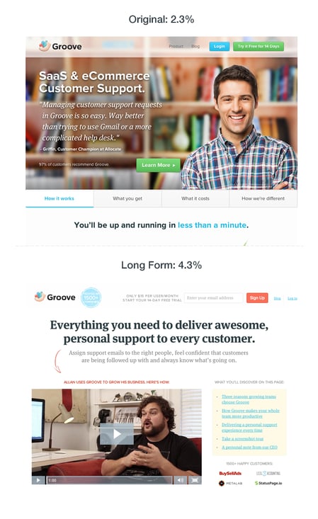
2. Groove's Landing Page Design
Every marketer will have to build a landing page at some point. But building a landing page that'll convert is hard.
Groove experienced that first hand when the company learned one of its landing pages was only converting at 2.3%.
However, Groove wasn't sure why the page wasn't converting. To figure it out, its team went on a journey. They looked up resources and talked to marketing experts to figure out why their site wasn't working.
That's when the company learned that the messaging was all wrong. To figure out how to appeal to its customers, Groove decided to reach out and actually talk to real users.
Then, when the team rebuilt their landing page, they focused on copy first, and design second. Only when the copy was completely finished and approved did they start the visual aspect of designing.
Overall, the tweaks to messaging ultimately doubled their conversions to 4.7%.
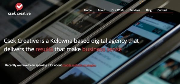
3. Csek Creative Homepage Design
The copy on your homepage is important because it helps users decide whether they want to continue looking deeper into your site.
In this example, a digital agency decided to test the tagline on its homepage. Ultimately, the goal was to decrease the bounce rate.
Before the A/B test, Csek's tagline read: "Csek Creative is a Kelowna based digital agency that delivers the results that make business sense."
To make the copy less vague and more explanatory of the services it offered, Csek Creative changed the verbiage to: "Csek Creative is a digital agency that helps companies with their online and offline marketing needs."
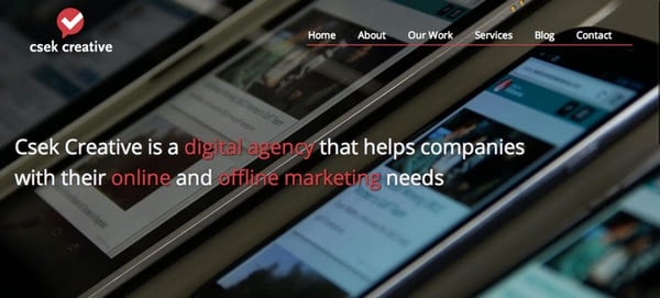
Expecting minor results, this change actually resulted in an 8.2% increase in click-throughs to other pages on the site.
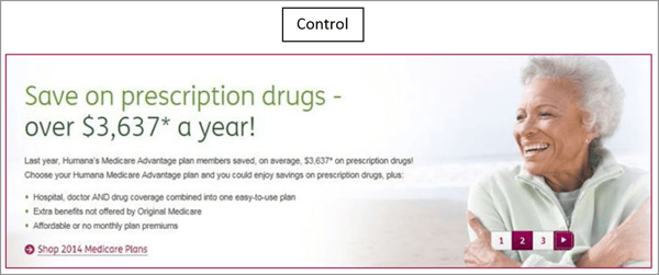
4. Humana's Site Banners
Many landing pages showcase large banners at the top of the page. That's valuable real estate, and if the banner isn't optimal, it could end up doing more harm than good.
That's why Humana, a healthcare insurance provider, decided to test its landing page banners.
In the control, Humana had been using a banner that displayed a lot of copy, a weak CTA, and no clear and concise message.
However, for variation B the company decided to simplify the message. This variation ended up receiving 433% more clickthroughs than the control.

Humana didn't stop there. Once variant B became successful, the company decided to make it the new control and wanted to test the CTA.
With variation C, Humana switched the CTA language to include language that was a harder sell, such as "Shop." The company decided this would be a good approach because customers signing up for Medicare have a limited window to make a decision.

The change in language resulted in a 192% increase in clickthrough.
Email A/B Testing Example
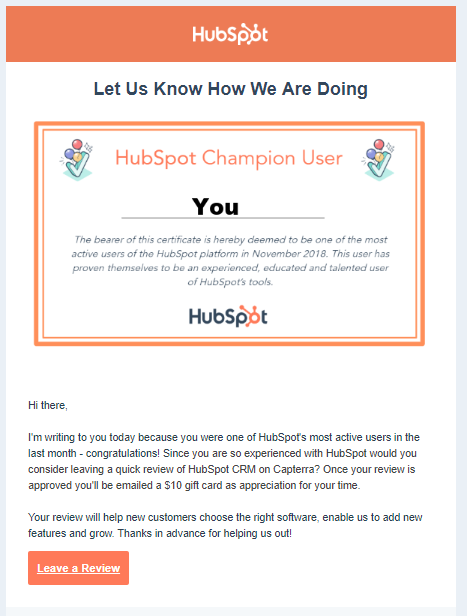
5. HubSpot's Email vs. In-App Notification Center
Gathering reviews from users isn't always an easy task. That's why HubSpot decided to A/B test ways to reach out to customers. The methods tested? In-app notifications versus email.
HubSpot decided to send an in-app notification and email alerting users that they were the champion user of the month and would receive a $10 gift card if they left a review on the Capterra site.
For variant A, HubSpot sent a plain text email to users.
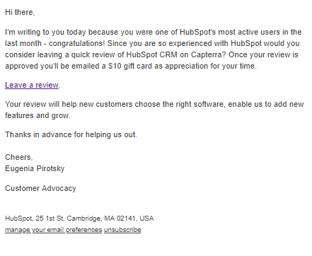 For variant B, HubSpot used a certification, templated email.
For variant C, HubSpot sent an in-app notification.
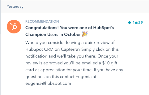
HubSpot found that unlike with emails, in-app notifications are often overlooked or missed by users. The emails outperformed in-app notifications by 1.4x. From both emails, 24.9% of those who opened the email left a review, compared to 10.3% of those who opened the in-app notification.
6. Unbounce's Tweet vs. Email CTA
On most landing pages, marketers typically ask users for an email address to deliver their content offers.
However, Unbounce decided to test whether customers would rather give an email address or just tweet about a product.
Both options have pros and cons for the company. Asking for an email address means your company can build a list of potential prospects while asking people to tweet can build viral momentum and increase social exposure.
The first landing page in this A/B test asked users to give their email address in exchange for an ebook.
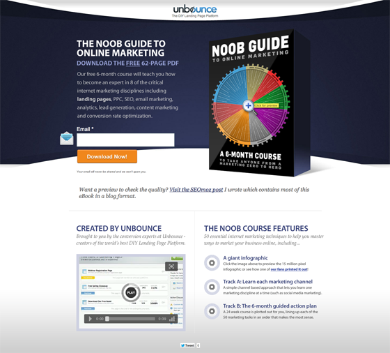
The second landing page asked users to send a tweet in exchange for the ebook.
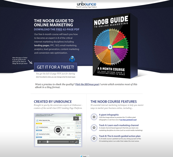
Overall, people far preferred giving out an email address. In the end, the email landing page had a 24% conversion lift.
Mobile A/B Testing Example
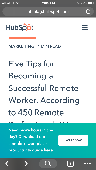
7. HubSpot's Mobile Calls-to-Action
HubSpot uses several different calls-to-action in its blog posts. For instance, on this blog, you'll notice anchor text in the introduction, a graphic CTA at the bottom, and a slide-in CTA when you scroll through the post.
However, on mobile, these CTAs might seem intrusive. That's why HubSpot tested mobile CTAs.
Previous A/B tests revealed that HubSpot's mobile audience was 44% more likely to click through to an offer landing page and 18% more likely to convert on the offer if all CTAs were stripped from blog posts and there was only one CTA bar at the bottom of the page with no ability to exit.
So, HubSpot decided to test different versions of the bottom-of-the-page CTA bar, using thank you page views as the primary metric and CTA clicks as the secondary metric.
HubSpot used four variants for this test.
For variant A, the control, the traditional placement of CTAs remained unchanged.
For variant B, the CTA had a maximize/minimize option so readers could dismiss the CTA. This could be accomplished by an up/down caret.
For variant C, the CTA had an X that would completely dismiss the CTA from the post. At this point, there would be no formal CTA on the blog.
For variant D, the CTA had no X or minimize/maximize option.
Overall, variant B saw a 7.9% increase, variant C saw an 11.4% decrease, and variant D saw a 14.6% increase.
From those numbers, HubSpot was able to project that using variant D on mobile would lead to about 1,300 additional submissions each month.
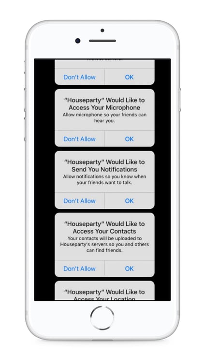
8. Houseparty’s Mobile Onboarding Design
Houseparty is a social app where users can have face-to-face conversations with their close friends. The business had a goal to incrementally improve the functionality and design of the app without causing significant dips in metrics, so it opted to use multiple A/B tests.
One of the things Houseparty aimed to improve was the onboarding funnel and how users are prompted to add friends through push notifications. Originally, users received permission requests to access their phone contacts with little context, and most users clicked “Don’t Allow” (as shown in the image below), making it difficult to connect with friends on the app.
After running A/B tests to improve this experience for customers, Houseparty notifies users of pop-up notifications and their context before they occur to understand why giving access is important (as shown in the image below).
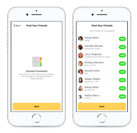
The final version, which was A/B tested, found that users sent 2X more friend requests on their first day, and there was a 15% increase in permissions to access contacts.
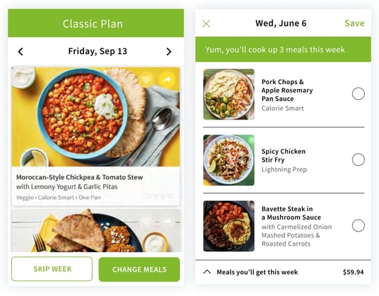
9. HelloFresh Menu Display
HelloFresh is a meal kit subscription service that delivers recipes to global users. As its user base grew, its recipe count grew, but it became more difficult for users to navigate through the app and find what they needed.
The business set out to redesign its menu pages for a seamless user experience while also drawing attention to upselling opportunities. HelloFresh ran an experiment that compared the impact of the original control menu display to a new version. The image below shows the control menu display.
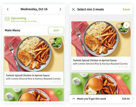
And the image below displays the variant and final version, which contributed to a 7% increase in upselling revenue.
A/B Testing Takeaways for Marketers
A lot of different factors can go into A/B testing, depending on your business needs. However, there are a few key things to keep in mind:
- Every A/B test should start with a hypothesis focused on one specific problem that you can test.
- Ensure you’re testing a control variable (your original version) and a treatment variable (a new version that you think will perform better).
- You can test various things, like landing pages, CTAs, emails, or mobile app designs.
- The best way to understand if your results mean something is to determine statistical significance once the experiment is over.
- There are a variety of goals to focus on for A/B testing (increased site traffic, lower bounce rates, etc.), but they should be testable and able to be supported or disproven.
- When testing, ensure you’re splitting your sample groups equally and randomly, so your data is viable and not due to chance.
- Take action based on the results you obtain.
These companies all saw these amazing results because they started testing. If you want to get the same results, you've got to get started, too. For more information, be sure to check out the on-demand webinar "Optimize Your Online Marketing Channels," hosted by Optimizely and HubSpot.
Editor's note: This post was originally published in October 2014 and has been updated for comprehensiveness.
9 A/B Testing Examples From Real Businesses was originally posted by Local Sign Company Irvine, Ca. https://goo.gl/4NmUQV https://goo.gl/bQ1zHR http://www.pearltrees.com/anaheimsigns
No comments:
Post a Comment