Monday, September 21, 2020

The Ultimate Guide to UX Design

Think about a website or app you love. What do you love about it? The ease of gathering relevant information? How you can buy something in one click (and have it delivered tomorrow)? Or how quickly it answers your questions?

Now think about the people who created that website. What was their goal?

They were trying to create a site that had the features you love about it — a site that is easy to use, effectively delivers the information you need, and allows you to make smart decisions tailored to your challenges or concerns.

UX, or user experience, focuses on the end user’s overall experience, including their perceptions, emotions, and responses to a company’s product, system, or service. UX is defined by criteria including: ease of use, accessibility, and convenience.

The concept of UX is most often talked about in terms of tech, such as smartphones, computers, software, and websites. This is why UX is not only a fairly new field, but also a variable one — it changes quickly due to technology advancements, new types of interactions, and user preferences.

It’s no secret that customers today want quick and simple ways to meet their needs and solve their pain points. That’s why UX matters so much.

Whether or not you’re in tech, the company you own or work for most likely has a website. Well, customers could write you off in a matter of seconds if they don’t find your website useful and easy to use. In fact, most website visitors determine whether or not they want to leave within a minute of opening a page.

Follow along to learn more about the importance of the emerging field of UX, what today's designers are being hired to do, and why every type of business can benefit from thoughtful UX design.

UX design is about creating products "that provide meaningful and relevant experiences to users," according to the Interaction Design Foundation. Within UX design, there are a few different categories.

1. Interaction Design

A subset of UX design is interaction design (IxD). It is defined as ... yup, you guessed it... the interaction between a user and a product — the goal of that interaction is for it to be pleasant for the user.

2. Visual Design

In visual design, creators use illustrations, photography, typography, space, layouts, and color to enhance user experience. To have successful visual design, artistic design principles including balance, space, and contrast are crucial. Color, shape, size, and other elements also impact visual design.

3. User Research 

User research is the last major element of UX design. User research is how companies determine what their customers and users want and need. At its core, your website should solve a problem, and so this is an important step in determining what exactly your users require. Without it, your designs are simply guesses.

4. Information Architecture

Designers use information architecture to structure and label content so that users can find information easily. Information architecture is used on websites, smartphones, apps, and even in the physical places we go to. Ease of use and discoverability are two important factors of information architecture, which is why it is so closely related to UX design.

Think about the New York City Subway map. This is a great example of information architecture that helps people understand how to get from one place to the next. According to the Information Architecture Institute, "If you’re making things for others, you’re practicing information architecture."
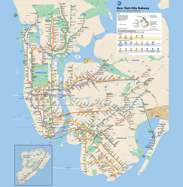
information-architecture

Source: NYC Subway Guide

UX Design Principles

UX is an ever-changing field, but the fundamental UX design principles remain the same. Designers also have to determine what they want in terms of visual balance. Being clear and concise is crucial … less is more! You want your design to be intuitive, and most importantly, your design should meet the user’s needs.

While UX is subject to trends and new technology, there are a few core principles that stay the same. These help designers look at various problems through a methodology that's consistent and focused.

  • Be contextual: You want individuals to know exactly where they are in their user journey. They should never feel lost or overwhelmed. Your design is there to guide them along their journey.
  • Be human: No user enjoys feeling like they are interacting with a machine. You’ll gain the trust of the end-user if you show them your brand’s personality and approachability.
  • Be findable: Users don’t want to waste time. With a successful UX design, your work will be easy to find and navigate.
  • Be easy: Being consistent and straightforward will go a long way with your users. You build relationships with your users by providing them with enjoyable and easy experiences.
  • Be simple: No fluff, tangents, or unnecessary descriptions. Get to the point. Let’s be honest here … these days, everyone has a short attention span.

These principles will guide you at every stage of the UX design process. Let's walk through what each of those stages entails below. 

UX Design Process

There are typically several stages of the UX design process to consider. UX design takes a human-centered design approach during all these stages. This is about considering the needs of the people you are designing for, coming up with a wide range of solutions to resolve the issue they are facing, designing prototypes for the users to test, and then finally putting the best solution in place for the user. If you look at the issue from the perspective of the user, and design with them in mind, you will create solutions they will want to adopt.

Let's take a closer look at each stage of the design process below.

1. Understand your user’s pain points.

Since UX design is about improving the user experience, your first step is finding out what the challenges and expectations of users are. Once you understand what the problems are, you can solve for them.

In an article for Career Foundry, Rosie Allabarton stresses the role of empathy at this stage of the UX design process. She said, “You’ll be working with groups of users who come from a variety of backgrounds and are bringing different experiences with them. Your job is to try to understand why they are behaving the way they are, not to try to change that behavior or influence it, but accommodate it within the product.”

There are a few approaches you can take to gather this important user research.

Interviews

One of the best ways to understand your audience is to be in the same room as them. User interviews typically entail a group of users browsing through an existing site or product or even a competitor’s while members of your team observe. That way, your team can watch how people interact with a website or product and gather feedback in real time. This can help uncover areas of improvement that you and your team hadn’t noticed. Like maybe users are overlooking the CTA button on your homepage, or maybe they want a search box to navigate a website. You can then incorporate this feedback into your design process.

If in-person interviews isn’t an option, then you can always hold remote user testing sessions

Online Surveys

While interviews are ideal for getting rich insights from a small group of users, online surveys are a great way to gather feedback from a larger audience. Surveys consist of a series of targeted questions sent to a sample of your audience. These questions can take on a variety of forms, including yes/no, multiple choice, checkbox, dropdown, ranking, ranking scale, and textbox. Online surveys are typically distributed via forms, and then compiled in a database so you and other stakeholders can review them.

2. Create user personas.

Now that you have all this user research, you’ll want to summarize it. Creating user personas is a great way to do so. Also known as buyer personas, these personas are semi-fictional representations of your ideal customers based on data and research. Buyer personas help you better understand your existing and prospective customers, so you can tailor your products as well as your services, content, and messaging to meet their specific needs, behaviors, and concerns.
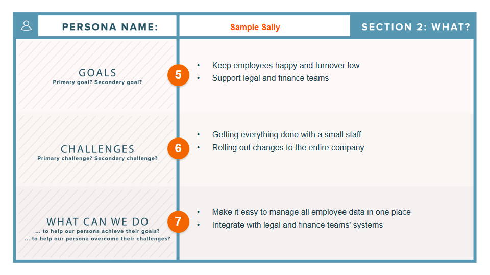
Buyer persona template with sections for goals, challenges, and what can we do

Image Source

These personas help ensure that everyone on your team understands, remembers, and centers the end user throughout the design process. 

To learn how to research and create personas, check out the post How to Create Detailed Buyer Personas for Your Business [Free Persona Template].

3. Map out user journeys.

While you can categories users into different types of personas, every user is unique. That means different users will interact with your site in different ways — even if they have the same goal. Say they’re looking to apply to a job at your company. Some might navigate to your homepage, click Careers from your navigation bar, and then browse your job openings. Others might search your company name plus “careers” in Google.

Your goal is to identify the primary goals of your users and ensure they can complete their goals. So an ecommerce site, for example, will need to identify all the different ways a customer might want to complete a purchase and make sure their site enables them at every step. Providing functionality to ensure a customer can complete a purchase on a desktop, tablet, and mobile device are just a few scenarios you’d have to plan for. You’ll likely need a lot of colorful post-it notes for this stage.

4. Create website wireframes.

Now that you’ve mapped out user journeys on paper, it’s time to map them out in your actual product with website wireframes and prototypes. You can think of a wireframe as a sketch of your product or website.

When creating a wireframe for your website or product, you can plot out how you want to display your main features, allocate space, and present images and content and how this layout helps (or hinders) the user from achieving their goals before introducing design elements like color schemes.

Evaluating your product’s functionality and intended user behavior at this stage can help you find potential problems or missing features that might get in the way of conversions or sales later on — before you’re too far along in the design process. That way, you can easily make changes, get approval from other stakeholders, and confidently move to the next stage of the design process.

Wireframes range in complexity. Some are hand drawn with a pencil, others are created with software tools like Sketch and Canva. Here’s an illustrated example.
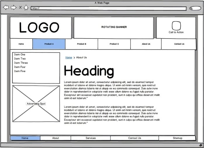
Illustrated example of website wireframe with logo, banner, navbar, sidebar, and content area

Image Source

5. Start prototyping.

Think of a prototype as the final draft of your product or website before the coding begins. It’s not the final version, but it’s close enough that you can fully test the product before it launches and demonstrate it to management and other stakeholders.

Unlike a wireframe, a prototype will include font, images, icons, and colors. This phase is focused less on aesthetics and more on user flow, however. Prototypes will be interactive, allowing you, users, and other stakeholders to experience how the product works in real life.

You’ll run more user testing at this phase to uncover issues like whether your checkout process requires too many clicks or your homepage is difficult to navigate.You’ll likely experiment with navigation and other functionality at this stage, and produce lots of iterations.

To create a prototype and subsequent iterations, you’ll need to use a dedicated tool like Adobe XD, InVision, or the free Justinmind. Here’s an example of a prototype built with Justinmind.
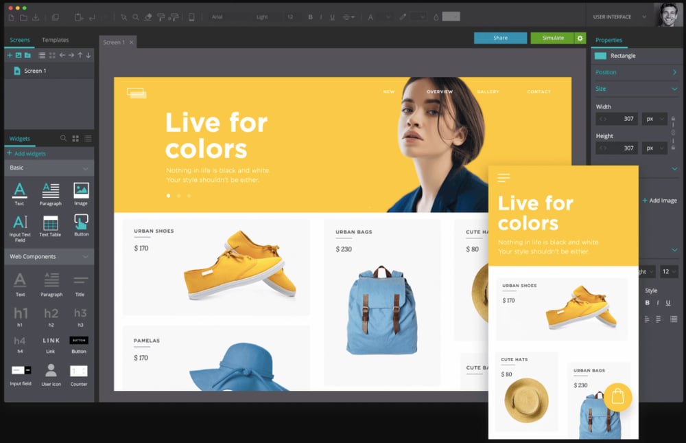
Justinmind prototype of ecommerce website on desktop and mobile

Image Source

At this point, the coding can begin so you’ll pass your prototype to designers and developers who will build a user interface. More on what a UI is and how it differs from UX later.

UX Deliverables

UX deliverables are the various outputs of a UX design process. The designer and team will have to produce and present these deliverables to an internal team and external clients for review — either during the design process or once the project is complete. 

As tangible records of the work that has occurred, UX deliverables are a critical part of the design process. These deliverables help UX designers to effectively communicate their design ideas and findings, and make it clear to stakeholders why recommendations for changes and improvements are made. They also help designers get buy-in for their ideas.

1. User Research

User needs, tendencies, and motivations can be determined through different types of user research. This might include quantitative and qualitative data from user testing sessions and focus groups. It could detail feedback on sign up flows, the onboarding process, and customer service inquiries.

The goal is to have a detailed analysis of what's both working on the site and what could be improved — and to have this all backed by information gathered from users. Researchers may create buyer personas based off of real user data to help them accurately determine who will be using their device, website, or app. Through user research, designers understand and empathize with the user.

2. Competitor Assessment

Assessing the strengths and weaknesses of your competitors is a way to enhance your own UX strategy. A great way to do this is by creating a competitive analysis report that details the interaction design of your competitors and provides an analysis of where you see pitfalls and missed opportunities — things your business can take advantage of.

3. Interaction Design

An interaction design deliverable could come in the form of a prototype so that people can review how interactions with the site would occur — showing how people would complete key tasks, get information, use a product, the flow of finding information, and how easy the product is to use. You want your prototype to be as similar to the final product as possible, so you can get sign off on the design before you begin building it.

4. Information Architecture

IA is the process of taking information and organizing it in a way that is easy to understand. For large websites, this is especially important, as you need to understand what content exists and how to organize it in a way that makes sense for your visitors. The result might be a content inventory, sitemap with suggested navigation, or sample user flows that reveal how visitors move through a site.
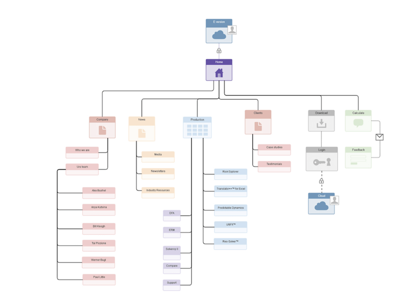
site-map

Source: Adobe Blog

Now that we understand the different deliverables a client or manager might ask from a UX designer, let's take a closer look at arguably the most important: UX research. 

User Experience Research

Without research, all of this focus on what the user needs and wants would be impossible. UX research is the investigation of users and what they need, which informs the UX design process. Companies and designers use this research to come to specific conclusions about what is working for users and what needs to be changed. There are several ways companies and designers perform UX research.

Usability Testing

Usability testing evaluates how successful a product is by testing it on actual users. It gives companies real input on how individuals are using a product or system and how that product or system works for that user. There are two primary testing methods. 

Hallway usability testing is a quick and cheap way for companies and researchers to get information from users who may not know of your company or products. Random individuals use the products and give feedback on their experience.

Remote usability testing allows companies to research with users in their natural environment (such as in their home or office). These tests can be moderated in any way the company chooses.

Usability Testing Tools

Usability testing tools allow researchers and designers to compile accurate feedback from users and then analyze that feedback to make data-driven changes. If you’re looking for a tool that can help you test how easy-to-use your site or product is, check out these options:

  • Crazy Egg: This tool allows companies to see exactly what users are clicking on while on their website. Crazy Egg also records exactly where site visitors are coming from, including geographic location, and if they were referred from another site.
  • Hotjar: This tool combines analytics and feedback to give an overview on ways to improve user experience. They do this through the use of heatmaps, visitor rates, conversion funnels, and more.

For more usability testing tools to consider, check out this post.

How to Enhance User Experience

Through the research and testing mentioned above, user experiences can always be improved. Some of the most common ways to improve user experience include: Taking a consultative approach to improving the experience, determining calls to action, implementing responsive web design, considering Fitt's Law (more on this next), avoiding overwhelming data entry, and more.

Using Fitt’s Law to Enhance UX

Fitt’s law is a predictive model that determines the amount of time it takes for a specific user to move their mouse or cursor to a target area on a website. There are multiple versions of Fitt’s law that exist but they all revolve around the general idea that, “The time required to move to a target depends on the distance to it, yet relates inversely to its size.” Fitt’s law is widely used in UX design to improve ergonomics in addition to usability for users.

Here’s an example of this at work: Have you seen the new Touch Bar on Apple’s MacBook Pro? This is a touchscreen above the keyboard that speeds up a user’s experience when using Google, bookmarking a page, changing screen brightness, volume, and more. Touch Bar options change depending on what page you are browsing while on your laptop, whether that be an app, a site you are visiting, or even just your personal settings.

With the Touch Bar, the user’s experience is simplified because many commonly used settings are in one compact location. Fitt’s law states the further away and smaller an object or button is for a user, the harder it is for that user to click on it. That’s why the Touch Bar is such a great example of taking Fitt’s Law and successfully applying it to your device to enhance user experience.

UX Design Tools

Whether you are researching, prototyping, wireframing, storyboarding, or creating graphics, there are multiple UX tools available to assist you during the design process. In fact, there are so many tools on the market, some free and some that require a subscription fee, that it may be overwhelming for designers who are unsure of exactly what they need. To get you started, here’s a list of some popular and valuable tools to use in your UX design work:

1. Adobe Fireworks

Adobe Fireworks CS6 gives web designers a way to create graphics for their web pages without getting into the code or design details. There are a few reasons why UX designers use Adobe Fireworks: The tool has impressive pixel accuracy, has image compression abilities (JPEG, GIF, etc.), allows users to create functional websites, and build vectors. This is a great option especially if you are already familiar with other programs in the Creative Cloud.

2. Adobe XD

With Adobe XD, you can design websites and mobile apps, as well as create prototypes, wireframes, and vector designs. Users can share interactive prototypes on multiple platforms, including Windows, Mac, iOS, and Android, so it’s perfect for team collaboration.

3. Axure

Axure RP Pro is another great UX design tool — that’s also free. Axure has several capabilities including wireframing, prototyping, and documenting. It can even help you create user flows and sitemaps. Axure is perfect for creating web and desktop applications, and it gives users the ability to easily export to PDF or HTML for review.

4. Adobe Illustrator and a Free Alternative

If you’re looking for an affordable alternative to Adobe software, such as Adobe Illustrator (which is primarily used to create vector graphics), we’ve got you. Inkscape is known for doing most of what Illustrator does, but for free. This software is open source and can be used to create impressive vector graphics. The only issue you could run into is lag, as some users have reported that the program is slow. If you’re partial to Illustrator, that’s OK too.

5. Sketch

Sketch is an end-to-end software with specific features including non-destructive editing (meaning Sketch won’t change the pixels in the photo you are working with), code export, pixel precision, prototyping, vector editing, and more. With Sketch, you can reuse and update your designs easily.

6. Storyboard Software

You might be wondering why you would need to storyboard in UX design. It’s a great way to visually predict and review the way a user would interact with and experience a product in a broader context. There are several storyboard tools available, with varying levels of features and complexity.

Storyboarder is a free storyboard software option, which has basic features made for designers of all levels. This software allows users to quickly create drawings and stick figures to lay out a plot or idea.

Another storyboard software option is Toon Boom Storyboard Pro. It combines drawing, animation, camera controls, and numerous other features, all for an annual or monthly fee. It has a wider range of features for more complex storytelling and detailed prep work. Both options are great for designers looking to visually tell the story of their persona or users.

Storyboards are also a great way to bring in all stakeholders, including researchers, developers, and UI designers. Before we discuss how to become a UX designer, let’s make sure we understand the difference between two similar roles: UX and UI designers.

What is User Interface design?

Remember when Apple unveiled its click wheel for the iPod? When it was introduced, the feature was intuitive and highly functional — not to mention cool-looking.

This is a great example of a successful user interface (UI). UI refers to how people interact with computers, machines, websites, apps, wearables, and other programs or devices. User interface design is the process of making these things as easy to use and efficient as possible.

Common UI Elements

Although UX and UI have similar definitions, it’s important to note the key differences that separate the two topics. Again, UI focuses on a product’s appearances and surfaces, while UX is more concerned with how people interact with a site. Here are some common UI terms you should know to better understand how the two differentiate:

  • Informational Components: UI designers use informational components to enhance the reading experience or give more information. Examples of informational components are progress bars, notifications, and message boxes. Designers use these when they want to make it clear to the user that they have completed a task, or if they want to notify the user that action on their part is necessary.
  • Breadcrumb Navigation: This is a design tool often used by UI designers to visually increase the usability of a website. It allows users to see their location on a site in a hierarchical structure. It doesn’t need to have special visual features or over-the-top design — it should just clearly state where a person is located on a site. You may have noticed these links along the top of a webpage while online shopping or on another site.
  • Input Controls: Input Controls give individuals multiple options in response to a question you are asking. These are things like checkboxes, drop-down lists, and toggles. Keep the information you are asking in your input controls simple and to-the-point so it’s easy to find what the user needs.
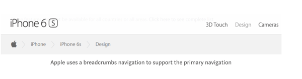
breadcrumb-navigation

Source: UX Planet

If you love designing, researching, working with other people in a fast-paced environment, and listening to others’ experiences, a career in UX design may be right for you. As a UX designer, you’d focus on the conceptual aspects of design and create better experiences for users.

Here are the steps to follow to become a UX designer.

1. Do your research.

This step may seem like a given, but pursuing a career path (or changing yours altogether) is a big move. Do plenty of research to ensure that you want to be a UX designer. Guides like this one will help give you an idea of what UX design entails. You can also lookup "day-in-the-life" articles, podcasts, and books to better understand how other UX designers spend their workdays.

2. Take a UX design course.

There are plenty of higher education courses available around the world, though they typically require a four-year undergraduate design curriculum as a prerequisite.

However, some programs allow for more flexibility, such as the online Quinnipiac University Graduate Program in User Experience Design. There are also UX certification programs for professionals. These vary in commitment length and level of expertise upon receipt of the certificate.

3. Apply for a UX design internship.

A UX design internship is valuable for a few reasons. First, UX design internships bridge the gap between education and real-life experience. Internships allow you to put what you've learned in the classroom (or online) to work while receiving helpful feedback from your peers and coworkers.

Secondly, UX design internships allow you to build a live portfolio of design work done on behalf of a real company. While demo work is valuable for demonstrating skill and process, you can report on the impact and results of the work you complete during your internship.

Lastly, UX design internships introduce valuable mentor relationships. Design mentors are critical to developing your skills, receiving constructive criticism, and expanding your network — three things that can help you land your dream UX design job.

To find a UX design internship, start with sites like LinkedIn, The Muse, Glassdoor, and AngelList, as well as simply searching on Google. You can also target the companies themselves: Apple, Google, Microsoft, Reddit, Adobe, Amazon, and Salesforce all offer UX design internship programs.

4. Build your UX design portfolio.

Once you’re ready to start applying for your dream UX job, you’ll need a stand-out resume and a flashy portfolio. Use a site like Dribble or Behance to showcase your work, or create your own website using a tool like SquareSpace.

When building your portfolio site, keep these tips in mind:

Make it visually stunning.

Presentation is everything. Your work should speak for itself ... show don’t tell! Your choice in color, typography, and layout all play a factor here.

Include an “about” page.

Hiring managers and recruiters want to get to know you, how you think about design, what inspires you, and what makes you unique. Why should they hire you? What value can you add to your new potential company and team?

Have clear navigation and links throughout your portfolio site.

Can you imagine the hiring manager at your dream company having a hard time navigating the portfolio site of a UX designer? Awkward. In your navigation bar, include options such as: “portfolio,” “about,” “contact,” and “resume” to avoid any confusion.

Explain your personal UX process.

Your future employer wants to know how you think. Include information that lets the hiring manager in on your UX researching, brainstorming, wireframing, designing, and prototyping processes.

Create additional portfolios to expand your network.

Use other tools to make your work available on sites where designers and those looking to hire designers to spend their time. Behance and Dribble are great portfolio sites for people looking for inspiration, networking, and new career opportunities.

If you're interested in this career path, we've gathered some ideas for UX projects that can help get you started and built out your portfolio. Let's take a look.

UX Design Ideas

Are you interested in UX design but don’t know where to get started? We’ve compiled a list of ideas for people who need inspiration just like you. Completing these projects will not only provide you with valuable experience, it will also provide valuable additions to your portfolio. Let’s take a look at some of these ideas and the real-life examples that go with them.

Redesign the digital menu of your favorite local restaurant.

Redesigning a restaurant’s menu is a great exercise in anticipating user needs. To find the right balance of information and images, you’ll have to decide what readers need to know and see to make informed decisions, and what will simply overwhelm them. You might experiment with the categorization, descriptions, and ratings of the food items, and more.

Below is a drink menu by Panji Arafat on Dribble.
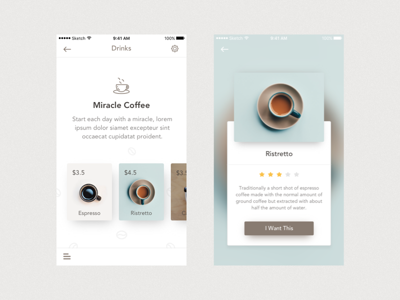
UX project showing redesigned drink menu for Miracle Coffee shop

Image Source

Sketch a better interface for your toaster oven.

This will help you practice analyzing an existing product and identifying where you can add value in terms of functionality and design. The best part is you can complete this project without leaving your kitchen!

Below is an example by designer Sarah Kerbleski.

Redesign the homepage of your personal site.

You can redesign the homepage of any website, but using your own personal site or a site that you have access to analytics to is ideal. That way, you can practice accumulating and analyzing user research and using those insights to inform your design process.

When HubSpot redesigned its homepage back in 2016, UX Designer Austin Knight analyzed massive amounts of data and discovered three important trends: a significant number of users were moving from the homepage to the pricing page, FAQ page, and the search bar. All of these trends supported the conclusion that the homepage was lacking critical information that was affecting its conversions. You can read more about this redesign in the UXPin case study.
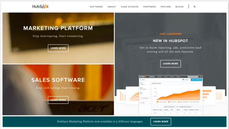
2016 Redesign of HubSpot homepage for UX

Image Source

Redesign a feature in an application that frustrates you.

This can help you practice redesigning some functionality in an existing app, rather than starting from scratch. Product designer Jo Zhouzheng did exactly this for Doordash. Frustrated by the restaurant and menu browsing experience in this popular food delivery app, Zhouzheng redesigned the interface. Here’s a before and after look of the interfaces.
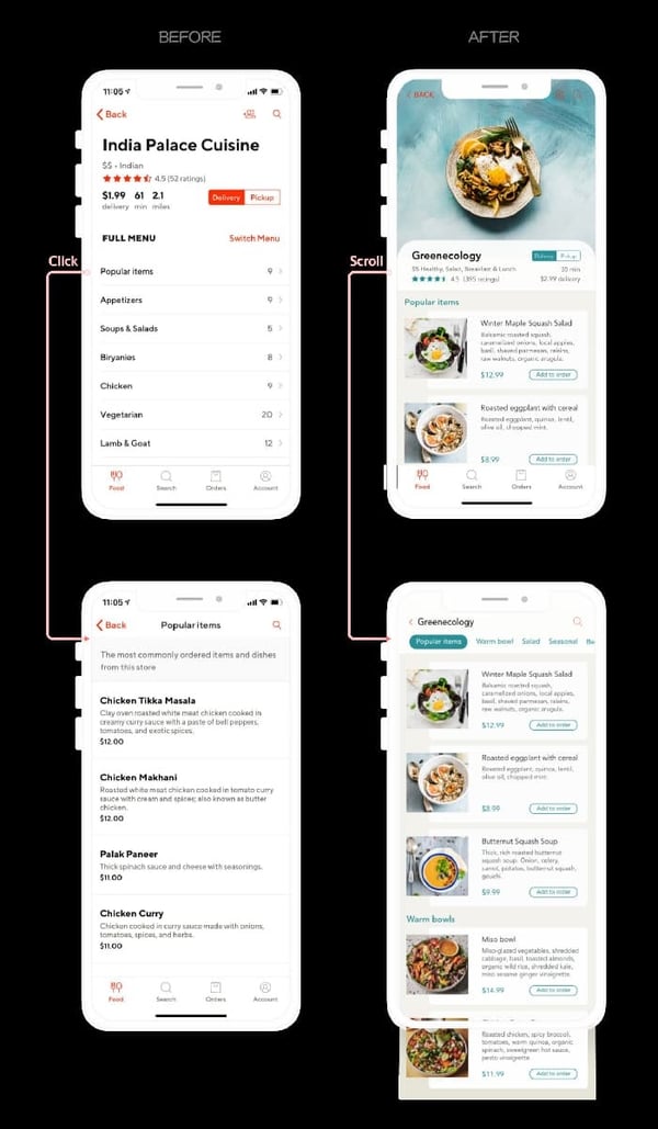
Redesigned menu of India Palace Cuisine on Doordash app for UX project

Image Source

Design an app for checking in at your primary care doctor or specialist.

Designing any health app will be a great exercise in UX. Focusing on the check-in process specifically will help you practice identifying and solving for user pain points. You can focus on an in-person or virtual check-in, like Digital Product Designer Divan Raj did below.
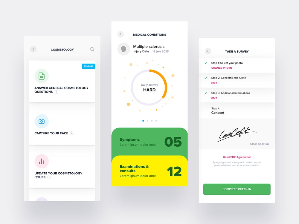
Three interfaces of patient app designed for UX project

Image Source

Create personas for an app you want to design (or redesign).

Creating personas is an important part of the UX design process. You can get some experience by creating personas for a hypothetical app, or an existing one. Maybe you like an app or website, but know the functionality or design could be better. In that case, you could define new personas for that product. Or you could create personas for a product that you’ve thought of.

Daorong Fang, for example, created a prototype of a mobile app for in-person social networking events. To illustrate her key audience and help potential stakeholders sympathize with her target issues (ie. how awkward and time-consuming networking can be), she built two personas. One of them — Techy Sarah — is shown below.
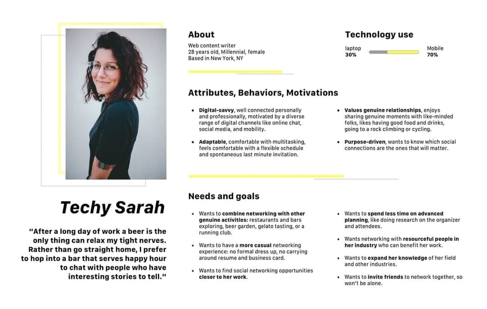
Persona for UX project for social networking app

Image Source

Map out a voter’s journey in a local, state, or federal election office .  

This can help you understand how UX design can contribute to larger phenomena, like low voter turnout, and flex your analytic and critical thinking muscles. By plotting out the path from registration to the point where voters have a ballot in their hands, you’ll uncover regulations, time constraints, a lack of transparency, poor design choices, and other pain points.

Whitney Quesenbery and Dana Chisnell founded The Center for Civic Design with this exact goal in mind: they wanted to understand where people fall off the voter journey, and how to get them back on. Below is one of their Field Guides to Ensuring Voter Intent, which helps local officials create well designed ballots.
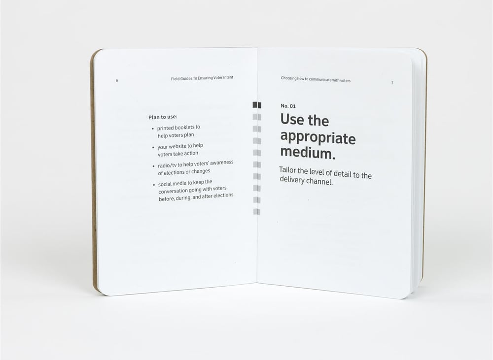
Field guide to voter intent is part of UX project for increasing voter turnout

Image Source

These are just a few ideas. For more inspiration, check out websites like Dribble and Awwwards.

UX Design Helps You Grow Better

Whether you’re a graphic designer, blogger, developer, or someone in an entirely different field, UX design can help you and your company grow. A happy end-user is the key to success, and without well-crafted UX design, this would be impossible to achieve.

As technology becomes more ubiquitous in our lives, successful UX design will continue to create seamless transitions between individuals and their devices and apps. UX design has never been more important, making it an exciting time to join the field and consider the benefits for your own business.

Editor's note: This post was originally published in June 2018 and has been updated for comprehensiveness. 


The Ultimate Guide to UX Design was originally posted by Local Sign Company Irvine, Ca. https://goo.gl/4NmUQV https://goo.gl/bQ1zHR http://www.pearltrees.com/anaheimsigns

Sunday, September 20, 2020

Sign Company Orange county


{Looking for a|Need a|Cant seam to find a|Tired of your Sign Company Orange County? From designing to manufacturing of signs, to installation. We also will get your cityapprovals of the building letters for you. Our concentration on creativity and expert service has actually made our business vary from all the other lighted signs business. A dedicated building signs crafter leads a team of building signs
specialists on every task.

We start with a mindful analysis of the task and perform the method in close cooperation with consumers. Experienced lighted sign

Posted via https://local.google.com/place?id=12322849628333271063&use=posts&lpsid=8818833608732200079

Saturday, September 19, 2020

The Power of Data Visualization Plus Examples of Good and Bad Visuals

It's no secret that data can be very powerful — when you can actually understand what it's telling you, that is.

It's not easy to get clear takeaways by looking at a slew of numbers and stats. You need to have the data presented in a logical, easy-to-understand way so you can apply your learnings in an effective way.

The human brain processes visual information better than it processes text — so using charts, graphs, and design elements, data visualization can help you explain trends and stats much more easily. But, not all data visualization is created equal. (Just check out "Why Most People’s Charts and Graphs Look Like Crap” to see what I mean.)

In this article, we'll offer you applicable ways to ensure your data visualization is effective, and provide examples for inspiration along the way.

What is data visualization?

Data visualization allows you to organize data in a way that's both compelling and easy to digest.

It's about representing data in a visual context, such as a chart or a map, to help anyone viewing it better understand the significance of that data.

How does data visualization work?

Whereas data shared via text can be confusing (not to mention bland), data represented in a visual format can help people extract meaning from that information more quickly and easily. Data visualization allows you to expose patterns, trends, and correlations that may otherwise go undetected, too.

Static vs. Interactive Data Visualization

Data visualization can be static or interactive. For centuries, people have been using static data visualization like charts and maps. Interactive data visualization is a little bit newer: It lets people drill down into the dirty details of these charts and graphs using their computers and mobile devices, and then interactively change which data they see and how it's processed.

Time Series Visualization

In addition to static and interactive data visualization, you may also hear the term time series visualization. Time series visualization is what it sounds like — visuals that track data, or performance, over a period of time. This is important because a major reason in which people want to focus on data visualization is to show changes in variables over time.

Time Series Data Visualization Examples

There are many ways to use time series data visualization — you'll learn more about these below, but here's a quick list to give you a better understanding of which visuals are considered time series visuals.

  • Line chart
  • Bar chart
  • Area chart
  • Bullet graph

Download a free introduction to data visualization to help you design compelling charts & graphs here.

Data Visualization Best Practices

While determining how you'll visualize your data, one of the first things you'll want to do is keep the following best practices in mind.

  1. Choose the best visual for your data and it's purpose.
  2. Ensure your data is easily understandable and viewable.
  3. Offer necessary context for your audience in and around your visual.
  4. Keep your visual as simple and straightforward as possible.
  5. Educate your audience with your visual.

With these best practices in mind, you may now be wondering how to actually show your data in an effective way. Well, there are a number of options when it comes to data visualization including:

  • Charts
  • Tables
  • Graphs
  • Maps
  • Infographics
  • Dashboards

Within each of these categories are more specific approaches to data visualization. Although the following list of 10 approaches doesn't cover all options, these should help you get started.

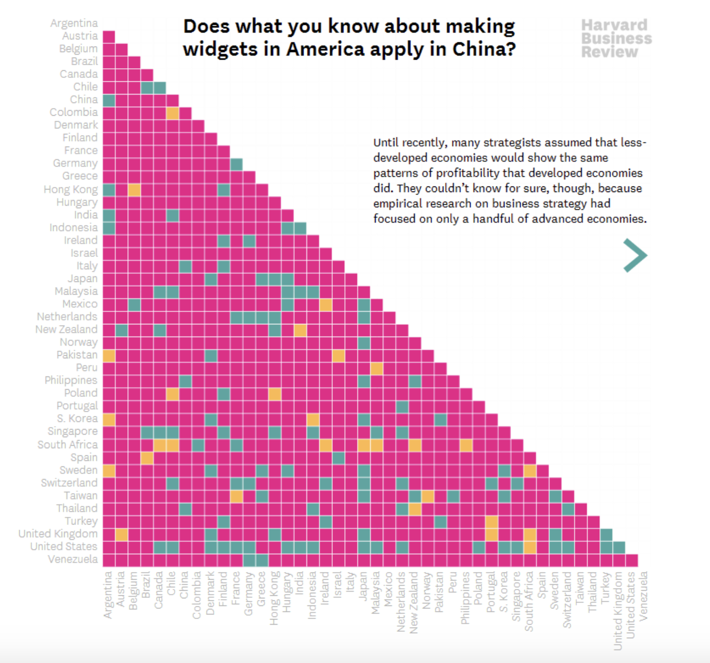
1. Line Chart

line chart data visualization Source

Use a line chart to display your data over the course of time to view trends and intervals. You can do this with a single, or multiple, data point(s).

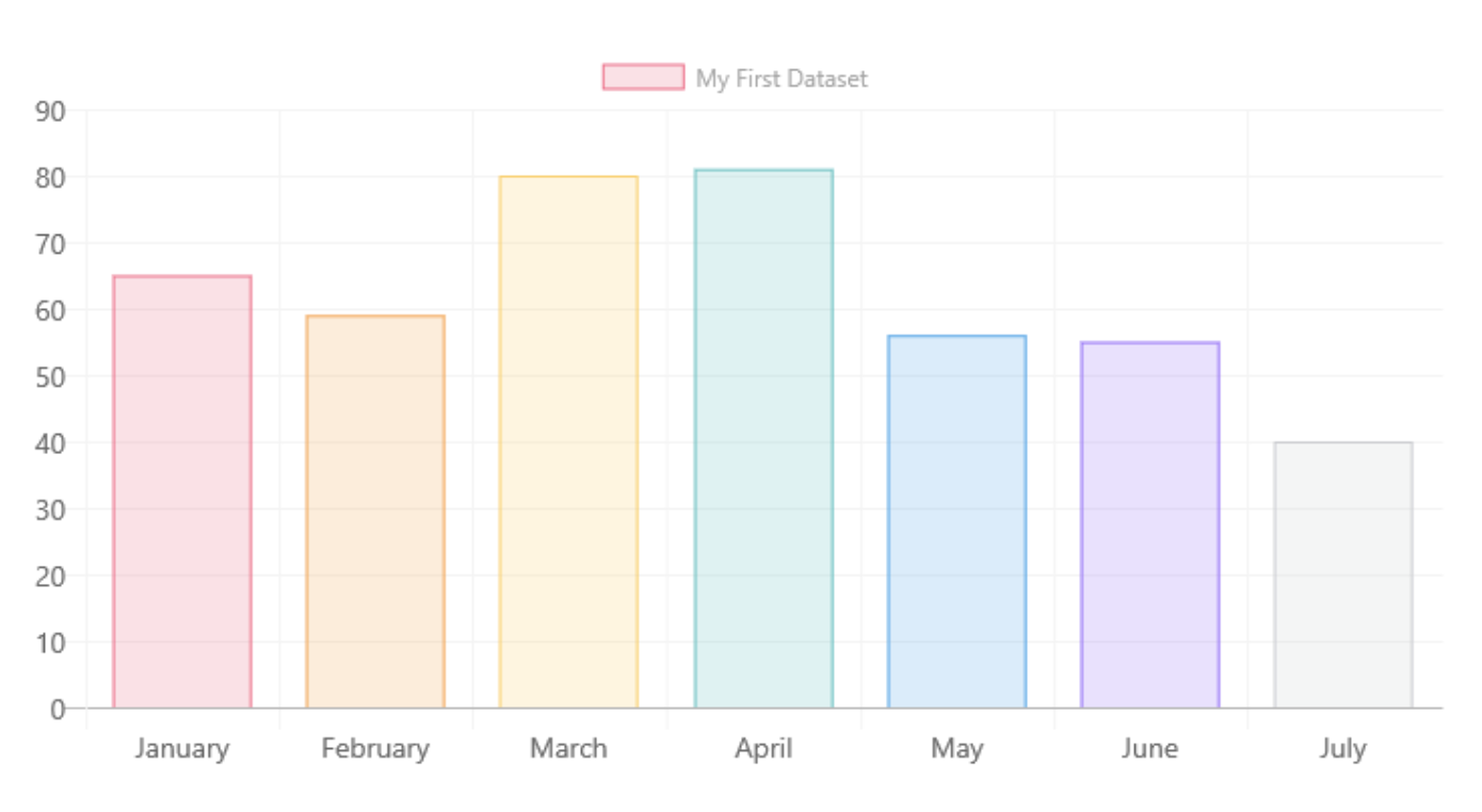
2. Bar Chart

bar chart data visualizationSource

Use a bar chart to compare groups or categories while also displaying clear values.

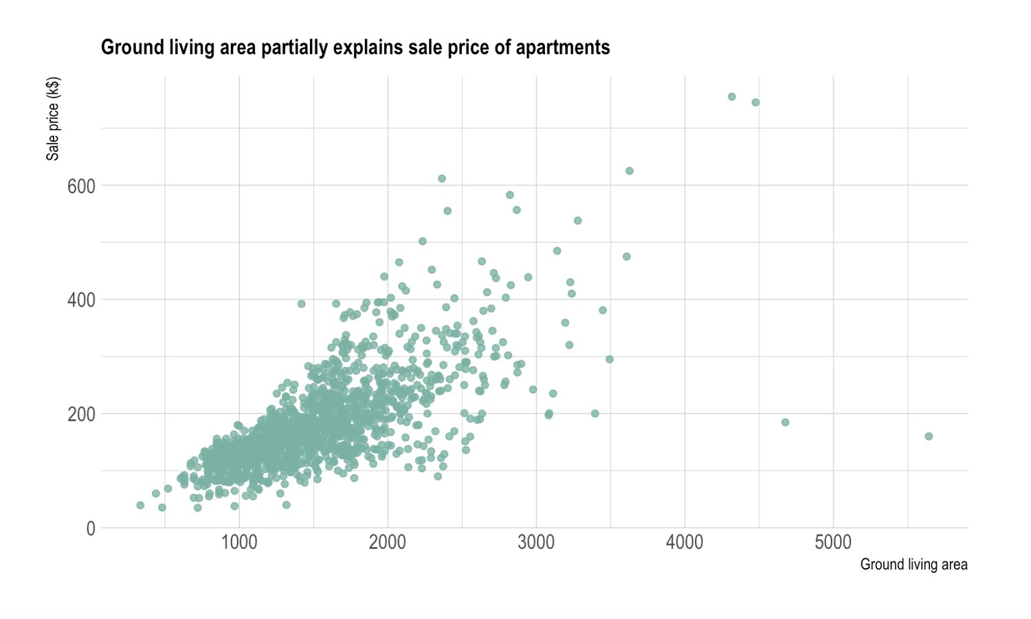
3. Scatter Chart

scatter plot data visualizationSource

Use a scatter chart to show the values of two different variables as points on a chart.

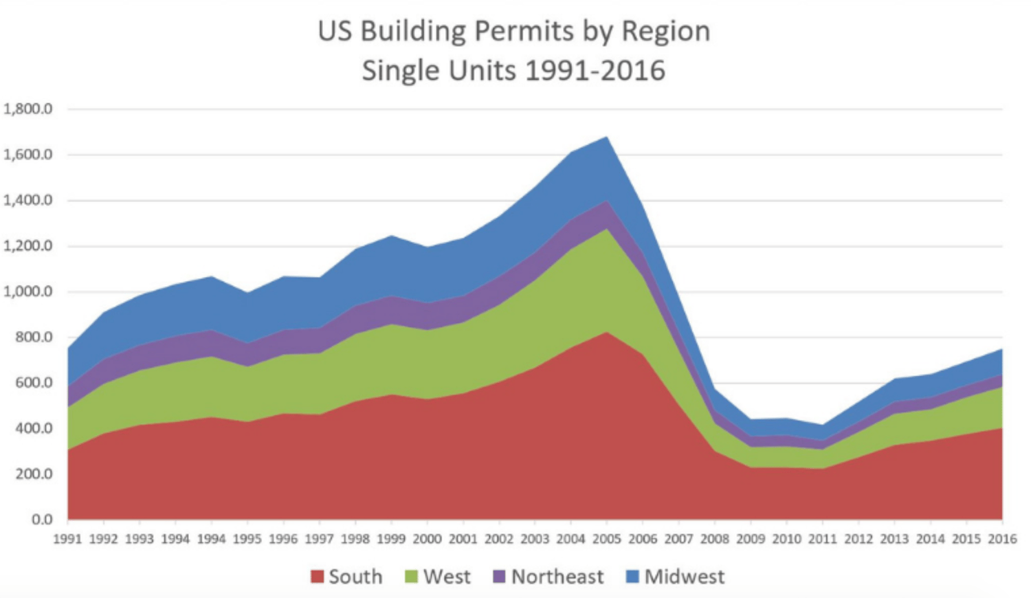
4. Area Chart

area chart data visualizationSource

Use an area chart in a similar way to how you'd use a line chart. The difference is that the area below the line is filled with color and/ or texture with an area chart. Both area and line charts display the evolution of a value.

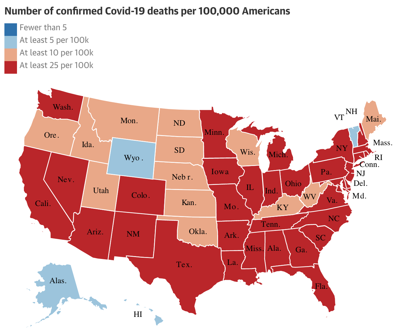
5. Map

map data visualizationSource

Use a map to display data that's geographically located and to show the distribution and proportion of data in specific areas.

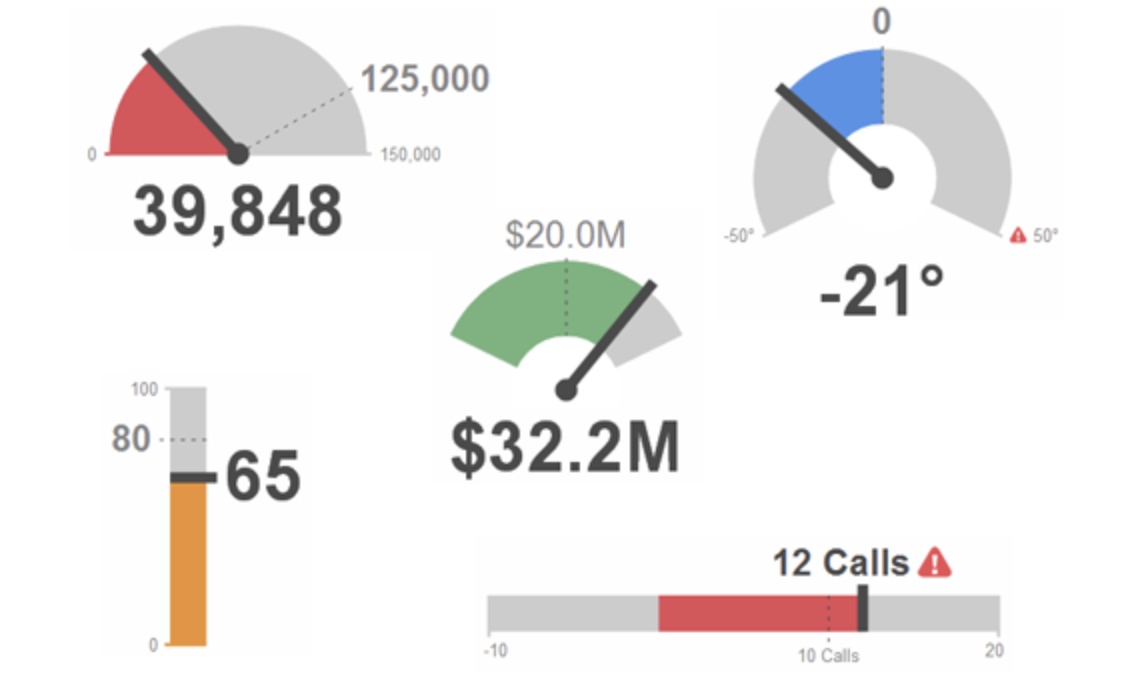
6. Indicator

indicator data visualizationSource

Use an indicator if you want to display your data with visual like a gauge or ticker which will clearly show which direction things are moving over time.

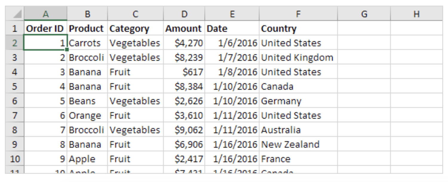
7. Pivot Table

pivot table data visualizationSource

Use a pivot table to summarize a large amount of information while specifically highlighting the most critical data for audience members.

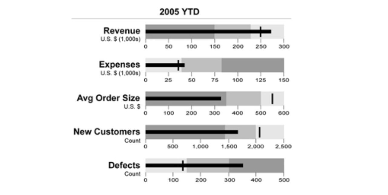
8. Bullet Graph

bullet graph data visualizationSource

Use a bullet graph or chart in a similar way to how you'd use a bar chart. The main difference is that a bullet graph allows you to include more detailed information and data in a way that doesn't look or feel cluttered.

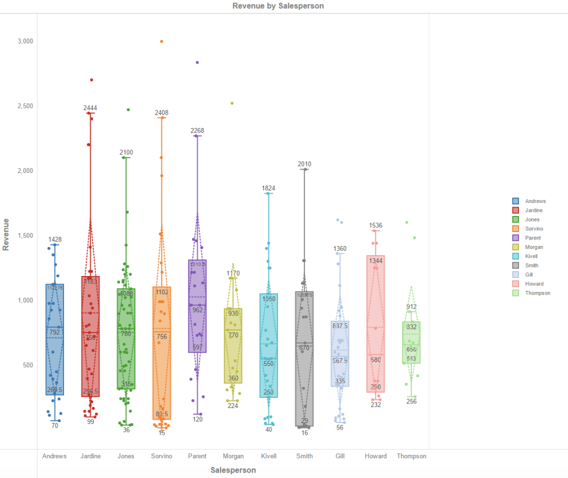
9. Box Plot

box plot data visualizationSource

Use a box plot to view the distribution of your data — you'll have one box plot for each attribute you're displaying.

10. Matrix

matrix data visualization

Source

Use a matrix to display the relationships between hundreds or thousands of data points, variables, and more to understand their interactions all in one location.

Ready to feel inspired? Let's take a look at some great examples of interactive and static data visualization.

Examples of Data Visualization

Below are 16 examples of data visualization, split into two major sections: interactive and static data visualization.

Examples of Interactive Data Visualization

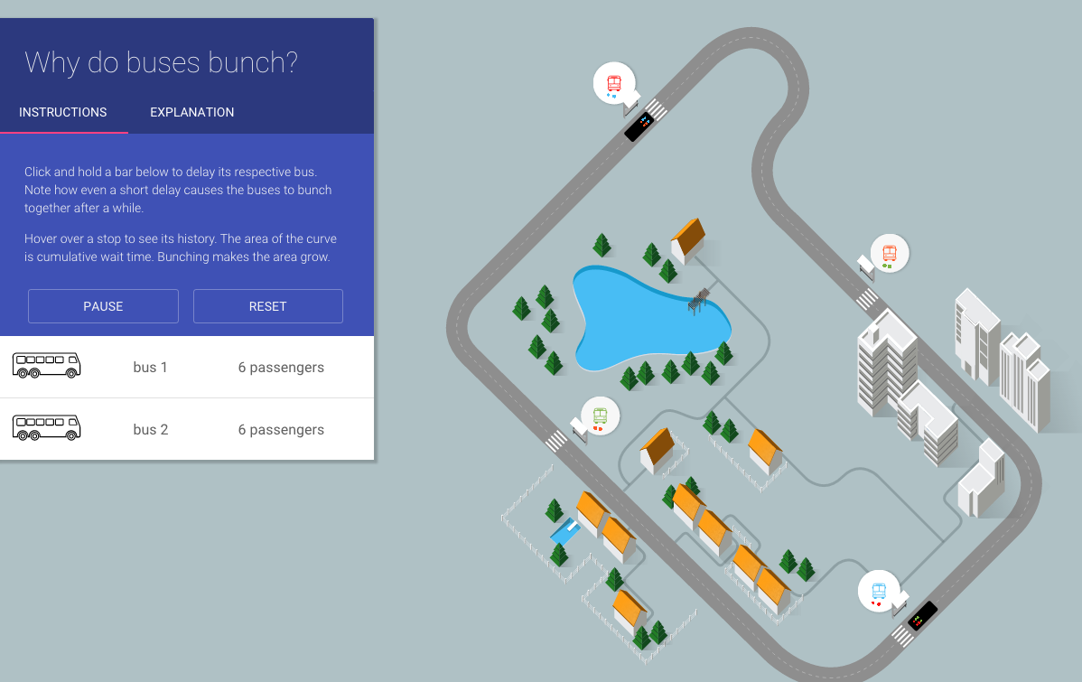
1. Why Buses Bunch

Here's an example of a complex data set boiled down in a way that looks and feels like a game. In this visualization, Setosa is showing how "bus bunching" happens, i.e. when a bus gets delayed and later causes multiple buses to arrive at a single stop at the same time.

why buses bunch data visualization example

Source

Telling this story in numbers alone would be pretty difficult — instead, they turn it into an interactive game that makes the data easier to understand. While the buses rotate along a route, you can click and hold a button to delay a bus. Then, all you have to do is watch to see how even a short delay causes the buses to bunch together.

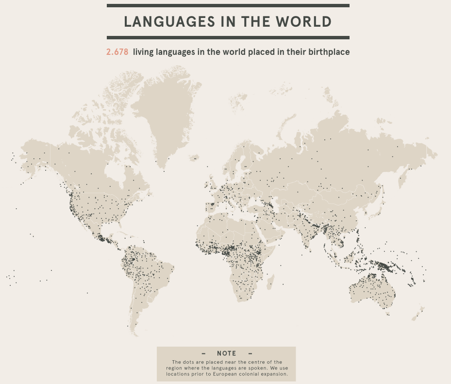
2. Languages in the World

This interactive by DensityDesign introduces the non-linguist to the many world languages. All 2,678 of them.

languages in the world data visualization example

Source

This piece allows you to explore common language families, see which languages are most frequently spoken, and view where languages are spoken around the world. This is visual storytelling: taking an in-depth subject and breaking it down in an easy-to-understand way.

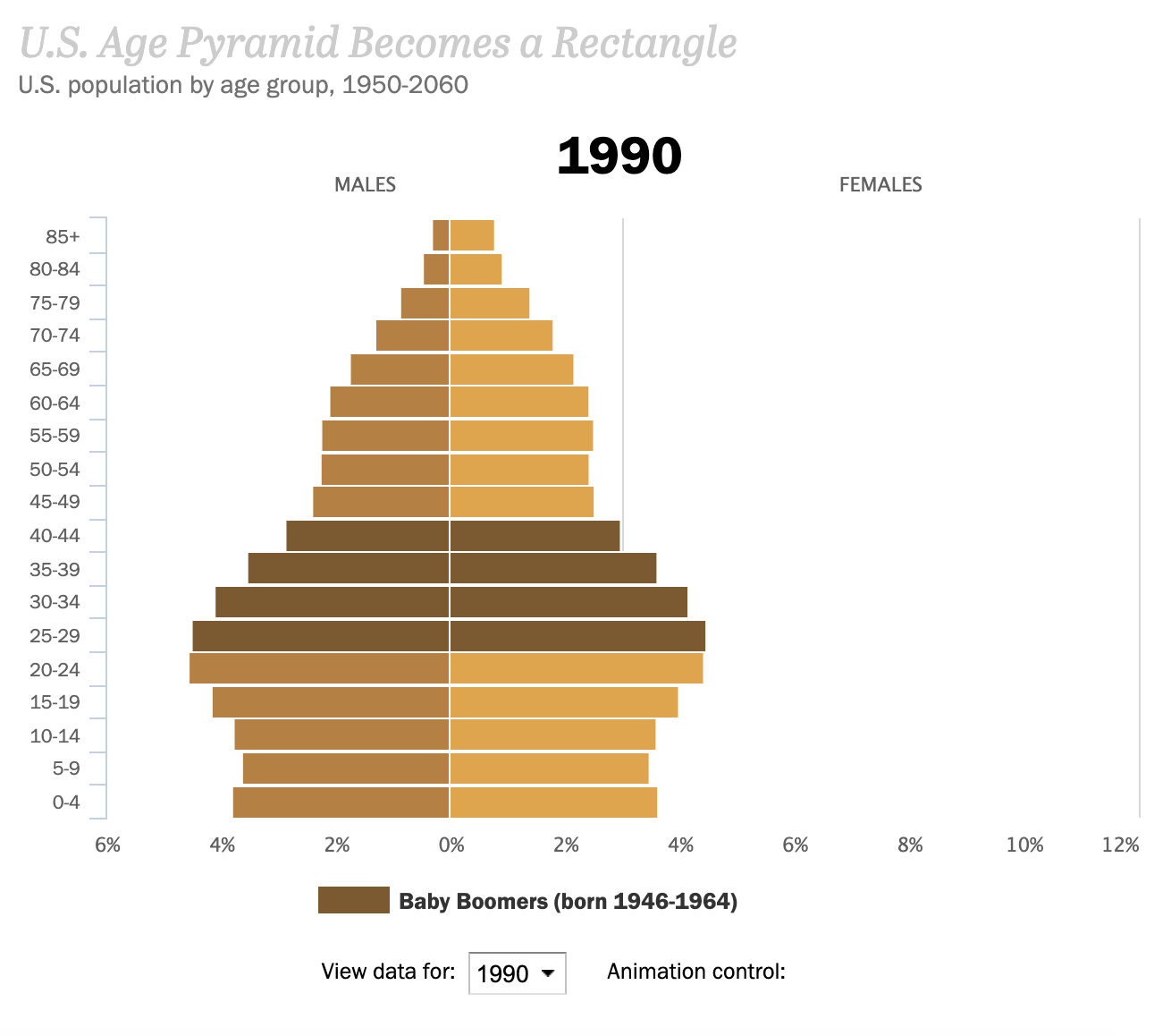
3. Percent of U.S. Population by Age Group

This is an example of how to present a single data set in a compelling way. Pew Research created an animated GIF composite to show shifts in population demographics over time. It’s an effective way to tell a larger story in a neat package.

us age pyramid becomes a rectangle data visualization exampleSource

Plus, this type of micro-content is easy to share on social or embed in blogs, extending the content’s reach. (If you want to make a GIF of your own using Photoshop, here's a step-by-step tutorial.)

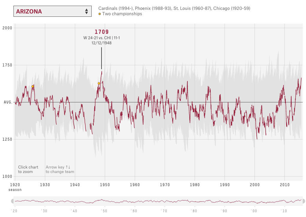
4. The Complete History of the NFL

In this interactive visualization below, an "Elo rating" — a simple measure of strength based on game-by-game results — has been calculated for every game in the history of the National Football League (NFL).

history of football teams data visualization example

Source

That's over 30,000 ratings in total. Viewers can compare each team's Elo to see how each team performed across decades of play.

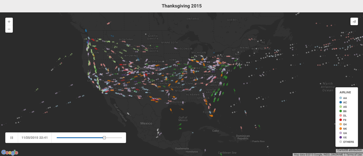
5. U.S. Thanksgiving on Google Flights

This visual is powered by Google Trends. It tracked flights as they flew to, from, and across the United States on the day before Thanksgiving.

thanksgiving flights data visualization example

Source

The visualization starts at the very beginning of the day and plays like a movie as time goes on, showing flights moving around the country.

Without showing any numbers beside the time, viewers can see which times were most popular for international flights, domestic flights, and flights to/ from different hubs around the country.

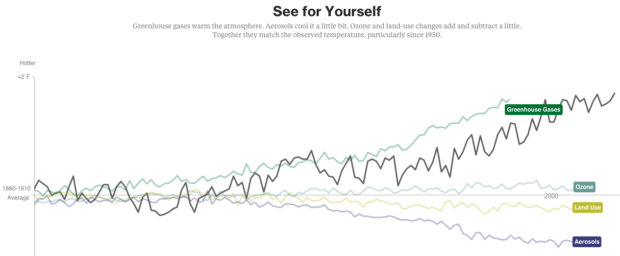
6. What's Really Warming the World?

Ever heard a version of the advice, "Don't simply show the data tell a story with it"? That's exactly what this visualization from Bloomberg Business does — and it's the interactive part that makes the story move along from beginning to end. The visual disproves theories that claim that global warming can be explained by natural causes.

The first thing you'll see is the observed temperature as it's risen from 1880 to present day.

bloomberg climate change data visualization example

Source

As you scroll down, the visualization takes you through exactly how much different factors contribute to global warming in comparison to what's been observed, adding a richer layer of storytelling. The conclusion the authors want viewers to draw is made very clear.

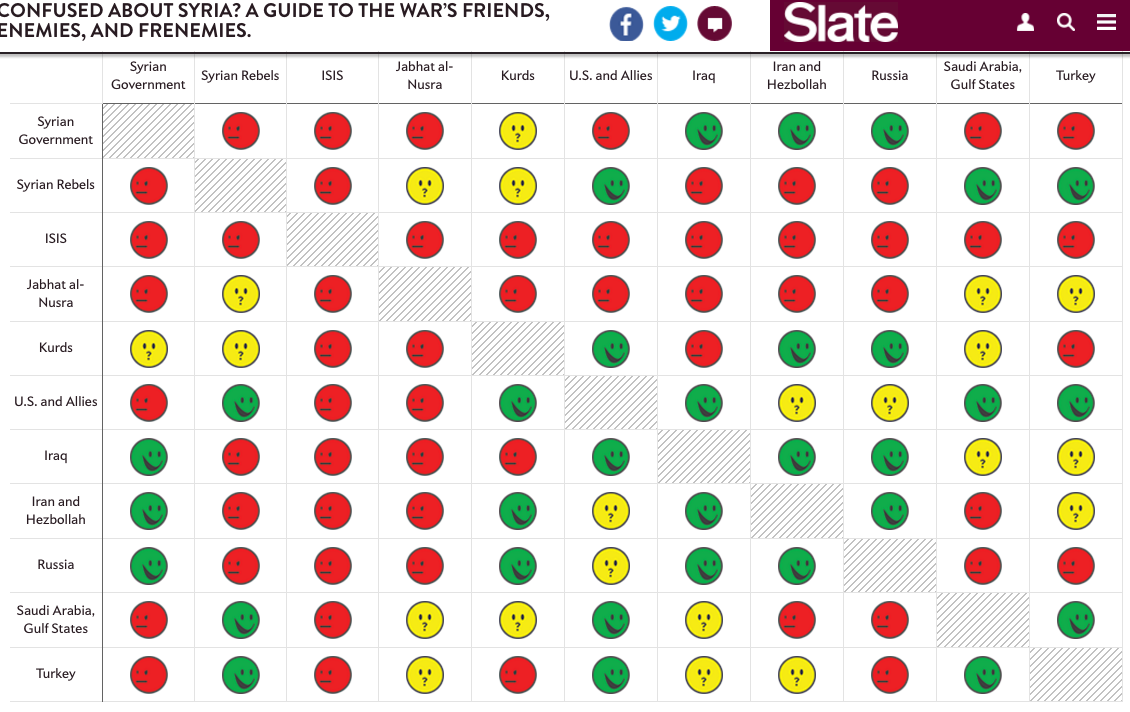
7. A Guide to Who is Fighting Whom in Syria

Relationships among many different groups can be difficult to understand — especially when there are 11 of them, many of which are on the same side as groups they're normally at odds with, and vice versa.

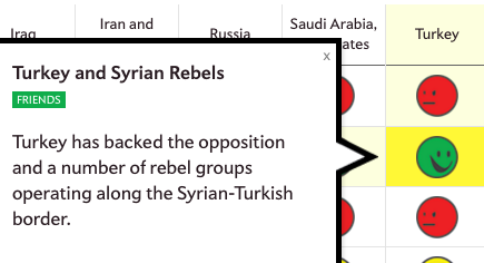
But using a table format and familiar visuals and colors, Slate simplified this data into a simple, digestible, and interactive format.

syrian war relationships data visualization example

Source

Viewers can click on any of the faces for a succinct description of the relationship.

slate relationships graphic zoom data visualization example

Source

8. Most Valuable Sports Franchises

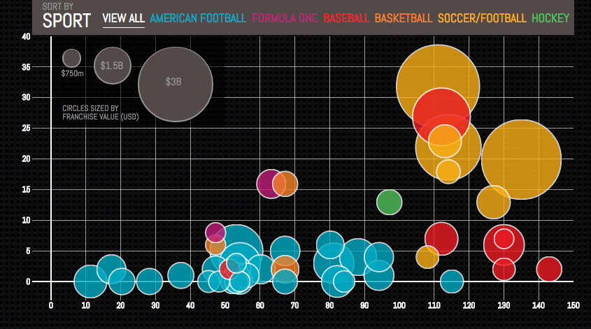
Here's an example of telling a deeper story by adding data.

valuable sports franchises data visualization example

Source

The interactive visual lets users see the number of years each team has competed, as well as number of championships won. This offers a more comprehensive view of each team’s history and success as a franchise.

9. U.S. Wind Map

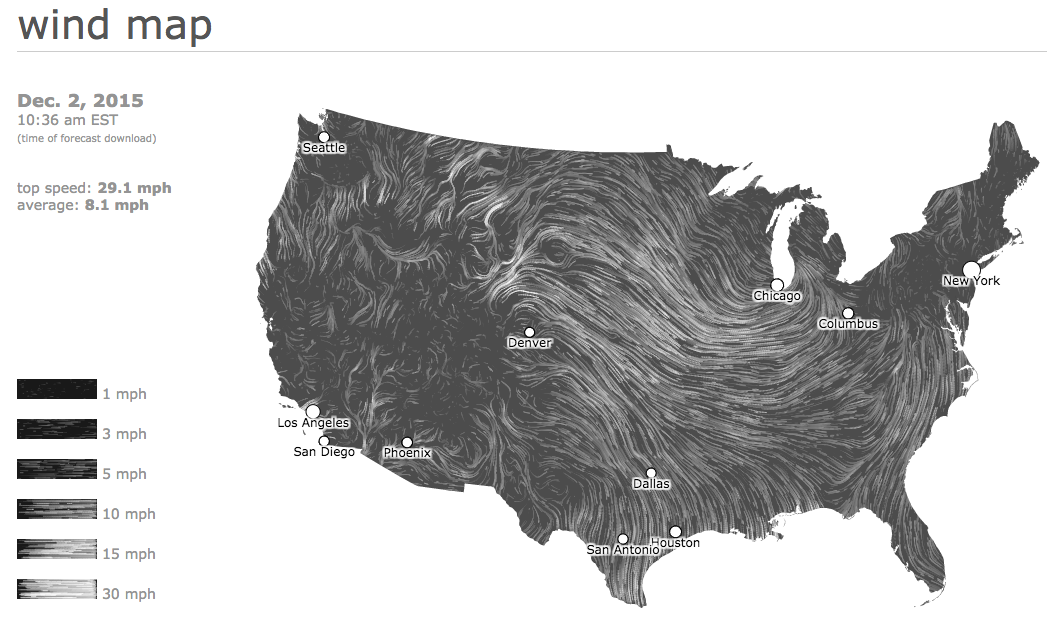
Here's a visual similar that shows the wind speeds and directions in the U.S. in real-time back in 2015.

united states wind map data visualization example

Source

It's a great example of intuitive design: Speed is represented by lines moving slowly or quickly, and direction is represented by which way the lines are moving. It's immediately clear what the general trends are without any need for numbers unless you click into the map itself. Plus, capping the number of variables at two makes it even easier to follow.

Examples of Static Data Visualization

10) Where News Audiences Fit on the Political Spectrum

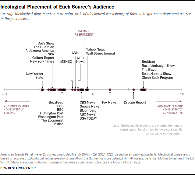
This visual shows data organized on a distribution plot — this is an effective visual choice because it allows viewers to see where each media outlet lies on a spectrum.

media polarization data visualization example

Source

On a spectrum, the distance between each media outlet is significant. If these outlets were just listed one after the other in a table, viewers wouldn't be able to see where each one stood in context.

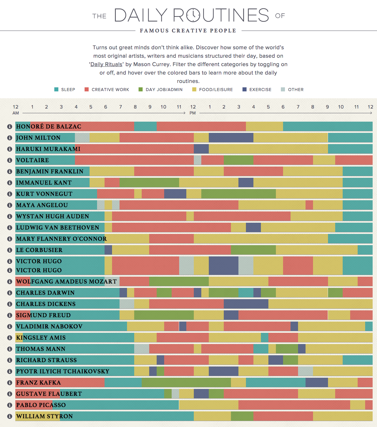
11. The Daily Routines of Famous Creative People

Using information from the book Daily Rituals by Mason Currey, the site showcases the daily schedules of famous creatives broken down by time and activity.

daily routines of creative people data visualization example

Source

Not only is this an example of engaging data (you can explore the schedules by individual activity), it's also an effective editorial piece for a brand.

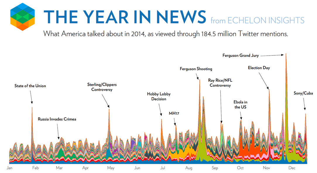
12. The Year in News

Echelon Insights created this visual to depict the most talked-about news stories of 2014 on Twitter.

What do 184.5 million tweets look like? Rad spin art.

the year in news data visualization example

Source

13. The Depth of the Problem

When you want to illustrate scale, static data visualization can be a great way to make your point. The infographic below from The Washington Post is incredibly long ... and that's on purpose.

In this case, they're showing how crazy far a deep-sea signal from an airplane can be detected by comparing that depth to tall buildings, the maximum depth of known mammals, the depth of the Titanic wreck, and so on.

the depth of the problem data visualization example

Source

It's a great use of simple visuals and color gradients. Finally, adding data to a news story (in this case, the missing Malaysian airliner) provides necessary context.

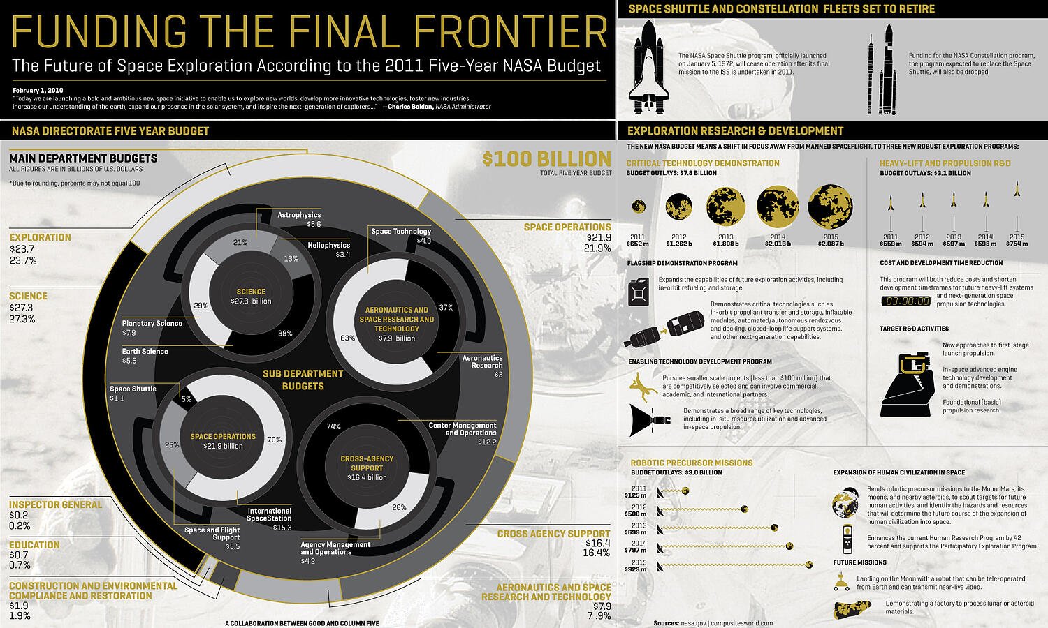
14. Funding the Final Frontier

While the infographic above is pretty simple, there are ways to create well-designed infographics that deliver a large amount of data. The secret? A simple and clean format that makes it easy for readers to understand the data.

funding the final frontier data visualization example

Source

This infographic, created by GOOD Magazine and Column Five, breaks down NASA’s five-year budget to show how and where the money will be spent. Plus, it has an on-theme design — an all-around win.

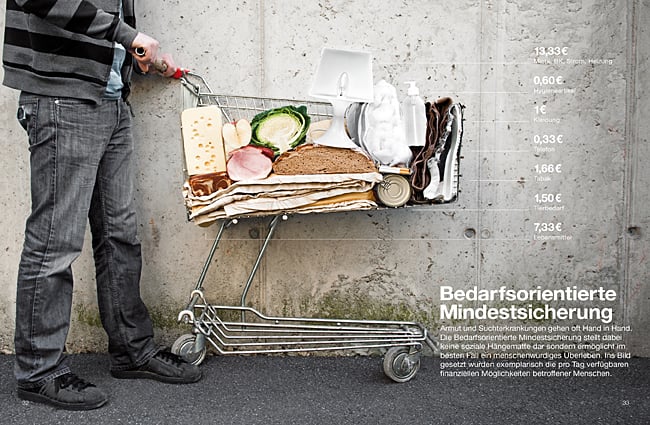
15. Caritas Kontaktladen Annual Report

Not all data visualizations need to be animated. When real-world data is visualized with real-life examples, the results can be stunning. The designer of this visual took a unique approach to the data contained in the annual report.

caritas Kontaktladen Annual Report data visualization example

Source

The organization provides support to drug addicts in Austria, so Luttenberger focused on communicating the mission through real-life visuals. For example, this shopping cart visualization represents how much of life’s necessities a welfare recipient can afford each day.

16. Austria Solar Annual Report

While there are many ways to visualize data, using the information subject to actually create the data visualization can be pretty profound.

This annual report from Austria Solar uses actual solar power to bring the company’s data to life through solar-activated inks on the page.

The good examples of data visualization above are great to reference while you develop your approach. However, it's also important we consider the less effective ways to go about data visualization so you know what to avoid — so, let's cover some bad examples next.

Bad Data Visualization Examples

There are many ways in which data visualization can go wrong.

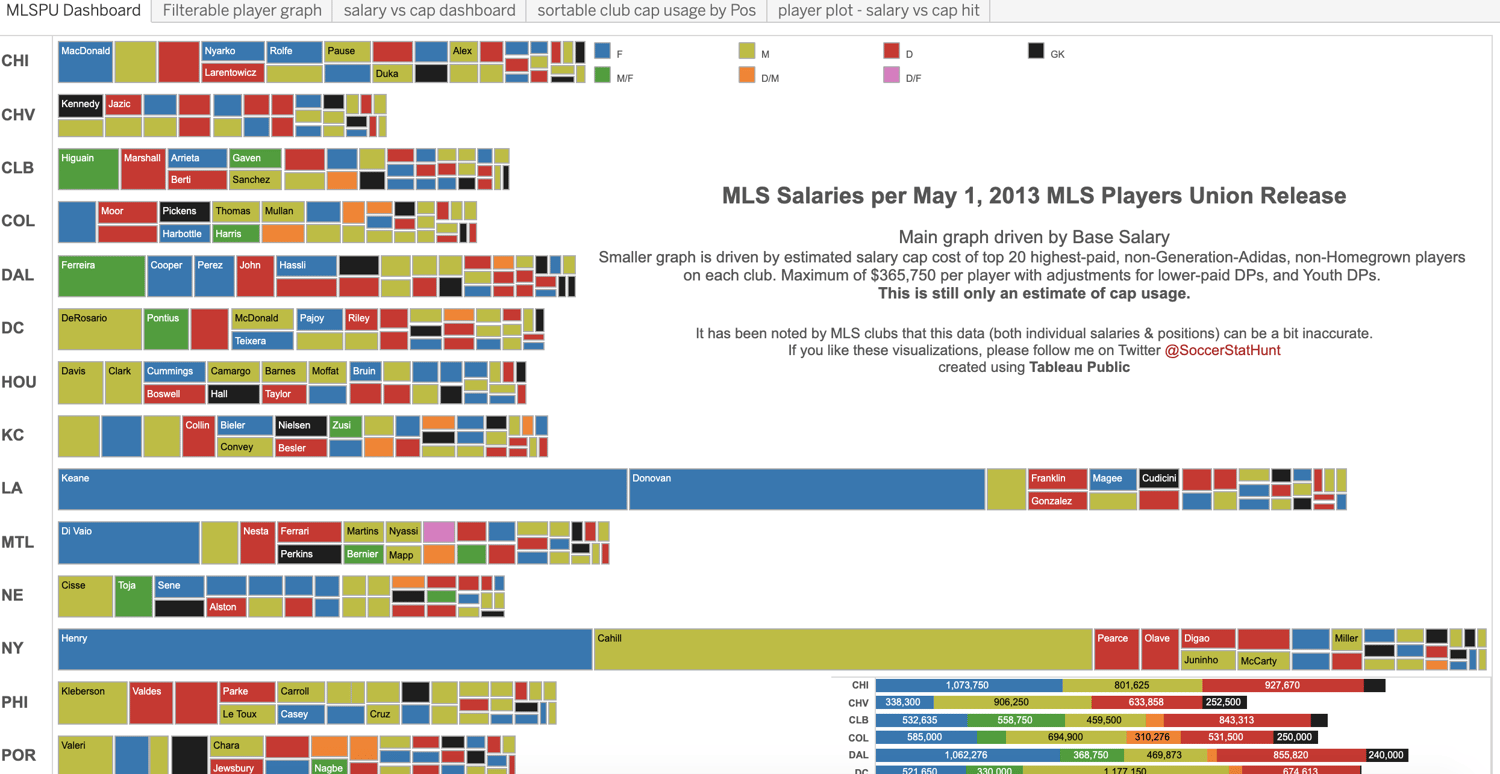
For instance, look at this data visualization example of MLS salaries in 2013. The sheer amount of information on this chart makes it difficult to read.

example of bad data visualizationSource

Additionally, the scale of the variables requires audience members to zoom in significantly to read the data. Some of the boxes that are being used to depict data appear to be vertical while most are horizontal — this also makes the information confusing to read.

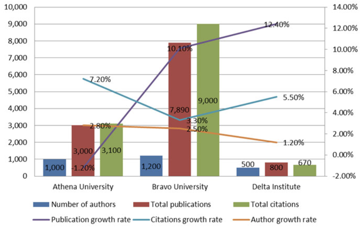
When you include a number of completely different variables within a single visual, it also becomes complicated for audience members to understand — the following chart is an example of this.

too many variables data visualization

Source

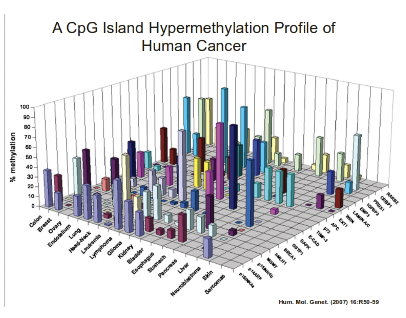
Something else you'll want to do is make sure you're not making your visual more complicated than it needs to be. For example, this chart has a number of variables that are depicted by 3D bars. This graph doesn't need to be 3D — in fact, it simply makes the information more difficult to understand and view.

bad data visualization example

Source

Lastly, let's review some data visualization tools to help make this process simpler.

Data Visualization Tools

There are a number of data visualization resources available today but the following list is here to help get you started. Don't be afraid to test out a few options to determine which option suits your needs (and data) best.

1. HubSpot

HubSpot offers several options for data visualization, specifically within Reports. You can create graphs and charts in many ways depending on your preference.

There's also a Dashboard and Reporting add-on that can ease the process of data visualization. Lastly, HubSpot allows you to manage your data and dashboards, as well as customize them, in a way that suits your specific needs.

2. Tableau Desktop

Tableau Desktop's data visualization software offers live analytics with interactive dashboards so you're able to easily spot trends, patterns, and insights.

There are easy-to-make maps, indicators, and many more visuals, as well as straightforward analytics which allow you to derive actionable information from calculations, reference lines, and forecasts as a result of your visuals.

3. Chartio

Chartio's data visualization tools offer users 15 types of charts to choose from with multiple variations, and even more options if you know how to use data programming languages.

With Chartio, you can bring all your data together from locations like Amazon Redshift, browse your data with the Visual SQL solution, create and manage customized charts and visuals, and easily share them (via web page, Slack, PDF reports for email, etc.).

4. Databox

Databox provides a number of ways to upload your data and efficiently create visuals to derive conclusions.

There are over 70 integrations that can help you quickly and easily create visuals with pre-built dashboards and reports. You can also create custom metrics. Databox then allows you to connect to Google Sheets or an SQL database, or you can push it via API to view and share your data.

5. Google Chart Tools

Google Chart Tools allow you to visualize live data on your website (and mobile) with the help of a number of interactive, customizable charts and data tools. The most common way to use Google Charts is with simple JavaScript that you embed in your web page. And by using the DataTable class, you can easily switch between chart types.

Grow Better With Data Visualization

With data visualization, you'll be able to identify, discuss, and act on insights in an easier and more effective way. So, look to the examples above for inspiration (and as a reference for what to avoid, too!) and experiment with the many tools available to determine what works best for your needs and goals.

Editor's Note: This post was originally published in March 2015 and has been updated for freshness, accuracy, and comprehensiveness.


The Power of Data Visualization Plus Examples of Good and Bad Visuals was originally posted by Local Sign Company Irvine, Ca. https://goo.gl/4NmUQV https://goo.gl/bQ1zHR http://www.pearltrees.com/anaheimsigns
How to Do Market Research: A Guide and Template

Today, consumers have a lot of power — they can research your product or service and make purchase decisions entirely on their own. And rather than talking to one of your sales reps, they're more likely to ask for referrals from members of their networks or read online reviews. 

With this in mind, have you adapted your marketing strategy to complement the way today's consumers research, shop, and buy?

In order to do just that — and to meet your potential buyers were they are — you must have a deep understanding of who your buyers are, your specific market, and what influences the purchase decisions and behavior of your target audience members.  Enter: Market Research. 

Whether you're new to market research, this guide will provide you with a blueprint for conducting a thorough study of your market, target audience, competition, and more.

What is market research?

Market research is the process of gathering information about your business's buyers personas, target audience, and customers to determine how viable and successful your product or service would be, and/or is, among these people.

What does market research tell you? 

Market research provides insight into a wide variety of things that impact your bottom line including (but not limited to):

  • Where your target audience and current customers conduct their product/ service research
  • Which of your competitors your target audience looks to for information, more options, or to make a purchase
  • What's trending in your industry
  • Who makes up your market and what their challenges are
  • What influences purchases and conversions among your target audience 

As you begin honing in on your market research, you'll likely hear about primary and secondary market research. The easiest way to think about primary and secondary research is to envision to umbrellas sitting beneath market research: one for primary market research and one for secondary market research.

Beneath these two umbrellas sits a number of different types of market research, which we'll highlight below. Defining which of the two umbrellas your market research fits beneath isn't necessarily crucial, although some marketers prefer to make the distinction.

So, in case you encounter a marketer who wants to define your types of market research as primary or secondary — or if you're one of them — let's cover the definitions of the two categories next. Then, we'll look at the different types of market research in the following section

Primary vs. Secondary Research

There are two main types of market research that your business can conduct to collect actionable information on your products including primary research and secondary research.

Primary Research

Primary research is the pursuit of first-hand information about your market and the customers within your market. It's useful when segmenting your market and establishing your buyer personas. Primary market research tends to fall into one of two buckets: exploratory and specific research.

Exploratory Primary Research

This kind of primary market research is less concerned with measurable customer trends and more about potential problems that would be worth tackling as a team. It normally takes place as a first step — before any specific research has been performed — and may involve open-ended interviews or surveys with small numbers of people.

Specific Primary Research

Specific primary market research often follows exploratory research and is used to dive into issues or opportunities the business has already identified as important. In specific research, the business can take a smaller or more precise segment of their audience and ask questions aimed at solving a suspected problem.

Secondary Research

Secondary research is all the data and public records you have at your disposal to draw conclusions from(e.g. trend reports, market statistics, industry content, and sales data you already have on your business). Secondary research is particularly useful for analyzing your competitors. The main buckets your secondary market research will fall into include:

Public Sources

These sources are your first and most-accessible layer of material when conducting secondary market research. They're often free to find and review — lots of bang for your buck here.

Government statistics are one of the most common types of public sources according to Entrepreneur. Two U.S. examples of public market data are the U.S. Census Bureau and the Bureau of Labor & Statistics, both of which offer helpful information on the state of various industries nationwide.

Commercial Sources

These sources often come in the form of market reports, consisting of industry insight compiled by a research agency like Pew, Gartner, or Forrester. Because this info is so portable and distributable, it typically costs money to download and obtain.

Internal Sources

Internal sources deserve more credit for supporting market research than they generally get. Why? This is the market data your organization already has!

Average revenue per sale, customer retention rates, and other historical data on the health of old and new accounts can all help you draw conclusions on what your buyers might want right now.

Now that we've covered these overarching market research categories, let's get more specific and look at the various types of market research you might choose to conduct. 

1. Interviews

Interviews allow for face-to-face discussions (in-person and virtual) so you can allow for a natural flow or conversation and watch your interviewee's body language while doing so. 

2. Focus Groups

Focus groups provide you with a handful of carefully-selected people that you can have test out your product, watch a demo, provide feedback, and/or answer specific questions.

3. Product/ Service Use Research

Product or service use research offers insight into how and why your audience uses your product or service, and specific features of that item. This type of market research also gives you an idea of the product or service's usability for your target audience. 

4. Observation-Based Research

Observation-based research allows you to sit back and watch the ways in which your target audience members go about using your product or service, what works well in terms of UX, what roadblocks they hit, and which aspects of it could be easier for them to use and apply. 

5. Buyer Persona Research

Buyer persona research gives you a realistic look at who makes up your target audience, what their challenges are, why they want your product or service, what they need from your business and brand, and more. 

6. Market Segmentation Research

Market segmentation research allows you to categorize your target audience into different groups (or segments) based on specific and defining characteristics — this way, you can determine effective ways to meet their needs, understand their pain points and expectations, learn about their goals, and more. 

7. Pricing Research

Pricing research gives you an idea of what similar products or services in your market sell for, what your target audience expects to pay — and is willing to pay — for whatever it is you sell, and what's a fair price for you to list your product or service at. All of this information will help you define your pricing strategy

8. Competitive Analysis

Competitive analyses are valuable because they give you a deep understanding of the competition in your market and industry. You can learn about what's doing well in your industry, what your target audience is already going for in terms of products like yours, which of your competitors should you work to keep up with and surpass, and how you can clearly separate yourself from the competition

9. Customer Satisfaction and Loyalty Research

Customer satisfaction and loyalty research give you a look into how you can get current customers to return for more business and what will motivate them to do so (e.g. loyalty programs, rewards, remarkable customer service). This research will help you discover the most-effective ways to promote delight among your customers.

10. Brand Awareness Research

Brand awareness research tells you about what your target audience knows about and recognizes from your brand. It tells you about the associations your audience members make when they think about your business and what they believe you're all about.  

11. Campaign Research

Campaign research entails looking into your past campaigns and analyzing their success among your target audience and current customers. It requires experimentation and then a deep dive into what reached and resonated with your audience so you can keep those elements in mind for your future campaigns and hone in on the aspects of what you do that matters most to those people. 
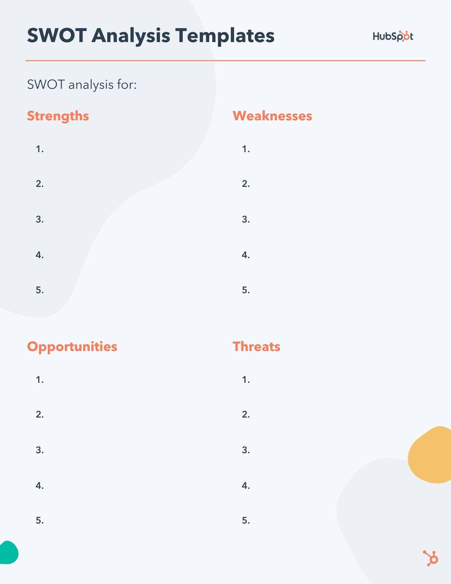
Now that you know about the categories and types of market research, let's review how you can conduct your market research.

Here's how to do market research step-by-step.

1. Define your buyer persona.

Before you dive into how customers in your industry make buying decisions, you must first understand who they are.

This is where your buyer personas come in handy. Buyer personas — sometimes referred to as marketing personas — are fictional, generalized representations of your ideal customers.

Use a free tool to create a buyer persona that your entire company can use to market, sell, and serve better.

How to do market research defining your buyer persona

They help you visualize your audience, streamline your communications, and inform your strategy. Some key characteristics you should be keen on including in your buyer persona are:

  • Age
  • Gender
  • Location
  • Job title(s)
  • Job titles
  • Family size
  • Income
  • Major challenges

The idea is to use your persona as a guideline for  how to effectively reach and learn about the real audience members in your industry. Also, you may find that your business lends itself to more than one persona — that's fine! You just need to be  thoughtful about each specific persona when you're optimizing and planning your content and campaigns.

To get started with creating your personas, check out these free templates, as well as this helpful tool. 

2. Identify a persona group to engage.

Now that you know who your buyer personas are, use that information to help you identify a group to engage to conduct your market research with — this should be a representative sample of your target customers so you can better understand their actual characteristics, challenges, and buying habits.

The group you identify to engage should also be made of people who recently made a purchase or purposefully decided not to make one. Here are some more guidelines and tips to help you get the right participants for your research. 

How to Identify the Right People to Engage for Market Research

When choosing who to engage for your market research, start by focusing on people who have the characteristics that apply to your buyer persona. You should also... 

  • Shoot for 10 participants per buyer persona: We recommend focusing on one persona, but if you feel it's necessary to research multiple personas, be sure to recruit a separate sample group for each one.
  • Select people who have recently interacted with you: You may want to focus on people that have completed an evaluation within the past six months — or up to a year if you have a longer sales cycle or niche market. You'll be asking very detailed questions so it's important that their experience is fresh.
  • Aim for a mix of participants: You want to recruit people who have purchased your product, purchased a competitor's product, and decided not to purchase anything at all. While your customers will be the easiest to find and recruit, sourcing information from those who aren't customers (yet!) will help you develop a balanced view of your market. Here are some more details on how to select this mix of participants:
    • Pull a list of customers who made a recent purchase. As we mentioned before, this is usually the easiest set of buyers to recruit. If you're using a CRM system, you can run a report of deals that closed within the past six months and filter it for the characteristics you're looking for. Otherwise, you can work with your sales team to get a list of appropriate accounts from them.

    • Pull a list of customers who were in an active evaluation, but didn't make a purchase. You should get a mix of buyers who either purchased from a competitor or decided not to make a purchase. Again, you can get this list from your CRM or from whatever system your Sales team uses to track deals.
    • Call for participants on social media. Try reaching out to the folks that follow you on social media, but decided not to buy from you. There's a chance that some of them will be willing to talk to you and tell you why they ultimately decided not to buy your product.
    • Leverage your own network. Get the word out to your coworkers, former colleagues, and LinkedIn connections that you're conducting a study. Even if your direct connections don't qualify, some of them will likely have a coworker, friend, or family member who does.
    • Choose an incentive. Time is precious, so you'll need to think about how you will motivate someone to spend 30-45 minutes on you and your study. On a tight budget? You can reward participants for free by giving them exclusive access to content. Another option? Send a simple handwritten 'thank you' note once the study is complete. 

3. Prepare research questions for your market research participants.

The best way to make sure you get the most out of your conversations is to be prepared. You should always create a discussion guide — whether it's for a focus group, online survey, or a phone interview — to make sure you cover all of the top-of-mind questions and use your time wisely.

(Note: This is not intended to be a script. The discussions should be natural and conversational, so we encourage you to go out of order or probe into certain areas as you see fit.)

Your discussion guide should be in an outline format, with a time allotment and open-ended questions for each section.

Wait, all open-ended questions?

Yes — this is a golden rule of market research. You never want to "lead the witness" by asking yes and no questions, as that puts you at risk of unintentionally swaying their thoughts by leading with your own hypothesis. Asking open-ended questions also helps you avoid one-word answers (which aren't very helpful for you).

Example Outline of a 30-Minute Survey 

Here's a general outline for a 30-minute survey for one B2B buyer. You can use these as talking points for an in-person interview, or as questions posed on a digital form to administer as a survey to your target customers.

Background Information (5 Minutes)

Ask the buyer to give you a little background information (their title, how long they've been with the company, and so on). Then, ask a fun/easy question to warm things up (first concert attended, favorite restaurant in town, last vacation, etc.).

Remember, you want to get to know your buyers in pretty specific ways. You might be able to capture basic information such as age, location, and job title from your contact list, there are some personal and professional challenges you can really only learn by asking.

Here are some other key background questions to ask your target audience:

  • Describe how your team is structured.
  • Tell me about your personal job responsibilities.
  • What are the team's goals and how do you measure them?
  • What has been your biggest challenge in the past year?

Now, make a transition to acknowledge the specific purchase or interaction they made that led to you including them in the study. The next three stages of the buyer's journey will focus specifically on that purchase.

Awareness (5 Minutes)

Here, you want to understand how they first realized they had a problem that needed to be solved without getting into whether or not they knew about your brand yet.

  • Think back to when you first realized you needed a [name the product/service category, but not yours specifically]. What challenges were you facing at the time?
  • How did you know that something in this category could help you?
  • How familiar were you with different options on the market?

Consideration (10 Minutes)

Now you want to get very specific about how and where the buyer researched potential solutions. Plan to interject to ask for more details.

  • What was the first thing you did to research potential solutions? How helpful was this source?
  • Where did you go to find more information?

If they don't come up organically, ask about search engines, websites visited, people consulted, and so on. Probe, as appropriate, with some of the following questions:

  • How did you find that source?
  • How did you use vendor websites?
  • What words specifically did you search on Google?
  • How helpful was it? How could it be better?
  • Who provided the most (and least) helpful information? What did that look like?
  • Tell me about your experiences with the sales people from each vendor.
Decision (10 Minutes)
  • Which of the sources you described above was the most influential in driving your decision?
  • What, if any, criteria did you establish to compare the alternatives?
  • What vendors made it to the short list and what were the pros/cons of each?
  • Who else was involved in the final decision? What role did each of these people play?
  • What factors ultimately influenced your final purchasing decision?
Closing

Here, you want to wrap up and understand what could have been better for the buyer.

  • Ask them what their ideal buying process would look like. How would it differ from what they experienced?
  • Allow time for further questions on their end.
  • Don't forget to thank them for their time and confirm their address to send a thank-you note or incentive.

4. List your primary competitors.

List your primary competitors — keep in mind listing the competition isn't always as simple as Company X versus Company Y.

Sometimes, a division of a company might compete with your main product or service, even though that company's brand might put more effort in another area.

For example. Apple is known for its laptops and mobile devices but Apple Music competes with Spotify over its music streaming service.

From a content standpoint, you might compete with a blog, YouTube channel, or similar publication for inbound website visitors — even though their products don't overlap with yours at all.

And a toothpaste company might compete with magazines like Health.com or Prevention on certain blog topics related to health and hygiene even though the magazines don't actually sell oral care products.

Identifying Industry Competitors

To identify competitors whose products or services overlap with yours, determine which industry or industries you're pursuing. Start high-level, using terms like education, construction, media & entertainment, food service, healthcare, retail, financial services, telecommunications, and agriculture.

The list goes on, but find an industry term that you identify with, and use it to create a list of companies that also belong to this industry. You can build your list the following ways:

  • Review your industry quadrant on G2 Crowd: In certain industries, this is your best first step in secondary market research. G2 Crowd aggregates user ratings and social data to create "quadrants," where you can see companies plotted as contenders, leaders, niche, and high performers in their respective industries. G2 Crowd specializes in digital content, IT services, HR, ecommerce, and related business services.
  • Download a market report: Companies like Forrester and Gartner offer both free and gated market forecasts every year on the vendors who are leading their industry. On Forrester's website, for example, you can select "Latest Research" from the navigation bar and browse Forrester's latest material using a variety of criteria to narrow your search. These reports are good assets to save on your computer.
  • Search using social media: Believe it or not, social networks make great company directories if you use the search bar correctly. On LinkedIn, for example, select the search bar and enter the name of the industry you're pursuing. Then, under "More," select "Companies" to narrow your results to just the businesses that include this or a similar industry term on their LinkedIn profile.

Identifying Content Competitors

Search engines are your best friends in this area of secondary market research. To find the online publications with which you compete, take the overarching industry term you identified in the section above, and come up with a handful of more specific industry terms your company identifies with.

A catering business, for example, might generally be a "food service" company, but also consider itself a vendor in "event catering," "cake catering," "baked goods," and more.

Once you have this list, do the following:

  • Google it: Don't underestimate the value in seeing which websites come up when you run a search on Google for the industry terms that describe your company. You might find a mix of product developers, blogs, magazines, and more.
  • Compare your search results against your buyer persona: Remember the buyer persona you created during the primary research stage, earlier in this article? Use it to examine how likely a publication you found through Google could steal website traffic from you. If the content the website publishes seems like the stuff your buyer persona would want to see, it's a potential competitor, and should be added to your list of competitors.

After a series of similar Google searches for the industry terms you identify with, look for repetition in the website domains that have come up.

Examine the first two or three results pages for each search you conducted. These websites are clearly respected for the content they create in your industry, and should be watched carefully as you build your own library of videos, reports, web pages, and blog posts.

5. Summarize your findings.

Feeling overwhelmed by the notes you took? We suggest looking for common themes that will help you tell a story and create a list of action items.

To make the process easier, try using your favorite presentation software to make a report, as it will make it easy to add in quotes, diagrams, or call clips.

Feel free to add your own flair, but the following outline should help you craft a clear summary:

  • Background: Your goals and why you conducted this study.
  • Participants: Who you talked to. A table works well so you can break groups down by persona and customer/prospect.
  • Executive Summary: What were the most interesting things you learned? What do you plan to do about it?
  • Awareness: Describe the common triggers that lead someone to enter into an evaluation. (Quotes can be very powerful.)
  • Consideration: Provide the main themes you uncovered, as well as the detailed sources buyers use when conducting their evaluation.
  • Decision: Paint the picture of how a decision is really made by including the people at the center of influence and any product features or information that can make or break a deal.
  • Action Plan: Your analysis probably uncovered a few campaigns you can run to get your brand in front of buyers earlier and/or more effectively. Provide your list of priorities, a timeline, and the impact it will have on your business.
Lastly, let's review a resource that can help you compile everything we just discussed in a simple yet effective way (plus, it's free!).

Market Research Report Template

Within a market research kit, there are a number of critical pieces of information for your business's success. Let's take a look at what those different kit elements are next. 

Pro Tip: Upon downloading HubSpot's free Market Research Kit, you'll receive editable templates for each of the give parts of the kit as well as instructions on how to use the templates and kit, and a mock presentation that you can edit and customize. 

Download HubSpot's free, editable market research report template here. 

free, editable and downloadable market research template

Source

1. Five Forces Analysis Template

five forces analysis template

Use Porter's Five Forces Model to understand an industry by analyzing five different criteria and how high the power, threat, or rivalry in each area is — here are the five criteria: 

  • Competitive rivalry
  • Threat of new entrants
  • Threat of substitution
  • Buyer power
  • Supplier power
Download a free, editable Five Forces Analysis template here. 

2. SWOT Analysis Template

free editable swot analysis template
 
 A SWOT (Strengths, Weaknesses, Opportunities, Threats) analysis looks at your internal strengths and weaknesses, and your external opportunities and threats within the market.
A SWOT analysis highlights direct areas of opportunity your company can continue, build, focus on, and work to overcome.
 

3. Market Survey Template

Both market surveys and focus groups (which we'll cover in the next section) help you uncover important information about your buyer personas, target audience, current customers, market, competition, and more (e.g. demand for your product or service, potential pricing, impressions of your branding, etc.).

Surveys should contain a variety of question types, like multiple choice, rankings, and open-ended responses. Ask quantitative and short-answer questions to save you time and to more easily draw conclusions. (Save longer questions that will warrant more detailed responses for your focus groups.)

Here are some categories of questions you should ask via survey: 

  • Demographic questions
  • Business questions
  • Competitor questions
  • Industry questions
  • Brand questions
  • Product questions

4. Focus Group Template

Focus groups are an opportunity to collect in-depth, qualitative data from your real customers or members of your target audience. You should ask your focus group participants open-ended questions. While doing so, keep these tips top of mind:

  • Set a limit for the number of questions you're asking (after all, they're open-ended). 
  • Provide participants with a prototype or demonstration.
  • Ask participants how they feel about your price.
  • Ask participants about your competition.
  • Offer participants time at the end of the session for final comments, questions, or concerns.

Conduct Market Research to Grow Better

Conducting market research can be a very eye-opening experience. Even if you think you know your buyers pretty well, completing the study will likely uncover new channels and messaging tips to help improve your interactions.

Editor's note: This post was originally published in January, 2019 and has been updated for comprehensiveness.


How to Do Market Research: A Guide and Template was originally posted by Local Sign Company Irvine, Ca. https://goo.gl/4NmUQV https://goo.gl/bQ1zHR http://www.pearltrees.com/anaheimsigns