If you compare how product pages take shape across different companies, it's clear they run the gamut. Some go for the direct approach, displaying an image of a product and explaining why someone should buy it. Other companies create elaborate pages with moving parts and fancy, interactive elements.
Still, other companies create delightful product pages that give users an authentic experience as they browse through what the company has to offer.

Believe it or not, the most captivating product pages don’t always have enterprise-level programming behind them. To give you an idea of what's possible — from small business all the way up to household names — we scouted out 20 examples that we find truly admirable.
The pages below have mastered their messaging, value propositions, and general product descriptions such that these sites resonate with their unique buyer persona.
(And after checking out these pages, you might want to buy their products, too.)
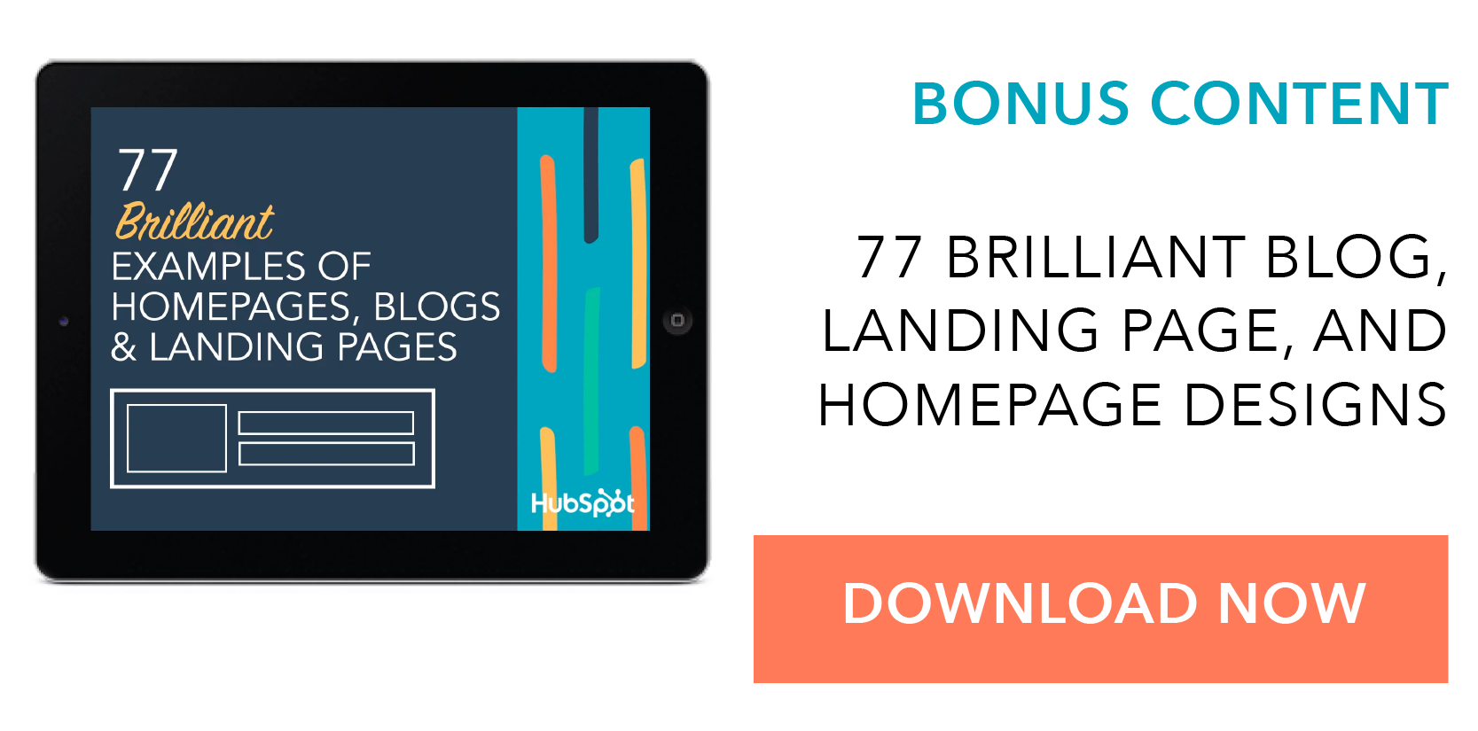
20 of the Best Product Landing Page Designs
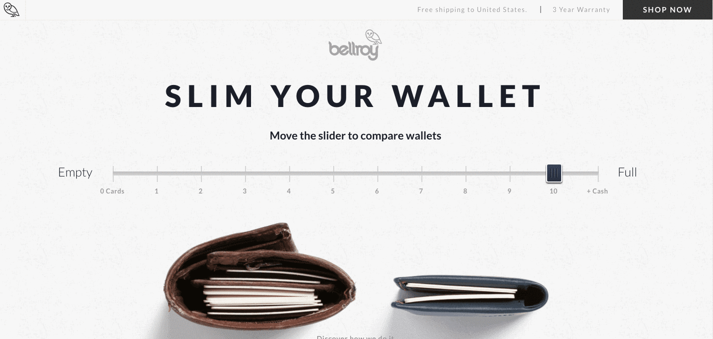
1. Bellroy
Bellroy sells thinner-than-typical wallets. There's value to that — but what is it, and how do you get the consumer to understand it?
To answer those questions, Bellroy divided its product page into three stages of the buyer's journey — understanding the problem, how to fix the problem, and how Bellroy can resolve the problem.
There's even an interactive section that shows how the skinny wallet will fill up in comparison to standard wallets. As users move a slider back and forth along a line, both of the wallets fill up with cards and cash, visually displaying the very problem Bellroy's skinny wallet solves.
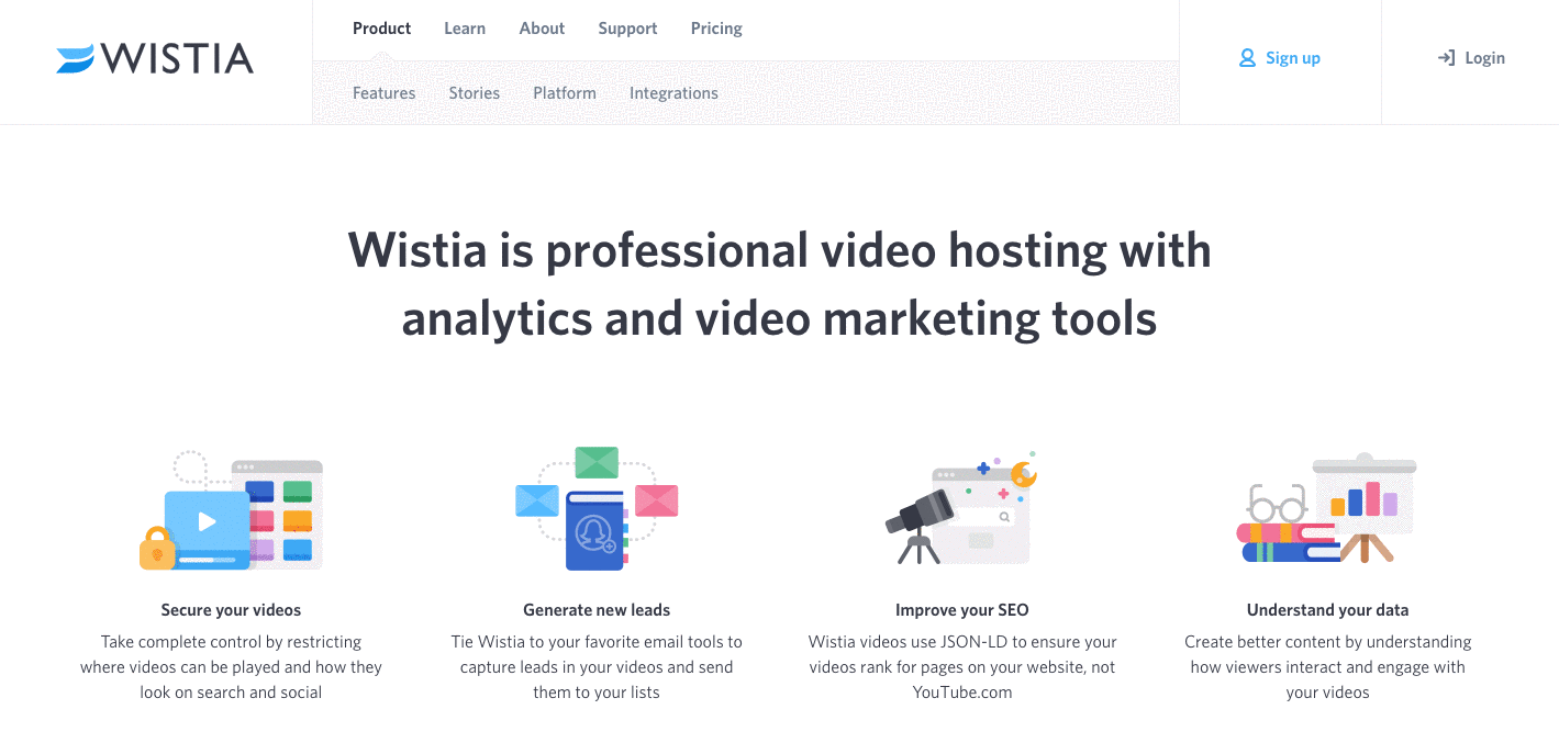
2. Wistia
Wistia is a video hosting and analytics company that provides users with detailed video performance metrics. It might sound like a snooze-fest, but let's dive into what really makes this product page stand out.
First, we're presented with five, colorful graphics illustrating the tools' value propositions. And in case that's all the user really needed to see, those graphics are followed by two calls-to-action.
But, if you continue scrolling, you'll see a video with information about Wistia's capabilities for that video — calls-to-action, email collectors, video heatmaps, and viewing trends.
One of the best ways to explain a visual platform's features is to demonstrate them on a product page. This one shows users all of Wistia's features and how they work, day-to-day.
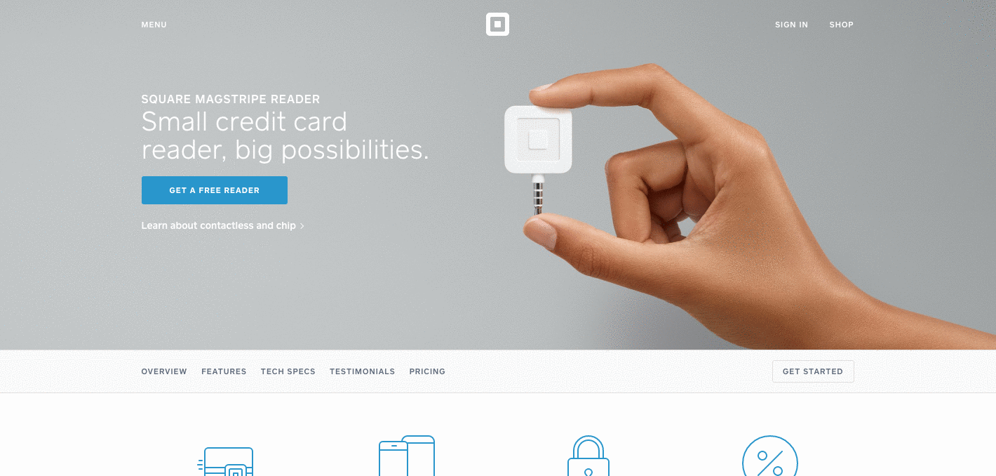
3. Square
Square is a mobile transaction company that merchants use to collect payment from customers — anywhere, any time, as long as they have a compatible phone or tablet.
The product marketing challenge here is to show why Square is an easier alternative than a typical cash register — and its product page displays those reasons in a visually captivating way.
The rest of the page is clearly organized headlines — which reads like answers to frequently asked questions — plenty of white space, succinct copy, and appropriate images. Anyone looking into each section can understand exactly how Square works at every stage of a transaction.
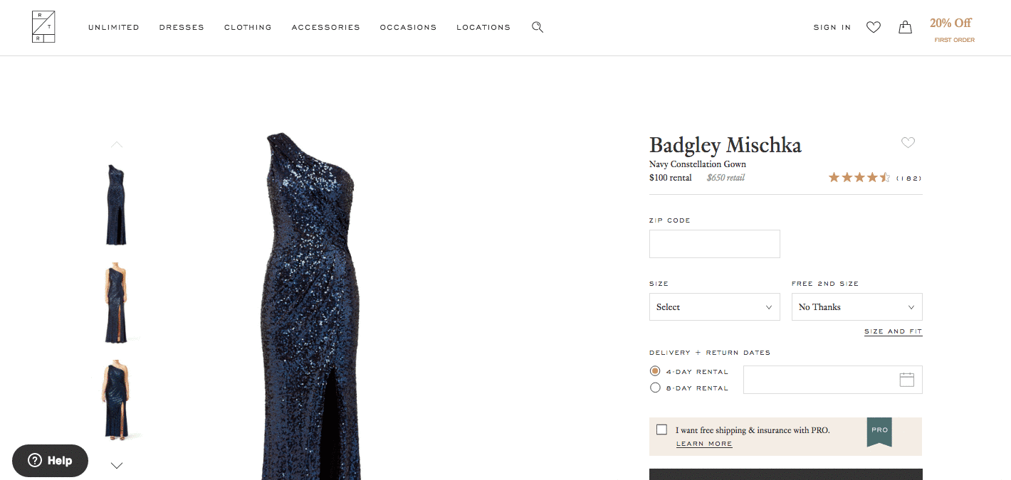
4. Rent the Runway
Some companies — especially in ecommerce — have up to thousands of product pages. Rent the Runway, an online dress rental company, is one of them.
Rent the Runway has an individual product page for every dress it carries, with all the information a customer could want — images, measurements, fabric, price, and reviews. So what sets them apart? The exceptional detail of the "Stylist Notes" and "Size & Fit" sections.
These details are clearly and carefully curated by stylists and reviewers. They don't just explain what a dress is made of and how it looks — they cover how it fits on every part of the body, which undergarments should be worn with it, and for which body types it's best suited. That kind of information not only delights customers and encourages their trust, but it also makes for a more confident buying decision.
Also, notice how there's plenty of white space surrounding the product images and description. According to research by ConversionXL, that white space creates a higher perceived value — in this case, price — of the product in the user's mind.
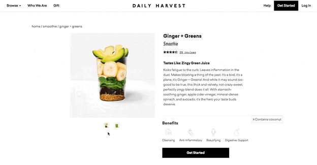
5. Daily Harvest
Daily Harvest develops superfoods in the form of smoothies, soups, and more, and delivers them to your doorstep. What makes these foods' product pages so outstanding? They show you exactly what makes these foods so super in a format that's both clear and digestible — no pun intended.
Check out one of Daily Harvest's smoothie product pages, below. Not only can you see what the smoothie looks like, but hovering over the lefthand preview icon, below the main image, shows you the foods used to create this drink. Scroll down, and you'll see each ingredient and a simple description of each one.
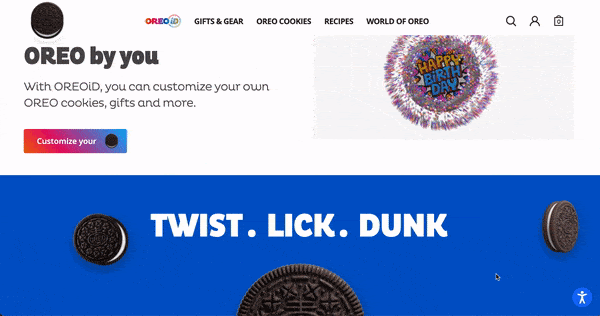
6. Oreo
If you've seen any of Oreo's marketing, you shouldn't be surprised it’s on this list. But sometimes, being well known can make it harder to create a product page. So how did Oreo do it?
The focus of Oreo's product page is how these simple, classic cookies can help people unleash their imaginations, dare to wonder, and become generally happier. It features a series of videos, one after another. One is accompanied by the lyrics, "It's so easy to let your imagination go when you play with Oreo," paying tribute to the age-old discussion about the "best" way to eat them. The page takes a creative, bold approach to marketing with what might otherwise be thought of as an ordinary snack.
Oreo also used a unique design for this page. Even though the cookies themselves are monochrome, the page is wonderfully colorful, from the videos, to the backgrounds, to the graphics.
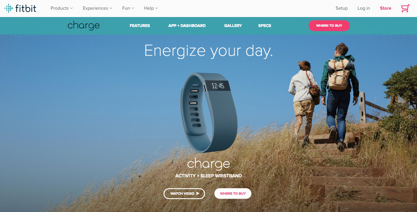
7. Fitbit Charge
When I took on this blog post, I asked a few people for their favorite product page suggestions. I was amazed how many people immediately recommended Fitbit — and after checking out the site, I can see why.
The page below helped unveil the original Fitbit Charge — now succeeded by the Fitbit 3 — and starts with a value proposition, rather than a list of features. It's a hero image of people hiking a mountain, who we can imagine are wearing Fitbits, with the copy, "Energize your day."
As you scroll down the page, it goes through four quick steps explaining how the product works. What's more, a lot of these are interactive — the section under "Everything you need, all in one place" allows users to hover over different features to see how they appear on Fitbit's mobile app.
But the page also explains why these features are valuable. For example, one tracks everything you do from walking, running, and sleeping. Why does that matter? Well, you can have your current records on hand, and try to beat them.
Knowing that users might not remember all of the specifics when they leave the page, Fitbit was sure to focus on how these features will actually make a difference in the visitors' lives. Well played.
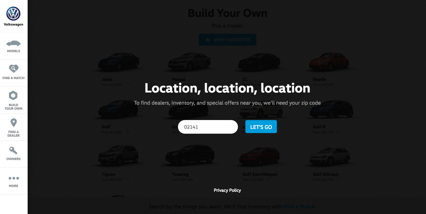
8. Volkswagen
Volkswagen takes an interactive approach to its product marketing. Instead of listing all of the features you can have in a car, the company walks you through the process of actually building your car. As you go through that process, Volkswagen highlights the different features you could choose, then gives you a preview of what the car will look like and how that will affect the price.
Even though I'm not currently in the market for a new car, I personally had fun tinkering with the different customization features on the page. What color do I want? Do I want premium audio? (Yes.) It's an interesting way for the brand to eliminate the notorious connotations of "car salesmen," by allowing users to learn about and select features independently.
Plus, there's a nifty matchmaking feature that allows you to see which nearby dealerships have the car with all of your preferences in its inventory.
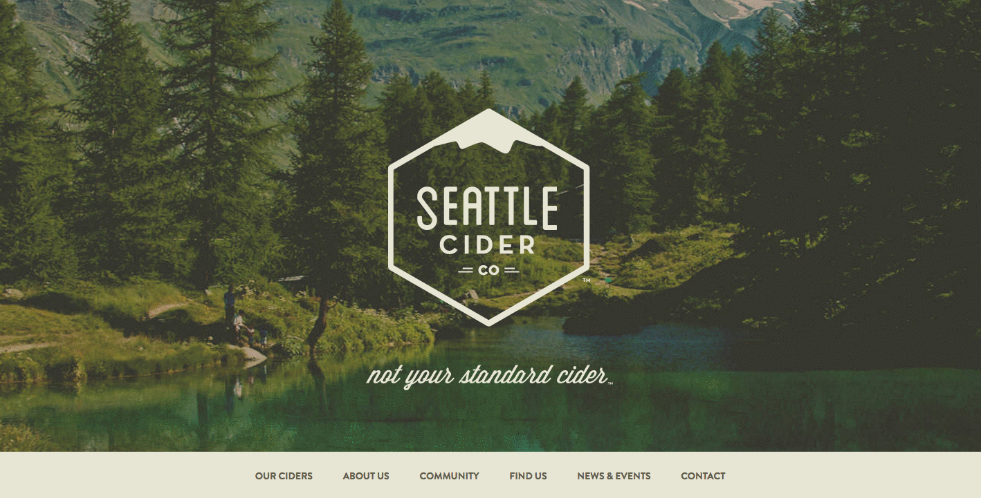
9. Seattle Cider
The folks at Seattle Cider claim its cider is "not your standard cider." Well, neither is the product page. It reads like a story, beginning with attractive, high-definition images of the cider selection, which happen to have really cool label designs. As you hover, an explanation appears of what differentiates Seattle Cider's products from others, and what makes each variation special.
But my favorite part is what comes next: a cool, interactive display of how cider is made from start to finish, which plays for users as they scroll. It's a surprising and delightful user experience that goes above and beyond the typical product page because it doesn't just display the products. It shows where they come from, and how.
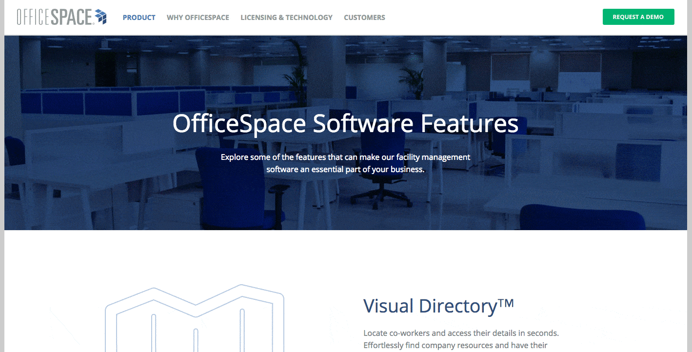
10. OfficeSpace Software
OfficeSpace sells facility management software to help folks manage, well, office spaces. Like the name, the product page is very clear and direct.
Each section of this product page is dedicated to a different feature of the software. The headline explains the feature, and the subheadline explains why this feature is important as you evaluate different software.
That makes it easy for prospects to quickly digest what the product offers, but also read more details on its value proposition — if they choose to. And, if someone wants to learn even more about a particular feature, there are clear calls-to-action to do so.
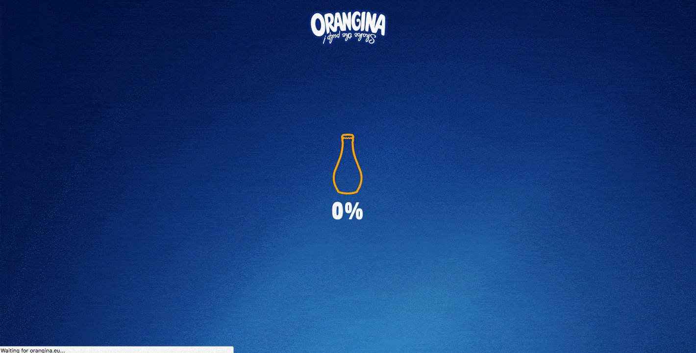
11. Orangina
This carbonated citrus drink has been around since 1935, and it has exactly four products — original, red-orange, light, and tropical. So, how does Orangina keep its product page both current and special?
For one, it's fun to explore. When you hover your mouse over any of the blocks, the picture or icon animates — the bottles dance around, the orange slices in half, and the thermometer drops. The animated images and bold colors fit in perfectly with the Orangina brand personality.
Also, you might notice that some of the blocks are actual products, while others are simply tips and details about its products. If you don't have a lot of products to sell, consider interspersing them with tips and information about the products you do have available.
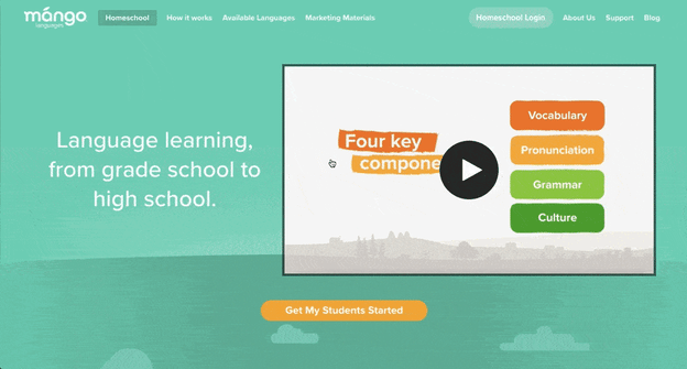
12. Mango Languages
Mango Languages creates "lovable" language-learning experiences for libraries, schools, corporations, government agencies, and individuals. Its homepage has illustrated calls-to-action for each of these buyer personas — from public libraries, to government offices, to those who are homeschooling their kids. Each of those calls-to-action leads to a different product page that's colorful, clearly written, and very comprehensive.
Take a look at the example for homeschool teachers below. Like every other part of the website, it exudes Mango's friendly, approachable, and helpful brand personality. The video couldn't be more delightful. I mean, a guitar-playing mango in a top hat? Yes, please.
As you scroll, you're greeted with clear value propositions that use playful language that's true to the brand. Everything about the page says "simple to use," "fun," and "effective."
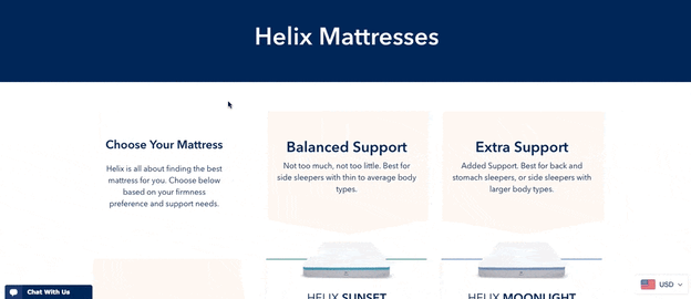
13. Helix Mattresses
It's one thing to sell a mattress — it's another thing to sell a good night's sleep. Helix Mattresses is laser-focused on the latter, having designed a product page that organizes each mattress by its level of plushness and support.
By looking at Helix's product line in chart form, website visitors don't have to examine each mattress individually to find the attributes they're looking for. Simply find the row and column that matches your bedding needs, and click through to your chosen mattress's product page to learn more.
Another reason why the Helix Mattresses product page is so effective is how it describes its products. It can be difficult to know what "plush," "firm," or "supportive," really mean in a mattress — they all seem so subjective. For that reason, Helix is all about brevity in its product descriptions, using evocative explanations of each category a mattress might belong to.
"Plush Feel: Soft top of your mattress that lets you sink in like a cloud."
"Balanced Support: Not too much, not too little. Best for side sleepers with thin to average body types."
"Firm feel: Firm top of your mattress with no sink or give."
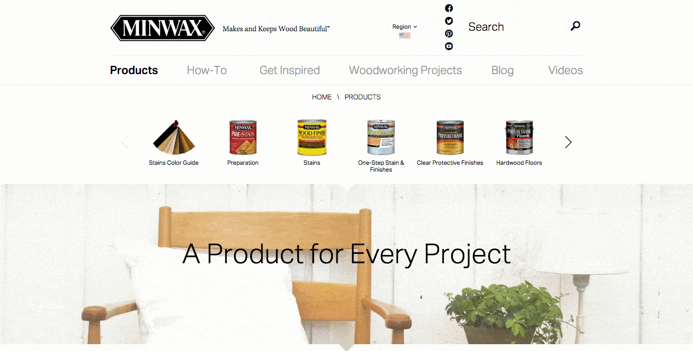
14. Minwax
Minwax makes products to help people care for wood furnishings and surfaces. Riveting, right? But the brand has managed to create a product page that's not only relevant but helps users quickly and easily find what they're looking for.
That's thanks partly to the Minwax Product Finder module. It functions like a quiz, asking a series of multiple-choice questions, like "What kind of project is it?" and "What are you looking to do?"
Once you answer the questions, the quiz generates recommended products, which includes a handy "Don't Forget" list with the tools you'll need to get the job done — things like safety glasses, gloves, and sandpaper. Helpful tips like this go above and beyond a normal ecommerce product page.
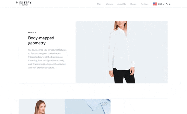
15. Ministry of Supply
Ministry of Supply specializes in comfortable formal wear, and it shows you just how comfortable any one of its garments are with its product landing pages.
Take the product page for the Juno Blouse, below. Underneath the photo gallery of a woman modeling the product, Ministry of Supply gives visitors "proofs," revealing the blouse's thread count, materials, and other key qualities that make the product unique.
The product page's best trait might actually be its motion graphics, using basic looped videos that demonstrate the clothing's resilience and flexibility.
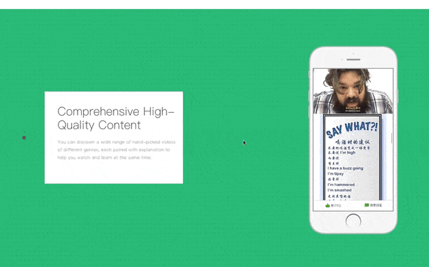
16. Liulishuo
Liulishuo is a China-based startup that builds English language-learning tools for personal development and test prep purposes. The company's mobile app product page offers a clean but media-rich overview of its curriculum.
As you can see below, the bottom of the page plays a crisp motion clip of the video-based coursework in action on a smartphone. It's essentially an app demo before users even download the app.
At the top of the page, Liulishuo makes cool use of QR codes by allowing users to download the app just by scanning the code on their mobile device. Presenting a software product in this way is a smart effort to increase customer acquisition simply by making the product easier to get.
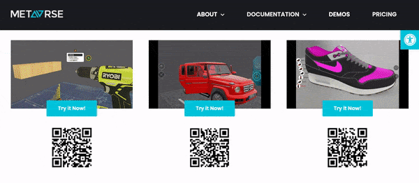
17. Metavrse Engine
Metavrse, a virtual reality (VR) consultancy and product developer, has just about the most immersive product page we've ever seen. The company sells not just VR insight, but also VR and 3D tools to help modern businesses better engage customers with its goods and services.
I don’t know about you, but I can’t help but be fascinated with this landing page.
Metavrse's VR product page actually allows users to scan QR codes on mobile devices to put themselves into a virtual experience according to the product at hand. So if you wanted to hold the Solar System in your hands and create or reposition planets — you could do it within seconds.
This company’s capabilities are displayed in an organized and immersive way, making its landing page nothing short of excellent.
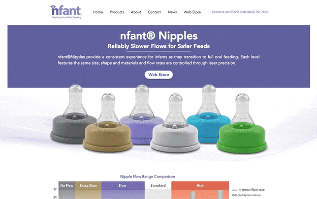
18. Nfant®Nipple
Nfant®, an infant nursing product, takes the transition from breastfeeding to oral feeding seriously — as is evident on the company's product page for the Nfant®Nipple.
What sets this small business apart from other nursing and parenting services is its use of data to attract customers.
The product page below touts several types of bottle top-shaped nipples, and each one offers a different level of flow when the baby is drinking. As involved as the conditions of each product is, however, the product page delivers the information gracefully using color coordination, a video demonstration, and even a graph comparing each product's flow range that nursing mothers can refer back to.
Nursing moms are always educating themselves on the resources they have for keeping their children healthy. With that in mind, Nfant's detailed but easy-to-understand product page knows its buyer persona well.
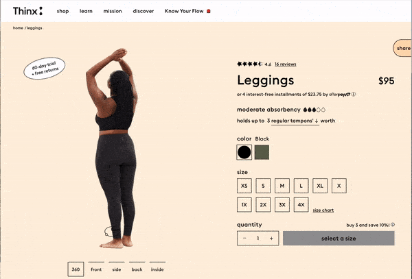
19. Thinx Leggings
Thinx is a clothing and undergarments brand that makes absorbent, zero-waste products for people with periods. It’s well known for its long-lasting line of menstrual products that are more cost-efficient and less polluting than the alternative of pads and tampons.
In the Thinx product page, you’ll find a wide range of body shapes and sizes displaying the inventory. This makes it easier for customers to determine what would look best on different individuals. Additionally, it lets the audience know which garment is best for them according to flow and activity level clearly.
What really makes its product page pop is the interactive, 360-view feature on all of its products. You can spin models of different dimensions to see exactly what the customer should expect — a feature that makes the online shopping experience more reliable than competitors.
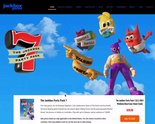
20. Jackbox Games
Jackbox is a party-game-making studio, enabling groups to play games under one roof or from anywhere in the world via the internet. This studio has brought many people together and has grown over the past couple of years, and its product page is aiding in its success.
From a visual standpoint, everything about the Jackbox product landing page is vibrant in color and interesting. The floating characters lead you to learn more about each game pack, all the fun features each one has, and specifies which gaming platforms you can access them through.
The Jackbox Party Pack stands out from other game product pages from its fun and whimsical appearance, giving customers a gleeful introduction to the fun its games have to offer.
Did you draw any ideas from these product pages? We hope you did, but before you start to work on your own, let’s go through some best practices.
Product Page Best Practices
So, what have these brands taught us about product pages? It boils down to a few must-haves:
1. Make it interesting and fun, especially if you have a less-than-riveting product.
No matter the type of product, your website should position itself in a way that is engaging, interesting to view and learn about. Your UX/UI designer or developer should make the product page interactive or, at minimum, visually appealing.
This practice can be as small as changing the colors of the page, or as large as reformatting each section and implementing more widgets to provide a better customer experience.
2. Help visitors to find what they're looking for.
Make sure the page isn’t cluttered and makes the product specs as clear as possible to ensure customers can see its value. Customers will turn to your competitors if they can’t find the information they’re looking for in a timely, and organized manner.
To aid in this practice, you could benefit from providing current customers a usability questionnaire to collect their opinion directly.
3. Personalize the user experience.
Allow users to "build their own" product, to show them that you can meet their preferences. You can even go as far as to compare product capabilities against one another or other products in the market if you know they provide more value to your audience. This all boils down to understanding product marketing and how you can better serve your specific market.
4. Product descriptions should be informative.
Without bogging it down in detail, be sure to include the right pieces of information that will show users what sets your products apart.
Chances are your customer has already navigated to your page with a general idea of what your product can do for them, now it’s your job to dive deep into what your product’s purpose and value are — you should also back it up with evidence like other customer reviews, too.
5. Make images clear and quality.
This should be a no-brainer, but you’d be surprised how much a blurry or outdated graphic can deter a customer. But no worries, this is one of the easiest problems to fix, and can make your product page look more professional in a matter of minutes.
6. Use live chat.
You want your product page to help customers find what they’re looking for, and adding a live chat feature will give them a helping hand as they explore it.
Live chat enables sales reps to address customer questions in minutes. Adding this feature can increase the efficiency of communication on your website, and help you improve it, too.
7. List not only the features, but benefits as well.
In product descriptions, it’s general knowledge to be thorough in detail, but take the extra step and describe how those features can benefit the customer, too.
For example, you could be selling a tech gadget with amazing specs in the description — but not all customers will see the point of all those features. Make sure to discuss the value of those features for better understanding.
8. Include customer reviews.
72% of customers won’t take any buying actions until they’ve read reviews.
When online shopping, customer reviews are extremely important for prospects. If they can read an honest review of a product, they will trust the quality of the brand more.
9. Compare prices.
If you are running special deals or discounts for your products, let customers know on the webpage. List the original price near the current offer and customers will feel more of a sense of urgency and be more willing to purchase quicker for a deal.
10. Make it convincing.
In all, you should know your product like the back of your hand. Make your product page just as convincing as you believe it can be — a solution to solve your customer’s pain points.
Design Your Product Page to Impress
The way you display your product can be the decision point for a potential customer. Because of that, you must make your products shine and convey its value properly.
Now that you’ve seen our list of effective product landing pages, we hope you have some new inspiration and will apply it to your website.
Editor’s note: This post was originally published in October 2018 and has been updated for comprehensiveness.

20 of the Best Product Page Design Examples We've Ever Seen was originally posted by Local Sign Company Irvine, Ca. https://goo.gl/4NmUQV https://goo.gl/bQ1zHR http://www.pearltrees.com/anaheimsigns
No comments:
Post a Comment