The modern job search is incredibly competitive, and technology has made it easier for your resume and job application to be overlooked and discarded before you even make it to the interview.
Luckily, technology is also here to help. There's no longer a template for how to apply for a job — you can use social media, websites, and even interactive campaigns to get your name noticed by a recruiter.
One resume format you may not have considered? Infographics. A highly engaging and visually appealing infographic that explains your skills and qualifications might help you stand out in the crowd and serve as a work sample when applying for a job.
It's important to note that an infographic resume won't be appropriate for all job applications. If you submit a resume in this format through an automated system, you could disqualify yourself if the technology can't read visual information, so it's best to stick to the format prescribed by the job posting.
Additionally, while an infographic resume might be a good idea for a more design-related role, it's likely not a good idea for most non-design roles. Here, we'll explore what six hiring managers have to say about infographic resumes — plus, how to make one for yourself.
How to Make an Infographic Resume
1. Start with a good structure.
You'll want to start by figuring out which tool you're going to use to create your infographic. You might choose to create one in Powerpoint, or use pre-made infographic resume templates on a design website like Canva or Venngage.
Once you choose your tool, you'll want to identify a good structure. Do you want your name and a brief opening description at the top? Would you prefer to put the Education section at the beginning, or end? Are you going to include previous positions, or focus on just the current one?
Additionally, you might want to figure out whether you're going to focus more on icons and images, or data.
For instance, take a look at the differences between these two Venngage infographic resume templates:
In the first Kyle Fisher example, you'll see he's structured it so there's plenty of white space; he's also highlighted creative and software skills, and left space for hobbies.
In the second Linda Jackson example, on the other hand, you'll see technical skills and educational training take up the majority of the space on the resume, along with work experience at the bottom.
When comparing these two infographic resumes, you'll see the structure is vastly different. Similarly, consider the role for which you're applying and which information is critical to demonstrate on your resume as it relates to the role — and which you can skip.
2. Take note of everything you want to include in your infographic resume.
Once you've chosen a structure, pull up an existing resume and take note of everything you want to transfer over to the infographic resume.
For instance, if you want your infographic resume to be data-heavy, write down a few key metrics related to your current role, such as "43% YoY growth" or "12% increase in MRR". It's easier to design your infographic resume once you know what you'll need to include.
3. Choose a good color scheme.
A cohesive color scheme is a critical component of any good design, and this is no exception. Consider using clean, complementary colors — like white, black, and orange, or yellow and teal — to help your resume stand out without becoming too distracting.
4. Have a strong opener.
This is a best practice for any resume, but particularly for an infographic, you'll want to start with a good, powerful opener. In the examples below, for instance, I put: "Passionate, creative, and driven Elon graduate with leadership experience and strong communication skills."
Ultimately, your opener is your value proposition — what will you bring to the role that the hiring manager can't find elsewhere?
5. Use good design principles.
Finally, an infographic resume should use the same design principles as anything else.
These include:
- Creating balance, using either symmetrical or asymmetrical designs.
- Leveraging contrast to highlight certain elements.
- Using movement to create a narrative and provide a high-quality user experience.
- Ensure there's unity in your design — i.e. your composition's elements are in agreement.
Take a look at Everything You Need to Know About the Principles and Types of Design for additional information regarding design principles.
6 Hiring Managers' Opinions on the Infographic Resume
To explore when — if ever — infographic resumes are a good idea, I reached out to a few HubSpot recruiters to get their take.
Kenny Nestle, a HubSpot G&A Recruiter, told me: "I personally love infographic resumes. It's different and stands out from your typical resume, and it's easy on the eyes."
Nestle adds, "I've had candidate share graphics on the types of roles they've supported, as well as metrics related to their current role."
Devon Brown, an Executive Recruiting Manager at HubSpot, echoes Nestle's perspective, telling me, "I love when candidates use infographics as an opportunity to highlight their creative or design abilities."
However, she urges candidates to ensure their design is clean and easily digestible. "It has to be formatted in a way that makes it just as easy to read as a typical resume," Brown advises. "The flow of information, and how it's presented, is critically important if a candidate chooses to go this route."
Not every recruiter feels that infographics are a good idea. Technical Recruiter Sarah Magner, for instance, says, "I could see why people applying for design, marketing, or branding roles might use an infographic to set themselves apart, but I've always found them to be a bit distracting. Plus, the graphics can take away from the actual content on the resume."
"I'd prefer an easy-to-read resume over a pretty one," Magner adds.
Tríona O'Sullivan, HubSpot's Global Marketing Recruiter, agrees with Magner that infographic resumes are typically not a good idea. She told me, "It can be great to see the creative side, but sometimes a candidate can spend so much time designing the template that they miss out on key information, details aren't aligned, or there are really obvious spelling and grammar issues in the mix."
O'Sullivan adds, "Given how competitive and busy the job market is today, it's more important to ensure your resume is easy to review, and states your experience and achievements clearly and quickly, since that's what someone is going to look for first when reviewing."
Amelia Towle, HubSpot's Head of Brand Infrastructure & Design Team Manager, spoke with her Design team on the potential merits of an infographic resume, but agrees that it's typically not a good idea. Towle told me, "If I think about the purpose of a resume, it's a document that your intended audience typically wants to scan as quickly as possible to glean information in an efficient way. If you drastically alter the format, you are perhaps forcing extra cognitive load on a busy recruiter who is just trying to narrow down a potentially vast pool of applicants."
Additionally, Towle told me that if a big company is using software to scan resumes, changing the layout might result in the resume being impossible for the scanner to interpret.
Ultimately, she believes infographics are typically unwise, unless it fits the business for which you're applying: "If it's a huge HubSpot-sized organization, you might be shooting yourself in the foot by altering format beyond what is expected. But if it's a tiny agency that is solely design-focused, it might be helpful to stand out."
Towle adds, "Infographics-for-the-sake-of-infographics has arguably had its day, so in that case, you might want to conceive of something new."
Finally, there are some recruiters who don't necessarily care one way or the other. As HubSpot Marketing Recruiter Erica Matos told me, "I don't really care about what a resume looks like — instead, I look at the content and make sure they have experience that aligns with what I'm looking for. I'd always love something visually appealing, but if I can't clearly gauge the candidate's actual experience, it's not going to help them get the job."
You'll only want to create an infographic resume if it makes sense for the role. If the role is design-related, then an infographic resume can help you display some of your skills.
However, even if the role is design-related, there are some risks associated with infographic resumes — including difficulty downloading or viewing across devices, and the design elements detracting from the resume itself.
For this reason, you might consider alternative methods to showcase your skills.
For instance, O'Sullivan told me, "While I don't love super creative infographic style resumes, I love when someone hyperlinks to their portfolio or website, etc. That's an amazing way to showcase both their experience and their thought process when it comes to applying for roles. If I see a hyperlink for one, 99% of the time, I will go and check that out."
If you do choose to create an infographic resume, take a look at a few of these examples for inspiration.
Infographic Resume Examples
1. The colorful, graphic-heavy infographic resume.
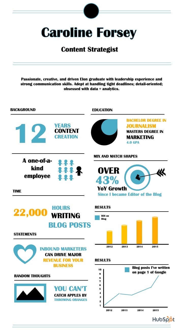
The resume I created below uses plenty of visuals and numbers to highlight relevant information. For instance, there's a graph to showcase the blog posts I've written that have earned a spot on the first page of Google; there's a large "12" to highlight the years of content creation under my belt; and there's even an image of 10 stick figures to demonstrate my individuality.
 Consider how you might use one font, and a complementary color palette, to create a similar infographic. I designed this one using one of HubSpot's free infographic templates, so feel free to create the same one using the templates, as well.
2. The data-heavy infographic resume.
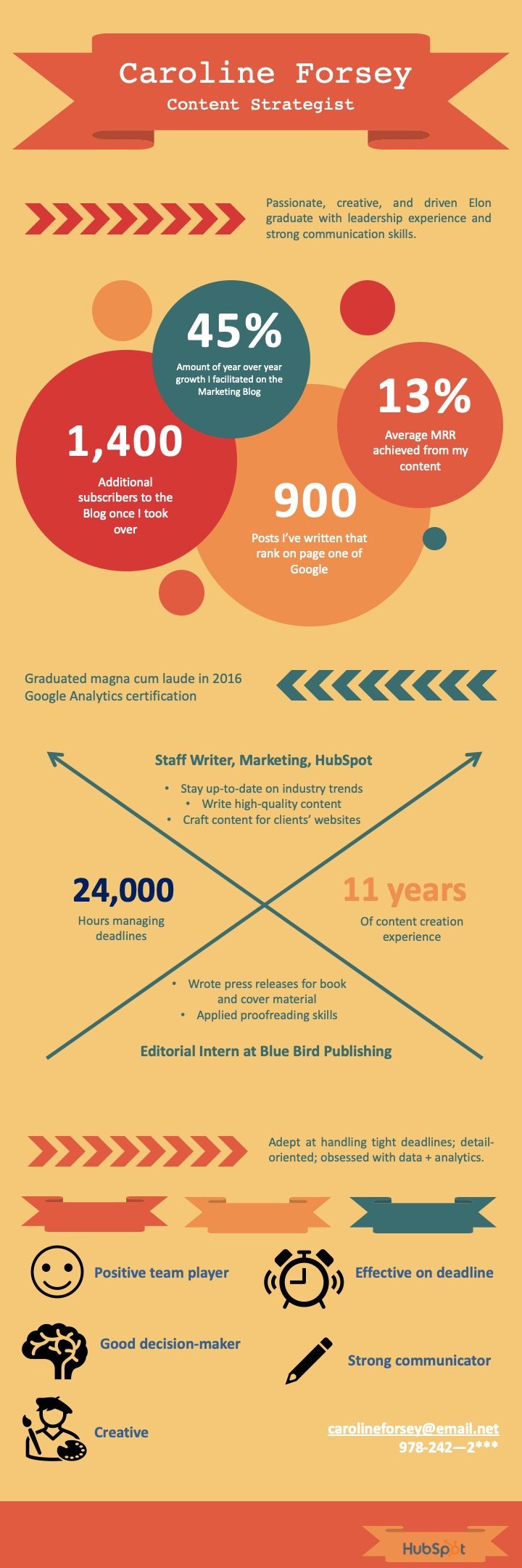
In the following infographic resume (also created using HubSpot's templates), you'll see I've highlighted most of my accomplishments using data — such as the 45% YoY growth, 1,400 additional subscribers, or 24,000 hours managing deadlines.
I also used icons of a smiley-face, pencil, and painter to demonstrate some of my skills in more visual form.

What do you think? Ready to take your resume to the next level? Grab some starter templates below.
Infographic Resumes: 6 Hiring Managers Weigh In was originally posted by Local Sign Company Irvine, Ca. https://goo.gl/4NmUQV https://goo.gl/bQ1zHR http://www.pearltrees.com/anaheimsigns

No comments:
Post a Comment