Monday, October 19, 2020

9 Australian Websites That Will Inspire Your Design

It's no question that Australia is one of the most visually stunning places on Earth.

And, for generations, Australian artists have embraced the continent's colorful culture in their work.

When walking through a museum or historical location in Australia, you might find canvases covered with vibrant colors and energetic images that feel like they're transporting you into an intense or action-packed scene.

Take, for example, this 1994 painting by Emily Kame Kngwarreye, an Australian high-colorist artis. Here, the painter uses explosions of different colors to simulate the action-packed beginning of Earth.

Image Source

But Australia's colorful, energetic art aesthetic doesn't stop at art museums. Today, it can be seen in architecture, graphic design, and online. In fact, many Australian brands exemplify the region's immersive or eye-popping artistic techniques in web design and user experience.

Whether you're an international marketer learning how to design a unique web experience for visitors around the world, or an Australian designer hoping to get a leg up on the local competition, we've compiled a list of nine stunning Australian company websites you can learn from.

Examples of Australian Websites

Vbreathe

Vbreathe, which sells a high-tech, compact air detoxification system for homes,leverages a full video experience on the homepage of its website.
vbreathe australian website demo

When you enter Vbreathe's site, you instantly see a silent video that uses animations and special effects to demonstrate how the detoxifier works. Then, when you click on the video's overlaid play button, you enter a full-screen product demo video that explains how the product works and why consumers should consider it.

After viewing the silent or full-screen video, visitors can scroll down to find more text-based product details and links to content air detoxification.

All in all, Vbreathe's site does a great job of combining stunning images, videos, and text-based content that educate visitors about in-home air quality and give them the information they need to justify making a purchase.

Kua Coffee

Kua Coffee pulls visitors into its website with an interactive homepage scale that simply asks, "How many coffees do you have a day?"

When you click an amount of coffee you drink on the scale and press "GO," you're sent through a slide show that calculates interesting measurements related to the amount of coffee you drink and explains where that coffee would be sustainably sourced from if you purchase brews from Kua.
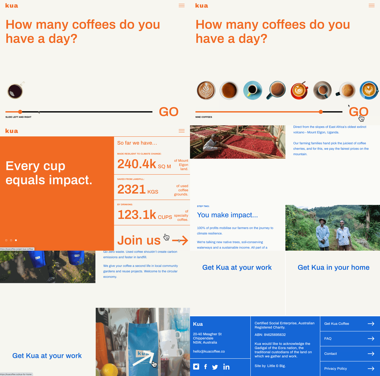
kua coffee australian website demo

Once you complete Kua's slideshow, you can scroll through a page that informs you more about the impact of environmentally-friendly coffee brewing and where Kua's ingredients are sourced from.

Kua Coffee's site is a great example of how a brand can create an interactive experience that allows a visitor to think about how they use or consume a product, learn more about how that type of product is made, and find out why a particular brand's product is better than its competition.

Slaven Torline

While some designers might find it difficult to create a memorable site around something as logistical as financial planning, Slaven Torline -- an Australian firm that advises struggling companies -- embraces whitespace and simple animations to create an intriguing, effective, and professional website.

On Slaven Torline's homepage, all you'll find a brief mission statement, an image with a sphere and a cube, and a headline asking "How can we help?"
Slaven Torline australian website demo

When you hover over the sphere, you'll see the word "Insolvency" appear with a few list items to the side explaining how the business can help. When you hover over the square, you'll see something similar around the word "Restructuring.

When you click "Learn more" for either Insolvency or Restructuring, the page expands with the associated shape moving down to a lower corner. From there, the shape's shadow will change based on where your mouse is moving, adding light interactivity to the page.

Overall, Slaven Torline's a great example of how a corporate or B2B company with less visual offerings can still leverage a clever -- yet professional -- aesthetic to create a memorable, interesting, and smooth user experience for its visitors.

SeeMakePlay

SeeMakePlay is a company that coordinates and teaches arts and crafts to children in schools or at parties. When you visit the site, you'll see a colorful SeeMakePlay logo surrounded by colorful animated characters. And, on the lower-right, you can click a color and a pencil icon which enables you to scribble all over the page and characters.

seemakeplay australian website demo

As you scroll down, you continue to see playful animations, testimonials, and images of happy children, as well as an explanation of how the business works. You can also find an inquiry form allowing you to learn more about the brand.

With SeeMakePlay's website, visitors can experience the fun and excitement of arts and crafts at the top of the homepage, scroll to learn more about the business, and ultimately find out where and how to schedule a class when they reach the bottom. This is an excellent way to pull a visitor through the flywheel as the design attracts, engages, and delights them.

PacVac

PacVac, an Australian vacuum company, offers its homepage visitors a highly visual and somewhat interactive experience that highlights the major value points of its Velo vacuum cleaner.

When you enter the site, you see a simple image of a woman vacuuming her home. Then as you scroll, you begin to see product shots of the Velo, which pop in front of a white background.

Just when you think this is a standard product site, you might notice that the product shots are animated. For some of them, you can twist and move the Velo in different directions with a simple swipe of your mouse, allowing you to get an interactive 360-degree view of the product.
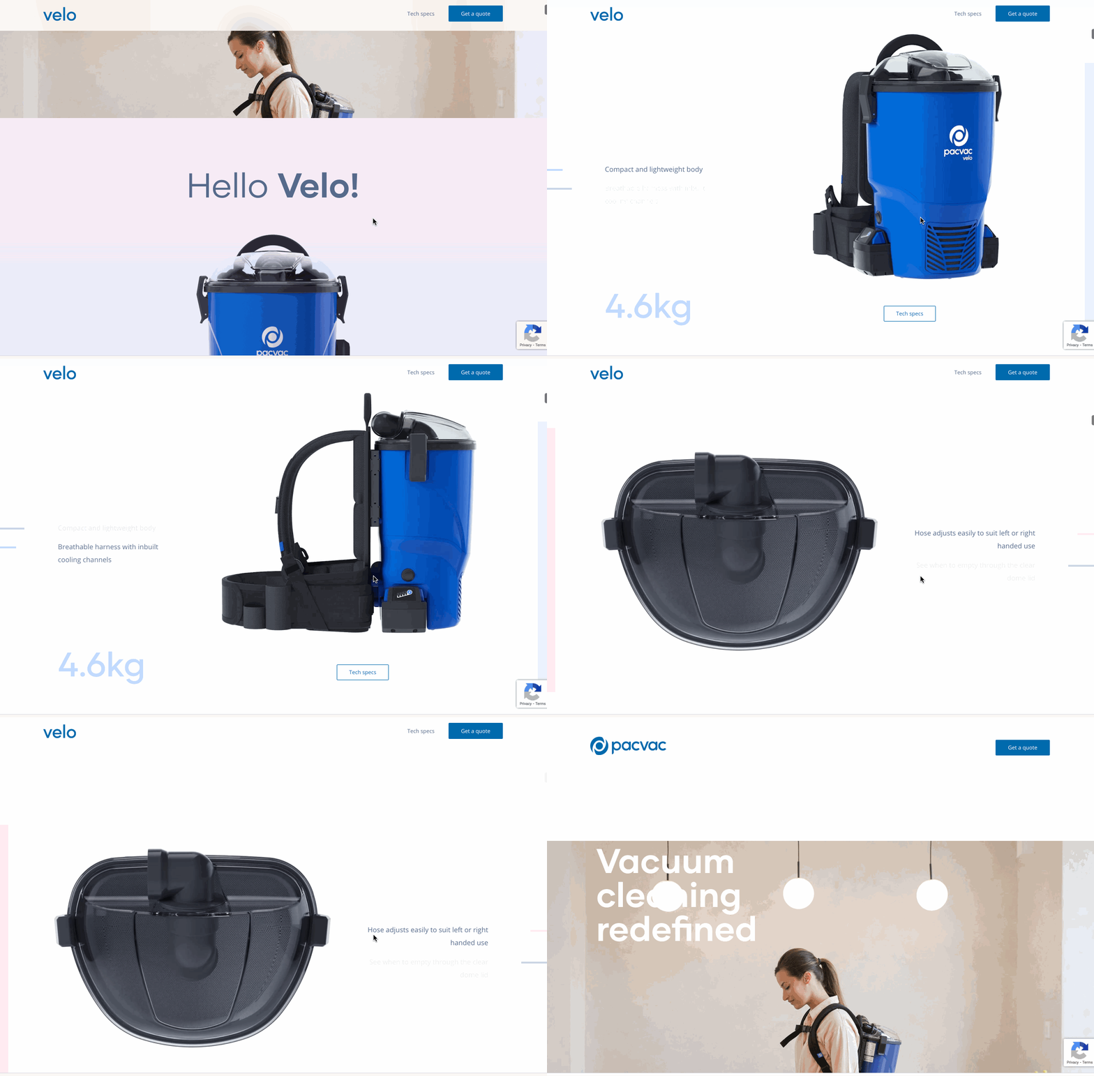
pacvac australian website demo

From there, the animations continue to get more advanced with each scroll. At one point you can scroll to see how each piece of Velo's inner machinery works.
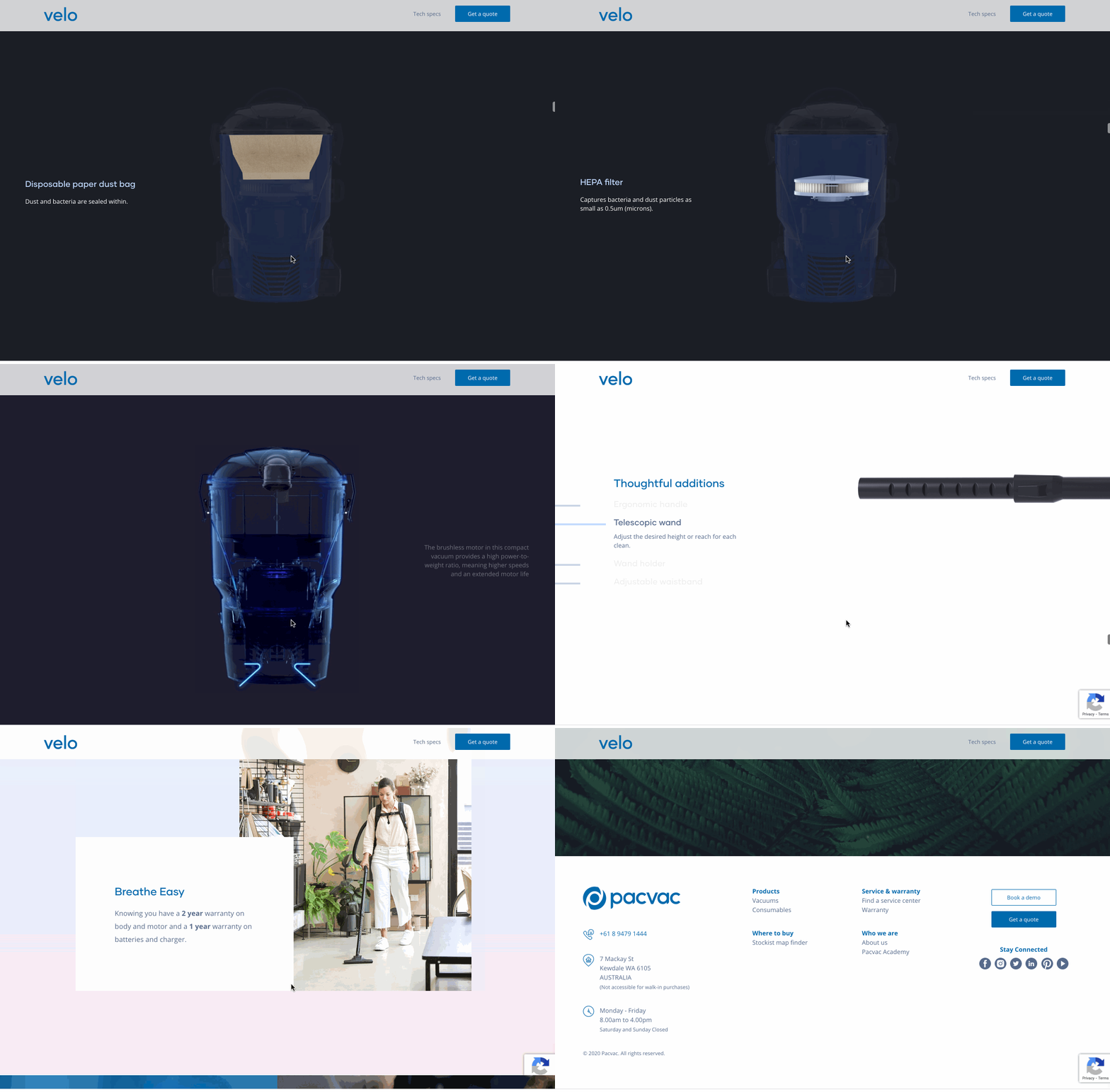
pacvac australian website demo

Essentially the home-page of this site feels like a self-paced, interactive video demonstration that shows a visitor everything they need to know about a vacuum without completely overwhelming them. The more you scroll, the more complex the details and animations get.

The progression of VacPac's homepage content lines up well with the average buyer's journey. When a prospect is doing initial research, they might just skim a site for light product information. But, as they get more serious about purchasing a product, they'll look for a longer list of details and specifications before making an informed decision.

The Rocks Markets

The Rocks Markets is a retail and dining space in Sydney, Australia. While this business could easily place static food shots and basic information on its site and still get great foot traffic as a notable tourist destination, the web designers used the site to embrace color, video, and a sense of movement with each scroll.
The Rocks australian website demo

When you land on the homepage, you can see that the background is a video of delicious foods from different vendors at The Rocks Market. As you scroll, you'll continue to see photos and notice that the page navigation shrinks to give space to the beautiful food photography.
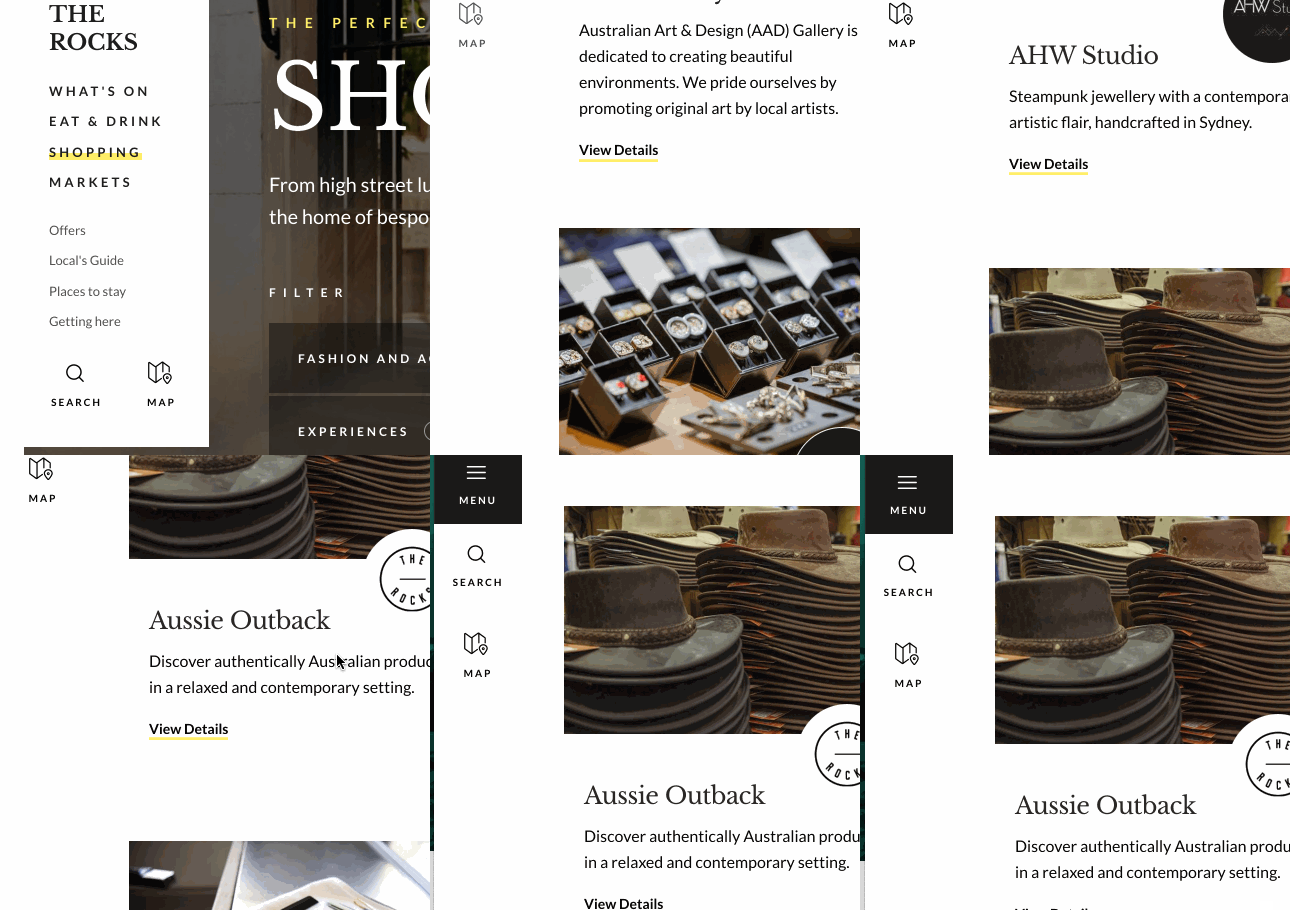
The Rocks Menu australian website demo

The Rocks Markets' site is a great example of how a brand can highlight product videos and imagery, text-based content, a detailed navigation bar, and other information without making a homepage look too busy or overwhelming to understand. When visiting this site, you feel like you've learned almost everything you need to know about the Rocks Market, but still know exactly where to click if you have remaining questions before your visit.

Australian Shopping Sites

Boyd Blue

Boyd Blue is a women-fun ecommerce site and store chain that sells a wide range of Australian-made home products -- from furniture to decor.

While many other sites on this list have amped up interactivity, Boyd Blue's designers aired on the side of simplicity by focusing each web page's format around large, high-resolution images of products in natural home settings.
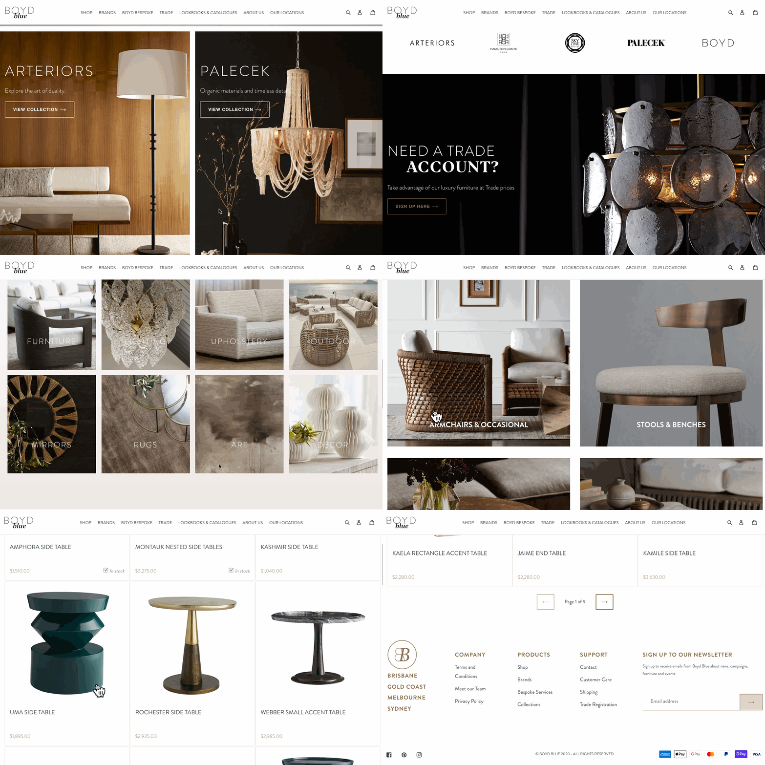
Boyd Blue australian website demo

Aside from its beautiful homepage, Boyd Blue's website also features an ecommerce store with a design and UX that's also simple and easy to navigate for quick, frictionless purchases:
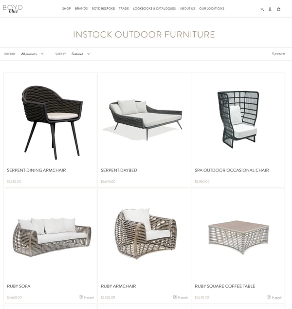
boyd blue australian website demo

Rather than burying basic product shots in a page design with tons of descriptive text, the image-centered, light-text design allows users to get an accurate idea of what products will look like in real life, while also enjoying a smooth, aesthetically pleasing web experience.

Queen Garnet is an Australian brand that sells plum-based health and wellness products such as supplements, powders, and beverages.

Like a Queen Garnet plum, which has been dubbed a "queen of antioxidants," the QueenGarnet.com's homepage is purple, decorative, and uses regal-looking imager and fonts. When you enter the homepage, you'll see a short, but memorable automatic video that presents one of Queen Garnets products in a castle with a moat surrounding it.
queen garnet australian website demo

As you scroll down the homepage, you'll see light animations that show each recent Queen Garnet product and basic information about it. With each product listing, visitors can click to buy it or learn more about it.

Visitors can also click to the Queen Garnet's ecommerce shop, which has a similar purple aesthetic, and lists all of its products:
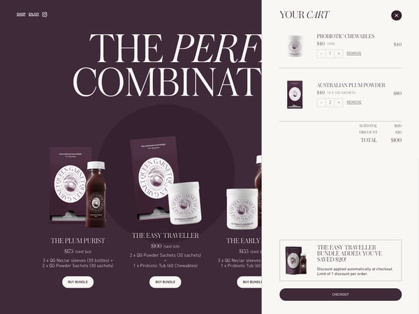
queen garnet australian website demo

Queen Garnet's site is a great example of how brands can benefit from light video, basic animations, and a consistent color and style aesthetic. The site's royal-purple theme is not only fun and vibrant, but it could also be very memorable to visitors sifting through a handful of health and wellness sites for the perfect product.

Birdsnest

Birdsnest is an ecommerce clothing site that allows you to skim through product listings or get automated product recommendations based on your interests.

The ecommerce brand's website design balances whitespace with colorful product shots to give off a simplistic, friendly, care-free aesthetic.
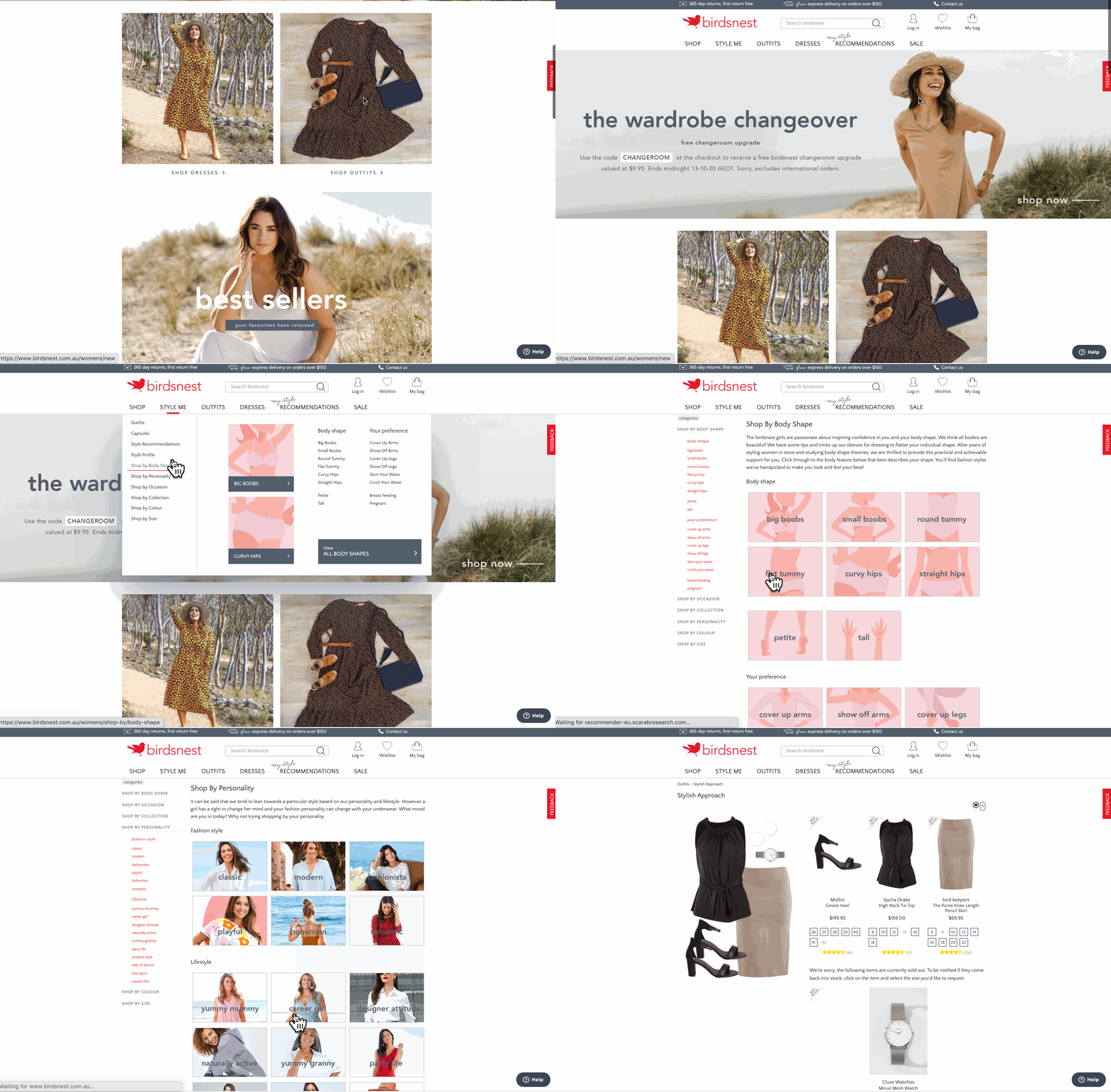
birdsnest australian shopping website demo

What's most memorable about Birdsnest's site is its user experience.

If you're a first time visitor, you can browse products using search filters, or shop by categories including body type, occasion, and even personality. You can also answer a few questions about yourself and your clothing interests to generate a Style Profile that will help the website send you suggestions.
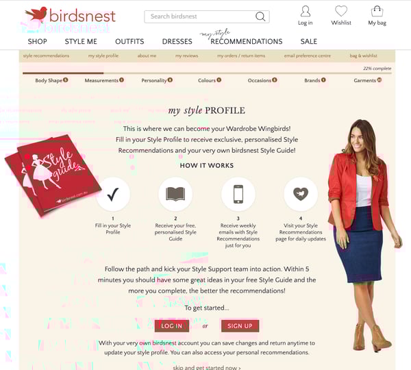
birdsnest style me australian shopping website demo

As you fill out your Style Profile, look at different products, or buy different outfits, the site will learn more about you and give you product suggestions in its Style Me section or through via an email subscription.

This is a great example of how designers and marketing teams can work together to create a highly-personalized shopping experience that can lead multiple groups of people with different interests to product purchases.

If you're interested in building a website and design that does something similar, there are plenty of affordable ecommerce tools that can help businesses in any region with personalization and ecommerce recommendations. Check out this guide to learn more about them.

What Marketers Can Learn From Australian Web Design

Whether you're in Australia or designing a website globally, the examples on this list have highlighted how brands can use color, video, and other elements to make their websites (and brands) seem memorable and unique to all visitors.

Here are a few techniques you can try leveraging:

  • Immersive or Interactive Experiences: Many of the sites above drop the visitor into a video or interactive experience that makes navigating the homepage feel like an entertaining journey. These experiences not only engage the visitor, but they're also memorable and allow prospects to easily digest lots of information about a brand in a short time.
  • High-Resolution Imagery: All of these websites played up imagery, whether the graphics related to products or stirring up emotion. Regardless of the photo strategy, solid photos with great quality will be very memorable to your visitors.
  • Vivid Color Schemes: While some websites on this list masterfully played with white space, all of the examples above had a design scheme that allowed colors related to their images or brands to stand out.

To learn more about designing the best website for achieving your brand's awareness or sales goals, check out this guide. Already have a website? Click here for redesign tips. You can also download the free resource below for even more handy advice.


9 Australian Websites That Will Inspire Your Design was originally posted by Local Sign Company Irvine, Ca. https://goo.gl/4NmUQV https://goo.gl/bQ1zHR http://www.pearltrees.com/anaheimsigns

Sunday, October 18, 2020

Why You Shouldn't Buy Instagram Followers (& What to Do Instead)

You might know your Instagram content is good, but imagine how much better it will seem if it looks like 10,000 people agree.

Whether you’re trying to become a social media celebrity or simply looking to spread brand awareness on Instagram, it can seem tempting to take shortcuts wherever you can in order to expand your audience, including 'buying' Instagram followers.

Here, we’ve gone ahead and covered all the questions you might have about buying Instagram followers to give you a better idea of how it actually works. We’ve also explored the pros and cons, so you can decide for yourself if it’s a good move for your brand.

Can you buy Instagram followers?

Yes, you can buy Instagram followers. There are plenty of cheap services available that allow you to buy 1,000 followers for as little as $10 USD. But you’re only paying for a number. Many of those followers are either bots or inactive accounts, which means they’ll never engage with your posts.

1,000 followers seems like a good deal for the price of a small Starbucks latte. But of course, if it really was that cheap and easy, everyone would be doing it. So what’s the catch? Is buying Instagram followers legal and safe for your business? Is it a worthwhile investment?

The main reason buying Instagram followers can prove to be a wasted investment is because the accounts you follow often aren't real. 

Buying 'Fake' Instagram Followers

The vast majority of purchasable followers are either bots or inactive accounts. Here's how it works:

Instagram Bots

As of 2018, Instagram may have as much as 95 million bots, which accounts for approximately 9.5% of its total user base. There are companies out there who have automated the process of creating bots so well that they can then sell these bots as followers. In some cases, the bots may even assume the identity of a real person, using stolen images and names. 

Depending on the service, these dummy accounts may even seem organic, running on automation to share and like content. Some can even be programmed to produce content. However, because they're not real people, they will not have an organic-looking following to follower ratio. As a result, the engagement they do produce will have little impact.

Without real followers to engage with your content, your posts are essentially hidden from everyone except your inauthentic audience. Plus, your bot followers won’t discuss your brand in real life with friends or family, because, well … they don’t exist in real life (no offense, bots).

Inactive Accounts

However, not all fake followers are bots. There are some companies who sell followers that are genuine accounts.

In this situation, the accounts are created either because they're managed by users whose only goal is to get followed in return or for the sole reason to offer this service. And while these followers might show early engagement, they'll ultimately become a drain on your Instagram account's performance metrics when their accounts go dormant.

After all, if their account was created for the sole purpose of fulfilling sponsorship requests, the real person behind the account has little reason to dwell on the newsfeed, interact with content, or purchase the goods and services being advertised. 

Without that interaction, your follower numbers are inflated with none of the value that organic followers would bring.

When you buy Instagram followers, you’re paying for a number alone. Engagement is not guaranteed, or even likely.

In addition to buying followers directly, you can also pay services to strategically follow other accounts on your behalf based on your preferences (location, hashtag usage, account type, and gender). Ideally, those followed accounts will then follow you back.

With this option, your followers are more likely to be real people, but engagement is still unlikely. Since you can't even guarantee these accounts will follow you back, it’s a risky investment. Most accounts won’t follow you back, and even if they do, they probably aren’t going to be long-term, loyal, or active followers.

Should you buy Instagram followers?

It’s not a good idea to buy Instagram followers. The purchased followers are likely bots or inactive accounts, so they won’t engage with your posts. This means your posts won’t show up on Explore Pages, or on your real audience’s newsfeeds. It will also make it hard to measure metrics.

You'll get early engagement that tapers off.

Purchased Instagram followers also provide no long-term value to your profile's content. The followers you buy might give you views, likes, and comments early into acquiring them as a follower, but the attention they throw you now won't be there later -- when you start reporting on how your Instagram account is performing.

And how helpful, really, are 10,000 followers that don't engage with you? Engagement is key to how Instagram’s algorithm displays posts to users. Without likes or comments, your post probably won’t show up on your audience’s newsfeeds, and it also won’t show up on any Explore Pages.

You could hurt your credibility.

Having a lot of followers could convince users to follow you organically, but it's not a guarantee.

Remember the risks: these followers will probably never like or comment on a post, and if you’re caught with a ton of fake followers, you could ruin your credibility with your real audience.

Users might notice you don’t have a ton of engagement on your posts, which could deter them from following you. If you have 10,000 followers but only four likes per post, it won't take people long to realize something is up.

Think of it this way: would you keep following an account if you saw that most of their “loyal audience” were inactive accounts or bots? I’m guessing not. It could seem deceitful, and lead you to believe the brand couldn’t get authentic followers through good content alone.

Bought Instagram followers can distort your performance metrics.

It’s practically impossible to measure how well your target audience is connecting with your brand if a high percentage of that audience isn’t real. How will you measure posts that do well with your real audience if those bots and inactive accounts skew the ratio?

If you don’t know how well your posts are doing or what your real audience thinks, you’ll never convert your Instagram followers into real customers. And isn’t that the point?

Ultimately, if you pay for Instagram followers, you aren’t paying for quality, real-life followers. You’re paying for a blank number. And since Instagram’s algorithm is largely tied to engagement, not followers, buying followers isn’t a long-term solution. In fact, it isn’t really a solution at all.

Take the time, energy, and money that you would’ve dedicated to buying followers, and focus instead on building genuine relationships with a real audience. If your content is engaging and authentic, your loyal followers will spread the word and engage with your brand without needing any bribes.

Instagram Identifies and Purges Fake Followers

Recently, Instagram has updated its terms of use to identify and remove inauthentic accounts from its platform. Instagram is removing any likes, follows, or comments from third-party apps that are designed to artificially grow accounts' audiences. By buying followers, you violate Instagram's community guidelines and it may trigger a reaction from Instagram moderators. 

Instagram is looking to maintain genuine interactions on its site, protecting real accounts and experiences. Fake or bought activity infringes upon this mission and might result in consequences, so it's better to grow your audience organically.

Alternatives to Buying Instagram Followers

Instagram's new algorithm rewards engagement more than follower count, displaying content similar to posts users engaged with in the past. In order to drive engagement, there are many different actions one can try on the platform to get in front of your ideal audience.

By using good Instagram marketing practices -- whether you are building your personal brand or a company account -- you can better reach the nearly 800 million monthly Instagram users and build an authentic audience. 

1. Make your account public.

First, make your account public so that users can see your profile and content. This way, you can grow your audience organically when your content pops up on users' explore pages, attracting and delighting your target viewership. 

2. Give users a reason to follow you by publishing quality content.

Next, publish a variety of posts to your feed: you can post images, GIFs, videos, Boomerangs, quizzes on your story, how-tos, user-generated content, and so much more. Build trust and excitement among your followers by using high-quality photos, writing catchy captions, posting consistently, and keeping up a unique style overall to differentiate yourself from other accounts. Do your research on which hashtags generate a lot of buzz and which are aligned with your brand -- hashtags can be a great way to reach new audiences if done correctly.

Depending on your brand personality, it can help to be funny or witty in your content. Having an acute awareness of how your brand is perceived and the trends going around Instagram will serve you when choosing content to post and how to interact with your Instagram community. 

3. Use Instagram to its fullest capability.

Lastly, utilize the many different channels on the platform, like Instagram Live, IGTV, Instagram Stories, or Shopping on Instagram. There are so many different ways to connect with users, and by driving engagement through these features, you can drive engagement and traffic organically and authentically.

Editor's note: This post was originally published in March 2020 and has been updated for comprehensiveness.


Why You Shouldn't Buy Instagram Followers (& What to Do Instead) was originally posted by Local Sign Company Irvine, Ca. https://goo.gl/4NmUQV https://goo.gl/bQ1zHR http://www.pearltrees.com/anaheimsigns

Friday, October 16, 2020

Best Display Advertising Campaign: CM.com

We are pleased to announce the latest winner of Bannerflow’s quarterly best display campaign competition for 2020. Our competition highlights the very best display campaigns out there, focusing on the use of technology, design, and overall impact of an ad.

This quarter’s campaign is a great example of a strong message and animation combining to make something even more powerful. And the winner of the best display advertising campaign of summer 2020 was by conversational commerce company CM.com.


CM.com is a global leader in cloud software for conversational commerce and it’s winning display campaign was designed to help launch its latest mobile marketing platform.

Extraordinarily this winning campaign was CM.com’s first campaign built in Bannerflow! We spoke to CM.com Graphic Designer, Davey Vos, and Creative Director, Paul Moelands about the campaign. Plus, Anneloes van Vugt Content, Team Lead at DEPT Agency about developing the concept.

CM.com body image interviewees

What was the purpose of this campaign and how did this translate into design challenges?

Paul Moelands, Creative Director at CM.com: The campaign was for the launch of our Mobile Marketing Cloud and we wanted to hit the ground running with an ad that would resonate with our target audience.

Our concept was turning an anonymous profile into a person with preferences and habits – moving from just a random data profile with nothing, to a real person.

Our audience knows data platforms, and assumes that marketing platforms are mostly anonymous – it’s point and shoot at a million people. We wanted to highlight this as a problem – one that our Mobile Marketing Cloud solution could solve.

Afterall, that’s the purpose of our platform. Mobile marketing cloud makes it possible for you as a company to talk to people with preferences – create mobile marketing campaigns that are relevant, personalised, and contextually make sense.

And that is basically the entire base of the campaign: going from old to new, going from anonymous to personalised.

Can you describe some of the technical details of this particular ad set?

Paul: For us it was important to have an attractive visual that would attract attention – and instantly be understood.

We also decided to animated the banner in such a way that the viewer would understand the steps towards personalised mobile marketing. It’s a 15 second storyline and visual approach explaining how you can go from this to that.

Essentially, we go from a flat stylistic shape to a human profile. And the little bit of animation we use helps to explain that process more clearly. In the past we’ve used animation for specific high profile projects but it was never really a first choice because of production times, costs and effort.

Which design challenges were the most satisfying to solve? How did Bannerflow help?

Davey Vos, Graphic Designer at CM.com: Paul firstly created the master creative in Bannerflow and then I created all the sizes and variations from there. We then scaled the campaign to multiple languages, including language variations in Dutch, English, and Spanish.

In total we made around 30 variations. We have from “Data to Diane”, “to Dave” and “to Danny”, etc. So we have three sets and Diana is one part of it.

examples of different faces from campaign

In the past I only created static banners and this was my first time trying animation in Bannerflow. I didn’t have a lot of animation experience. Fortunately, the program was fairly easy to use and it didn’t take too much time to produce the animated banner set.

This campaign was the first project for me using Bannerflow. In fact, in our product demo we actually practiced using Bannerflow for the campaign. Looking back on it, this was quite helpful because we were able to quickly create and be more efficient when making all the different sizes of the banners.

Wait, this was your first campaign in Bannerflow?

Davey: Yes! In the beginning it took some getting used to, but like I said, it was a good exercise to go live with a big campaign in a new tool we hadn’t quite mastered yet. It was a great choice, but it took a lot of effort!

Paul: I almost cried a couple of times in the beginning from pressing the wrong buttons! But from then on it was an easy process. I think Davey really picked it up and made it work – now we’re happy using the platform.

It really eliminates the process of having to make all the different versions within Photoshop. It makes everything scalable and translatable, giving us more time for creativity than just the factory work.

What did you use for your display campaigns before Bannerflow?

Davey: Well, I started two months ago at CM.com and then we already used Bannerflow. Before then CM.com used Adobe Photoshop and every banner had its own Photoshop documents. With Bannerflow we can now work a lot faster and more efficiently. This allows us to focus more on the context of what we want to tell the audience.

Are the assets for this ad set custom built or are they part of a bigger media campaign?

Paul: We worked with a creative agency called ‘DEPT’ to help generate the campaign concept. Together we workshopped how we would talk about all the pains and needs. Including how we could hit our message with the target audience.

Anneloes van Vugt, Content Team Lead, DEPT Agency: Together with CM.com we aimed to create a campaign which catered to the needs and wants of the target audience, in terms of design and messaging.

Through quantitative and qualitative insights we tried to get inside the heads of the target audience, thinking about how the Mobile Marketing Cloud could really help them excel in their work. We then translated this into a striking pay-off and corresponding assets.

We’re super proud of this strong campaign we created together. 100% on point from a brand and audience perspective!

Paul: From there we created a basic visual, which we then translated into our new visual language. This is an extension of our new brand identity we developed in the summer together with ‘Studio GAAR’ and will be embedded across all marketing campaigns and throughout the entire company.

In general, how do you tackle the design process of building display campaigns?

Davey: We have a team focused on the Mobile Marketing Cloud. All Mobile Marketing Cloud’s visuals are created by our team. I am the Graphic Designer for this team and I work in close cooperation with our Creative Director, Paul. He is our final design check before we go live.

When working on the design process which other tools, beyond Bannerflow, do you use?

Davey: Apart from Bannerflow, mostly Photoshop, Illustrator and InDesign – but now it’s mainly Bannerflow for display ads.

What is it about the Bannerflow platform that makes designing ads easier?

Davey: At the beginning it was a struggle because our initial ad designs were in Photoshop which we then needed to push to Bannerflow. Plus, they were of course animated, and the software was still new to us. However, now we start building out ads straight in Bannerflow and import the different graphical elements to bring the ad to life. Importing the assets is pretty great.

We did push some changes to the live ads too and that was pretty easy. I just made the change and Bannerflow republished to all the different sizes, instantly to Google.

Paul: I think we’re working much more efficiently now – especially in terms of localisation. We’re a global company, with offices across the world. Therefore, we need to produce campaigns that are sensitive to cultural and gender differences.

Using Bannerflow it’s much easier to duplicate a campaign, change the imagery, or message, to match cultural preferences. Today, I think we save roughly to 50 to 70% of the time it normally took to build a campaign – just by using Bannerflow.

Are there any particular favourite features in Bannerflow that have helped you take your ad designs to a higher level?

Paul: It’s a flexible system that gives you a lot of room to be creative. The production part lets you think more creatively and act faster. I think the widgets are good too and that’s something we still need to dive more into.

In the long term it would be great to engage viewers with interactivity in our ads – maybe even incorporating elements of our own products into our banners.

As a designer, how do you continue to find inspiration for your work?

Davey: That’s a good question. I think my creativity mostly comes from my environment, from talking to people or watching how other companies design something. It gives me a lot of creative input, and I use it to think about how I can create something, and just how I can implement those choices in my work.

Paul: For me, it’s very similar. I’ve always had a visual mind, and I dream pictures, and solutions to problems. But it always comes down to how can I get my message across? How can I take the exact points I’m trying to make and put them into a visual?

And that could literally happen when I’m driving down the street and see a building that has a specific architecture – and that could trigger my creativity. The same goes for our new visual language and how we’ve been working with an external agency, turning an idea, into a concept, and being inspired by each other to take it to the next level.

How everything comes together and works as a whole, from all the angles, from all perspectives – everyone and everything building together – that’s magic. And If we can achieve that with the people in the team, with people like Davey and our design team, that inspires me. And if we can work on something together and make it grow then I’m a happy camper.

Want to know more about Bannerflow?

Find out more about how you can use Bannerflow to design outstanding display advertising? Get in contact with us, or apply for a demo now!

The post Best Display Advertising Campaign: CM.com appeared first on Bannerflow.


Best Display Advertising Campaign: CM.com was originally posted by Local Sign Company Irvine, Ca. https://goo.gl/4NmUQV https://goo.gl/bQ1zHR http://www.pearltrees.com/anaheimsigns

20 Stats About Australian Instagram Users & Trends

In July, nearly 41% of Australia's population was on Instagram.

And, with Australia being one of the biggest internet and social media growth regions, its Instagram audiences are likely to keep getting bigger.

Yes. No matter what country you're marketing in, Instagram's platform is primed for brand awareness. You might think with growth stats like this, Australian brands are rushing to Instagram.But that's not the case -- many Australian businesses are actually missing out on the opportunities Instagram offers. In fact, recent research reveals that only 32% of Australian SMBs use it in their social media strategy.

Although Instagram sounds promising, SMBs with limited time, budget, or bandwidth might be hesitant to add any new social platform.

Why? Even though an Instagram account can majorly boost local and global brand awareness, building a scalable strategy for it can seem intimidating and time-consuming for smaller brands.

Luckily, Australian businesses don't just have to launch an Instagram account and hope it works. In 2020, there's plenty of data that can help these brands determine if the platform is appropriate for their goals, and how to engage Australian audiences once they've made a Business page.

If you're an Australian social media marketer looking to improve your Instagram strategy or are working to boost a brand's Australian presence from afar, here are 20 stats to know about Australian Instagram usage, marketing, and peak engagement times.

Australian Instagram Usage Stats to Know

Australian Instagram Users

  • There were 10.45 million Instagram users in Australia in July 2020: roughly 40.8% of its entire population. (NapoleonCat, 2020)
  • Australian Instagram users grew from just over 9 million to 10.45 million between May 2019 and July 2020. (NapoleonCat, 2020)
  • 46% of Australian social media users say they regularly use Instagram, making it the second most popular channel in the region. (Yellow Sensis Social Media Report, 2018)

Instagram is the third most commonly used app in Australia

Image Source

  • Most Australian Instagram users are women, with the highest ratio of women to men being in the 45-to-54 age group. (NapoleonCat, 2020)
  • More than 3.2 million Australian Instagram users are 25 to 34, making them the largest user group. (NapoleonCat, 2020)
  • Roughly 9.1 million Instagram users are listed as over 18. (Laurel Papworth, 2020)
  • 48% of Australian Instagram users follow a brand on the platform. (Yellow Sensis Social Media Report, 2020)
  • Instagram is the third-most-used non-gaming mobile app in Australia. (We Are Social, 2019)

Instagram User Behavior in Australia

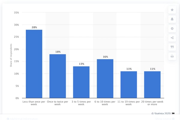
  • More than 51% of Australian Instagram users log on to the app at least three to five times a week. (Statista, 2018)

Most Australian Instagram users log on to the app at least once daily.

Image Source

  • Three regularly-trending Instagram hashtags in Australia are #photography, #Australia, and #Sydney, which have 450 million, 55 million, and 28 million posts associated with them, respectively. (Talkwalker, 2019)
  • 45% of Australian social media users have taken a selfie for platforms such as Instagram. Selfies posts are more common among men and 18 to 29-year-olds. (Yellow Sensis Social Media Report, 2018)
  • Roughly 40% of Australian social media users have posted a picture of food on channels such as Instagram. (Yellow Sensis Social Media Report, 2018)

Australian Business on Instagram

  • 22% of Australian SMBs have advertised on Instagram (Yellow Sensis Social Media Report, 2020)
  • 32% of Australian SMBs have an Instagram account, compared to 90% and 33% respectively on Facebook and LinkedIn. (Yellow Sensis Social Media Report, 2020)
  • Instagram influencers whose accounts were about yoga experienced 127% growth in overall Australian engagement in March 2020. (Statista, 2020)
  • Also in March 2020, hotel-related Instagram accounts experienced a 100% decrease in Australian engagement. (Statista, 2020)

Peak Engagement Times in Australian

  • When using Instagram in any global region, the best time to post to get local post engagements is 2 PM and 3 PM in your brand's timezone. (HubSpot, 2020)
  • The best day to post on Instagram in Australia is Thursday in the AEDT timezone. (ShareMyInsights, 2020)
  • Weekday posts on Instagram get more impressions from Australians than weekend posts. (ShareMyInsights, 2020)
  • When aiming for global post engagement, the best times to post on Instagram from Australia are 12 AM to 2 AM, 6 AM to 8 AM, and 9 PM to 10 PM AEDT. (ShareMyInsights, 2020)

Growing Australian Brand Awareness with Instagram

From looking at the data above, it's clear that Australian businesses can benefit from Instagram, which has a huge pool of users that will follow, engage with, and potentially purchase products from all sorts of brands on the platform.

But, simply creating an Instagram account and forgetting about it won't boost your brand awareness. To truly gain audience engagement, you'll want to create an active account with content that entertains users, grabs their attention, and educates them about your brand and your products.

If this list has inspired you to get ahead of the one-third of Australian SMBs missing out on Instagram, check out this guide or the free resource below for proven tips on building an effective Instagram strategy.


20 Stats About Australian Instagram Users & Trends was originally posted by Local Sign Company Irvine, Ca. https://goo.gl/4NmUQV https://goo.gl/bQ1zHR http://www.pearltrees.com/anaheimsigns
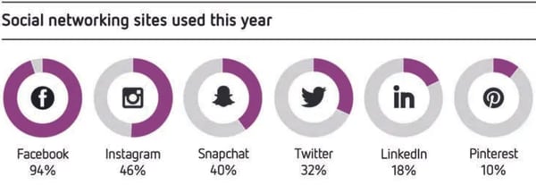
Thursday, October 15, 2020

7 Best Link Shorteners to Shorten that URL

Trying to convince people to click on a long, jumbled link is almost as bad as a door-to-door salesman trying to sell people financial services.

If your audience sees a link they perceive to be spammy in one of your social media posts, they’ll do the digital equivalent of slamming the door in your face -- scroll past it.

To avoid being perceived as spammy or sloppy when you have a legitimate link to share, check out our list of the seven best link shorteners that’ll clip your links into clean, consistent, and clickable URLs.

What are the benefits of using link shorteners?

Using link shorteners can benefit your brand in three main ways:

  1. When you post long links on social media, it can look like spam or deter users from clicking on something they don't recognize. In particular, adding tracking parameters to your links can result in URLs that look long and confusing to someone who's unfamiliar with typical link tracking practices. Link shorteners can prune spammy-looking links into clear and concise links.
  2. Many link shorteners also let you track each of your link’s performance and analytics, which can help you understand which pieces of content perform best on specific platforms.
  3. Every social media network limits the amount of characters you can include in your posts. Twitter and LinkedIn have the shortest character limits at 280 and 700 characters, respectively, so if you need to squeeze a link or an extra hashtag in one of your posts, link shorteners can help you stay within the limit.

1. Bit.ly

Bit.ly link shortener

Image Source

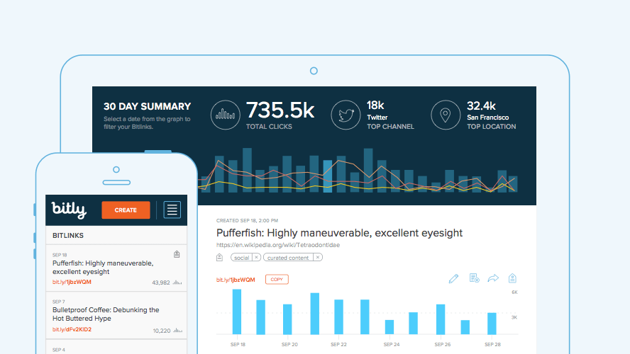
Bit.ly is a link shortener platform that features a comprehensive dashboard displaying your links’ performance metrics, such as click-through rates, channel stats, and geographic information of the people clicking on your links.

They also offer branded links and have integrations with social media management software, like Sprinklr, Sprout Social, Buffer, Hootsuite, and HubSpot to help you seamlessly distribute your shortened links through your social media profiles.

Bit.ly’s free account offers up to 1,000 unbranded links and link reporting for 30 days, which is ideal for small businesses. Their enterprise plan lets you brand 3,000+ links a month and provides all the data and metrics mentioned above, which is best for large businesses who want to brand and track every link in their marketing campaigns.

2. Bl.ink

BLink link shortener page

Image Source

As one of the more robust link shorteners out there, Bl.ink offers smart branded links that allow you to create custom links that contain relevant words and not just a random string of characters.

They also provide analytic reports that can track clicks by date, time, language, referrers, device, and location and integrate with web analytic tools like Google Analytics and Adobe.

Bl.ink offers six subscriptions tiers from a free to an enterprise plan. Starting at $12 per month, they price their plans based off the amount of links you’d like create and track.

3. Rebrand.ly

Rebrand.ly link shortener page

Image Source

Trusted by over 250,000 customers, Rebrand.ly is a link shortener platform that can brand your links, track their performance metrics, or integrate with over 50 other platforms to seamlessly distribute your links.

With three plans for individuals and two plans for teams, Rebrand.ly offers link shortening solutions for both small business and enterprise companies. For instance, their free plan offers 5,000 tracked clicks, 500 branded links, and 5 custom domain names, while their premium plan offers 1,500,000 tracked clicks, 150,000 branded links, and 20 custom domain names for $499 per month.

4. Ow.ly

Hootsuite's Ow.ly link shorterner page

Image Source

Developed by the social media management platform, Hootsuite, Ow.ly is a link shortener that’s included in every free Hootsuite account. With Ow.ly, you can distribute your links and track their performance metrics directly in the Hootsuite platform, which allows you to shorten every single link you post to all your social media profiles. Ow.ly is a great option for anyone who already uses Hootsuite as their social media management platform.

5. Buff.ly

Buffer's link shortening page

Image Source

Similar to Hootsuite’s link shortener tool, Buff.ly is integrated in Buffer, another social media management platform. With Buff.ly, you can shorten your links, customize them, distribute them to all your social media profiles, and track their performance metrics right in the Buffer platform. Buff.ly is perfect for anyone who uses Buffer as their social media management platform.

6. TinyURL

TinyURL is a free link shortening platform that's perfect for users who have one-off links they want to shorten.

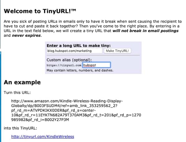
Using TinyURL is simple. All you have to do is go to TinyURL.com and follow the instructions. You can quickly fill in the link you want a short URL for, as well as a custom alias. If no one uses your alias, the link you will get will look something like "tinyurl.com/alias."

TinyURL Link shortening page

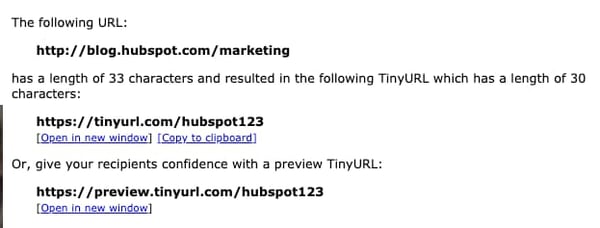
Once you fill in the URL information and press submit, you'll be shown three types of URLs: the long link, a generated short link, and a third that can serve as a web page's preview link. Here's an example:

TinyURL results page

7. Tiny.CC

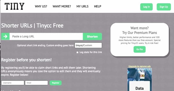
Tiny.CC is another free link shortener that allows you to create temporary short links by simply pasting your long link into a text box and pressing Shorten. Like TinyURL, you can also customize these links.

If you register or become a paid subscriber, you can have non-expiring links and edit URLs later. If you're a free user, the link will eventually expire and you cannot edit them once they're generated.

Tiny.CC homepage and link shortener

Navigating Link Shorteners

If you have to share a few ginormous links, there's no harm in shortening them because the process is quick and simple. Aside from being easier to look at, shortened links can also be helpful for print ads, physical signage, or places where you can't link to another site.

There are a handful of free or affordable link shortening websites out there. But you might be wondering which to choose. To help you, we'll leave you with two quick tips:

  • If you don't use an analytics software, like Google, you might want to use a link-shortener that includes basic stats, like page views.
  • On the other hand, if you want to customize your link, you'll also want a shortener that allows you to do that.

After you master shortening your URLs, you might also want to look into a similar process of creating QR codes. If so, check out this guide for tips and tricks.

Editor's note: This post was originally published in January 2019 and has been updated for comprehensiveness.


7 Best Link Shorteners to Shorten that URL was originally posted by Local Sign Company Irvine, Ca. https://goo.gl/4NmUQV https://goo.gl/bQ1zHR http://www.pearltrees.com/anaheimsigns
Google Cache: How to View Cached Pages

Cached pages is an undeniably useful tool when you come across a web page that is performing poorly, or temporarily down for some reason.

At its most basic, Google crawls web pages and then makes raw HTML copies of them -- a cached page. This can enable you to view a website that is slow or not responding, and it can also help SEO experts figure out indexation issues with a site.

What is a cached page?

A cached page is a backup of the raw HTML and content of a page taken at a single point in time to be stored on a server and retrieved later. 

For example, when Google crawls a web page, it will take a screenshot of that page and index the content for future reference. Additionally, Google will provide the date of the last time the page was indexed on the cache page, i.e. "This page is a snapshot of the page as it appeared on Feb 20, 2020".

If you've come across a page that isn't responding, or if you want to make sure your site is being properly indexed, keep reading to figure out how cached pages can help you solve both.

How to View Cached Pages

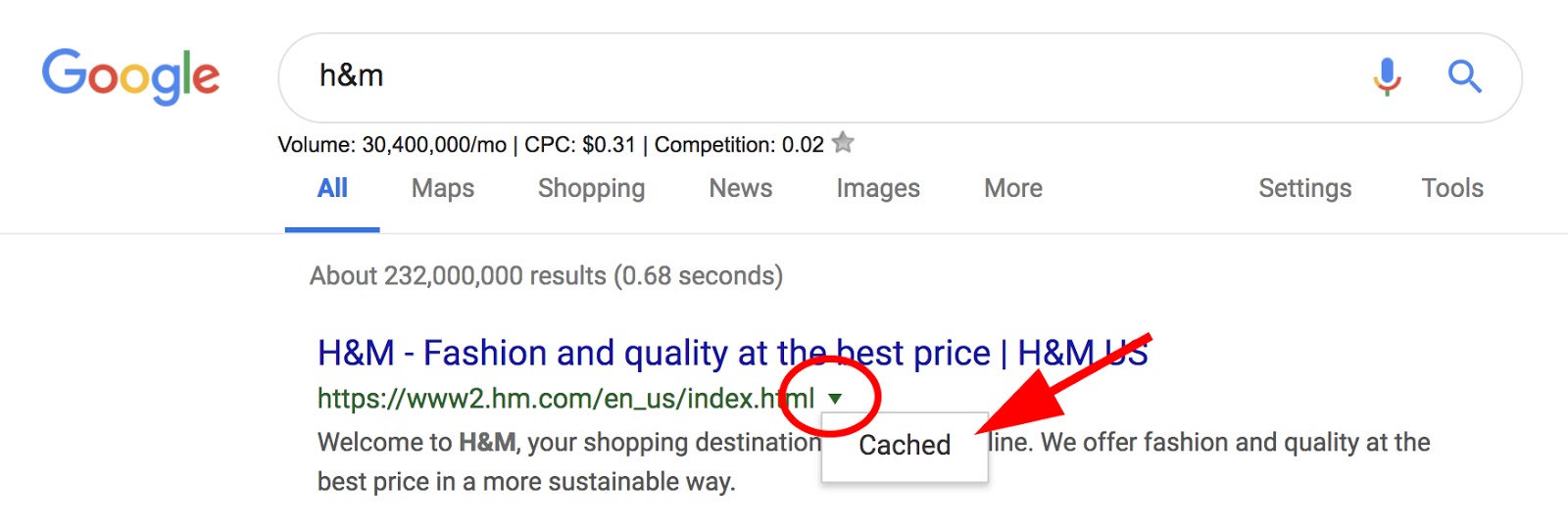
  1. In Google's search box, type the website or page you're trying to see.
  2. Beside the URL, click the down arrow.
  3. Select "Cached".
  4. You are now viewing the cached page.
  5. Alternatively, type the word "cache" in front of the web page's URL. i.e. "cache:https://examplesite.com".

1. In Google's search box, type the website or page you're trying to see. Beside the URL, click the down arrow. Select "Cached".

Cached dropdown underneath arrow next to SERP URL

2. You are now viewing the cached page.

Cached page with message at the top that reads: "This is Google's cache of [URL]. It is a snapshot of the page as it appeared on [Date]. The current page could have changed in the meantime."

2. Alternatively, type the word "cache" in front of the web page's URL. i.e. "cache:https://examplesite.com".

Google search query that reads: cache:https://ww2.hm.com/en_us/index.html


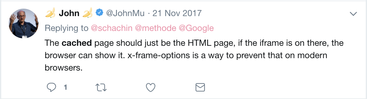
It's important to note, the cache is the part of the website written in plain HTML -- it doesn't also save JavaScript. Webmaster Trends Analyst at Google, John Mueller, verifies this, stating on his Twitter:

John Mueller's Tweet that reads: The cached page should just be the HTML page, if the iframe is on there, the browser can show it. x-frame-options is a way to prevent that on modern browsers.

JavaScript content is typically inaccessible from the cache, but that doesn't mean it wasn't indexed -- to check how a Google bot views your website, try using the Fetch and Render tool in Google Search Console instead.

Next, let's explore how you can use Google Cache for website optimization.

How to Use Google Cache

  1. Use Google Cache if you're on a web page that is slow or unresponsive.
  2. Use Google Cache to check when a particular page was last visited by a Googlebot.
  3. Check how your website is indexed online.

1. Use Google Cache if you're on a web page that is slow or unresponsive.

If you're trying to find information on a website but it seems the page is down (or just slow), you might try alternating to the Google Cache version. Of course, the page might not look aesthetically identical, but you'll be able to see the HTML from the last time a Googlebot crawled the page.

2. Use Google Cache to check when a particular page was last visited by a Googlebot.

If you want to know the last time a Googlebot visited a certain page, but don't have access to server logs, you can now see when the page was last visited by checking out the Cache version of the page. It can be helpful to see the last time the page was successfully fetched by a bot -- if you've made changes that make the page unresponsive, you might need to know which changes you need to un-do.

3. Check how your website is indexed online.

You might be curious to see whether your website is cached online. If it's not cached, there are a few potential reasons -- first, you'll want to check there is no content="noarchive" attribute in the source code of the page. If the page is non-indexable or blocked from crawling, it won't be cached. Alternatively, if a page is new, it might take a little while for the cache to become available.

If it's not able to be cached, it's still visible online. But if you want your site viewers to have the option of viewing it in a cache-version if your site is slow or unresponsive, you might consider digging deeper to figure out what the problem is.

Editor's note: This post was originally published in February 2019 and has been updated for comprehensiveness.


Google Cache: How to View Cached Pages was originally posted by Local Sign Company Irvine, Ca. https://goo.gl/4NmUQV https://goo.gl/bQ1zHR http://www.pearltrees.com/anaheimsigns

9 Quick Ways to Reduce Page Loading Speed

When it comes to your site's performance, page speed is of the utmost importance.

However, unless you understand how this metric works — and, more specifically, the factors that influence it — you may find it difficult to improve.

To reduce your bounce rate and increase visitor engagement, it's essential that your web pages load quickly and seamlessly.

A site that is optimized for speed not only enhances the user experience (UX) but can also help to boost your search engine rankings.

In this article, we'll explain what page speed is, why it's important, and how to measure it. Then we'll provide you with nine quick solutions you can use to reduce page loading speed.

Let's get started!

What is page speed?

In a nutshell, page speed refers to how quickly your content loads when someone visits a page on your site. Not to be confused with website speed, page speed represents the loading time of a specific page.

There are a variety of factors that can influence page speed. Some of the most important include:

  • How many images, videos, and other media files are contained on the page
  • What themes and plugins are installed on your site
  • Your site's (and the specific page's) coding and server-side scripts

All of these elements affect your page loading speed and in turn your website's UX. After all, visitors dislike slow-loading pages and are more likely to click away from them.

Why is page speed important?

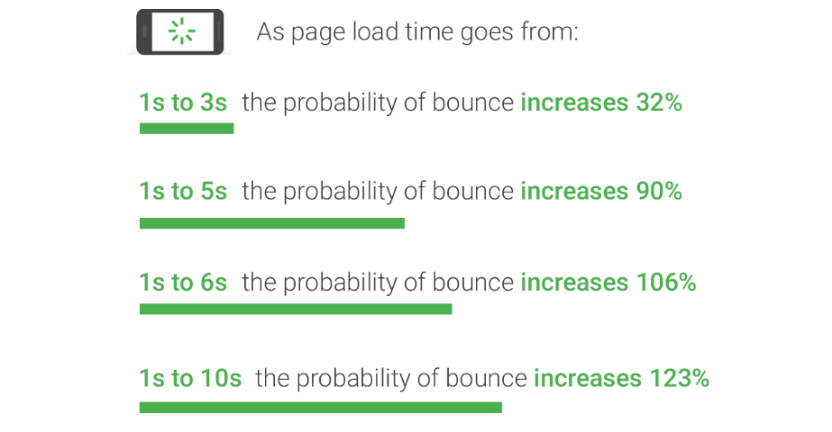
When it comes to page loading speed, every second counts. In fact, Google research shows that when loading times increase from one to three seconds, the probability of a bounce (the visitor leaving right away) increases by 32 percent.

If the page takes five seconds to load, the probability of a bounce rises by 90 percent:


Image Source

In other words, if your pages don't load within a few seconds, it significantly increases the chance that visitors will leave your site. Additionally, if your web pages are sluggish, that can hurt your ability to drive engagement and conversions.

Page speed also plays a pivotal role in Search Engine Optimization (SEO). Google takes a wide variety of factors into consideration when deciding how to rank web pages.

However, speed is an important ranking signal for both desktop and mobile searches.

Another reason page speed matters is because it can influence consumers' perception of your brand. If your web pages take too long to load or anything goes wrong during the process, it can make you look unprofessional, and your website unreliable.

If you want to run a highly-effective website, therefore, it's necessary to focus on optimizing page speed. The first step in doing that is figuring out how your pages are currently performing.

How to Measure Page Speed

Before making any changes to your site, you'll need to gauge your web pages' performance. There are various tools you can use to test and measure page speed. Two popular solutions are Pingdom Website Speed Test and GTmetrix, which are both beginner-friendly options.

However, we recommend starting with Google PageSpeed Insights. This is an easy-to-use tool that enables you to measure and test the speed of your web pages on both desktop and mobile devices.

Plus, as a Google-supported tool, it can help you make sure you're hitting the performance benchmarks required for high search result placements.

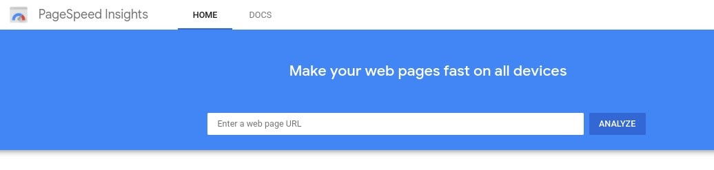
To use PageSpeed Insights, simply enter the URL of the web page you want to test into the text field, and select the Analyze button:

Google PageSpeed Insights.

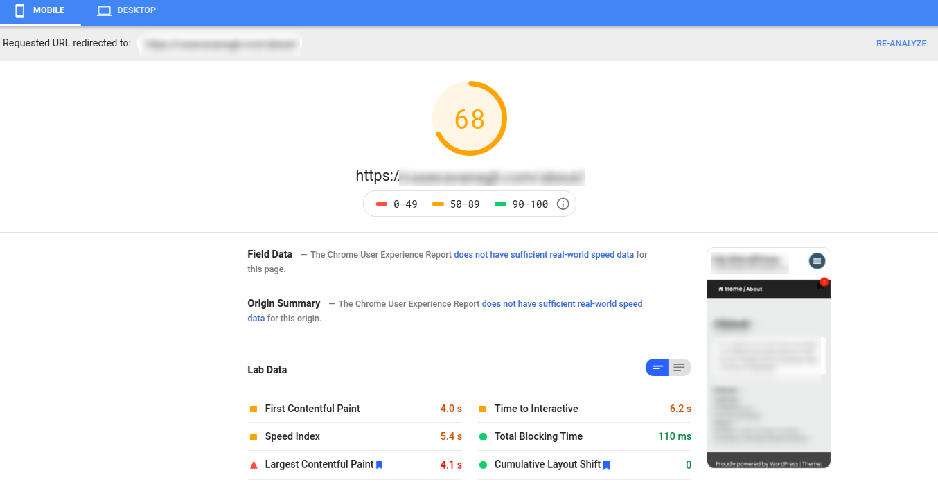
PageSpeed Insights will then analyze the content on your page, and score it on a scale of 0 to 100. Below your score, you'll find a list of suggestions on ways you can reduce page loading speed:

Suggestions for improving performance.

It's worth noting that you'll get a separate score and list of suggestions for both the desktop and mobile versions of your site.

This information gives you a solid starting point for gauging how fast your web pages are, and offers tangible actions you can take to improve page loading speeds.

9 Quick Ways to Reduce Page Loading Speed

Now that you understand the importance of page speed and how to test your site's performance, it's time to work on improving this key metric.

With that in mind, let's take a look at nine easy ways to make your pages load faster.

1. Choose a performance-optimized hosting solution.

The hosting provider you use plays a major role in your website's management and performance. That includes its page speeds.

One of the worst mistakes you can make is settling for mediocre hosting in order to get a lower monthly rate.

Cheap hosting often translates to poor performance. It can mean sharing resources between multiple websites on an overloaded server, which can end up straining your page loading times.

On the other hand, there are a handful of performance-focused hosting solutions you can use that provide a powerful platform designed for speed. Usually, these providers don't offer shared hosting, which means you'll never have to worry about other websites draining your pool of potential resources.

2. Compress and optimize your images.

Images help enhance the appearance of your web pages and increase the quality of your content. However, large images can also delay loading times.

Therefore, one of the easiest ways to reduce page loading speeds is to compress and optimize your images. This can include changing their file formats, enabling lazy loading, and compressing images through lossy or lossless compression.

By reducing your images' file sizes, you can reduce their ‘weight', ultimately helping your pages load more quickly. There are a variety of image optimization plugins you can use for this purpose, such as WP Smush.

After you install and activate this plugin, it will automatically resize and compress your images without affecting their quality. It includes features for lossless compression, lazy loading, and even optimizing images in bulk.

If you're not using WordPress as your CMS, you might want to try with tinypng.com, which can reduce your image sizes anywhere from 25% to 80%, and a free website app called Squoosh.

3. Reduce your redirects.

Too many redirects on your website can really hurt loading times. Every time a page redirects somewhere else, it prolongs the HTTP request and response process.

Of course, in some cases redirects may be necessary, such as when you're moving to a new domain. However, eliminating unnecessary redirects on your site can result in significantly lower page loading times.

There are a few different ways to reduce redirects in WordPress. One is to avoid creating unnecessary ones when building internal links and menus. Another is making sure your Top-Level Domain (TLD) resolves with a maximum of one redirection.

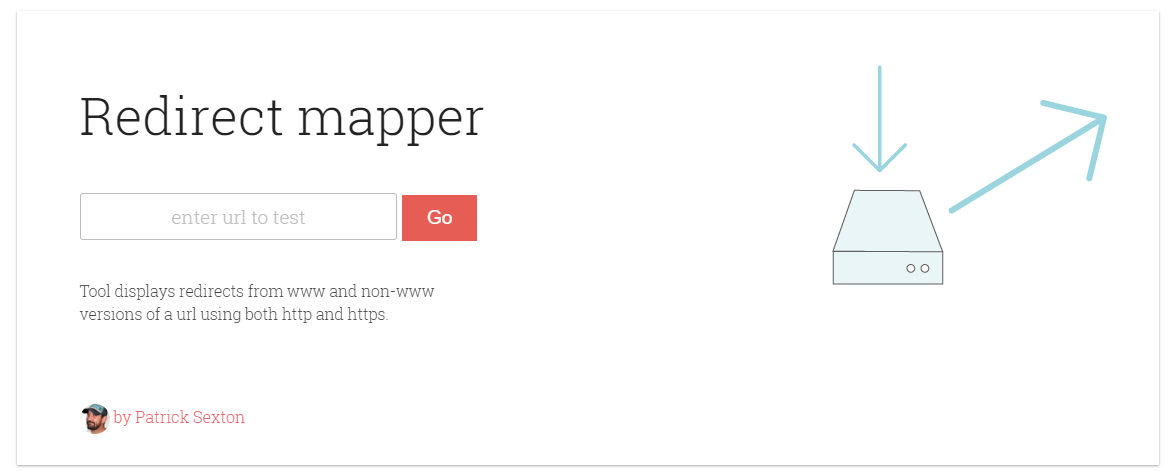
If you need help identifying redirects that are incorrectly set up on your site, you can use the Patrick Sexton Redirect mapper tool:

The Patrick Sexton Redirect mapper tool.

This will uncover any duplicate redirects. You can also use a tool such as Screaming Frog to identify all the redirects on your site and where they lead to. This should make it easier to identify redirects that aren't serving a purpose. Then you can delete the ones you don't need via your site's .htaccess file.

4. Cache your web pages.

Caching is one of the most effective ways to speed up your web pages. Caching stores copies of your site's files, minimizing the work needed for the server to generate and serve a web page to a visitor's browser.

Caching your web pages can help with lowering Time to First Byte (TTFB), by requiring the server to use fewer resources to load a page.

There are various ways to cache your web pages. You can do this at the server level, meaning that your host handles it for you.

Another option is to use a caching plugin such as W3 Total Cache, which is a free WordPress plugin that makes caching your web pages quick and easy. After you install and activate it, simply navigate to General Settings > Page Cache and select the Enable option.

5. Enable browser caching.

Browser caching is another form of caching you can leverage to reduce page loading speeds. This technique enables the browser to store a variety of information, including stylesheets, images, and JavaScript files, so it doesn't have to reload the entire page every time a user visits it.

Similar to W3 Total Cache, WP Rocket is a powerful caching plugin you can use on your WordPress site. It employs page caching and cache pre-loading to optimize the speed of your pages, and create lightning-fast loading times. WP Rocket is a premium plugin, with a variety of pricing plans to choose from.

6. Use asynchronous and defer loading for your CSS and JavaScript files.

Your site is made up of CSS and JavaScript files. These scripts can load either synchronously or asynchronously.

Synchronously means that the files load one at a time, in the order in which they appear on your web page.

With this method, when the browser encounters a script, it will stop loading other elements on the page until that file has been fully loaded first.

Conversely, asynchronous loading enables multiple files to load at the same time, which can speed up the page's performance. Setting this up involves eliminating render-blocking resources.

If you're using WordPress, you could either use a combination of the Autoptimize and Async JavaScript plugins to take care of this task easily.

7. Minify CSS, JavaScript, and HTML.

Optimizing the way your files load can help reduce page loading speed. Similarly, so can minifying your CSS, JavaScript, and HTML code. This means removing unnecessary spaces, characters, comments, and other unneeded elements to reduce the size of the files.

Decreasing your files' sizes also makes it easier to combine them. The result is cleaner code, and leaner web pages that load faster.

Of course, combing through every line of code for each of your site's files isn't exactly efficient.

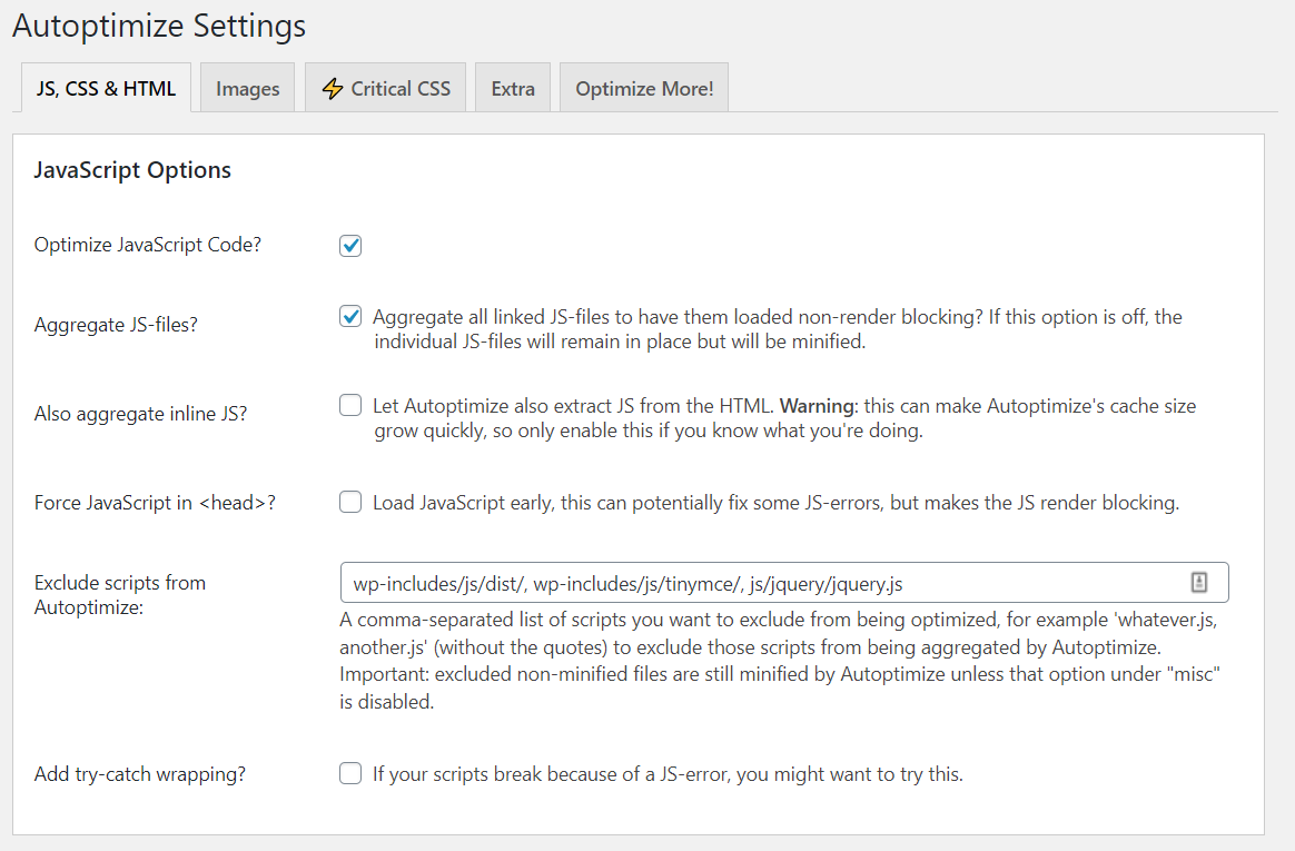
Instead, you can minify your CSS, JavaScript, and HTML with a free plugin: Autoptimize instead. This popular plugin makes it easy to aggregate and minify your scripts and styles automatically:

The Autoptimize WordPress plugin's settings.

Considering the wide variety of features and settings it offers, configuring this plugin can be a bit overwhelming at first. To make your job easier, feel free to check out this guide on how to set up Autoptimize on your website.

8. Leverage a content delivery network (CDN).

A Content Delivery Network (CDN), also referred to as a ‘content distribution network', is a network of servers that can help reduce page loading speed. It does this by hosting and delivering copies of your site's static content from servers located across the globe.

A CDN works with, rather than in place of, your host. In addition to the server that hosts your primary website, you can leverage a CDN to distribute copies of your site's files among strategically-chosen data centers.

This can maximize performance, by reducing the distance data requests have to travel between browsers and your host's servers. By loading the content for a web page from a server close to each visitor, a CDN helps reduce network latency and produce lower TTFBs.

You have a variety of CDN options to choose from, one of which is opting for a host that provides a CDN you can enable it directly from your own dashboard.

9. Eliminate unnecessary plugins.

Not all plugins are created equal. Having too many plugins on your site can cause unnecessary bloat that slows it down.

Additionally, plugins that are outdated or aren't well maintained can pose a security threat, and even introduce compatibility issues that hamper performance.

Therefore, it's a smart idea to minimize the number of plugins you use on your WordPress site. Of course, one of the easiest ways to do this is by disabling and deleting any plugins you don't currently use.

We also recommend reviewing the plugins you have installed, to evaluate whether they're actually necessary. There might be some tools that have overlapping functionalities and features, and others that are simply no longer relevant to your needs.

Finally, certain plugins may slow your site down more than others. To identify any plugins that are reducing your page speeds, you can try testing them individually.

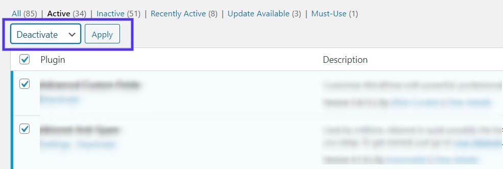
First, deactivate all of your plugins (it's safest to do this on a staging site):

Deactivating WordPress plugins.

Then turn them back on one by one. Each time you activate a plugin, use a speed testing tool such as PageSpeed Insights to see if your score and timings have been affected.

Many plugins might increase your page speeds by a small margin. However, if you see a sudden large increase, it may be time to find an alternative tool that serves the same purpose (but is better optimized).

Ultimately, reducing page loading speed improves not only the overall performance and UX of your website but its SEO as well. Luckily for you, there are a variety of methods you can use to decrease your loading times.

In addition to leveraging a CDN and caching your pages, you can use plugins to optimize your images, defer loading scripts, and minify your site's files.

Using a hosting solution optimized for performance can also have a major influence on your site's speed.

Remember, though — every second your web pages take to load drastically increases the chance your visitors will leave. How long will you able to run your business while losing leads?


9 Quick Ways to Reduce Page Loading Speed was originally posted by Local Sign Company Irvine, Ca. https://goo.gl/4NmUQV https://goo.gl/bQ1zHR http://www.pearltrees.com/anaheimsigns
How to Get the Most out of Your Ecommerce Marketing Strategy

What do a Hand Forged 1060 High Carbon Black Steel Blade Full Tang Samurai Katana Sword and a 7,541-Piece Lego Millennium Falcon™ Replica have in common?

First and foremost, they're both awesome.

Second, if you have kids under the age of three, you probably don't want them playing with either — one is a choking hazard and one is a katana.

Third, you can buy both through the magic of something called ecommerce — a.k.a. the sale of products or services online. Ecommerce is a business staple for companies across virtually every industry.

Here, we'll examine some ecommerce marketing strategies your business can employ to land and retain as many customers as possible.

Ecommerce Marketing Plan

Your ecommerce marketing plan is essentially the sum of the ecommerce strategies and tactics you choose to implement. The most effective plans aren't randomly cobbled together — they're designed with intention. They're often guided by a general marketing philosophy or underlying structure.

For instance, the inbound methodology can be applied to an overarching ecommerce marketing plan. In this case, you would tailor your ecommerce marketing efforts to attract visitors, convert those visitors into leads, close deals and turn them into customers, and delight them once they've purchased your products or services to turn them into promoters.

There are a number of different strategies to consider when constructing your plan. Here are some of the most effective options worth exploring.

1. Blog.

Maintaining a blog is one of the better ways to attract potential customers to your site organically. By creating quality content relevant to your industry, you can project a sense of legitimacy and trustworthiness to prospects.

If you give strangers an incentive to visit your site through your content — beyond material specific to your product or service — you generate interest that might ultimately turn into action. Regardless of what you're selling, maintaining a blog for your site is a cost-effective way to prove that your business is an authority in its space

2. Contribute guest posts to other websites.

Guest posts have the potential to expand your online visibility. Not only can it better establish you as an authority within your industry, contributing guest posts affords you more domain authority for your ecommerce site — leading search engines to believe your site is more reliable and worth ranking higher.

You can accomplish this by identifying sites with keywords relevant to your products and reaching out to the people behind them. Sometimes, you won't even need to create a post of your own. You might be able to just expand upon one of a site's current posts with relevant context or an infographic that links back to your site.

3. Try referral marketing programs.

Referral marketing combines two of the most powerful underlying assets to any ecommerce marketing strategy — word of mouth and incentives. A solid ecommerce referral program allows customers to relay your messaging to prospects who trust their judgment.

Research indicates that word of mouth is directly responsible for 19% of all purchases and influences as much as 90% of them. So a significant part of your ecommerce marketing strategy has to be tapping into that trend. Referral marketing is one way to do that.

By offering some sort of incentive — like a discount or small gift — to your customers in exchange for their referral of new prospects, you're putting yourself in a position to retain current customers while expanding your base.

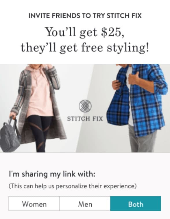
Here's an example of a referral program from Stitchfix.

Ecommerce marketing strategy referral marketing

Source

For more information on referral marketing, check out this article.

4. Leverage social media.

A well-maintained social media presence is an invaluable component to a successful ecommerce marketing strategy. That being said, ecommerce marketing over social media might not look like marketing for a conventional business, brand, contractor, or publisher. And not every social media platform is optimal for ecommerce.

Ecommerce is an inherently visual medium. Very few consumers are willing to buy a product based solely on text. The success of your social media efforts often hinges your use of imagery to capture attention and generate traffic to your product pages. That makes Instagram one of the better platforms to complement your ecommerce marketing strategy.

If possible, you should consider incorporating shoppable content — interactive content that allows your visitors to buy immediately — into your ecommerce marketing strategy. That can mean anything from strategically placing display ads within a social feed to adding additional tags that take users directly to a shopping cart.

ecommerce marketing strategy social media

Source

5. Drive user-generated content.

Driving user-generated content is the practice of finding and fostering ways for your customers to promote your business. It's an excellent way to facilitate word of mouth for your company. It drives traffic to your ecommerce site while building an authentic following of interested customers.

User-generated content can come in many forms. One of the most effective ways to encourage it is through competitions — offering prizes to customers that promote your product in some form. You could also use promotional hashtags on social media or maintain review platforms where customers can share feedback about your product.

One way or another, getting your customers to actively promote your product on their own provides a new degree of trustworthiness and a relatively inexpensive source of potential traffic to your site.

For instance, Starbucks launched its #WhiteCupContest campaign in 2014. Customers were encouraged to draw whatever they felt like on the chain's white cups. The winners' designs would be used as limited edition templates for Starbucks' cup design. In just three weeks, the company received over 4,000 submissions — generating plenty of buzz and free promotion.

ecommerce marketing strategy user-generated content

Source

If your business has any sort of ecommerce presence, you stand to gain a lot by exploring and employing different ecommerce marketing strategies. Many of the available options can be as cost-effective as they are valuable.

No matter how you choose to structure your ecommerce marketing plan, make sure it's dynamic, multifaceted, and well-maintained. Putting one of these plans in motion will take some effort, but if done correctly, that effort will pay off in spades.

Editor's note: This post was originally published in April 2020 and has been updated for comprehensiveness.


How to Get the Most out of Your Ecommerce Marketing Strategy was originally posted by Local Sign Company Irvine, Ca. https://goo.gl/4NmUQV https://goo.gl/bQ1zHR http://www.pearltrees.com/anaheimsigns

How to Design Your Ecommerce Site for More Conversions

To increase conversion rates on your ecommerce website, no part of the customer journey can be overlooked. From your landing page to your checkout page, every aspect of your ecommerce website needs to be carefully designed.

But cultivating a user journey that successfully balances an enjoyable shopping experience with a clear path to conversion is easier said than done.

To help you design a more delightful and intentional conversion path on your ecommerce website, we've put together a list of some best practices to follow. 

10 Ways to Design Your Ecommerce Website for More Conversions

When designing your ecommerce website, consider the following tips to enhance its user experience for your visitors and customers. 

1. Add clear CTAs.

Having a clear call-to-action (CTA) is essential to convert website traffic into sales.

Ecommerce website CTAs are often "Buy Now" or "Add to Basket" buttons that stand out on a web page to grab the attention of visitors and encourage them to click. This is typically done by using contrasting colors and unique design elements, among other tactics. And like the examples mentioned above, the wording in the CTA should be kept short and sweet.

In addition, make sure your CTA is aligned with the intent of the web page it's located on. For example, the CTA on your product page may read "Buy Now" whereas the CTA on a content page may be"Read More."

2. Create a sense of urgency.

Consider creating a sense of urgency on your ecommerce site. One CXL study found that, by creating a sense of urgency on an ecommerce site, conversation rates were increased by over 330%.

This can be done simply by changing the way you word your CTAs — for example, changing the CTA from "Shop Here" to "Shop Now" may give your visitor the nudge they need to convert.

3. Offer simple, one-click checkout for all customers.

By adopting a one-click checkout process, customers can skip the "add to cart" step and check out quickly and efficiently while still on the product page. In fact, by doing this, one-click checkout can shorten the checkout process by 90%.

This is important because by eliminating extra steps required in a traditional checkout process, cart abandonment is less likely due to the streamlined and simple process.

Even if you choose not to implement a one-click checkout, streamline your site's checkout process as much as possible to boost conversions and lower cart abandonment. You may do this by requiring the very minimum data input from your customers to make the process efficient for them. 

4. Add green-bar SSL.

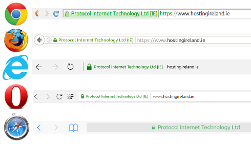
It has been found that shopping cart abandonment may decrease if you display the green-bar SSL on your website. Here is what this looks like on different search engines:

greenbar ssl

The greenbar SSL helps convey a trustworthy and reputable website — it's not only a visual cue to customers but it also plays an important role in the security of your site as well.

Having a greenbar SSL encrypts the visitor’s payment information, which makes it harder for hackers and scam artists to steal their information. Simply put, users do not want to purchase from an unsecure website.

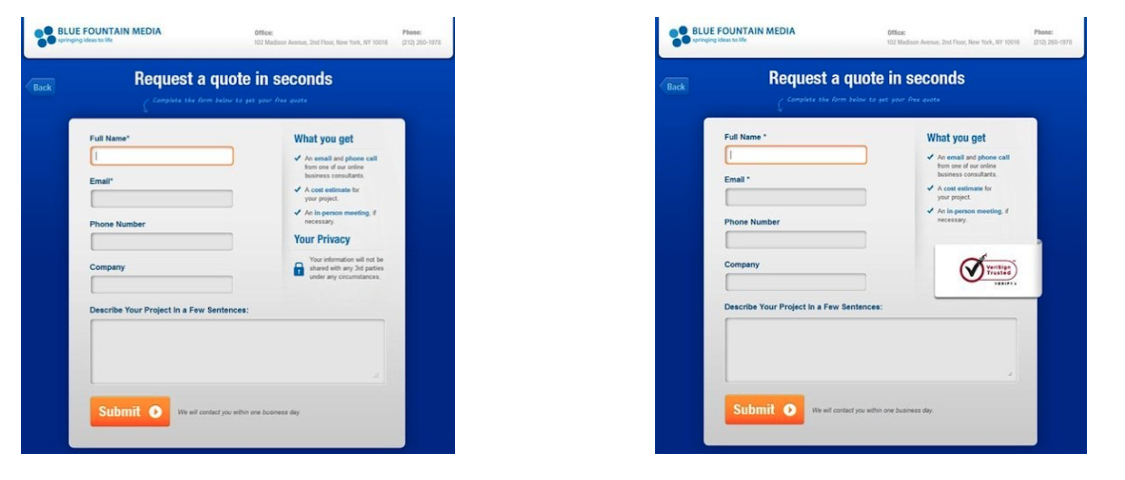
In a test, two forms were created for customers to complete — one without a Verisign seal and the another with it.

greenbar ssl and trustworthy websites

There was a 42% increase in conversions on the form containing the Verisign seal, demonstrating that visitors are more inclined to share personal data and convert when they are confident that it is secure.

5. Offer different payment methods.

There are hundreds of different ways to pay online that aren't reliant on a card, including direct debit, bank transfers, digital wallets, e-invoices, digital currencies (like Bitcoin), and many more.

Although it is impossible to offer 100+ payment methods on your website, it is important that you understand your target market and are able to offer payment methods best suited for them.

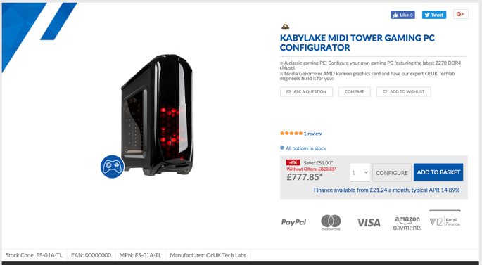
For example, a website where the average spend is $50 may benefit from offering mainly credit and debit card-style payments, whereas a website such as overclockers.co.uk may want to push a financing option as the value of the products being sold is significantly higher.

Try to provide the top three payment methods in your sector — doing so has resulted in an increase in conversion rates of 30% for businesses.

Overclockers does a great job of this by showing all their available options to buy in the product description, and near the CTA.

overclockers example of offering different payment methods

6. Incorporate product or company reviews.

Reviews are one of the most powerful tools to convert any interest in your product to a sale — potential customers want to hear from other buyers like them.

Add customer reviews directly next to or below your products to demonstrate your trustworthiness. Customer recommendations drive purchasing decisions as customers tend to believe the reviews from customers they relate to. To do this, give customers opportunities to provide instant feedback on the quality of your product or service.

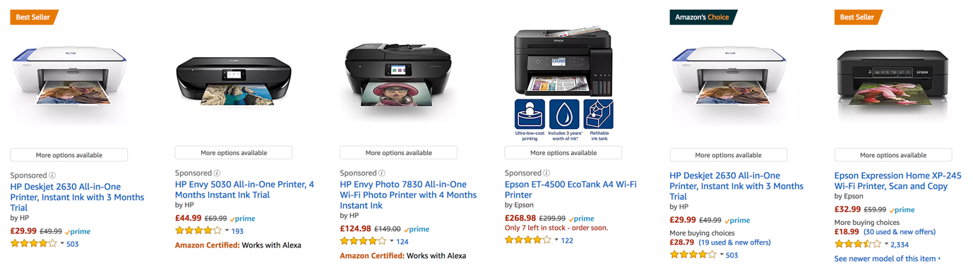
Amazon manages their customer reviews well — in fact, one of the first things you see when searching for any product is a list of customer reviews.

amazon example of customer reviews next to products

7. Add well-selected imagery.

Excellent imagery of the product or service you are selling is pivotal when trying to boost conversions online — as the old saying goes, "a picture is worth a 1000 words." 

Ensure you have high-quality photos of your product, covering all angles and details. This gives the buyer confidence in what the product is, its quality, and what they are to expect when they receive it.

On the other hand, if you have low-quality pictures without a zoom function and a lack of detail, you'll leave your potential customers feeling anxious and wondering what you have to hide. 

Truthfully, only a fraction of your site visitors actually go through the entire page and read it word for word — meaning your images can make an impact on a customer's understanding of your brand and product.

8. Optimize your website for mobile. 

Mobile accounts for approximately half of web traffic worldwide. With this in mind, it's essential that your ecommerce site is mobile-friendly.

Having a simple checkout process is even more important on mobile than it is on desktop. Users are working with a significantly smaller screen, so the less distractions the better. Keep it simple.

It's also important to remember the unreliable nature of phone data. With phone signal dropping in a split second, reducing a user's download speed (to a snail’s pace!), it's imperative that your site is mobile-optimized. This will allow for fast load times, even when on a slow internet connection. Simple steps like this can make the difference between a customer converting on mobile or visiting a competitor's site.

9. Write concise and effective product descriptions.

Product descriptions are a key tool in your ecommerce selling arsenal. Without effective product descriptions, you're bound to miss out on clicks and purchases.

Focus on your ideal buyer and target them with words and descriptions of your products that relate to them, their goals, and their challenges. This will give customers the feeling that you understand who they are and what they need from you — which, ultimately, makes them feel more confident in choosing to do business with you.

Above all, the most important factor to consider when writing your product descriptions is to keep them concise. As we mentioned earlier, users will skim anything longer than a few lines. If you do have a large amount of information that you need to convey to your customer, you might consider hiding it behind a "read more" button or cutting it down in easy-to-digest bullet points or even incorporating an infographic.

10. Design a simplistic layout.

Creating an easy-to-follow and cohesive journey from homepage to checkout is one of the most important factors when lowering your bounce rate and boosting conversion rate.

A study shows that websites that have a clean look (meaning, more white space, bigger images, and less text) see significantly higher user engagement rates than websites that do not.

While it might seem daunting to think about redesigning your ecommerce site to be more minimalistic, it is actually relatively straightforward if you follow a few simple rules:

  1. Focus on product imagery with fewer design elements and distractions on product pages.
  2. Direct your customers to your CTA buttons and make sure they stand out.
  3. Test your website on different devices to ensure the shopping and checkout processes are streamlined no matter how customers are visiting your site. 
  4. Stay away from creating any distractions on your site — less is more. Typically, if the page works without something, then you can lose it. 
Editor's note: This post was originally published in September 2018 and has been updated for comprehensiveness.

How to Design Your Ecommerce Site for More Conversions was originally posted by Local Sign Company Irvine, Ca. https://goo.gl/4NmUQV https://goo.gl/bQ1zHR http://www.pearltrees.com/anaheimsigns