Tuesday, September 22, 2020

What are Mini Apps & Why Marketers Should Care

With apps continuing to grow as a vital staple of everyday life, marketers continue to ask, "Do I need to have an app for my business?"

Luckily, unless your small business' product is an app -- or you have a skilled staff of developers, you probably don't need to spend tons of time and money building one just yet. Brainstorming, developing, launching, and promoting an app is a lot of work for a small company. In that same amount of time, you can launch a mobile-optimized website or mobile email strategy that could earn you solid awareness and ROI.

But, if you're a marketer at a digital startup, agency, or tech firm that thinks an app might be helpful for business, a more affordable development option could be on the horizon.

In 2020, some tech companies are starting to invest in "mini-apps." And, as these programs expand, there might be room for companies to test the waters with a more compact app experience.

Mini-apps became a commodity on large-scale Chinese social media platforms as recently as 2017. During this year, WeChat's founding company, Tencent, announced the launch of WeChat Mini Programs.

After showing success on apps like WeChat, miniature app-like experiences recently caught the attention of Western tech firms like Apple and Snapchat. These companies have begun to build out and launch similar programs to WeChat.

But what exactly do these apps look like, and how do they benefit the brands that launched them? Below, I'll highlight a few major mini-program platforms and give you a look at what these mobile experiences look like for brands.

Early Mini-App Platforms

WeChat Mini Programs

A 2017 report from TechCrunch described Mini-Programs as basic app experiences that could be accessed via WeChat. Although tech journalists describe these as mini-apps, Tencent could not label them as "apps" because they worried about infringing upon Apple and Google trademarks.

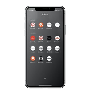
To give you a visual perspective of how Mini-Programs look on WeChat, here's a screenshot of what users see when accessing them. Although the text is in Chinese, the app's native language, you can tell the programs are all sponsored by other companies:

WeChat mini-app homescreen

Image Source

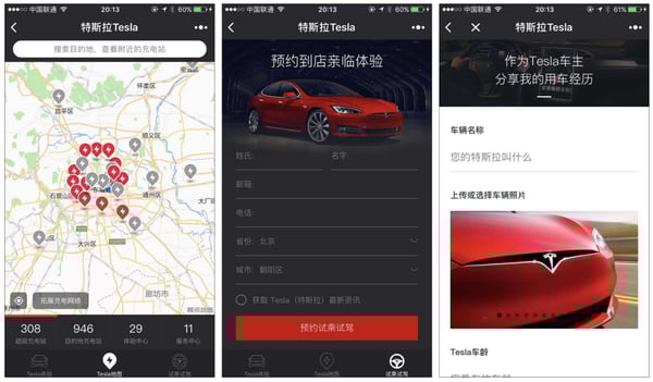
When you tap on a Mini-Program, such as Tesla's, you'll stay on the WeChat app, but enter a new experience within it. With Tesla's basic program, you can find charging stations for your car, or schedule test drives:

Tesla Mini-app on WeChat

Image Source

For users, a mini-program like Tesla's gives them the ability to connect with friends on WeChat, while learning about Tesla in the same session. Meanwhile, Tesla's content spreads awareness about its business to possible audiences or buyers who use WeChat.

At this point, the WeChat Mini Program is only available for the app's original Chinese version, Weixin. However, if a marketer is trying to grow awareness on this platform, they can apply for a Mini Program account. Mini-program app creators will require a developer to create the experience. According to a WALKTHECHAT review of mini-programs, this aspect can be somewhat tricky:

"Mini-programs have to be developed in a specific 'language' (a JavaScript framework developed by Tencent). Developers have to write WXML, WXSS instead of traditional HTML and CSS, and leverage this framework for all their development," the 2019 post noted.

Snap Minis

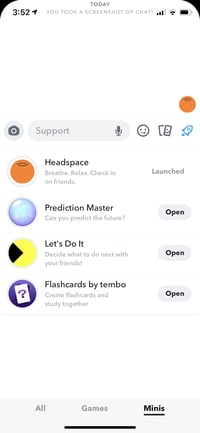
Snap Minis, announced in 2020, are miniature branded experiences within the Snapchat app. To access Snap Minis, a user opens a chat with a friend or group. Then they'll click on the spaceship icon, which reveals a number of searchable mini-programs. These include a number of different branded experiences from games, to scheduling tools, to meditation applets.

Mini app experiences in the Snapchat mini program

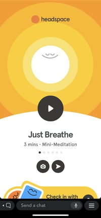
When users click on a miniature program, such as Headspace, they can interact with it in basic ways, such as playing daily meditations. You can also share in-app experiences, such as the meditations you listened to or a score on a gaming app, with your Snapchat contacts.

Headspace mini experience within Snapchat

While Tesla's WeChat Mini-Program spreads awareness of the car brand and its physical store locations, Snap's Minis take things a step further as they offer content that audiences can share with others, rather than just interacting with it. This is a great option for tech marketers or digital brands that want people in the Snapchat demographic to actively share branded content with others in their community.

According to Snapchat, some development work is required before launching a Mini on its platform, but it is unclear if Snap or the partnering company will do most of the app development. Snap does note that Minis are easy-to-use build with HTML5 code.

At this point, brands interested must apply for early access to the Minis program. In the Snap application, businesses must include their contact information and explain what they'd like the Mini to be used for.

Apple App Clips

At this point, Apple Clips will still be inaccessible for brands that can't make their own Apple App Store app. However, they are still an interesting example of mini-apps that are worth noting, especially if your brand does have an app.

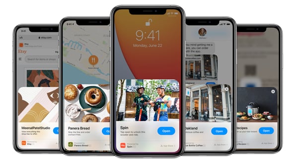
Apple App Clips, which launched with iPhone IOS 10.14 update in 2020, are small features of a larger app that's currently available in the App Store. Users can access App Clips by scanning QR codes, walking near an App Clip business with an NFC tag, visiting the brand's website, or clicking on a specially designed link, but users can also find them when using other apps, such as Apple's Messenger or Maps apps.

Apple App clips mini app program

Image Source

When someone is discussing or searching for something related to a business that has an Apple App Clip, a call-to-action will pop up allowing a user to "Open" the Clip without downloading a full app. From there, a user can then take advantage of one of the app's basic features.

For example, if two friends are talking about a restaurant chain that has an app via text message, an App Clip CTA might pop up encouraging them to open the restaurant's Clip to see a menu. When the user enters the Clip experience, they can do a small task, such as scanning the menu or making a reservation. Users can also click a CTA in the App Clip to download the full program from the App Store.

While companies who can't easily create an app probably won't benefit from App Clips, digital startups and tech companies should keep on their radar. Along with literally allowing people to test out an app before they download it, the App Clip CTA options allow people to get notified about a brand's app when they walk near its store, are messaging friends about products the brand offers, or while searching local businesses on Maps. This enables app promotions to literally meet audiences where they are.

Mini-App Takeaways for Marketers

Although some mini-app programs, such as Apple and Snapchat's are more exclusive and less accessible to smaller brands right now, they could be a helpful marketing tool for more companies in the future. Here's what marketers should keep in mind as mini-app programs grow and expand.

1. Brands that embrace digital transformation will get better "mini" opportunities.

First of all, your brand will likely need to offer a digital tool or store that will improve another major app's experience. For example, Tesla's website already allowed you to look up car charging stations and schedule test drives, so turning this into a mini-app experience would be much easier for developers.

Additionally, some of WeChat's audiences had an interest in technologies, cars, and Tesla's, which offered a business case for creating this experience. While audiences are zoning in on Tesla's offerings, they are still spending time on the WeChat app.

Because you'll need a strong digital presence and online business capabilities, mini-apps might not be possible for many small businesses yet -- especially in the U.S. where they are just now being embraced. However, as the world becomes more connected to apps, this strategy could become more accessible to you later on.

2. Big apps will only host mutually beneficial mini-apps.

Think of mini-apps like a website integration or a brand partnership project. A major brand likely wouldn't have an integration with a competitor's tool or partner with a business that doesn't target similar audiences. In the mini-app space, the thinking might be similar.

Ultimately, big app brands will opt to host mini-programs that spread awareness to businesses with similar audiences and offer digital experiences that keep users on their main app longer. This is likely why companies such as Snapchat and WeChat require brands to apply for their mini-programs, rather than just allowing them to buy space for a mini-app.

3. Brands will still need to do groundwork in creating mini-apps.

In some cases, you might not need your own in-house developer to have a mini-app. In WeChat's case, the company offers a mini-program where brands can apply and pay to have a mini-app experience made and launched for them.

Despite the ease of working with some platforms, others like Apple will require you to already have developed an app. Meanwhile, Snapchat's site is unclear (at time of publication) about what creating a Mini fully entails.

4. Not all brands will be able to access "mini" partnerships.

Despite the opportunities that might exist with mini-apps, marketers -- especially at small companies -- should still keep in mind that this might not be applicable to them or their strategy.

As noted above, large platforms that offer mini-programs will selectively look for partners who can offer digital tools or experiences that improve each user's time on their main app. And, even though larger platforms might be more involved with producing a mini experience for smaller brands, these partners will still likely spend some time and money on ensuring that their program offers a glitchless experience.

The good news? Although many companies can't launch a mini-app, just yet, they don't necessarily need to. If you never see this tactic fitting into your strategy, there are plenty of ways you can boost mobile or online awareness without any sort of app.

If you'd like to harness on mobile marketing alternatives without an app, check out this Ultimate Guide.


What are Mini Apps & Why Marketers Should Care was originally posted by Local Sign Company Irvine, Ca. https://goo.gl/4NmUQV https://goo.gl/bQ1zHR http://www.pearltrees.com/anaheimsigns

Monday, September 21, 2020

7 ways to increase mobile display advertising performance

Optimising display advertising for mobile is one of the cornerstones of of increasing advertising performance. In fact, we believe its essential teams can produce engaging and creative display ads from the smallest screen to the very largest.

With that in mind, this article is designed to help marketers such as yourselves create brilliant mobile display ads that convert and provide return-on-investment (ROI).
In this article we will cover:

  • What is mobile display advertising?
  • What are the key trends for improving display advertising performance?
  1. Create your display advertising mobile-first
  2. Cater to shifting consumer behaviours
  3. Stay relevant to your customers
  • How do you create mobile display ads that perform?
  1. Incorporate the use of video into mobile ads
  2. Include data feeds and dynamic content
  3. Branch out from the main sizes on mobile
  4. Use a form of creative automation
  • Conclusion

 What is mobile display advertising?

In today’s day and age, making the distinction between mobile and desktop advertising seems a little ludicrous. Every marketer worth their salt knows mobile is the future! And for the savvy display marketer, getting your mobile strategy right is key to success.

So, before we dive into the strategies for success, let’s clarify for everyone here exactly what mobile display advertising is. Mobile display advertising is the bread and butter of display advertising. With consumers spending more and more time on their mobile and smart devices – the age of desktop domination is over. In fact, mobile is now overtaking its traditional desktop counterpart. In 2020, 54.7% of marketing was served on mobile devices and mobile ad spend exceeded $199 million worldwide.

Mobile ad formats for display advertising usually fit somewhere between 320×50, larger ad formats 300×250 and full-screen interstitials of 320×480. Due to their smaller format and limited share of screen space, mobile banner ads have to optimise on copy, design and innovation. Getting the balance right between all of this can be tricky, which is why we have created the ultimate guide to mobile display advertising.

 What are the key trends for improving display advertising performance?

Of course, a nice balance between your call-to-action and your background image isn’t necessarily enough in today’s competitive marketplace. The average consumer will be served over 1,700 ads per month, but will likely only notice half that number. It’s not enough to make ok ads anymore! Your ads need to be innovative, engaging and adaptive to suit your ideal consumer’s context, especially if you want to stand out from the crowd.

To do this, there are some key trends your marketing should pay attention to when creating your mobile display ad strategy:

1. Create your ads mobile-first

June 2020 saw a new Bannerflow record for numbers of ads served to mobile devices at 58.2% over their desktop and tablet counterparts. Now more than ever, it’s important to design your mobile banner first. And then scale-out campaigns to larger desktop and tablet sizes. This will ensure that your ads on mobile look as good as possible for your predominantly mobile audience.

2. Cater to shifting consumer behaviours

The onset of the global pandemic has brought about seismic shifts in the ways consumers interact both socially and with their digital devices! Individuals at any one time might be engaging with their computer, TV, mobile phone and smart speaker – all at once! In fact, according to the IAB, 87% of consumers said they found themselves consuming more online media compared to pre-lockdown levels.

Therefore, it’s not enough to simply talk about omnichannel marketing. Today brands need to be engaging consumers and making digital connections across some – if not all – of these devices. For instance, a user browsing on desktop could be retargeted on their mobile with abandoned check out items, while sale announcements play over Spotify and on TV. The possibilities are endless!

3. Stay relevant to your customers

The e-commerce and iGaming industries are a perfect example of how mobile display advertising can play a part in your personalisation strategy. In 2019, Bannerflow found that iGaming used personalisation in 21% of their banners whereas e-commerce used it in 11% of theirs.

The ability to tailor your ads with special offers, live odds, retargeting from abandoned check out items – all of these tactics can be used across industries to elevate your mobile advertising strategy!

How do you create mobile campaigns that perform?

You would be forgiven for thinking that creating mobile display advertising that performs is difficult! However, the simple truth is that there are a few simple tricks to producing effective display advertising. The reality is, that most advertisers just don’t use them!

At Bannerflow, we see the banners that perform better usually have one or more of these characteristics:

1. Incorporate the use of video into mobile ads

The banners that really capture the attention of your audience are those that include either an animated element or some form of video. In our best-performing banners, the majority of those we see include video.

Georg Jensen is particularly good at highlighting their jewellery on the smallest screens using video. In fact, when filming on set they even reduce the frame to make sure that first and foremost, their videos look good on mobile.

2. Include data feeds and dynamic content

Dynamic content is another tactic in which you can boost display advertising performance and stand out from the crowd. By adding this type of element, you add contextual relevance that is sorely needed in many of the display ads of today.

This can come in many forms, whether that’s in the use of live feeds to display current sale items or stock market conditions. The possibilities of dynamic ads are endless if you have the right tool.

More advanced banners, make use of dynamic creative optimisation (DCO) techniques. These ads have tailored creative and messaging for each consumer depending on what stage of the sales funnel they’re at. Whichever method you choose, know that click-through rate (CTR) will improve by as much as 8% if you do!

To learn more about data feeds and other forms of dynamic content, check out our blog here.

3. Branch out from the main sizes on mobile

Just because it’s on a smaller screen doesn’t mean that mobile advertising has to stick to just one size! In fact, from an ROI perspective, it’s better to experiment a little with the sizes you produce for mobile. The chances are, that some of the more unusual sizes will come in at a lower price point for your media buying team.

According to the latest Bannerflow data, the most popular sizes, and the ones dominating 52.2% of all ad spend were the mobile sizes – reinforcing the idea that mobile is the future of display advertising.

4. Use a form of creative automation

Manually building all the sizes you need for your display advertising campaigns – across thousands of publishers – will send your designer into despair. These days, most marketers will use some form of creative automation to easily scale those designs.

There are a number of solutions out there, but make sure the platform you use has the ability to scale from mobile-first. Indeed, the smartest creative management platforms (CMPs) do this automatically. How? By using machine learning to optimise each design for individual sizes – alongside a whole host of incredibly useful features!

Watch the Three case study for more information on how the Bannerflow creative management platform can help enterprise marketing teams increase display advertising performance.

Conclusion

The technology exists for your team to create truly exceptional display advertising! Don’t make the mistake of thinking that just because you’re limited on space that your ads are limited on performance.

Mobile display advertising that performs isn’t that difficult to accomplish. Using the right tactics and the right tools, you can have creative ads for the smallest screens easily. To learn more about how a creative management platform can improve your mobile display advertising, sign up for a demo today.

The post 7 ways to increase mobile display advertising performance appeared first on Bannerflow.


7 ways to increase mobile display advertising performance was originally posted by Local Sign Company Irvine, Ca. https://goo.gl/4NmUQV https://goo.gl/bQ1zHR http://www.pearltrees.com/anaheimsigns

5 Brand Partnership Fails [+Co-Marketing Mistakes to Avoid]

When you were in school, did you ever work on a group project?

If so, you probably remember that some went well, and others weren't as synergistic.

The same thing is true with brand partnerships.

Sometimes co-marketing works because each brand pulls in a new audience and the two are able to learn from one another.

However, this isn't the case with all partnerships.

Below, let's review some brand partnerships that have failed and discuss co-marketing mistakes to avoid.

5 Brand Partnership Fails

1. Kendall Jenner and Pepsi

A few years ago, a major brand partnership that failed was between Kendall Jenner and Pepsi. Pepsi featured Jenner in a commercial where she offers a soda to a policeman at a protest.

Here's the commercial:

The reason this partnership failed was because audiences thought the two brands were making light of serious social and civil rights issues.

Essentially, this commercial was perceived as being done in poor taste and didn't showcase social consciousness.

2. Target and Neiman Marcus

In 2013, Target and Neiman Marcus partnered on a new clothing line.

However, Target's customers search for cost-efficient, mass trend clothing options, while Neiman Marcus is a luxury brand that offers expensive, edgy clothes.

Unfortunately, this collection didn't take Target's target audience into account. The clothing line ended up being too expensive and edgy for Target's audience.

Usually, if a high-end brand is partnering with Target, the prices would be lower, so customers can get trend-setting designs at an affordable price.

This partnership failed because the brands couldn't make both target audiences' happy with their collection.

3. Kraft and Starbucks

A partnership that had lasted for years ended in a major court battle.

When this partnership was successful, Kraft was able to help Starbucks grow by offering distribution services and helping the coffee brand build a presence in grocery stores.

According to William Neuman of "The New York Times," "Kraft claims that Starbucks unilaterally decided to end their agreement, and Starbucks says that Kraft failed to aggressively promote its brands, which include Seattle's Best Coffee, in stores."

Ultimately, this brand partnership failed because of poor communication, and possibly poor execution as well.

4. Forever 21 and Atkins

Last year, Forever 21 decided to partner with Atkins by sending out Atkins snack bars to customers who had ordered online.

However, Forever 21's target market didn't appreciate the brand sending them weight loss bars. In fact, customers complained that the brand was body-shaming them.

Additionally, since the partnership wasn't explained to customers, some people assumed the bars were being sent to plus-size customers who ordered online.

This partnership failed because it didn't make sense for the audiences and the brands' missions didn't align.

5. Shell and LEGO

Another example of brands that had worked together for years (about 50 years to be exact), Shell and LEGO had a falling out.

At first, it made sense that LEGO would partner with an oil company because they could use the credibility of Shell with their race cars and gas station sets.

However, LEGO eventually became a global children's entertainment brand, and the partnership didn't make sense anymore because of the oil company's reputation of poor environmental practices and oil drilling.

Eventually, this partnership failed because of the public outcry from LEGO's audience and the impact on the brand's reputation.

Now that we've reviewed some brand partnerships that have failed, let's discuss why they didn't do well and look at some common co-marketing mistakes to avoid.

1. Poor communication.

When you're working with another brand, it's important to communicate effectively and efficiently with each other.

You need to be honest about what you're both going to give and get from the partnership since it has to make sense for your brands.

Margot Mazur, a senior marketing manager in charge of co-marketing for HubSpot, says, "Co-marketing is all about negotiation — you give some, and you get some from your partner. Make sure to come into the negotiation from a place of positivity, and instead of focusing on what you're going to get — whether it's promotional materials, ad spend, or placement — focus on what you can give the partner to make sure that they're finding value from the relationship."

She added, "On the other side of that email, there's a human being trying to do their best work, just like you. Focus on strengthening that relationship, being honest and clear about expectations and needs, and your co-marketing offer is sure to succeed."

2. The brand stories don't align.

Before you partner with another brand, think about your brand messaging and your story. Personify your brand and think of it as a person -- who is your brand?

Now, when you choose a partner, your brands should have the same values and similar brand messaging.

For example, if you're an eco-friendly brand working with an oil company, those stories don't make sense together.

Your brand stories need to align, otherwise your customers will notice and call you out.

3. The partnership doesn't consider the customers.

As we saw with some of our examples, it's important that a brand partnership makes sense for both target audiences.

In fact, three out of the five examples failed because the brand partnership didn't make sense for the audience.

Before you begin a co-marketing relationship with another brand, consider your audience. Will this partnership make sense to them? What would they think of your partnership?

It's important to answer these questions before moving forward with a co-marketing campaign.

4. Badly written agreements.

Unfortunately, for a couple of our examples above, there were issues over contracts and agreements.

If you don't have a detailed, well-written agreement, then you could end up in court for not upholding your end of the deal.

Each partner should agree to every part of the partnership so no one is left disappointed.

5. Executed poorly.

Another reason that a partnership might fail is because it's executed poorly. If the implementation is misguided, then you could do serious damage to your reputations.

If you're going to partner with another brand, make sure that both parties are committed to it and will execute the agreement with 100% effort.

So, now that we've discussed why brand partnerships might fail, how can you avoid these mistakes?

Avoiding Co-Marketing Mistakes

Co-marketing can be greatly beneficial for both brands if it makes sense and provides value for your audience.

To avoid these mistakes, make sure that you communicate with your partner and consider your customers.

To learn more about co-marketing, check out our ultimate guide.


5 Brand Partnership Fails [+Co-Marketing Mistakes to Avoid] was originally posted by Local Sign Company Irvine, Ca. https://goo.gl/4NmUQV https://goo.gl/bQ1zHR http://www.pearltrees.com/anaheimsigns

Everything Marketers Need to Know About Instagram Reels

Throughout the past two years, two of the most popular apps used by Gen Z and younger millennials were Instagram and TikTok.

While Instagram steadily pulled in more than 1 billion active users since its 2016 debut, TikTok made news when it surpassed 1 billion global downloads within 18 months of its launch.

Both networks have solid benefits and entertainment factors.. While Instagram's visual layout allows users to see images, videos, Stories, and live streams from their favorite accounts, TikTok provides an endless feed of short, entertaining video clips.

But, late this summer, as countries including the U.S. considered banning TikTok due to privacy concerns, Instagram launched a handful of new audio and video editing features that are quite similar to what users would find on TikTok. This new set of mobile features, which can be accessed in the Stories section of the Instagram app, has been dubbed Instagram Reels.

Aside from allowing users to record videos with sound or audio overlays, the Reels camera and editor also includes the following features:

  • More editing tools: These include augmented reality effects, transitions, and the ability to speed up or slow down videos.
  • Audio attribution: If a user uploads native audio, other users can overlay the sound in their videos while the app credits the original user's account for it.
  • Stitchable takes: This enables users to share a video with just one long take or a combination of quicker takes.
  • Shareability on the Instagram Feed, Explore, Stories, and your profile: Depending on the privacy settings of your profile, you can share Reels with just friends on your Stories or profile, or publicly in the Reels area of Explore.
  • Mobile-only: Unlike Instagram profiles and Stories, you can’t view or upload Reels on a desktop.

Right now, it's worth noting that ads are not yet supported in the Reels area of Instagram Explore. But since Reels show up in this public part of the app, and can be seen by people who don't follow your brand, your business has the opportunity to reach new audiences across the globe.

At the time of this post, we also don’t know how the Instagram algorithm works for presenting Reels to audiences. But, based on our exploration of the Reels feed within Explore, it seems much like TikTok in that it prioritizes posts by location, people you follow, and content similar to what you've engaged with recently.

Why Instagram Launched Reels

According to Instagram -- which started testing Reels in Brazil in November 2019 and launched the feature globally this August -- the brand wanted to give users more content creation opportunities on its app.

"We’re excited to introduce Instagram Reels: a new way for anyone — people, creators, and businesses — to create and discover short, entertaining videos on Instagram," notes an August announcement from Instagram.

While Instagram hasn't acknowledged TikTok's success or competition as a reason for launching Reels, several tech journalists have suggested that this was a strategic move.

"Instagram's short-form video feature, Reels, launched Wednesday. Instagram is swooping in at a vulnerable time for its largest competitor, TikTok. Reels allows users to create 15-second clips, like TikTok, and share them publicly or with friends within the Instagram app," wrote CNBC's Jessica Bursztynsky.

While Reels is Instagram's first attempt at launching similar features to TikTok, this certainly isn't the first time a Facebook-owned company has launched similar video editing offerings.

In 2018, amid TikTok's early success, Facebook quietly launched a competing app called Lasso.

Lasso, which offered similar portrait-style feed and video editing tools to TikTok, had fewer than 80,000 app downloads by June 2020. In July, one month before the launch of Reels, Lasso was discontinued.

"We place multiple bets across our family of apps to test and learn how people want to express themselves. One of these tests was Lasso, our stand-alone short-form video app, which we have decided to shut down. We thank everyone who shared their creativity and feedback with us, which we’ll look to incorporate in our other video experiences,” a Facebook spokesperson told TechCrunch.

At this point, knowing the history mentioned above, some marketers might wonder, "Will Instagram Reels be a great TikTok alternative for my brand, or will it fail like other TikTok competitors?"

The question above is fair. After all, as a marketer, you'll only want to invest time and money into platforms with a solid track record, loyal audience, and great brand awareness opportunities, rather than those that could be discontinued a short time later.

While Reels might have been flocked to by Gen Z if TikTok were banned, TikTok's partnership deal with Oracle and Walmart has ensured that this app will remain active in many countries -- at least for now. This means that even if Reels is successful, some audiences might still spend all of their time surfing TikTok.

On the other hand, Instagram is a widely-used platform that has successfully launched competitive social media features before. Remember when the brand launched Stories and eventually surpassed the user count of Snapchat, which launched this feature first?

At the moment, it's not clear whether Reels will be as successful as TikTok. But, since the feature only requires you to expand your Instagram strategy, rather than building out TikTok tactics from scratch, it could still be a great place for brands to test out highly experimental short-form content.

If you're intrigued by Instagram Reels and ready to try it out, below I'll walk through how brands are already using the feature, steps for creating Reels content, and a few takeaways marketers should keep in mind as they build it into their Instagram marketing.

How Brands Already Use Reels

Emmy Mae Bridal

Fashion and beauty are perfect for Reels, as is evident by this Reel from Emmy Mae Bridal in Queensland, Australia.

In Emmy Rae's Reels, the brand presents videos and imagery of their wedding attire to the sounds classy music. Although we can't embed Reels, here's a screenshot of recent content the company posted

Emmy rae bridal Instagram Reel content

Earth Official

The travel industry is also finding Reels to be an excellent way to reach people. In this piece of Reels content, Earth Official, an account that highlights travel content, deals, and influencers, shows beautiful footage of Thailand's lantern festival with native audio.

Earth Official Reels content of Thailand

Critical Care Now

If your business isn’t exactly consumer-facing, Reels might still fit into your Instagram strategy, depending on how well you’ve cultivated your audience and how creative your content team is.

In the Reels post below from CriticalCareNow, an informative Instagram account run by resuscitation expert Haney Mallemat, Mallemat educates viewers about central and peripheral arterial lines used in the emergency response field.

Critical Care Now doctor explains arterial lines via Reels

Think the topic of the Reel above was too informative or formal for Instagram's audience? Think again. At the time this blog post was written, this Reel had more than 30,200 views. Pretty amazing for content that isn’t the latest dance move.

Haney's Reel might be so engaging because he's done a great job of building a large, niche audience of over 24,000 Instagram followers and learned what types of content they value. While more followers could certainly get you more views, creating Reels around what your audience and similar users want to watch can also take your engagement a long way.

1. Enter Reels mode within Instagram Stories.

To get started with Reels, open the Instagram Stories camera and tap Reels.

Instagram Reels can be found within Instagram Stories on the mobile app

2. Explore the editing tools.

Before and after you record footage on your Reels camera, you'll see four editing icons on the left side of your camera screen.

Effect options within Instagram Reels

The tools you'll see include:

  • Sound: Which enables you to add a pre-recorded sound from other users or Reels' featured song list to your content.
Sound overlay tool in Instagram Reels
  • Playback Speed: This allows you to speed up or slow down content.
playback speed tool in Instagram Reels
  • Effects: Tapping this icon, which looks like an emoji outline, allows you to add stickers and filter effects to your video. The filters for Reels are similar to Instagram Stories and many of these effects crossover between both video formats
Special effects tool in Instagram Reels
  • Timer: If you can't hold down the Record button for the full clip, but want to make a video that lasts for a certain amount of time, you can tap this icon to set recording time for your clip. When you press record, a countdown of three seconds will appear on your screen before Reels starts to record. Then Reels will automatically film for the amount of time you designated.

3. Hold Record to begin filming, or upload a pre-recorded video.

Once you press and hold the record button, you'll start filming a clip. If you let go of the record button, but still have time left in your Reel video, you can hold the record button again to start a second clip that will begin immediately after the first ends.

As you record one or multiple clips for your Reel, the progress bar at the top of the screen shows you how much recording time you have left.

Progress bar in Instagram Reels

Alternatively, if you've already recorded a great video or TikTok that you think will be engaging on Reels, you can tap the camera icon to upload clips from your camera roll.

4. Add last-minute effects.

If you didn't add effects before the video started recording, but want to after seeing how it came out, you can add stickers, drawings, and text to your Reel before publishing.

Adding last-minute effects after recording video in Reels

When you are finished, tap the arrow at the bottom when you’re ready to publish. Again, these effects are nearly the same as those you'll see on Instagram Stories.

press next to go to posting page for Reels

5. Prepare to publish your Reel.

When you press the arrow after reviewing the video and adding any last-minute effects, you'll be taken to the post screen, where you can choose a cover image, write a caption, add hashtags, and publish your video to Reels.

6. View your Reels.

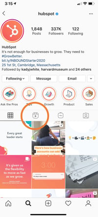
Once you've published one or more Reels, this content will appear on the Explore page, as well as a tab on your profile.

Where to find Instagram Reels on your profile

7. Share your Reels.

Along with posting Reels for Explore audiences, you can also post them to your feed which will also cause them to appear on your main profile grid. Reels can also be sent as direct messages or even posted to your Instagram Stories. Unless you share a Reel so it appears on your main grid, the content will behave like a Story and disappear within 24 hours.

8. Monitor your performance.

Currently, to view any insights for a Reel, you need to view the post itself. At this time, there isn’t a way to view the analytics of your Reels within Instagram Insights. Instead, look at the likes and comments to get a sense of engagement.

engagement metrics on Instagram Reels

9. Watch Reels from other accounts.

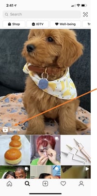
To access Reels, simply go to search and you’ll see a featured Reel. Tap that and then you can easily scroll through the clips. From there, you can follow users and like, share, and comment on reels directly. You can find Reels on specific topics by searching for hashtags.

Where to find Instagram Reels content in Instagram Explore feed

What to Keep in Mind with Instagram Reels

As you consider Reels, TikTok, and other emerging social media platforms in your marketing strategy, it's important to weigh the pros, cons, and key marketing takeaways when determining if a channel or feature is right for your team.

Here are just a few things to remember as you consider Reels:

Reels competes against a unique, viral sensation:

Although Instagram has a huge audience that is loyal to its platform, many Gen Z users are used to going to TikTok for viral videos and general entertainment. Because the app has pulled in astounding fan loyalty in its short lifespan, you might find that Reels don't have the same viral opportunities that TikTok videos might have. 

What works on TikTok might not work on Reels

TikTok is a highly experimental platform with a younger, but huge, global audience. Because of these factors, there aren't many rules about what you should and shouldn't post on there. Meanwhile, Instagram has been around for years, has a slightly older audience, and has some content norms or audience expectations set in place

If you've already posted a handful of TikTok videos and want to test them on Reels, you can consider uploading a few, watching how they perform, and learning more about what works well on both platforms.

However, as you learn the differences between TikTok and Instagram audiences, you might find that high-performing TikToks aren't as engaging to your Reels audience. If this is the case, you might want to consider creating specialized content for Reels.

There aren't ad opportunities just yet.

Although you'll want to keep the points above in mind as you consider testing out Reels, you'll also want to remember the opportunities it offers. For example, Reels might be a great option for you if you've mastered Instagram, know what content your audiences want, and are eager to test out TikTok-styled content without using time and resources to build a full TikTok app strategy.

If you do begin to test out Reels, it can't hurt to brush up on your Instagram marketing skills and Instagram platform knowledge to ensure that your profile, other content, and -- ultimately -- your Reels will be on point for your brand and optimized for brand awareness.

Be sure to check out our Ultimate Guide for Instagram Marketing, or sign up for the free HubSpot Academy course below.


Everything Marketers Need to Know About Instagram Reels was originally posted by Local Sign Company Irvine, Ca. https://goo.gl/4NmUQV https://goo.gl/bQ1zHR http://www.pearltrees.com/anaheimsigns

The Ultimate Guide to UX Design

Think about a website or app you love. What do you love about it? The ease of gathering relevant information? How you can buy something in one click (and have it delivered tomorrow)? Or how quickly it answers your questions?

Now think about the people who created that website. What was their goal?

They were trying to create a site that had the features you love about it — a site that is easy to use, effectively delivers the information you need, and allows you to make smart decisions tailored to your challenges or concerns.

UX, or user experience, focuses on the end user’s overall experience, including their perceptions, emotions, and responses to a company’s product, system, or service. UX is defined by criteria including: ease of use, accessibility, and convenience.

The concept of UX is most often talked about in terms of tech, such as smartphones, computers, software, and websites. This is why UX is not only a fairly new field, but also a variable one — it changes quickly due to technology advancements, new types of interactions, and user preferences.

It’s no secret that customers today want quick and simple ways to meet their needs and solve their pain points. That’s why UX matters so much.

Whether or not you’re in tech, the company you own or work for most likely has a website. Well, customers could write you off in a matter of seconds if they don’t find your website useful and easy to use. In fact, most website visitors determine whether or not they want to leave within a minute of opening a page.

Follow along to learn more about the importance of the emerging field of UX, what today's designers are being hired to do, and why every type of business can benefit from thoughtful UX design.

UX design is about creating products "that provide meaningful and relevant experiences to users," according to the Interaction Design Foundation. Within UX design, there are a few different categories.

1. Interaction Design

A subset of UX design is interaction design (IxD). It is defined as ... yup, you guessed it... the interaction between a user and a product — the goal of that interaction is for it to be pleasant for the user.

2. Visual Design

In visual design, creators use illustrations, photography, typography, space, layouts, and color to enhance user experience. To have successful visual design, artistic design principles including balance, space, and contrast are crucial. Color, shape, size, and other elements also impact visual design.

3. User Research 

User research is the last major element of UX design. User research is how companies determine what their customers and users want and need. At its core, your website should solve a problem, and so this is an important step in determining what exactly your users require. Without it, your designs are simply guesses.

4. Information Architecture

Designers use information architecture to structure and label content so that users can find information easily. Information architecture is used on websites, smartphones, apps, and even in the physical places we go to. Ease of use and discoverability are two important factors of information architecture, which is why it is so closely related to UX design.

Think about the New York City Subway map. This is a great example of information architecture that helps people understand how to get from one place to the next. According to the Information Architecture Institute, "If you’re making things for others, you’re practicing information architecture."
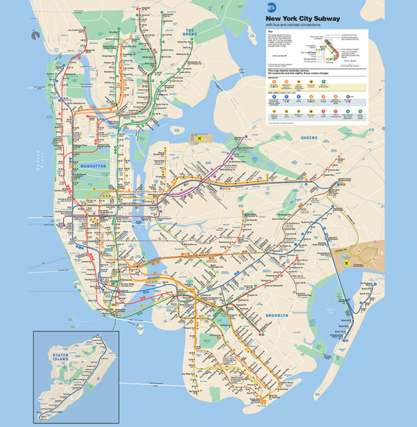
information-architecture

Source: NYC Subway Guide

UX Design Principles

UX is an ever-changing field, but the fundamental UX design principles remain the same. Designers also have to determine what they want in terms of visual balance. Being clear and concise is crucial … less is more! You want your design to be intuitive, and most importantly, your design should meet the user’s needs.

While UX is subject to trends and new technology, there are a few core principles that stay the same. These help designers look at various problems through a methodology that's consistent and focused.

  • Be contextual: You want individuals to know exactly where they are in their user journey. They should never feel lost or overwhelmed. Your design is there to guide them along their journey.
  • Be human: No user enjoys feeling like they are interacting with a machine. You’ll gain the trust of the end-user if you show them your brand’s personality and approachability.
  • Be findable: Users don’t want to waste time. With a successful UX design, your work will be easy to find and navigate.
  • Be easy: Being consistent and straightforward will go a long way with your users. You build relationships with your users by providing them with enjoyable and easy experiences.
  • Be simple: No fluff, tangents, or unnecessary descriptions. Get to the point. Let’s be honest here … these days, everyone has a short attention span.

These principles will guide you at every stage of the UX design process. Let's walk through what each of those stages entails below. 

UX Design Process

There are typically several stages of the UX design process to consider. UX design takes a human-centered design approach during all these stages. This is about considering the needs of the people you are designing for, coming up with a wide range of solutions to resolve the issue they are facing, designing prototypes for the users to test, and then finally putting the best solution in place for the user. If you look at the issue from the perspective of the user, and design with them in mind, you will create solutions they will want to adopt.

Let's take a closer look at each stage of the design process below.

1. Understand your user’s pain points.

Since UX design is about improving the user experience, your first step is finding out what the challenges and expectations of users are. Once you understand what the problems are, you can solve for them.

In an article for Career Foundry, Rosie Allabarton stresses the role of empathy at this stage of the UX design process. She said, “You’ll be working with groups of users who come from a variety of backgrounds and are bringing different experiences with them. Your job is to try to understand why they are behaving the way they are, not to try to change that behavior or influence it, but accommodate it within the product.”

There are a few approaches you can take to gather this important user research.

Interviews

One of the best ways to understand your audience is to be in the same room as them. User interviews typically entail a group of users browsing through an existing site or product or even a competitor’s while members of your team observe. That way, your team can watch how people interact with a website or product and gather feedback in real time. This can help uncover areas of improvement that you and your team hadn’t noticed. Like maybe users are overlooking the CTA button on your homepage, or maybe they want a search box to navigate a website. You can then incorporate this feedback into your design process.

If in-person interviews isn’t an option, then you can always hold remote user testing sessions

Online Surveys

While interviews are ideal for getting rich insights from a small group of users, online surveys are a great way to gather feedback from a larger audience. Surveys consist of a series of targeted questions sent to a sample of your audience. These questions can take on a variety of forms, including yes/no, multiple choice, checkbox, dropdown, ranking, ranking scale, and textbox. Online surveys are typically distributed via forms, and then compiled in a database so you and other stakeholders can review them.

2. Create user personas.

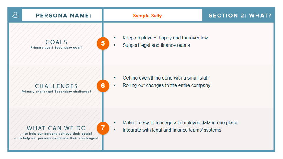
Now that you have all this user research, you’ll want to summarize it. Creating user personas is a great way to do so. Also known as buyer personas, these personas are semi-fictional representations of your ideal customers based on data and research. Buyer personas help you better understand your existing and prospective customers, so you can tailor your products as well as your services, content, and messaging to meet their specific needs, behaviors, and concerns.

Buyer persona template with sections for goals, challenges, and what can we do

Image Source

These personas help ensure that everyone on your team understands, remembers, and centers the end user throughout the design process. 

To learn how to research and create personas, check out the post How to Create Detailed Buyer Personas for Your Business [Free Persona Template].

3. Map out user journeys.

While you can categories users into different types of personas, every user is unique. That means different users will interact with your site in different ways — even if they have the same goal. Say they’re looking to apply to a job at your company. Some might navigate to your homepage, click Careers from your navigation bar, and then browse your job openings. Others might search your company name plus “careers” in Google.

Your goal is to identify the primary goals of your users and ensure they can complete their goals. So an ecommerce site, for example, will need to identify all the different ways a customer might want to complete a purchase and make sure their site enables them at every step. Providing functionality to ensure a customer can complete a purchase on a desktop, tablet, and mobile device are just a few scenarios you’d have to plan for. You’ll likely need a lot of colorful post-it notes for this stage.

4. Create website wireframes.

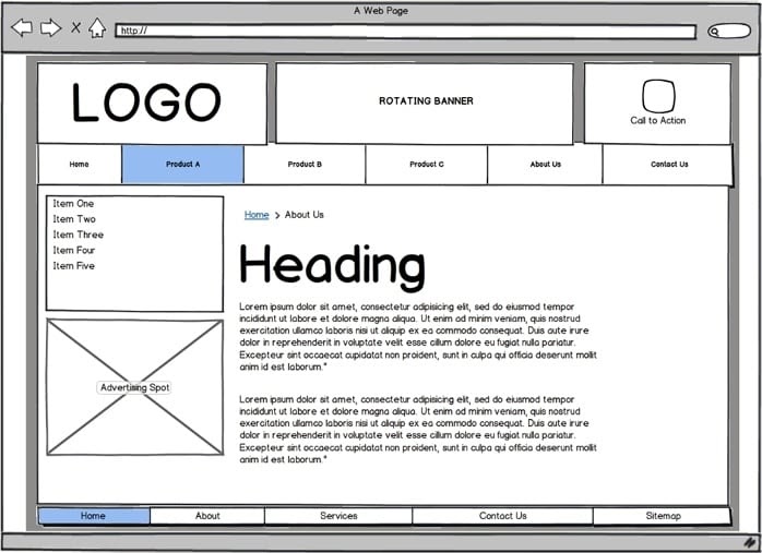
Now that you’ve mapped out user journeys on paper, it’s time to map them out in your actual product with website wireframes and prototypes. You can think of a wireframe as a sketch of your product or website.

When creating a wireframe for your website or product, you can plot out how you want to display your main features, allocate space, and present images and content and how this layout helps (or hinders) the user from achieving their goals before introducing design elements like color schemes.

Evaluating your product’s functionality and intended user behavior at this stage can help you find potential problems or missing features that might get in the way of conversions or sales later on — before you’re too far along in the design process. That way, you can easily make changes, get approval from other stakeholders, and confidently move to the next stage of the design process.

Wireframes range in complexity. Some are hand drawn with a pencil, others are created with software tools like Sketch and Canva. Here’s an illustrated example.

Illustrated example of website wireframe with logo, banner, navbar, sidebar, and content area

Image Source

5. Start prototyping.

Think of a prototype as the final draft of your product or website before the coding begins. It’s not the final version, but it’s close enough that you can fully test the product before it launches and demonstrate it to management and other stakeholders.

Unlike a wireframe, a prototype will include font, images, icons, and colors. This phase is focused less on aesthetics and more on user flow, however. Prototypes will be interactive, allowing you, users, and other stakeholders to experience how the product works in real life.

You’ll run more user testing at this phase to uncover issues like whether your checkout process requires too many clicks or your homepage is difficult to navigate.You’ll likely experiment with navigation and other functionality at this stage, and produce lots of iterations.

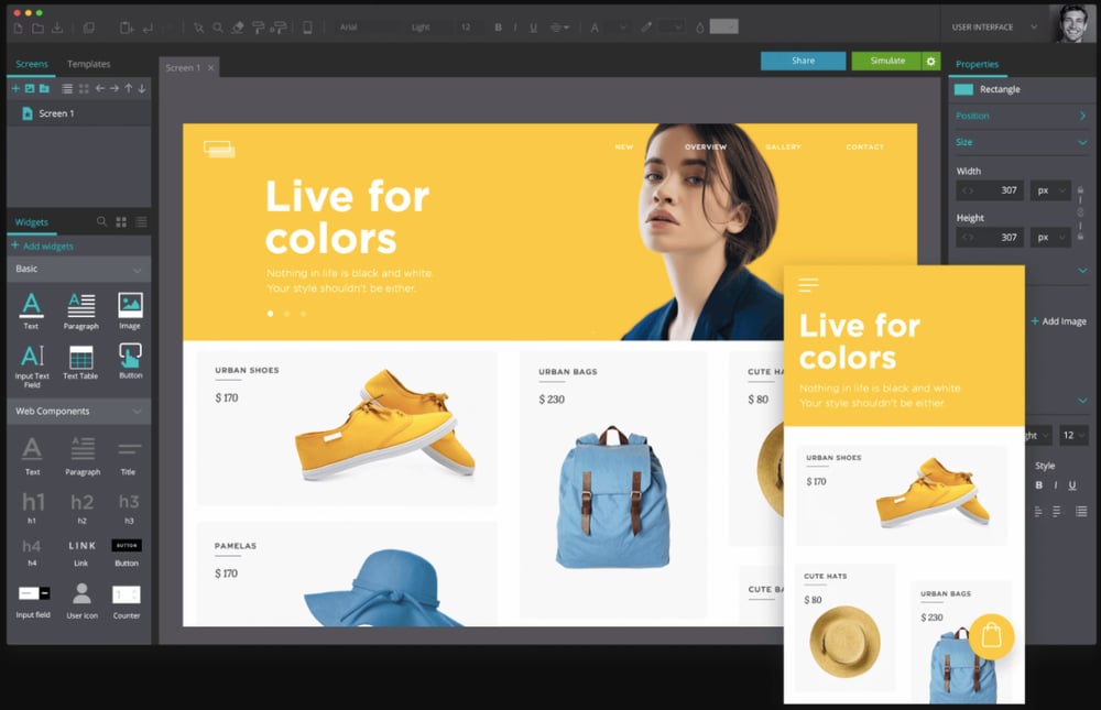
To create a prototype and subsequent iterations, you’ll need to use a dedicated tool like Adobe XD, InVision, or the free Justinmind. Here’s an example of a prototype built with Justinmind.

Justinmind prototype of ecommerce website on desktop and mobile

Image Source

At this point, the coding can begin so you’ll pass your prototype to designers and developers who will build a user interface. More on what a UI is and how it differs from UX later.

UX Deliverables

UX deliverables are the various outputs of a UX design process. The designer and team will have to produce and present these deliverables to an internal team and external clients for review — either during the design process or once the project is complete. 

As tangible records of the work that has occurred, UX deliverables are a critical part of the design process. These deliverables help UX designers to effectively communicate their design ideas and findings, and make it clear to stakeholders why recommendations for changes and improvements are made. They also help designers get buy-in for their ideas.

1. User Research

User needs, tendencies, and motivations can be determined through different types of user research. This might include quantitative and qualitative data from user testing sessions and focus groups. It could detail feedback on sign up flows, the onboarding process, and customer service inquiries.

The goal is to have a detailed analysis of what's both working on the site and what could be improved — and to have this all backed by information gathered from users. Researchers may create buyer personas based off of real user data to help them accurately determine who will be using their device, website, or app. Through user research, designers understand and empathize with the user.

2. Competitor Assessment

Assessing the strengths and weaknesses of your competitors is a way to enhance your own UX strategy. A great way to do this is by creating a competitive analysis report that details the interaction design of your competitors and provides an analysis of where you see pitfalls and missed opportunities — things your business can take advantage of.

3. Interaction Design

An interaction design deliverable could come in the form of a prototype so that people can review how interactions with the site would occur — showing how people would complete key tasks, get information, use a product, the flow of finding information, and how easy the product is to use. You want your prototype to be as similar to the final product as possible, so you can get sign off on the design before you begin building it.

4. Information Architecture

IA is the process of taking information and organizing it in a way that is easy to understand. For large websites, this is especially important, as you need to understand what content exists and how to organize it in a way that makes sense for your visitors. The result might be a content inventory, sitemap with suggested navigation, or sample user flows that reveal how visitors move through a site.
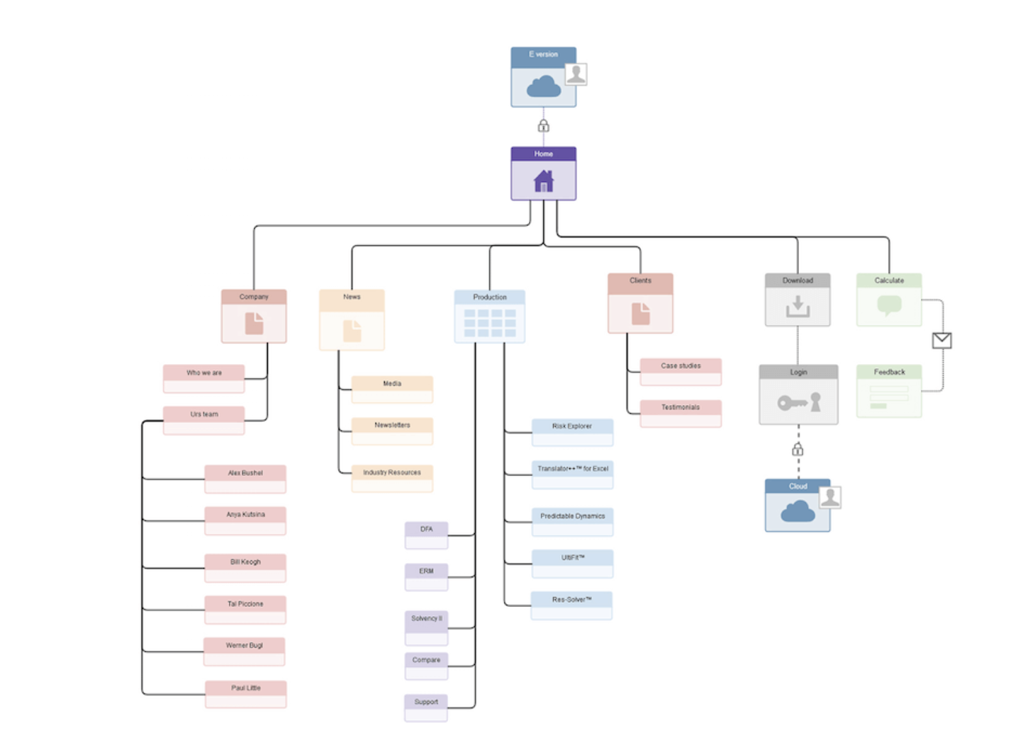
site-map

Source: Adobe Blog

Now that we understand the different deliverables a client or manager might ask from a UX designer, let's take a closer look at arguably the most important: UX research. 

User Experience Research

Without research, all of this focus on what the user needs and wants would be impossible. UX research is the investigation of users and what they need, which informs the UX design process. Companies and designers use this research to come to specific conclusions about what is working for users and what needs to be changed. There are several ways companies and designers perform UX research.

Usability Testing

Usability testing evaluates how successful a product is by testing it on actual users. It gives companies real input on how individuals are using a product or system and how that product or system works for that user. There are two primary testing methods. 

Hallway usability testing is a quick and cheap way for companies and researchers to get information from users who may not know of your company or products. Random individuals use the products and give feedback on their experience.

Remote usability testing allows companies to research with users in their natural environment (such as in their home or office). These tests can be moderated in any way the company chooses.

Usability Testing Tools

Usability testing tools allow researchers and designers to compile accurate feedback from users and then analyze that feedback to make data-driven changes. If you’re looking for a tool that can help you test how easy-to-use your site or product is, check out these options:

  • Crazy Egg: This tool allows companies to see exactly what users are clicking on while on their website. Crazy Egg also records exactly where site visitors are coming from, including geographic location, and if they were referred from another site.
  • Hotjar: This tool combines analytics and feedback to give an overview on ways to improve user experience. They do this through the use of heatmaps, visitor rates, conversion funnels, and more.

For more usability testing tools to consider, check out this post.

How to Enhance User Experience

Through the research and testing mentioned above, user experiences can always be improved. Some of the most common ways to improve user experience include: Taking a consultative approach to improving the experience, determining calls to action, implementing responsive web design, considering Fitt's Law (more on this next), avoiding overwhelming data entry, and more.

Using Fitt’s Law to Enhance UX

Fitt’s law is a predictive model that determines the amount of time it takes for a specific user to move their mouse or cursor to a target area on a website. There are multiple versions of Fitt’s law that exist but they all revolve around the general idea that, “The time required to move to a target depends on the distance to it, yet relates inversely to its size.” Fitt’s law is widely used in UX design to improve ergonomics in addition to usability for users.

Here’s an example of this at work: Have you seen the new Touch Bar on Apple’s MacBook Pro? This is a touchscreen above the keyboard that speeds up a user’s experience when using Google, bookmarking a page, changing screen brightness, volume, and more. Touch Bar options change depending on what page you are browsing while on your laptop, whether that be an app, a site you are visiting, or even just your personal settings.

With the Touch Bar, the user’s experience is simplified because many commonly used settings are in one compact location. Fitt’s law states the further away and smaller an object or button is for a user, the harder it is for that user to click on it. That’s why the Touch Bar is such a great example of taking Fitt’s Law and successfully applying it to your device to enhance user experience.

UX Design Tools

Whether you are researching, prototyping, wireframing, storyboarding, or creating graphics, there are multiple UX tools available to assist you during the design process. In fact, there are so many tools on the market, some free and some that require a subscription fee, that it may be overwhelming for designers who are unsure of exactly what they need. To get you started, here’s a list of some popular and valuable tools to use in your UX design work:

1. Adobe Fireworks

Adobe Fireworks CS6 gives web designers a way to create graphics for their web pages without getting into the code or design details. There are a few reasons why UX designers use Adobe Fireworks: The tool has impressive pixel accuracy, has image compression abilities (JPEG, GIF, etc.), allows users to create functional websites, and build vectors. This is a great option especially if you are already familiar with other programs in the Creative Cloud.

2. Adobe XD

With Adobe XD, you can design websites and mobile apps, as well as create prototypes, wireframes, and vector designs. Users can share interactive prototypes on multiple platforms, including Windows, Mac, iOS, and Android, so it’s perfect for team collaboration.

3. Axure

Axure RP Pro is another great UX design tool — that’s also free. Axure has several capabilities including wireframing, prototyping, and documenting. It can even help you create user flows and sitemaps. Axure is perfect for creating web and desktop applications, and it gives users the ability to easily export to PDF or HTML for review.

4. Adobe Illustrator and a Free Alternative

If you’re looking for an affordable alternative to Adobe software, such as Adobe Illustrator (which is primarily used to create vector graphics), we’ve got you. Inkscape is known for doing most of what Illustrator does, but for free. This software is open source and can be used to create impressive vector graphics. The only issue you could run into is lag, as some users have reported that the program is slow. If you’re partial to Illustrator, that’s OK too.

5. Sketch

Sketch is an end-to-end software with specific features including non-destructive editing (meaning Sketch won’t change the pixels in the photo you are working with), code export, pixel precision, prototyping, vector editing, and more. With Sketch, you can reuse and update your designs easily.

6. Storyboard Software

You might be wondering why you would need to storyboard in UX design. It’s a great way to visually predict and review the way a user would interact with and experience a product in a broader context. There are several storyboard tools available, with varying levels of features and complexity.

Storyboarder is a free storyboard software option, which has basic features made for designers of all levels. This software allows users to quickly create drawings and stick figures to lay out a plot or idea.

Another storyboard software option is Toon Boom Storyboard Pro. It combines drawing, animation, camera controls, and numerous other features, all for an annual or monthly fee. It has a wider range of features for more complex storytelling and detailed prep work. Both options are great for designers looking to visually tell the story of their persona or users.

Storyboards are also a great way to bring in all stakeholders, including researchers, developers, and UI designers. Before we discuss how to become a UX designer, let’s make sure we understand the difference between two similar roles: UX and UI designers.

What is User Interface design?

Remember when Apple unveiled its click wheel for the iPod? When it was introduced, the feature was intuitive and highly functional — not to mention cool-looking.

This is a great example of a successful user interface (UI). UI refers to how people interact with computers, machines, websites, apps, wearables, and other programs or devices. User interface design is the process of making these things as easy to use and efficient as possible.

Common UI Elements

Although UX and UI have similar definitions, it’s important to note the key differences that separate the two topics. Again, UI focuses on a product’s appearances and surfaces, while UX is more concerned with how people interact with a site. Here are some common UI terms you should know to better understand how the two differentiate:

  • Informational Components: UI designers use informational components to enhance the reading experience or give more information. Examples of informational components are progress bars, notifications, and message boxes. Designers use these when they want to make it clear to the user that they have completed a task, or if they want to notify the user that action on their part is necessary.
  • Breadcrumb Navigation: This is a design tool often used by UI designers to visually increase the usability of a website. It allows users to see their location on a site in a hierarchical structure. It doesn’t need to have special visual features or over-the-top design — it should just clearly state where a person is located on a site. You may have noticed these links along the top of a webpage while online shopping or on another site.
  • Input Controls: Input Controls give individuals multiple options in response to a question you are asking. These are things like checkboxes, drop-down lists, and toggles. Keep the information you are asking in your input controls simple and to-the-point so it’s easy to find what the user needs.
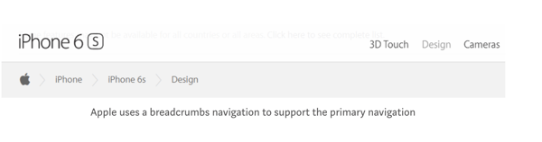
breadcrumb-navigation

Source: UX Planet

If you love designing, researching, working with other people in a fast-paced environment, and listening to others’ experiences, a career in UX design may be right for you. As a UX designer, you’d focus on the conceptual aspects of design and create better experiences for users.

Here are the steps to follow to become a UX designer.

1. Do your research.

This step may seem like a given, but pursuing a career path (or changing yours altogether) is a big move. Do plenty of research to ensure that you want to be a UX designer. Guides like this one will help give you an idea of what UX design entails. You can also lookup "day-in-the-life" articles, podcasts, and books to better understand how other UX designers spend their workdays.

2. Take a UX design course.

There are plenty of higher education courses available around the world, though they typically require a four-year undergraduate design curriculum as a prerequisite.

However, some programs allow for more flexibility, such as the online Quinnipiac University Graduate Program in User Experience Design. There are also UX certification programs for professionals. These vary in commitment length and level of expertise upon receipt of the certificate.

3. Apply for a UX design internship.

A UX design internship is valuable for a few reasons. First, UX design internships bridge the gap between education and real-life experience. Internships allow you to put what you've learned in the classroom (or online) to work while receiving helpful feedback from your peers and coworkers.

Secondly, UX design internships allow you to build a live portfolio of design work done on behalf of a real company. While demo work is valuable for demonstrating skill and process, you can report on the impact and results of the work you complete during your internship.

Lastly, UX design internships introduce valuable mentor relationships. Design mentors are critical to developing your skills, receiving constructive criticism, and expanding your network — three things that can help you land your dream UX design job.

To find a UX design internship, start with sites like LinkedIn, The Muse, Glassdoor, and AngelList, as well as simply searching on Google. You can also target the companies themselves: Apple, Google, Microsoft, Reddit, Adobe, Amazon, and Salesforce all offer UX design internship programs.

4. Build your UX design portfolio.

Once you’re ready to start applying for your dream UX job, you’ll need a stand-out resume and a flashy portfolio. Use a site like Dribble or Behance to showcase your work, or create your own website using a tool like SquareSpace.

When building your portfolio site, keep these tips in mind:

Make it visually stunning.

Presentation is everything. Your work should speak for itself ... show don’t tell! Your choice in color, typography, and layout all play a factor here.

Include an “about” page.

Hiring managers and recruiters want to get to know you, how you think about design, what inspires you, and what makes you unique. Why should they hire you? What value can you add to your new potential company and team?

Have clear navigation and links throughout your portfolio site.

Can you imagine the hiring manager at your dream company having a hard time navigating the portfolio site of a UX designer? Awkward. In your navigation bar, include options such as: “portfolio,” “about,” “contact,” and “resume” to avoid any confusion.

Explain your personal UX process.

Your future employer wants to know how you think. Include information that lets the hiring manager in on your UX researching, brainstorming, wireframing, designing, and prototyping processes.

Create additional portfolios to expand your network.

Use other tools to make your work available on sites where designers and those looking to hire designers to spend their time. Behance and Dribble are great portfolio sites for people looking for inspiration, networking, and new career opportunities.

If you're interested in this career path, we've gathered some ideas for UX projects that can help get you started and built out your portfolio. Let's take a look.

UX Design Ideas

Are you interested in UX design but don’t know where to get started? We’ve compiled a list of ideas for people who need inspiration just like you. Completing these projects will not only provide you with valuable experience, it will also provide valuable additions to your portfolio. Let’s take a look at some of these ideas and the real-life examples that go with them.

Redesign the digital menu of your favorite local restaurant.

Redesigning a restaurant’s menu is a great exercise in anticipating user needs. To find the right balance of information and images, you’ll have to decide what readers need to know and see to make informed decisions, and what will simply overwhelm them. You might experiment with the categorization, descriptions, and ratings of the food items, and more.

Below is a drink menu by Panji Arafat on Dribble.
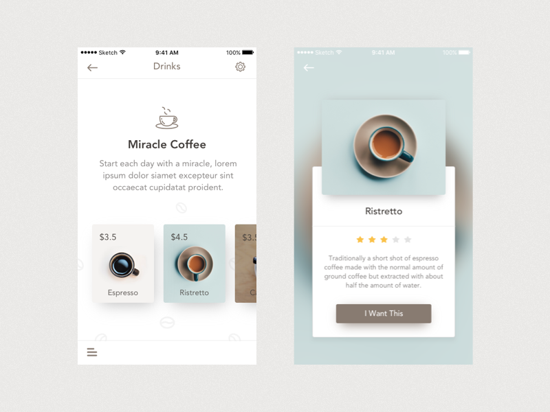
UX project showing redesigned drink menu for Miracle Coffee shop

Image Source

Sketch a better interface for your toaster oven.

This will help you practice analyzing an existing product and identifying where you can add value in terms of functionality and design. The best part is you can complete this project without leaving your kitchen!

Below is an example by designer Sarah Kerbleski.

Redesign the homepage of your personal site.

You can redesign the homepage of any website, but using your own personal site or a site that you have access to analytics to is ideal. That way, you can practice accumulating and analyzing user research and using those insights to inform your design process.

When HubSpot redesigned its homepage back in 2016, UX Designer Austin Knight analyzed massive amounts of data and discovered three important trends: a significant number of users were moving from the homepage to the pricing page, FAQ page, and the search bar. All of these trends supported the conclusion that the homepage was lacking critical information that was affecting its conversions. You can read more about this redesign in the UXPin case study.
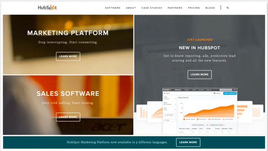
2016 Redesign of HubSpot homepage for UX

Image Source

Redesign a feature in an application that frustrates you.

This can help you practice redesigning some functionality in an existing app, rather than starting from scratch. Product designer Jo Zhouzheng did exactly this for Doordash. Frustrated by the restaurant and menu browsing experience in this popular food delivery app, Zhouzheng redesigned the interface. Here’s a before and after look of the interfaces.
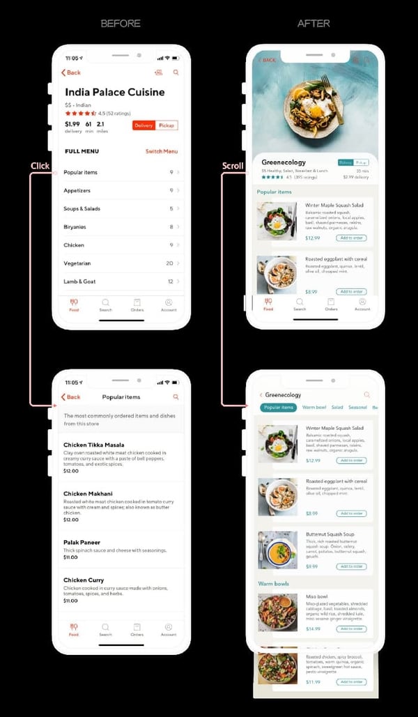
Redesigned menu of India Palace Cuisine on Doordash app for UX project

Image Source

Design an app for checking in at your primary care doctor or specialist.

Designing any health app will be a great exercise in UX. Focusing on the check-in process specifically will help you practice identifying and solving for user pain points. You can focus on an in-person or virtual check-in, like Digital Product Designer Divan Raj did below.
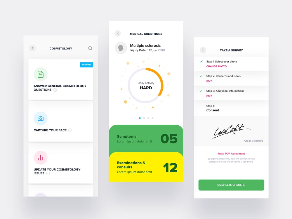
Three interfaces of patient app designed for UX project

Image Source

Create personas for an app you want to design (or redesign).

Creating personas is an important part of the UX design process. You can get some experience by creating personas for a hypothetical app, or an existing one. Maybe you like an app or website, but know the functionality or design could be better. In that case, you could define new personas for that product. Or you could create personas for a product that you’ve thought of.

Daorong Fang, for example, created a prototype of a mobile app for in-person social networking events. To illustrate her key audience and help potential stakeholders sympathize with her target issues (ie. how awkward and time-consuming networking can be), she built two personas. One of them — Techy Sarah — is shown below.
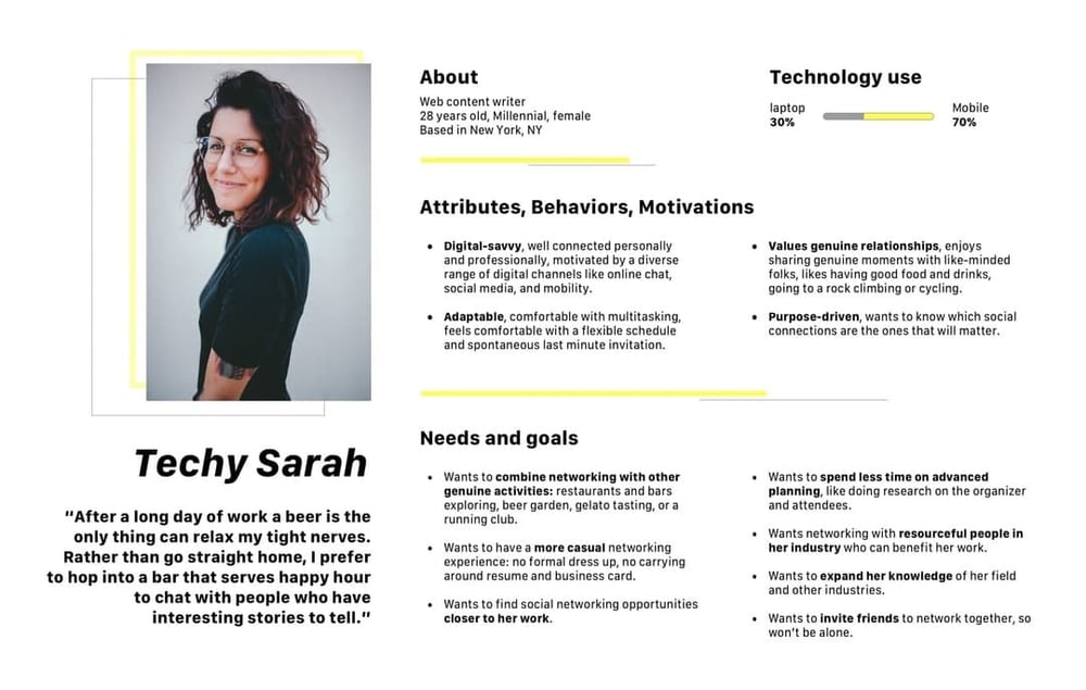
Persona for UX project for social networking app

Image Source

Map out a voter’s journey in a local, state, or federal election office .  

This can help you understand how UX design can contribute to larger phenomena, like low voter turnout, and flex your analytic and critical thinking muscles. By plotting out the path from registration to the point where voters have a ballot in their hands, you’ll uncover regulations, time constraints, a lack of transparency, poor design choices, and other pain points.

Whitney Quesenbery and Dana Chisnell founded The Center for Civic Design with this exact goal in mind: they wanted to understand where people fall off the voter journey, and how to get them back on. Below is one of their Field Guides to Ensuring Voter Intent, which helps local officials create well designed ballots.
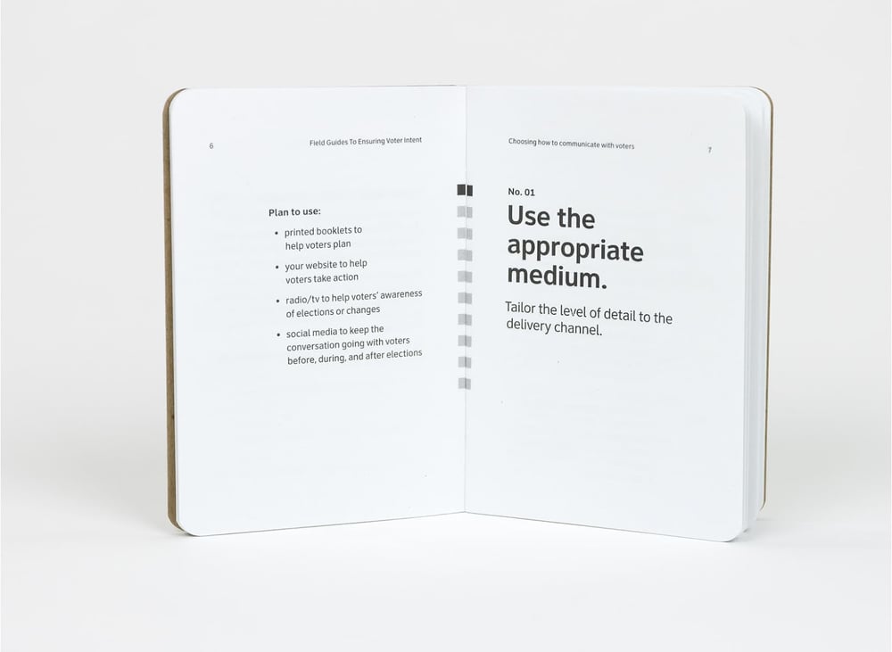
Field guide to voter intent is part of UX project for increasing voter turnout

Image Source

These are just a few ideas. For more inspiration, check out websites like Dribble and Awwwards.

UX Design Helps You Grow Better

Whether you’re a graphic designer, blogger, developer, or someone in an entirely different field, UX design can help you and your company grow. A happy end-user is the key to success, and without well-crafted UX design, this would be impossible to achieve.

As technology becomes more ubiquitous in our lives, successful UX design will continue to create seamless transitions between individuals and their devices and apps. UX design has never been more important, making it an exciting time to join the field and consider the benefits for your own business.

Editor's note: This post was originally published in June 2018 and has been updated for comprehensiveness. 


The Ultimate Guide to UX Design was originally posted by Local Sign Company Irvine, Ca. https://goo.gl/4NmUQV https://goo.gl/bQ1zHR http://www.pearltrees.com/anaheimsigns