Wednesday, September 9, 2020

Should Marketers Use Pop-Up Forms? A Comprehensive Analysis

As inbound marketers, we care about creating lovable experiences for our website visitors -- but we also want to generate as many leads as we can for our sales teams. Most of the time we can do both without any problem. But when it comes to pop-up forms, conflict does emerge.

Pop-ups are everywhere these days. Over the past few years, pop-up forms have re-emerged as a popular marketing tactic for promoting content, driving blog subscriptions, growing email lists, and fueling lead generation.

Some pop-ups are fairly benign and you hardly notice them. Others are distracting, and quite frankly, downright poopy (see the example below). 
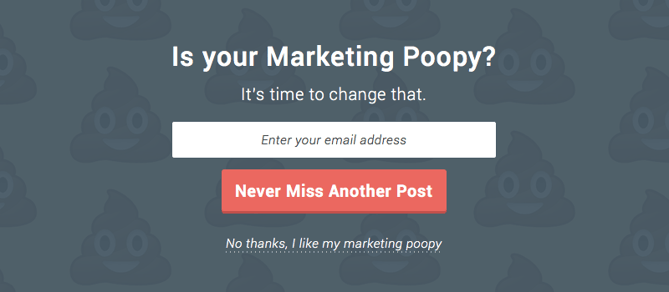
Funny pop-up that says "Is your marketing poopy? It's time to change that."

Pop-ups have become so prevalent that even Google has had to weigh in, announcing that they will begin to penalize websites that use what they call "intrusive interstitials" (we call them "crappy popups").

So the million dollar question for inbound marketers is this: Should we be using pop-up forms? Before we dive in and attempt to answer this question, let's take a step back and re-acclimate ourselves with the world of pop-ups.

What Is a Pop-Up Form?

According to Wikipedia, the first ever pop-up ad appeared in the late 1990s on the web hosting website Tripod.com. In their early days, pop-ups were primarily used by third-party advertisers, and they were particularly cringe-worthy. Do you remember the first time a brightly colored pop-up jumped out on your screen, alerting you that you'd won some sort of content or prize? I know I do. And as far as I can remember, I never collected any of those fabulous prizes.

Over time, consumers and web browsers alike got better at hiding or ignoring these types of pop-ups, and eventually, advertisers gave up. Nowadays you'll rarely see a sketchy third-party pop-up -- unless you find yourself on a particularly sketchy website.

For a time, pop-up ads largely disappeared from the internet. But they eventually became replaced by pop-up forms. Only this time it wasn't third-party advertisers that were using this pop-up format ... it was marketers like you and me.

Because of the association of intrusive ads with this pop-up functionality, marketers need to be careful of when and how they appear as well as the type of content they present. 

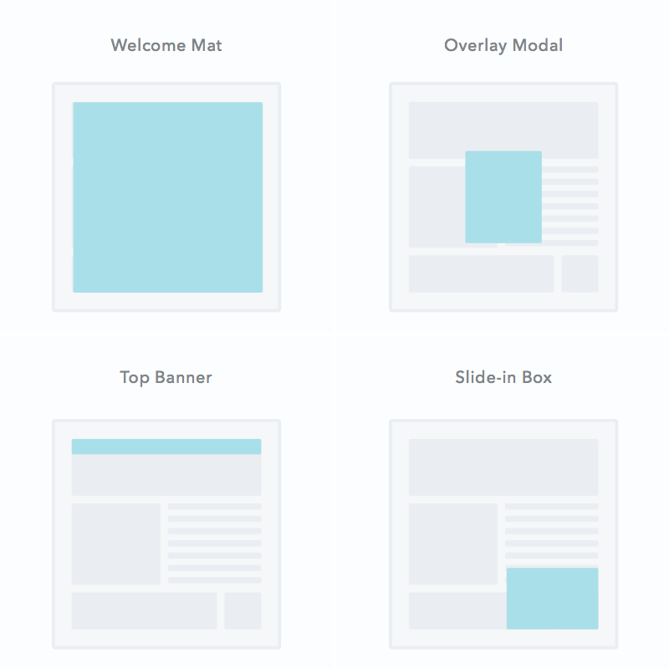
Pop-ups come in many shapes and sizes, but here's a graphic that depicts the most common ones you might see on a web page: 
types of pop-up: welcome mat, overlay modal, top banner, slide-in box

Let's dive a little deeper into these pop-up formats:

1. Welcome Mats

These are full-screen pop-ups that slide above the page content. The up-side to these is that they bring the offer front and center in front of website visitors. You may consider doing this if the offer is highly relevant to your content and important to your strategy. Otherwise, a welcome mat pop-up may be a little too intrusive and annoying for your users.

2. Overlay Modals

As close to the traditional pop-up as you can get, these are center screen pop-ups that appear on top of page content. Unlike the welcome mat, overlays don't block the rest of the content from being shown, but the user will have to click out of the pop-up to continue what they're doing. While some users do feel that overlay modals are intrusive, they often have high conversion rates if the offer is compelling.

3. On-Click Pop-Ups

An on-click pop-up is a specific type of overlay modal that pops up with a form when a user clicks a call-to-action or other page element. They're perfect for when an in-line form would clutter the page but you want to decrease friction to a particular offer. The UX tends to be easy, which reduces friction on the conversion path.

4. Gamified Coupons

Another type of overlay modal, gamified coupons will let you play a game for a discount or prize of some kind in exchange for the users information. They often come in the form of a prize wheel or scratch-off ticket and are best for fun ecommerce store brands (since the coupon can then be applied at checkout).

5. Top Banners (Also Called Sticky Bars)

These are small banners that manifest as a bar at the very top of the page, asking the user to take action on something. They are typically a more permanent conversion element than other types of pop-up and are best used for broad offers such as newsletter subscriptions, coupons, or even general announcements.

6. Slide-In Boxes

Slide-ins are small boxes that slide in from the side/bottom of the page, similar to an overlay modal but with less obtrusive behavior. These are great for presenting offers as the user is scrolling through the content of the page.

Pop-Up Triggers

As more and more marketers have started using pop-up forms, a mini-industry of pop-up providers has emerged, offering bells and whistles that were never available before. Most notably, pop-up tools have proliferated the types of triggers that prompt a pop-up to appear.

Among the most popular pop-up triggers are:

  • Page entrance: Pop-up appears when the visitor first gets to the page. These are often considered the most annoying and but can be used effectively with the less-intrusive formats such as the top banner.
  • Page scroll: Pop-up appears when the visitor scrolls to a certain point on the page. These are great for long-form content when you don't want to embed CTAs in the content.
  • Element interaction: Pop-up appears when the visitor clicks on or hovers over a specific element. These are highly effective since the user took a specific action with intent to convert.
  • Time on page: Pop-up appears when the visitor has been on the page for a specific amount of time.
  • Exit intent: Exit intent pop-ups appear when the visitor scrolls towards the top of the page to leave. Consider it a last-ditch effort to capture their attention before they leave.
  • Inactivity: Pop-up appears when the user has not taken action on the website in a while.

Now that we know a little more about pop-up forms, let's get back to the core question: Should marketers be using them?

And in order to properly answer that question, we need to consider two slightly more specific but related questions:

  1. Do they work?
  2. Is it possible create inboundy pop-up forms that don't, well, suck?

Let's dig in.

Do Pop-Up Forms Work?

I'll answer this one right off the bat: The answer is yes. Pop-up forms do work, and this is the main reason so many marketers are using them.

According to research conducted by Sumo, the top performing 10% of pop-up forms convert at a whopping 9.3%. Now I don't know about you, but an additional 9.3% conversion rate across my website sounds pretty good to me.
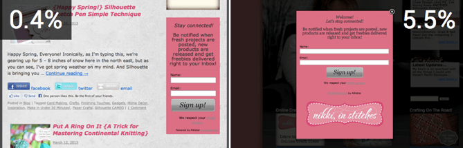
sidebar form converted at 0.4% while pop-up converted at 5.5%
Source: AWeber

The numbers don't lie: Pop-up forms work. However, is that worth sacrificing the experience that a visitor has on your site? The inbound answer is no. User experience trumps all else.

But what if you didn't have to sacrifice performance for experience? What if you could create user-friendly pop-ups that didn't suck?

Is There Such a Thing as an Inbound Pop-Up?

If you ask someone how they feel about pop-ups, they're likely to offer an emotional response that loosely resembles a child eating vegetables (I call this expression "blegh").

People hate the idea of pop-ups. Most pop-ups out there are annoying. What's more, the pop-ups that annoy you the most are the ones you'll remember the longest.

But here's the thing: not all pop-ups are bad. Pop-ups can be used for good, and they can be a healthy part of an inbound strategy.

Just think about email marketing for a second. Email is another example of a channel that has been heavily abused. We've all gotten some crappy emails throughout the years. But as inbound marketers, we know to use email responsibly and to only send contextualized email that adds value to people's lives.

The same goes for pop-ups. When used correctly, they can actually enhance the experience a user has on your website, as well as boost your conversion rates.

4 Tips for Crafting High-Converting Pop-ups (That Don't Suck)

But how do we make sure that our pop-ups are helpful and not spammy? Here are some guidelines.

1. Offer something relevant and valuable.

The problem with most pop-ups is they get in the way of the visitor's experience on a website, rather than enhance it. Oftentimes this is because what's being offered in the pop-up is either not valuable to the visitor, or it has nothing to do with the page they're on.

To boost engagement with your pop-up as well as enhance the experience that someone has on your site, be sure to offer something that is both valuable and relevant to them, given the page that they're on. For example, if I were writing a blog post on social media, I would offer a free ebook on the same topic:
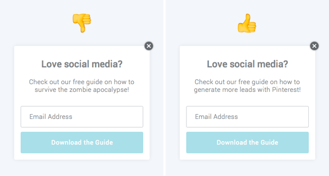
example pop-ups, one that's relevant and one that's not

2. Think about the way people engage with your pages.

Another common mistake marketers make with pop-ups is having them appear at the wrong time, which adds to the annoyance factor. Be strategic about the timing and trigger of your pop-ups. Think about the way that visitors interact with certain types of pages on your site.

For instance, when someone engages with a blog post, they do so by scrolling down the page as they read the content. If you want to catch your visitors while they're most engaged, then you should customize your pop-up to appear when someone has scrolled halfway down the page.

Similarly, you might find that people who stay on your product or pricing pages for more than 30 seconds are highly engaged because they're taking the time to read through and consider their options. In this scenario, you could use a time-based pop-up that appears when a visitor has been on the page for a specific number of seconds.

To better understand exactly how your visitors engage with different pages on your site, try looking into Google Analytics data, such as bounce rate and average time on page. Better yet, use a tool like HotJar or Crazy Egg to record users on your site to build heat maps of where they click and scroll. This will give you a better sense of how people engage with your content.

3. Use language that's specific, actionable, and human.

Most pop-up forms have a fairly basic layout. You get a headline, some body copy, and maybe an image. In other words, you don't have a lot of real estate to work with.

This means it's super important to nail the copy on your pop-up form. In order to do that make sure your copy is specific, actionable, and human:

  • Specific: Specify exactly what a visitor is going to get if they click on your pop-up. Don't tell them it's a guide; tell them it's a 10-page guide with actionable tips. Don't encourage them to join your email list; ask if they'd be okay with getting two to three emails on a given topic per week.
  • Actionable: Let visitors know exactly what you'd like them to do. Instead of "Click Here," try "Download our Free Guide," or better yet, "Get my Free Guide." Craft a compelling call-to-action that will inspire your visitors to take action.
  • Human: Remind visitors that there's a real person behind the pop-up form. Use colloquial language to make your forms friendly. Instead of "Join our email list," try "Mind if we email you twice a week?" Instead of "Subscribe to our blog," try "We'd be happy to notify you whenever we publish new articles."
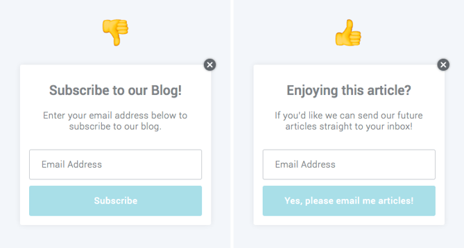
example pop-ups, one with generic copy and one with more natural copy

4. Don't ruin the mobile experience.

In an effort to improve mobile user experience, Google announced that they were going to start penalizing websites that use what they call "obtrusive interstitials" -- in other words, pop-ups that mess with the user experience. Now I don't know about you, but I certainly don't want my Google rankings to go down from using pop-up forms.

To ensure a user-friendly mobile experience and avoid being penalized by Google, be sure exclude your pop-up forms for mobile, or use pop-ups that don't take up the entire screen of the page on mobile devices. Most pop-up tools already offer this type of functionality, but if what you're currently using doesn't, you may need to find a new solution.
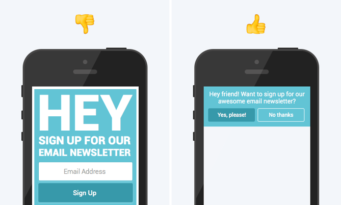
example of pop-up that's optimized for mobile and one that's not

Need a Free Pop-Up Tool?

So there you have it. To sum up: Pop-up forms do work, they can be inboundy, and you should be using them.

If you're looking to get started with pop-up forms, we'd recommend that you try HubSpot's free marketing tools. We built it ourselves to help marketers generate more leads across their entire website without sacrificing the user experience.

Editor's note: This post was originally published in October 2016 and has been updated for comprehensiveness.


Should Marketers Use Pop-Up Forms? A Comprehensive Analysis was originally posted by Local Sign Company Irvine, Ca. https://goo.gl/4NmUQV https://goo.gl/bQ1zHR http://www.pearltrees.com/anaheimsigns

Everything Marketers Need to Know About Sender Scores

Email marketing seems like an easy win for your inbound marketing strategy. Write an awesome email, put in some snazzy images, fire it off to your opt-in list, and watch the customers roll in.

Even if it all was that easy, though, the step marketers often overlook is just how difficult it can be to actually get your email into a recipient's inbox in the first place. Seems basic, but there are tons of moving parts involved in email deliverability, and a huge one is the reputation of the email sender.

Luckily, there's a service called Return Path that has a metric called Sender Score, which gives you insight into your reputation as an email sender.

Have you checked your Sender Score? If you do know your Sender Score, do you know what it means for your reputation as an email marketer? If you're interested in your reputation as an email sender, read on to learn everything you need to know about Sender Score.

To collect your Sender Score, Return Path gathers data from over 60 million mailboxes at big ISPs like BellSouth and Comcast. They record if people frequently unsubscribe or report spam from certain email senders, and then assign you a Sender Score based on that monitoring.

It's a crucial number to stay on top of, because mail servers will often check your Sender Score before deciding what to do with your emails. The lower your Sender Score, the harder time you'll have getting into someone's inbox. There are plenty of things that can impact the deliverability of your email, but Return Path reports that 83% of the time an email is not delivered to an inbox, it is due to a poor sender reputation.

Even if an email network or ISP doesn't query your Sender Score to determine whether they will deliver your email, the factors used in determining your Sender Score are similar to those used by email networks and ISPs to determine your sender reputation. As such, the score is a great, free email sender reputation tool to ensure you are aware of and have the opportunity to fix any deliverability problems.

Domain reputation and IP reputation are just a few of the considerations that are used to determine your overall Sender Score. Other characteristics include spam complaints, industry blacklists, and more.

Now that we know a little more about how your Sender Score is determined, let's learn how to check your score.

Checking your Sender Score is actually an easy process. Use the steps below to get started.

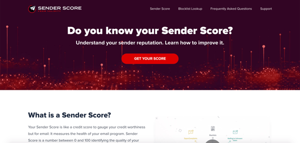
1. Go to SenderScore.org.

Sender Score home page.

Image Source

To get started, go to the SenderScore.org home page.

2. Click "Get Your Score."

Then, click the "Get Your Score" button in the middle of the page.

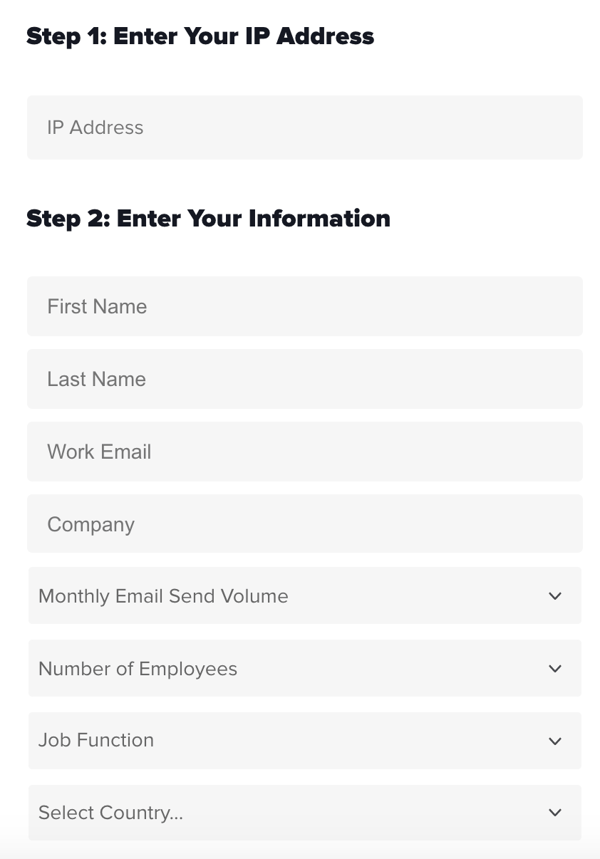
3. Input your IP address and contact information.

Next, fill out the form on the page.

As Sender Score is a free email reputation evaluation service from Return Path by Validity, you'll have instant access to detailed reputation reports and other free tools.

Sender Score provides an indication of the trustworthiness of an email sender’s IP address. Mailbox providers evaluate the reputation of senders to determine whether to deliver messages into the inbox.

Form fields for checking your Sender Score on Return Path.

Image Source

4. Submit.

Lastly, click "Submit" and find out your Sender Score.

Once you know what your score is, you might be wondering, "What do I do with this information?" Below, let's dive into how to interpret your score.

How Do I Interpret My Score?

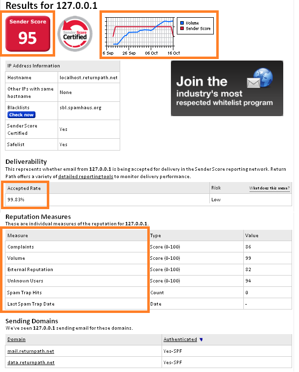
To check your Sender Score, visit Return Path's registration page, and you'll soon have a report that looks something like this (but with different data, of course!)

Sender Score example.

Scores are calculated on a rolling, 30-day average and represent the rank of an IP address against other IP addresses, much like a percentile ranking.

The closer your score is to 0, the worse it is, and if you're close to 100 like Return Path is in this sample report, well you're in pretty great shape! Now let's break down what each of the items you're being scored on in this report mean:

  • Complaints: How complaints about that IP address compare to all other IP addresses. Complaint rates are calculated as complaints divided by accepted mail, and complaint scores are a rank based on your complaint rates.
  • Volume: While not an indication of a good or bad sender reputation alone, it is an important part of the overall reputation algorithm. For example, an IP address which sends 100 messages and receives 99 complaints is problematic, while an IP address which sends 100,000 messages and receives 99 complaints is probably okay. A higher score equates to larger volume monitored by the Sender Score Reputation Network.
  • External Reputation: How the IP address compares to all other IP addresses on a variety of external blacklists and whitelists.
  • Unknown Users: The rank of the IP address' unknown user rate compared to all other IP addresses. Unknown user rates are taken directly from incoming SMTP logs of participating ISPs, tracking how often an IP address attempts to send a message to an address which does not exist.
  • Rejected: This represents how often messages are bounced compared to other IP addresses.
  • Accepted: The number of email messages accepted for delivery, this number is expressed as the number of messages seen minus the number of messages rejected.
  • Accepted Rate: The ratio of email messages accepted for delivery compared to email messages attempted. This is the number of messages accepted for delivery, divided by the number of messages seen.
  • Unknown User Rate: The ratio of unknown users, or invalid email addresses, compared to the amount of email seen.

So, what's a good score? If your score is over 80, congratulations! That's a very good Sender Score. If your score is between 70 and 80, something isn't right -- move on to the next section of this blog post to see what you could be doing wrong that's impacting your email deliverability. If your score is less than 70, well ... you need to repair your sender reputation.

What Do I Do If I Have a Bad Sender Score?

The first step is knowing, so good job on checking your score. It can take weeks or months to fix a low Sender Score, so the sooner you're aware of the problem, the better. There are several aspects of your email marketing that you need to check and possibly change to improve your Sender Score and email delivery rates -- here are the ones that Sender Score takes into serious account:

  • Inconsistent Volume of Email Sends: See the graph in the top right corner of the Sender Score report? Their email send volume goes up at a pretty steady rate, and as a result, their score maintains a pretty even number. However, if you were to send 5,000 emails on Monday, 200 on Friday, nothing for a week, and then suddenly another 15,000, you would likely get dinged for sending inconsistent volumes of emails.
  • Frequency of Sends: Just as the volume of sends should be consistent, so should the frequency with which you email recipients. Email every day, every other day, every week -- whatever your needs are. Just make sure you don't jump on the email marketing bandwagon, abandon it after a month, then hop back on and expect no deliverability penalties. As you perfect your email marketing machine, you'll be able to test the optimal email sending frequency for your recipients.
  • Cold IP Address: If you're new to email marketing, you may have neglected to warm up your IP address. Start email marketing on a new IP address with small batches of the best people on your email list -- you know, the ones who love you and won't mark you as SPAM or unsubscribe from your communications. Progressively increase the amount of people you email to warm up your IP and prove you're a safe sender.
  • Being Blacklisted: There are about 50 known blacklists out there that denote which IPs are spammers. Return Path has a service that lets you see if you're on a blacklist. Assuming you're a legitimate email marketer who just didn't know some of the rules for good email deliverability, visit the sites of those who have blacklisted you to consult their information for being removed from their blacklist. If you contact them for removal, they will help you understand why you were blacklisted in the first place and what you can do to improve your email marketing methods.
  • Getting Caught in a Spam Trap: A spam trap is an email address that was once valid, but no longer is, and will thus garner a hard bounce notice when you email them. However, when a mail server sees consistent traffic going to the dead email, they can turn the email into a spam trap that will stop returning a hard bounce for the known bad address, and instead accept the message and report the sender as a spammer. The moral of the story here is, if you're not monitoring your hard bounces and removing them from your active email list, you could be perceived as a spammer.
  • SPAM reports: Finally, if your email recipients think you're a spammer and identify you as such via a SPAM report, your sender reputation is going to suffer. Check the rate at which your emails are marked as SPAM -- an acceptable rate is 1 in every 1000.

There are several other factors to getting your email into a recipient's inbox -- the content of your email, email infrastructure, recipients' personal filtering preferences -- more of which you can learn about in this email post about email deliverability.

Additionally, if you're looking to start email marketing on the right food, consider taking HubSpot's course on "Understanding Email Deliverability."

To be successful with your email marketing, you need to build trust with the people receiving your emails. To build trust, you need to provide value. And to provide value, you need to know how your emails are performing to a healthy email deliverability strategy.

Editor's note: This post was originally published in February 2012 and has been updated for comprehensiveness.


Everything Marketers Need to Know About Sender Scores was originally posted by Local Sign Company Irvine, Ca. https://goo.gl/4NmUQV https://goo.gl/bQ1zHR http://www.pearltrees.com/anaheimsigns
Facebook's Testing New Email Marketing Tools: Here's What We Know So Far

Each day, millions of brands launch ads, create business pages, and test out lead-generating marketing strategies on Facebook.

While Facebook offers a robust selection of marketing tools, one big marketing staple they've never really explored is email marketing. That might be about to change.

This summer, a small number of Facebook Business users were given access to a new email marketing tool, which Facebook later confirmed it was experimenting with.

While you might not expect a major social media platform like Facebook to invest in email marketing tools, this move actually makes a lot of sense.

In the last decade, Facebook's amped up its advertisement and lead-generation offerings. While B2C companies could easily launch an ad for a product and see ROI roll in, the platform has also enabled B2B companies aiming to sell higher-priced offerings to connect their CRM and generate leads via lead ads or landing pages.

Facebook has consistently been expanding to make its platform a stronger lead generator for brands. And, now that Business Pages are able to gain contact lists from the platform, it makes sense for Facebook to consider an email tool that allows brands to reach out directly to those audiences.

“We’re evaluating whether these tools are beneficial for people and businesses before deciding whether to expand it further,” Facebook told AdWeek.

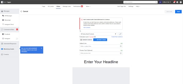
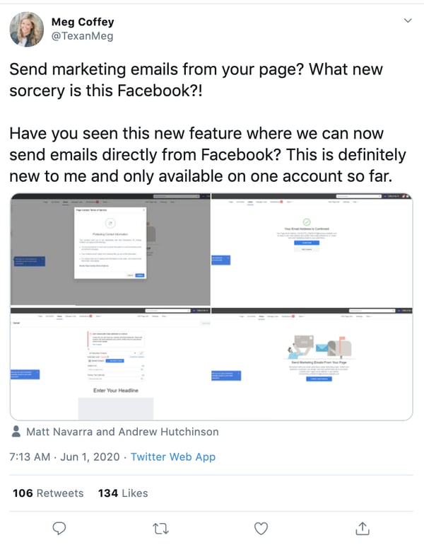
Since Facebook began the email marketing tool's test, marketers have caught on. At one point Meg Coffey, a social media strategist, tweeted screenshots of the tool after discovering it:

social media manager shares facebook email marketing tool discovery on Twitter

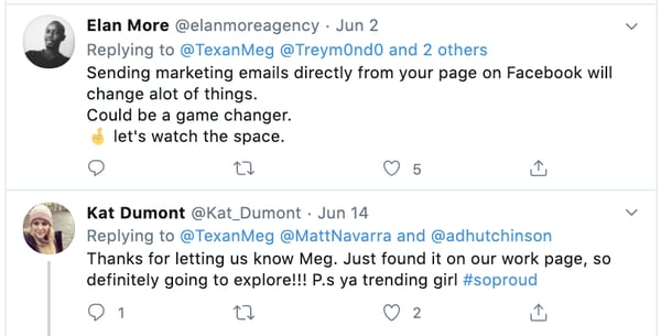
In the replies, a number of marketers shared their thoughts on the new email tool.

Twitter-based marketers respond to the news of Facebook's email marketing tool.

In the tweet's thread, many marketers were optimistic about what Facebook's email and CRM compatibility could mean for lead-generation.

Facebook's email tool might seem interesting, but before you drop your marketing email tool for this one, keep in mind that it's still in its testing phase. While some brand pages have the ability to use it, others do not. Additionally, if the test fails, there's a possibility the tool won't ever fully launch.

If you do want to learn more about the tool and how it could benefit your Facebook marketing strategies if and when it goes live for all pages, here's a quick rundown of what we know about it so far.

What to Know About Facebook's Email Marketing Tool

Although Facebook's email marketing tool is in its testing phase and not yet available to all users, social media marketers and page admins have shared a number of screenshots to demonstrate what it's capable of.

Here's what we know based on the screenshots and information we could dig up.

1. Facebook's email marketing tool will follow GDPR subscriber list regulations.

Sending emails to people who didn't knowingly sign up for them infringes on GDPR regulations -- and emails sent through Facebook's new tool won't be an exception

And although Facebook is primarily a social media network, it will follow email privacy regulations by instructing users to only send marketing emails to contacts who sign up for them.

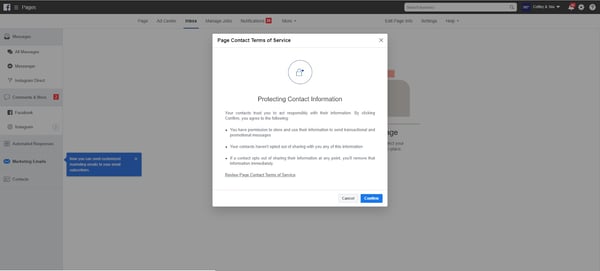
According to social media posts, Facebook marketers will see a warning and disclaimer about what they can and can't send contacts when they click into the email tool.

Facebook email marketing tool rules

Image Source

2. You can't build email lists with addresses from your contacts' Facebook profiles.

When hearing that Facebook offers email marketing, you might think that the marketing emails could simply go to someone's Facebook Messenger or the emails associated with Facebook accounts that Like your business page.

However, like any other email marketing platform, your contacts will need to subscribe to a list and have an address associated with their contact name to get sent an email from Facebook's platform.

Luckily, if your connected CRM already has an email subscriber list, you can just select it from a drop-down menu seen in this image:

Facebook email marketing tool

Image Source

If you don't already have a subscriber list, there are a few ways to create one. You could build a form on your website that promotes your new email and encourages people to subscribe, or you could launch a Facebook lead ad that promotes the email subscription.

3. Facebook's tool might not be as advanced as other free email marketing software.

Available screenshots of the tool show that users can customize email headlines, subject lines, and body copy, but marketing organizations like IMPACT say it's unclear how much design control email marketers will get related to images, color schemes, links, and formatting.

In a follow-up tweet, Coffey said that there are "far more robust email marketing tools out there," but that the Facebook tool might be useful for those "getting their feet wet" with email marketing.

In its current form, the email tool might be useful for entrepreneurs or less tech-savvy Facebook page owners who are beginning to try email marketing. But, because reviews of the tool hint that it's fairly basic, it might not be robust enough for businesses that require solid customization, personalization, and performance tracking.

Developing an Email Marketing Strategy

Even if Facebook's email tool doesn't pass its test-phase and fully launch, Facebook's interest in marketing email proves one thing: Email certainly isn't dead.

Email marketing from any tool helps with boosting brand awareness, can keep you connected to your audiences, result in ROI from customers, and even bring solid non-organic traffic to your website.

If you're a beginner to email marketing, here are a few things you'll want to keep in mind regardless of which tools you use to create your message.

  • Respect your contact's privacy: If a contact fills out your lead-gen form but doesn't want to receive email -- listen to them. Similarly, don't build your email list by purchasing contacts from other brands. This is against GDPR regulations.
  • Provide valuable content: Once you get a list of subscribers, provide them with content that they're most interested in seeing, as well as the content you promoted when encouraging them to subscribe. For example, engaging email content could include discounts or links to helpful blog posts. Remember, don't just overpromote or blast your subscriber list with emails about your products. This could cause your messages to get marked as spam.
  • Grab the reader's attention: Because emails sent through Facebook, or other email marketing tools will go directly into a number of crowded inboxes, try to create catchy subject lines, preview text, and body text that will grab the attention of a busy person who's just scrolling through emails on their smartphone.

If you're testing out email marketing for the first time or trying to improve your current strategies, check out this ultimate guide for more expert tips and tricks.


Facebook's Testing New Email Marketing Tools: Here's What We Know So Far was originally posted by Local Sign Company Irvine, Ca. https://goo.gl/4NmUQV https://goo.gl/bQ1zHR http://www.pearltrees.com/anaheimsigns
Tuesday, September 8, 2020

The 5 Kinds of Digital Marketing Collateral You Should Be Creating

It goes without saying, but your marketing materials shouldn't be limited to conventional outbound advertisements — particularly if your business is B2B. Sure, capturing attention is part of the battle, but what happens when a prospect visits your website and sees nothing but some product descriptions and a pricing page?

There has to be more there. You need to have some material to show that you can walk the walk. One kind of content that helps get you there is known as marketing collateral, and it can come in a variety of shapes and sizes.

Here, we'll get a more in-depth understanding of the concept and go over the five most important marketing collateral formats you can use to help establish legitimacy and supplement your sales efforts.

At its core, marketing collateral is a way to let prospects know that you know what you're talking about. It's not supposed to be as flashy as conventional advertisements. In creating marketing collateral, your first priority generally isn't to capture attention — it's to retain and enhance it.

In most cases, the prospects who are looking at your marketing collateral are curious about your company, but they might not be intimately familiar with you or your offering. Well-crafted marketing collateral can put them at ease. It can help build the kind of trust necessary to start and sustain a customer relationship.

Marketing collateral tends to be educational in some capacity. When done right, the informative nature of the format lets you separate yourself from the competition by letting you showcase an extensive understanding of your industry that others in your space might not be projecting.

If all of your marketing materials are solely dedicated to talking up your product or service, you're selling yourself short. When prospects are deciding to buy, they're not just considering what's for sale — they're considering your company as a whole.

They want to know they'll be taken care of by a competent, capable, knowledgeable organization that they can rely on to address any issues and concerns they might have as they arise. Creating thoughtful marketing collateral is one way to help that cause.

1. Blog Posts

Producing good marketing collateral is often a matter of consistently providing value to your audience. One of the better forums to create and promote the kind of material that does that on an ongoing basis is a well-maintained company blog.

It allows you constantly to supplement your sales efforts with helpful insight and audience engagement — driving traffic to your website and generating leads through actionable advice, expertise, and entertainment.

Like any other kind of effective marketing collateral, good blog posts can project authority in your industry. You want to show you're staying abreast of industry trends and understand the nuances of your space — constantly churning out high-quality, helpful content can help that cause and put your prospects at ease.

2. Ebooks

Ebooks are similar to blog posts in that they should project industry authority through engagement, but they tend to be longer, more in-depth, and less snackable than typical blog content. This type of marketing collateral generally attracts prospects with a vested interest in your industry. Here are some examples from HubSpot.

digital collateral ebooks

Image Source: HubSpot

In some ways, an Ebook could be likened to an extended blog post or a few blog posts strung together. Like blog content, an Ebook generally contains accessible language and directly actionable advice.

In many cases, Ebooks are downloadable and can only be accessed in exchange for a prospect's contact information — making them a powerful vehicle for lead generation.

No matter where your company stands, you likely have the resources and knowhow to channel your industry-specific knowledge into a thoughtful Ebook. Remember, your marketing collateral should be designed to build trust with prospects and customers.

If you can put out Ebooks to reliably bolster their knowledge of your industry, you can convince them they're in good hands when they buy your product or service.

3. Case Studies

Case studies are offering-specific documents that detail how specific customers saw success as a result of leveraging your product or service. This format is different from the previous two in that it's never product-agnostic. Here's an example from HubSpot:

marketing collateral case study

Image Source: HubSpot

Every case study is made in collaboration with a satisfied customer. It's a form of cross-promotion that shows what your product or service is like in practice — a roadmap that lets prospects imagine what you could do for their business.

Like almost every other example on this list, case studies are educational. They provide a more thorough explanation of how your product or service works through an active example. It's also another avenue for building trust.

If you can point to reputable customers who are willing to vouch for your business in extensive detail, you can bolster your company's reputation as a solid, knowledgeable organization with a product or service that delivers results.

4. Testimonials

Testimonials are essentially condensed, snackable case studies. Many — if not most — prospects don't have the time or interest to delve into a full-on case study. If you want to reach them, you're going to have to provide quick-hitting content that they can glance over passively. Testimonials can do just that.

Here's an example of one from HubSpot:

marketing collateral testimonial

Image Source: HubSpot

This testimonial follows the format's best practice. It's visually engaging, clearly establishes who provided the quote, and references specific benefits — a solid example of an appropriately informative, easily digestible piece of marketing collateral. Ultimately, a good testimonial helps project the company's legitimacy while inspiring potential customers to further explore the product it's promoting.

5. White Papers

A white paper is a persuasive, authoritative, in-depth report on a specific topic. Generally, one of these documents will raise a problem and present a solution to it.

It's typically more technical and less accessible than an Ebook. It's meant to draw a crowd more intimately involved with or interested in your industry — an audience that might naturally run into the issue at the core of the document.

White papers shouldn't be product pitches. It's best practice to keep them objective and educational. That being said, the topics you choose need to be relevant to your company or space.

This kind of collateral also needs to be thoroughly researched, thoughtfully formatted, polished, and written in a serious tone. That means no flashy language or cute gimmicks. Here are some examples of topics from HubSpot's Not Another State of Marketing Report.

marketing collateral whitepaper

Image Source: HubSpot

As I keep mentioning, every format listed in this article is tailored to project authority to some extent — the white paper is the purest example of that trend. It's a technical document that's meant to demonstrate technical knowledge to a crowd with technical prowess.

Well-crafted marketing collateral can give you a leg up on your competition. Not only is it an excellent vehicle for lead generation, but it can also offer your business an element of authority and trustworthiness to make potential customers more comfortable and inclined to buy from you. If your company isn't producing it, consider trying out one of the formats listed above.


The 5 Kinds of Digital Marketing Collateral You Should Be Creating was originally posted by Local Sign Company Irvine, Ca. https://goo.gl/4NmUQV https://goo.gl/bQ1zHR http://www.pearltrees.com/anaheimsigns

12 Tried-and-True Ways to Promote Your Blog Posts

The initial phase of starting your blog is one of the most fun and exciting parts of your journey.

After pouring all that time and effort into the ideation process, researching your target market, and narrowing in on your niche — this is the part where your efforts begin to pay off.

However, in order for your blog to be successful from the get-go, there are certain steps you have to take to lay the groundwork. That's right: There's research involved in this stage, too.

If you don't have a good plan of action for the launch of your blog, things can fall apart during execution.

Here, we'll walk you through a simple but thorough blog promotion checklist.

Read on to learn about all the things you should have in place when you first go live with your blog, plus, what you can do to ensure your blog is successful for the long-run.

Benefits to a Blog Promotion Checklist

You might be thinking, "Haven't I already done enough planning and research? Let's get the ball rolling!"

Yes, you have put a lot of hours into the blog already. But without a proper promotion plan, all that hard work will go to waste. Nobody wants to have a grand opening to crickets.

By having a checklist to work with, you gain the following benefits:

  • Less procrastination: It's easy to slip up once all the planning and research is done and go a little 'easy' on your execution. Focusing on your efforts at this stage will change that.
  • Better content management: As your blog goes live, you'll still have to write a consistent amount of quality content regularly and keep up with the momentum you set at the start. Having the right plan and tools to organize your tasks can help you stay on track.
  • Better organized marketing: A lot of your efforts at the start of your blog going live will center around its promotion. How else will people know it exists? Knowing what the promotion phase will look like can help you better organize a strong blog marketing strategy.

A lot of this is dependent around how you structure your time and activities. It's a lot like having a standard operating procedure for blog promotion.

Rolling out your blog in a phase-by-phase approach will add the above perks and ensure the entire process of execution won't seem as overwhelming.

Pre-Promotion Checklist

Before starting a blog promotion campaign, you need to make sure that it's ready for the world to see.

Remember: not all blogs get the spotlight. The ones that do are there for a reason — they have a strong selling point. No influencer will be interested in promoting a spammy blog.

As such, you have to find out what makes your blog stand out and work towards promoting that.

Let's see what you should put on your pre-promotion checklist.

1. Figure out whether you need to hire freelancers.

Promoting your blog is no easy feat! It involves a lot of overlapping tasks and resources.

Depending on where you are, that can be anything from doing the campaign yourself to hiring a bunch of freelancers.

In my case, I do a combination of both. I do the important tasks (think: strategy, optimization, etc.) myself, and outsource menial tasks to my VAs.

This option is great if you have other priorities, as promoting your blog by yourself can be quite the hustle. What's more, it's typically relatively cheap to hire freelancers. Plus, you can hire several freelancers and manage a remote team to work on your blog while on-the-go.

Another important factor to look into is organization, which involves how you'll go about promotion. Here, you can follow a phase-by-phase approach to focus on what's best first, and even create a solid project management plan to manage your blog promotion strategy.

My point is, promoting a blog is no easy feat, but today, there's several ways to (successfully) promote it without too much time or money. That said, you just need to know your blog well, who you're targeting, and how.

Which brings me to my next point.

2. Make visuals to complement blog posts.

Media like images and videos make your blog posts more visually appealing and memorable. Consumers remember 65% of visual content versus only 10% of written content, meaning that adding visual media to your blogs can help readers retain information and remember your brand.

Another way to help your blog content resonate with readers is to develop original images for your blog. This applies to blog headers as well as original infographics, graphs, and other types of visual media.

Save countless hours by using these pre-made templates to design your infographics.

Visual content can also help drive traffic to your blog. Image alt text alone can help boost your blog SEO — an experiment we ran at HubSpot that saw a 25% increase in blog traffic. (Image alt text also contributes to your blog’s accessibility, an equally important feature to optimize.)

3. Ensure you have high-quality content.

Before you consider how you’ll promote your blog, make sure you’re creating high-quality blog content. Creating content for the sake of creating content won’t help your business in the long run. Your blog should contain helpful, unique content that relates to your product and brand.

Aside from how-to content and ultimate guides, feature guest writers on your blog, too. Not only will this mix up the type of content you’re publishing, but it will highlight different voices from your network, employee base, and even current customers, which provides valuable insight for readers.

Don’t shy away from trends. While every blog needs evergreen content, content based on trends, seasonality, and recent news can keep your brand relevant and blog interesting.

Remember, even the best promotion plan won’t matter if you’re promoting low-quality blog content.

4. Make your blog searchable.

In addition to creating interesting, helpful content, don’t forget to optimize your blog content for search. Employ on-page and off-page search engine optimization (SEO) tactics to help your content show up on search engine results pages (SERPs).

To write blog posts for SEO, do keyword research to identify high-ranking terms and naturally integrate those terms throughout your content. Link to relevant internal pages as well as influential external sites.

Optimizing your blog for search allows readers to organically discover, read, and share your high-quality blog content. Better yet, it’s more cost-effective than paid promotion.

5. Build real relationships with your readers.

Not all blog promotion needs to happen online and on your blog; building real relationships with readers can be just as beneficial.

First, establish and build a loyal base of readers. (One way to cultivate this base is via email, which we’ll talk about in the next section.) You can count on these readers to provide feedback for and share your blog content, effectively distributing it for you.

Another way to leverage real relationships for blog promotion is to build off-site relationships with other bloggers and businesses. Share other people’s content on social media, in your emails, and through links in your blog content — you never know who will share yours in exchange.

1. Repurpose your content.

Content repurposing requires you to re-imagine your top posts into other forms of content. This can only be done if you have a birds-eye view of what you have published already and what each one offers to your audience.

For example, a blog post can be repurposed by turning it into an infographic, a video for YouTube, a podcast, or even a presentation on Slideshare.

You can also leverage your blog post with CTAs that encourage your readers to become leads. For instance, you might add an online course to it for readers to sign up, or a free e-book.

Repurposing your content can triple your blog traffic, and will also provide a better engagement rate.

2. Build links to your site.

Once you know the ins-and-outs of the content you have, you can start to build organic links.

You must have heard this a lot of times already. If you really want to rank on Google, then you want to invest in link-building.

Building links to your site is one of the best ways to ensure you're cultivating a good, long-term SEO strategy for your blog.

Of course, there are different ways to build backlinks to your sites. One of them is guest posting, which we'll discuss more in phase three.

3. Create a UTM link to track marketing campaigns.

What is one technical opportunity you can capitalize on with your content? UTM links.

UTM links add some code to the end of your blog post URL, which makes it easy to monitor and track your marketing campaigns on Google Analytics.

Using Google Analytics alone will only provide you with some simple metrics, such as which websites or search engines your users are coming from. But with a UTM link added to your post URL, you can see a detailed result that makes it easier to track the exact content driving the traffic.

You can also use a custom link management tool or URL shortener to track your links.

Pro tip: If you organize your content ahead of time on the basis of which posts you want to drive for a specific marketing campaign, you can then assign priority UTM links to those.

4. Share your blog on social media.

This is likely not your first time hearing about social media promotion.

Sharing your blog post on social media will always be one of the best ways to promote your content.

Of course, you'll want to take the time to cultivate a strong social media presence, and ensure you aren't posting swipe-up links to your content daily. Instead, try creating a diverse social media content calendar with a variety of engaging posts, and have 3-4 a month drive traffic to a new or relevant blog post.

Even if a social media post doesn't explicitly mention a blog post, you can still aim to increase followers on your social media accounts, and over time, those followers will become naturally curious and take a look at your blog for themselves.

Additionally, try leveraging a social media automation tool that helps you share and manage all your social media accounts from one dashboard.

5. Answer questions on Quora.

Quora is one of the best platforms for engaging with people that might be interested in topics you discuss on your blog. And, as a new blogger, Quora can be a great promotion opportunity.

Create a Quora account and make it a daily obligation to go on Quora and answer questions relating to your niche.

Don't simply copy-and-paste your blog URL into each Quora answer, though, which can come across as spammy and might even get you blocked on Quora. Instead, try to genuinely help Quora users with useful answers, and simply keep the URL of your blog on your profile for users to find on their own if they'd like.

6. Post on subreddits.

Subreddits on Reddit are another good place for sharing your knowledge with a ready audience looking for more information on a topic.

Just like Quora, Subreddits are topics in which you can join and add to the conversation. This is another way of sharing your post and building your influence.

7. Flip posts to Flipboard.

Flipboard is a social network site that aggregates news from the web and stores it on its cloud for readers.

Flipboard also allows bloggers to flip their blog posts to Flipboard and allow their followers to read the content directly from the platform.

Flipboard could be another opportunity to drive traffic to your blog depending on your content and audience's preferred channels.

8. Reach out to influencers.

Reaching out to influencers in your niche is one of the most promising opportunities to promote your blog, but comes with a good number of rejections by influencers.

To get an influencer to say yes to your outreach email, you need to build a relationship with the influencer before asking for a favor in return.

As mentioned above, it can be helpful if you link to influencers' blogs or social media sites in your blog posts, which might help you form a relationship with them that you can nurture for the long-run.

Pro tip: While working on your outreach campaign, make sure to verify emails to increase your email delivery rate.

9. Guest post on popular blogs.

Guest posting is one of the oldest marketing techniques around, and it's still as effective as ever.

Guest posting requires you to reach out to similar blogs in your niche and then pitch ideas for them to publish to their blog. This is a win-win for the two parties involved — it provides a high-quality, unique piece of content for the blog host, while giving you a backlink to your own website.

However, guest blogging isn't easy and requires a lot of work. Other than sending outreach emails to the bloggers in your niche, you also need to take the time to craft high-quality guest blog posts.

To do this on a larger scale, you will need to hire freelance writers that can help you write the blog post while you conduct the outreach process.

10. Network on related or similar blogs.

Many bloggers have neglected to leave a comment on other blogs simply because they believe it won't affect their SEO rankings. And yes — they're right, it won't. But the benefits of leaving a comment on another, related blog are still worthwhile.

Leaving a comment on another blog can help you get on the radar of other bloggers in your industry, and begin cultivating relationships within your community.

While admittedly small, this is still a potential avenue for getting your name out there without spending money or sacrificing too much time.

11. Use heat maps.

Creating a website heat map is a great way to review user engagement on a page-by-page level.

Heat maps are a great visual way for you to collect your data into insights that you can use to make your user experience even better. In terms of websites, they show which features users engage with and rank them from a 'hot' to 'cold' level using appropriate colors.

This can vary from showing elements such as what pages users click on, where they choose to exit, where they scroll, what content they look at, etc.

By using a heatmap, you can better visualize your user's experience and work toward improving it.

12. Leverage SEO tools to audit and monitor your website performance.

Ultimately, your blog content won't rise to the top of search engines if you don't have a healthy website.

You might consider using an SEO tool to conduct an analysis on your website performance and identify areas for improvement to ensure your website is optimized for both users and search engines alike.

Where to Promote Your Blog

Where you promote your blog posts is just as important as how you promote them. In this section, we’ll talk about where you can distribute your content and grow your audience.

Email

Email is a uniquely powerful blog promotion tool. You can use it to cultivate your reader audience as well as connect with industry experts and guest writers.

First, consider starting a blog newsletter to build your list of readers. Include a simple call-to-action (CTA) on your blog for those interested in reading new posts. This is a great way to convert readers into subscribers and, eventually, into paying customers.

how to promote your blog email

Once you build a substantial list, start to segment your subscribers by topic interest. You can decipher these interests based on what blog links each subscriber clicks on, what content offers they download, or what products they buy.

Another way to leverage email for blog promotion is to reach out to people you mentioned or quoted in your content. Not only does this alert them to their name or brand being mentioned, but it gives them an incentive to share your content with their networks. Email, in this case, is also more personal than Twitter, which we’ll discuss next.

Social Media

Social media is a great way to share blog content in a friendly way as well as engage with readers and customers. Twitter is beneficial for content promotion as many professionals are active on the network and can jump into conversations or mention your blog with a short tweet. As you promote your content on Twitter, tag relevant people (including those you mentioned in your blog or may be interested in your post).

how to promote your blog social media twitter

When posting on social media — Twitter included — take note of the timing of your posts. Research when your audience is online and post within those windows. Promote your blog on as many channels as possible, sometimes posting multiple times with the same link. Also, be sure to add context with each link you share, otherwise, your followers may not open and read it.

Website

Your website can be a helpful tool for promoting your blog content. First, make sure your blog is a prominent link on your site menu. Throughout your website, encourage readers to check out your blog. Also, include a subscription CTA on your website so that visitors can sign up to receive new posts.

how to promote your blog website

Ultimately, it's important to remember that blog promotion won't happen overnight. You'll want to lay a strong foundation to ensure your blog is successful in the long-run, rather than relying on tactics that only encourage "quick hits" in traffic.

The very best blog content can't engage readers and convert customers without a solid promotion plan. Put these blog promotion tactics to work to grow your reader base and convert more customers.


12 Tried-and-True Ways to Promote Your Blog Posts was originally posted by Local Sign Company Irvine, Ca. https://goo.gl/4NmUQV https://goo.gl/bQ1zHR http://www.pearltrees.com/anaheimsigns
iGaming: Display Advertising Trends 2020

Unlike many industries, iGaming is ahead of the curve in reaching audiences via display advertising. However, not all iGaming brands are alike and many are failing to realise a greater return on vestment from their display campaigns.

In a company first, Bannerflow is exploring European iGaming display advertising trends, analysing display data for 2018, 2019, and the eventful first half of 2020. Download the report now to find out what you need to increase performance and return on investment in your display campaigns.

Why is knowing iGaming display advertising trends so important?

Effective mobile display advertising is essential

A recent report highlights that globally iGaming is set to increase to be worth $160 billion by 2026. Key reasons for this growth are the adoption of smartphones and greater accessibility for consumers. Within our data we have found evidence to suggest that European iGaming is rapidly evolving to cater for this trend.

Combining technologies for greater impact

Additionally, some European iGaming brands are strategically using technologies, such as video and dynamic content, to boost user engagement. Findings from a recent report by WARC that found iGaming brands are now effectively engaging with consumers via combining video and mobile advertising. Our data also suggests that more brands could benefit from doing this within display advertising.

Adaptation and agility to external events (Covid-19, etc)

Finally, Covid-19 has exposed just how important being able to quickly adapt to external factors are to iGaming and display advertising strategies. Nowhere is this more clear than in how sportsbook brands pivoted overnight to the lack of sporting events. Indeed, data for display advertising across 2018, 2019, and 2020 shows how critical the European football season – in particular, the English Premier League – is in shaping iGaming ad views.

What can I expect to discover from the report?

In our iGaming report we explore the stats and facts that are impacting display advertising campaigns in 2020 and beyond.

Our report will offer insight and analysis on the following topics:

  • Increases and decreases in device ad views for the past three years
  • Video increases, patterns in behaviour, and the impact of Covid-19
  • Dynamic creative use and the impact of Covid-19
  • Key patterns in ad views and what connects the best days of the year
  • The most popular European iGaming banner formats


The post iGaming: Display Advertising Trends 2020 appeared first on Bannerflow.


iGaming: Display Advertising Trends 2020 was originally posted by Local Sign Company Irvine, Ca. https://goo.gl/4NmUQV https://goo.gl/bQ1zHR http://www.pearltrees.com/anaheimsigns
Monday, September 7, 2020

How 6 Brands Use Instagram Live in Their Marketing Strategy

83% of Instagram users say they find new products or services by browsing the platform. So, how can you ensure your brand attracts new audiences on Instagram?

One way is with Instagram Live.

The live feature is part of Instagram Stories and allows you to stream video and engage with followers in real-time. When a user goes live, Instagram notifies their followers and highlights their profile picture in the Stories section, making it appear first in line on their followers’ feeds.

Live video can be an effective tool to highlight your business offerings and host engaging events for users to join. In fact, 82% of people prefer live video over social posts from a brand according to a survey hosted by Vimeo Livestream and New York Magazine!

But enough from me — now, I’ll let you take inspiration from those already using Instagram Live to grow their brand.

How 6 Brands Use Instagram Live

1. Global Citizen

Global Citizen is a non-profit organization with a mission to end extreme poverty by 2030. Earlier this year, the brand used Instagram Live to promote their #TogetherAtHome campaign — an effort to encourage social distancing in order to slow the spread of coronavirus.

To attract viewers, Global Citizen partnered with numerous celebrities to host an at-home concert series. Below is their Instagram Live collaboration with H.E.R., a musical artist.

In this livestream, H.E.R. advocated for quarantine, performed a few songs, and responded to live comments to lift spirits during difficult times. Besides the many heart-eye emoji reactions, viewers also shared comments such as, “This song brings me so much peace.” and “Music does heal.” to express their enjoyment.

Our socially-distant world also helped to make the #TogetherAtHome campaign popular because it was able to bring people together virtually.

The takeaway for your business: Research influencers in your industry to collaborate with and host Instagram Live takeovers. By doing so, your business will likely reach new audiences who are more willing to learn about your brand. You can also interact with the viewers in real-time in the comments or have your guest share a message about your business.

Lastly, consider tying Lives to current events to make your livestreams relevant to national or global conversations. These actions will boost your brand awareness.

2. Barry’s Bootcamp

Barry’s Bootcamp is a worldwide fitness studio offering workout classes. The company has been using Instagram Live to their advantage by sharing high energy workout sessions.

The live feature works well here because it can be more engaging for viewers to follow along with a live class rather than watching a pre-recorded session. In Live, they can also see how many other viewers are tuning in and watch their reactions to the class. The instructors also offer motivational words of encouragement to keep the energy going.

For Barry’s Bootcamp, live fitness classes align with their company brand and mission while providing valuable content to fitness enthusiasts. This helps to increase their brand equity and capture future converting customers.

The takeaway for your business: Instagram Live can also be used to host live workshops from your business. Lives make it easy for users to follow along and can serve as something people look forward to in their day.

Think of Instagram Lives as a way to create a virtual community of people coming together to do something. Similarly, a wellness company may host live meditation sessions. Any activity is up for grabs as long as it supports the business vision.

3. Chipotle

Chipotle is a fast food chain serving Mexican food and the company uses Instagram Live to share tasty recipes. In the below example, Chipotle’s executive chef shares how to make margaritas for Cinco de Mayo.

chipotle instagram live class

In this Live, Chef Chad takes viewers step-by-step through his margarita-making process and explains his thought process behind each step. This tutorial is one that viewers can trust and learn from since it comes from a top chef at the restaurant, especially if they’re already a fan of Chipotle.

It’s also worth noting how this Instagram Live celebrates Cinco de Mayo, which naturally ties into the restaurant’s Mexican cuisine. Chipotle leveraged this holiday as a great opportunity to provide entertaining and informational content.

The takeaway for your business: Ask yourself: What can we, as a business, teach members of our audience? Depending on the answer to that question, Instagram Live could be a great place to educate your audience while responding to their feedback and questions in real-time.

From the above Chipotle example, you can also better understand how acknowledging well-known events and holidays (e.g. cultural events, sports, and awards seasons) can work in your favor for this type of marketing strategy.

4. Bon Appetit

Speaking of food, Bon Appetit is a magazine all about cooking and recipes. Recently, Bon Appetit used Instagram Live as an opportunity to host a virtual dinner party with various celebrity guests. Each guest pairing was also creatively named after courses of a meal, from appetizer to digestif. Below is a screenshot from dessert:

bon appetit instagram live dinner party

Throughout the series, the chefs and guests carried out relaxed and casual conversations about anything and everything (you know how it goes at a dinner party). Bon Appetit was able to create a laid-back, yet engaging atmosphere. For those watching, this could’ve been an immersive experience to feel as if they were chatting with their friends over dinner.

The takeaway for your business: Instagram Live doesn’t have to be formal. Let your guard down and show your authenticity. Bon Appetit’s Dinner Party concept is both fun and creative — brainstorm potential themes you may be able to incorporate into your livestreams to achieve the same results.

Moreover, creating a series of Lives will incentivize people to follow your account and stay tuned for new content. Also, take advantage of Instagram’s guest feature to add someone else into your brand’s conversation.

5. Chewy

If you prefer more structured programming, then look to Chewy, an online retailer for all pet essentials, for inspiration. Targeting pet owners, Chewy provides educational content on how to care for a variety of pets. An example of this is their Vet to Vet Live:

chewy instagram live class

These Q&A sessions provide valuable insight from experts for pet owners. Pet parents can also input their questions in the comment section for instant expert advice. As a brand, these informational videos help Chewy establish itself not only as a place to shop, but also as a resource they can turn to for any pet-related needs.

The takeaway for your business: Using Instagram Live to conduct Q&As and interviews can provide insightful tips and advice for your audience. This educational content will be appreciated by your audience members who are eager to learn and help you increase customer loyalty. Additionally, listening to a conversation between multiple people, and watching that interaction live, can also be more enjoyable than a one-man show.

6. Origins

Origins is a cosmetics company creating products from naturally-derived ingredients. Origins aligns Instagram Live with their brand by showcasing products and hosting conversations about skincare.

origins instagram live product demo

As shown in the screenshot, the Origins representative presents one of their products up close to the camera. This is important because products online often only show the packaging of the product, so revealing what the product itself looks like lends potential customers a better understanding of how they might expect the product to look and feel.

The two hosts also share what they like about the products and how they use it in their day-to-day lives. Sharing their stories provokes viewers to consider how they can incorporate the product into their own routines, which ultimately pushes them closer to purchase.

The takeaway for your business: Live is the perfect place for product demos and to show customers what they can expect from your business. This can resolve any hesitations related to making a purchase. It also offers a place for experts and current users to answer any concerns about the product a prospect may have. Assess your current offerings and create a live session to discuss how the customer can use and benefit from your products.

No matter which industry your business is in, all successful Lives have one theme in common — they provide valuable content for viewers that’s entertaining and/or educational.

Now that you know how other companies are marketing with Instagram Live, see the exact steps you need to start your next Live.


How 6 Brands Use Instagram Live in Their Marketing Strategy was originally posted by Local Sign Company Irvine, Ca. https://goo.gl/4NmUQV https://goo.gl/bQ1zHR http://www.pearltrees.com/anaheimsigns
Friday, September 4, 2020

9 Guidelines for Exceptional Web Design, Usability, and User Experience

When it comes to designing or redesigning a website, it’s easy to get hung up on the aesthetics.

That shade of blue doesn't look right…

Wouldn't it be cool to have the logo on the right side of the screen?

How about we put a giant animated GIF in the middle of the page?

However, if you're truly trying to accomplish something with your online business (e.g., brand awareness, lead generation, etc.), you'll need to focus on more than just how your website looks.

In a world where folks have more than a billion websites they can potentially land on, you need to make sure yours is designed for usability, how easy your website is to use, and user experience (UX), how enjoyable it is to interact with your website.

Now, you could spend years studying the ins and outs of usability and UX. But for the sake of giving you a jumping-off point, we've assembled a list of the fundamental guidelines you can apply to your next website redesign or website launch. Then, we’ll review 10 features you’ll need on your site to put these recommendations into practice. Let’s dive in.

1. Simplicity

While the appearance of your website is certainly important, most people aren't coming to your site to evaluate how slick the design is. They want to complete some action, or to find some specific piece of information.

Therefore, unnecessary design elements (i.e., those which serve no functional purpose) will only overwhelm and make it more difficult for visitors to accomplish what they're trying to accomplish.

From a usability and UX perspective, simplicity is your best friend. If you have all the necessary page elements, it’s hard to get too simple. You can employ this principle in a variety of different forms, such as:

  • Colors: Basically, don't use a lot. The Handbook of Computer-Human Interaction recommends using a maximum of five (plus or minus two) different colors in your design.
  • Typefaces: The typefaces you choose should be highly legible, so nothing too artsy and very minimal script fonts, if any. For text color, again, keep it minimal and always make sure it contrasts with the background color. A common recommendation is to use a maximum of three different typefaces in a maximum of three different sizes.
  • Graphics: Only use graphics if they help a user complete a task or perform a specific function (don't just add graphics willy-nilly).

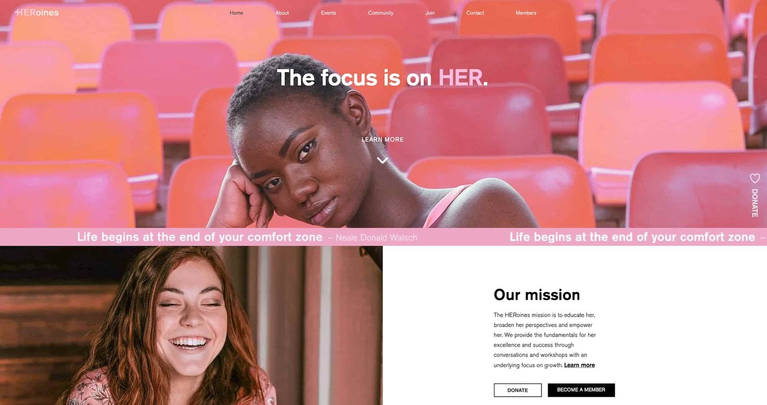
Here's a great example of a simple but effective homepage design from HERoines Inc:

examble of website design on the website for HERoines Inc

Image Source

2. Visual Hierarchy

Closely tied to the principle of simplicity, visual hierarchy means arranging and organizing website elements so that visitors naturally gravitate toward the most important elements first.

Remember, when it comes to optimizing for usability and UX, the goal is to lead visitors to complete a desired action, but in a way that feels natural and enjoyable. By adjusting the position, color, or size of certain elements, you can structure your site in such a way that viewers will be drawn to those elements first.

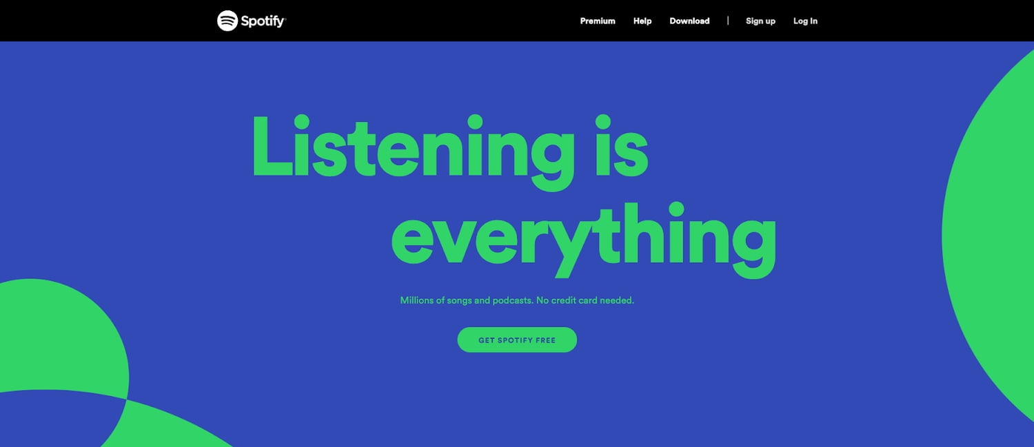
In the example below from Spotify, you can see that the main header “Listening is everything” sits atop the visual hierarchy with its size and page position. It draws your eye to their mission before anything else. This is followed by the "Get Spotify Free" CTA, which prompts action. Users can click this CTA, or scan the menu items above for more actions.

a web design example on Spotify.com

Image Source

3. Navigability

Planning out intuitive navigation on your site is crucial to help visitors find what they're looking for. Ideally, a visitor should land on your site and not have to think extensively about where to click next. Moving from point A to point B should be as frictionless as possible.

Here are a few tips for optimizing your site's navigation:

  • Keep the structure of your primary navigation simple (and near the top of your page).
  • Include navigation in the footer of your site.
  • Consider using breadcrumbs on every page (except your homepage) so users remember their navigation trail.
  • Include a search bar near the top of your site so visitors can search by keywords.
  • Don't offer too many navigation options per page. Again, simplicity!
  • Include links within your page copy, and make it clear where those links go.
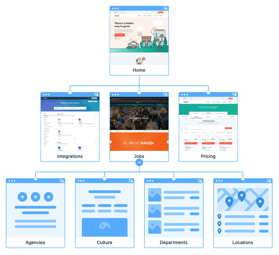
  • Don't make users dig too deep. Try making a basic wireframe map of all your site pages arranged like a pyramid: Your homepage is at the top, and each linked page from the previous forms the next layer. In most cases, it’s best to keep your map no more than three levels deep. Take HubSpot’s site map, for example.
site map for HubSpot.com

Image Source

One more pointer: Once you've settled on what your site's main (top) navigation will be, keep it consistent. The labels and location of your navigation should remain the same on every page.

This leads us nicely into our next principle...

4. Consistency

In addition to keeping your navigation consistent, the overall look and feel of your site should be similar across all of your site's pages. Backgrounds, color schemes, typefaces, and even the tone of your writing are all areas where consistency has a positive impact on usability and UX.

That's not to say every page should follow the same layout. Instead, create different layouts for specific types of pages (e.g., landing pages, informational pages, etc.). By using those layouts consistently, you'll make it easier for visitors to understand what type of information they're likely to find on a given page.

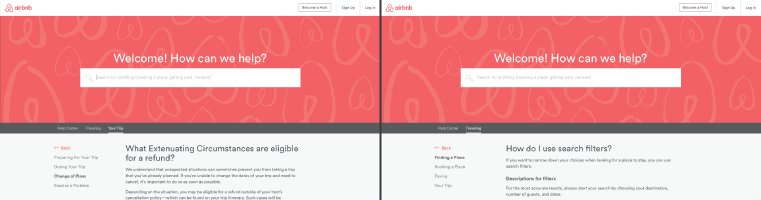
In the example below, you can see that Airbnb uses the same layout for all of its "Help" pages, a common practice. Imagine what it would be like from a visitor's perspective if every "Help" page had its own, unique layout. There would probably be a lot of shoulder shrugging.

a help page on Airbnb.com

Image Source

5. Responsivity

According to Statista, 48% of page global views were from mobile devices like smartphones and tablets. And according to our research, 93% of people have left a website because it didn’t display properly on their device.

The takeaway here: To provide a truly great user experience, your site has to be compatible with the many different devices that your visitors are using. In the tech world, this is known as responsive design.

Responsive design means investing in a highly flexible website structure. On a responsive site, content is automatically resized and reshuffled to fit the dimensions of whichever device a visitor happens to be using. This can be accomplished with mobile-friendly HTML templates, or by creating a special mobile site.

Ultimately, it's more important to provide a great experience across different devices than look identical across those devices.

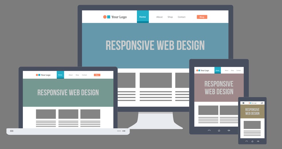
an illustration of a responsive web page on different devices

Image Source

Alongside mobile-friendliness, it’s worth your while to test your website’s cross-cross browser compatibility. In all likelihood, you’ve only viewed your site on one web browser, be it Google Chrome, Safari, Firefox, or something else.

Now is the time to open your pages on each of these browsers and evaluate how your elements appear. Ideally, there won’t be much difference in presentation, but you can’t know for sure until you see for yourself.

6. Accessibility

The goal of web accessibility is to make a website that anyone can use, including people with disabilities or limitations that affect their browsing experience. As a website designer, it’s your job to think of these users in your UX plan.

Like responsiveness, accessibility applies to your entire site: structure, page format, visuals, and both written and visual content. The Web Content Accessibility Guidelines (WCAG), developed by the Web Accessibility Initiative and the World Wide Web Consortium, set the guidelines for web accessibility. In a broad sense, these guidelines state that websites must be:

  • Perceivable: Visitors are aware of the content on your site.
  • Operable: The functionality of your website should be possible in different ways.
  • Understandable: All content and alerts can be easily understood.
  • Robust: Your website is usable across different assistive technologies, devices, and browsers.

For a deeper dive into this topic, see our Ultimate Guide to Web Accessibility.

7. Conventionality

A big challenge in web design is balancing originality with your expectations. Most of us are expert internet users, and there are specific conventions we’ve grown accustomed to over time. Such conventions include:

  • Placing the main navigation at the top (or left side) of a page.
  • Placing a logo at the top left (or center) of a page.
  • Making the logo clickable, so it always brings a visitor back to the homepage.
  • Having links and buttons that change color/appearance when you hover over them.
  • Using a shopping cart icon on an ecommerce site. The icon also has a number badge signifying the number of items in the cart.
  • Ensuring image sliders have buttons users can click to manually rotate slides.

While some might opt to throw these out the window for the sake of uniqueness, this is a mistake. There’s still plenty of room for creativity within the constraints of web conventionality.

Let’s briefly consider another field of design, architecture. Building codes are put in place so that folks can easily and safely use indoor spaces. An architect doesn’t complain about these codes or violate these designs because, aside from being against the law, they assure safety and comfort. It doesn’t matter how dazzling the building appears — if you trip on uneven stairs, or you can’t get out in a fire, you’re going to hate that building.

In the same way, you can craft a memorable experience while meeting user expectations. If you violate what users anticipate, they may feel uncomfortable or even frustrated with your site.

8. Credibility

Sticking to web conventions lends your site credibility. In other words, it increases the level of trust your site conveys. And if you're striving to build a site that provides the best user experience possible, credibility goes a long way.

One of the best methods to improve your credibility is to be clear and honest about the product or service you're selling. Don't make visitors dig through dozens of pages to find what it is you do. Be up-front on your homepage, and dedicate some real estate to explaining the value behind what you do.

Another credibility tip: Have a pricing page, also linked on the homepage. Rather than force people to contact you to learn more about pricing, list your prices clearly on your site. This makes your business appear more trustworthy and legitimate.

Here's an example of an effective pricing page from the Box website:

pricing page for Box.com

Image Source

9. User-Centricity

At the end of the day, usability and user experience hinge on the preferences of the end-users. After all, if you're not designing for them, who are you designing for?

So, while the principles detailed in this list are a great starting point, the final key to improving the design of your site is to conduct user testing, gather feedback, and implement changes based on what you've learned.

And don’t bother testing usability by yourself. You’ve already invested a lot of time into your design, which brings your own biases into the equation. Get testers who have never seen your site before, the same as any first-time visitor.

Here are a few user testing tools to get you started:

  • Website Grader: Our free tool evaluates your website based on several factors: mobile, design, performance, SEO, and security. It then offers tailored suggestions for improvement. You can learn more about Website Grader in our dedicated blog post.
  • Crazy Egg: Track multiple domains under one account and uncover insights about your site's performance using four different intelligence tools -- heat map, scroll map, overlay, and confetti.
  • Loop11: Use this tool to easily create usability tests -- even if you don't have any HTML experience.
  • The User Is Drunk: Pay Richard Littauer to get drunk and review your site. Don't believe me? We tried it.

For even more helpful options, see our list of the best user testing tools.

Hopefully, these guidelines are useful in informing the structure of your web pages and website as a whole. But, how does one put these guidelines into practice? In the next section, I’ll run down the essential page elements that you should strongly consider including in your design plan.

1. Header and Footer

The header and footer are a staple of just about every modern website. Try to include them on most of your pages, from your homepage, to your blog posts, and even your “No results found” page.

Your header should contain your branding in the form of a logo and organization name, menu navigation, and maybe a CTA, and/or a search bar if well-spaced and minimal. On the other end, your footer is where many users will instinctively scroll for essential information. In your footer, place contact information, a signup form, links to your common pages, legal and privacy policies, links to translated versions of your site, and social media links.

2. Menu Navigation

Whether it’s a list of links across the header or a tidy and compact hamburger button in the corner, every website needs a guide for navigation positioned at the top of at least your homepage and other important pages. A good menu limits the number of clicks to reach any part of your website to just a few.

To reduce clutter, you might consider making some or all menu options a dropdown menu with links within it, as can be seen on HubSpot's homepage.

homepage for hubspot.com

3. Search Bar

In addition to menu navigation, strongly consider placing a search bar at the top of your pages, so users can browse your site for content by keyword. If incorporating this functionality, make sure your results are relevant, forgiving of typos, and capable of approximate keyword matching. Most of us use a high-quality search engine every day, be it Google, Amazon, YouTube, or elsewhere. These all set the standard for your own site search.

4. Branding

Remember the conventions we’ve discussed? One that you see practically everywhere is a logo in the top left corner. On first landing, many visitors’ eyes will instinctively shift to this region to check they’re in the right place. Don’t leave them hanging.

To reinforce this notion, incorporate your company branding into every element you add, piece of content you post, and color scheme you create. That’s why we recommend establishing brand guidelines if you haven’t already — check out our style guide for a reference.

5. Color Palette

Color choice plays a major role in your site’s usability and UX as well. This decision tends to be more subjective than other requirements in this list. But, like everything else we’ve discussed, try to simplify — limit your color selection to 3-4 prominent colors at most.

Starting a color palette from scratch can be surprisingly difficult the first time. We seem to intuitively pick up on which colors work well together and which don’t, but we stumble when trying to pick from the infinite combinations available.

The solution? Try a color palette that’s been shown to work on other websites. Take influence from your favorite sites, and see our list of our favorite website color schemes to get started.

6. Headers

Headers are key to establishing the visual hierarchy we discussed earlier, especially on text-heavy pages. As users skim your pages what you need, a clear and to-the-point header alerts readers to stop scrolling after finding what they want. Use only as many headers as there are distinct sections of your page, as too much blown-up and bolded text will dampen this effect.

7. Clear Labels

Whenever a user takes an action on your website, it must be obvious exactly what they’re doing and/or where they’re going. All buttons should have clear text or an icon to precisely and concisely signal their purpose. The same goes for in-text links and widgets (simple interactive elements, like dropdowns and text forms).

For example, a button linking to a pricing page should just read “Pricing” — anything beyond that (e.g., “See our prices”, “Check out the pricing page for a deal”) is superfluous. A search bar/button only needs a search glass icon (🔍), and perhaps also the word “Search”, to denote its purpose.

User testing can be a major help here. While you yourself know what all of your interactive page elements do, the same can’t be said for a new user. Testing will give valuable insight into what users think your labels mean beyond your own perspective.

8. Visuals and Media

When incorporating static images, gifs, videos, and other media into your pages, remember to be consistent and intentional in your choices. These elements will draw attention over most other text and will likely stay in users’ minds, so choose wisely.

Here’s just one example of effective media on a homepage. Notice how every image complements the page aesthetic and supports the offer of personalized fitness training with results.

an example of web design guidelines used on a web page for a personal training gym

Image Source

Also, all images and videos should be optimized for search engines and include descriptive alt text for accessibility.

9. Calls to Action (CTAs)

Having a pleasing website is great, but how do you know whether your visitors are actually doing what you want? Are they engaging with your content? This is where CTAs come into play.

A CTA is any page element that prompts user action. The action could be adding a product to a card, downloading a content offer, or signing up for an email list. Make your CTA elements prominent in the visual hierarchy (remember our Spotify example), but not intrusive or distracting like many click-through ads tend to be.

If you need ideas for sleek CTAs that drive more conversions, see our CTA examples list.

10. Whitespace

That’s right, sometimes it’s about the elements you don’t include. After reading these guidelines and requirements, you may feel tempted to stuff your pages with all the bits and bobs needed for a flawless UX. Don’t forget that your viewers need room to digest all this new info, so give your elements room to breathe.

But, how much whitespace should you have? That’s another personal call, and varies from site to site. So, user testing is handy here as well. What are people focusing on? Do they feel overwhelmed with the density of content? Once again, it all ties back to our first guideline, simplicity.

Design that Puts Users First

Indeed, web design is largely subjective — your website’s look and experience isn’t going to please everyone. However, there are also tried-and-true UX principles that, when carefully considered and incorporated, help visitors feel more at home.

According to Amazon Web Services, 88% of website visitors are less likely to return to a website after a poor experience. And how could you blame them? We’ve surely all been there.

So, as a final bit of usability/UX wisdom, start caring more! Imagine yourself into the shoes (or, more accurately, browser windows) of your visitors, and keep them in mind every step of the design process.


9 Guidelines for Exceptional Web Design, Usability, and User Experience was originally posted by Local Sign Company Irvine, Ca. https://goo.gl/4NmUQV https://goo.gl/bQ1zHR http://www.pearltrees.com/anaheimsigns