Today, your Instagram profile is like a mini-version of your website.
Think of your profile page as your homepage and each tab as a different section of your website. Instagram Story Highlights serve as your navigation bar, each one points to a collection of Stories relating to a specific theme.
You’ll find everything from "Meet the Team" and event recaps to FAQs and customer reviews on Highlight covers. While brands often set up their Highlights early on, many forget one important step: Designing Highlight covers.
In this article, we’ll cover the steps to make your own Highlight covers, some tips to keep in mind, and examples to inspire you.
How to Make Instagram Highlight Covers
Before you can add your Highlight covers to your Instagram profile, you first have to create them.
The easiest way to do this is through Canva, the graphic design app that offers hundreds of templates for just about everything. And did I mention it’s free?
Let’s get started.
-
Go to Canva.com and create an account.
-
Once you’re logged in, go to the search bar. Type in "Instagram Story Highlight Cover" and click "Enter" on your keyboard.
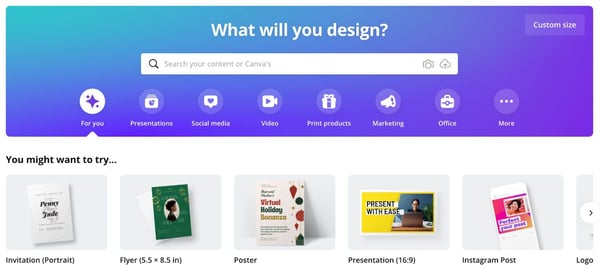
-
From there, you can choose one of the pre-built templates or start from scratch.
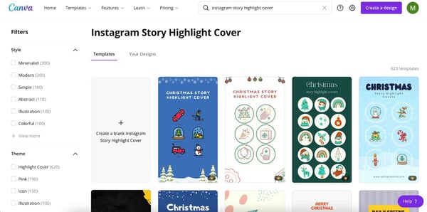
-
On the editing page, choose from hundreds of icons, graphics, and elements to customize your cover. You can also upload your own images and graphics.
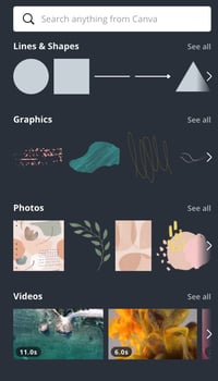
-
Once you’re done editing, click on the "Download" button on the top right corner of the page.
Now that you know how to make your Highlight covers, let’s cover how to add them to your Instagram profile.
-
Log into your account and head to your profile tab. Once there, click on the "New" icon located just under your bio section.
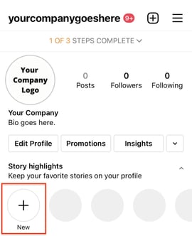
-
Select which Stories you want to add to your Highlights then click "Next."
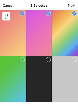
-
Click on "Edit Cover" to upload your Highlight cover.
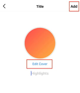
-
Then write a name for this Highlight then click on "Add."
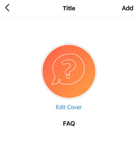
-
That’s it! Your new Highlight cover will now show up on your profile.
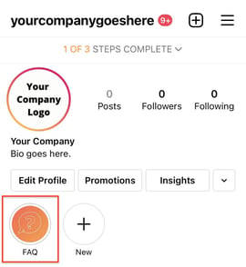 Pro-tip: Pick a name that will let your followers know exactly what to expect when clicking on it. Think of it as a navigation bar.
Best Instagram Highlight Covers
1. The Jungalow
What I love about The Jungalow’s Highlight covers is that they’re cohesive while still being different. Each cover features different icons and colors but they all blend well together.
They even customized Target’s logo to fit within their aesthetic.
Instagram is all about aesthetics. So whenever you can, you want to find opportunities to make that happen. This is a great example of how to do so.
2. Good Lines
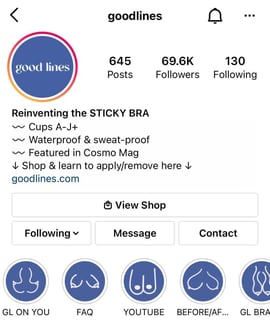
Good Lines’ Highlight covers are fun, creative, and memorable.
Instead of using the standard icons, the brand decided to take a unique approach and use illustrations that align with its product.
Highlight covers are an opportunity to have fun and show some of that brand personality. It will help you stand out from the rest and leave a lasting impression.
3. MKT Heights
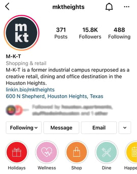
For its Highlight covers, this brand went for simple icons against vibrant colors.
One thing to note here is that the brand picked icons that would complement the Highlight texts. You never want to leave your audience wondering or confused about what to expect. As such, you want icons that will be easily recognized and align with the topic.
For example, the "Dine" Highlight has the utensils icon, the "Holidays" one has a boxed gift icon. It’s a simple, foolproof strategy.
4. Ettitude
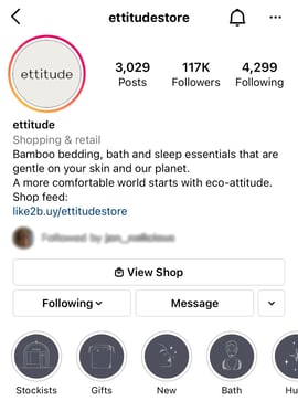
This brand went for a minimalist and cohesive look with its Highlight covers. Another interesting thing to note about this brand is that its Highlight cover background matches the colors on its website.
Keeping your brand colors consistent everywhere online is a great way to improve brand recognition. It also gives your profile a clean look that users can easily navigate.
Tips When Creating Instagram Highlight Covers
Highlight covers can greatly elevate your Instagram profile when done right. Here are some tips to help guide you:
- Opt for icons or images instead of text – One mistake I often see brands make is writing the same words in their highlight cover as the description right below it. The text is supposed to complement the image and add more dimension to your profile.
- Pick icons and images that align closely with the content – Don’t make your audience guess what each highlight is about. For instance, if one of your Highlights is about food, great icons include utensils, bowls, ingredients menus.
- Keep it cohesive – With Highlight covers, there’s a lot to play with: text, icons, images, colors. Make sure you pick icons with similar shapes and styles, choose colors that are complementary, and follow the same text format for all Highlights.
There you have it – everything you need to know about your Highlight covers. The great thing about them is that you can always update them. So don’t be afraid to play around with some ideas on Canva and design Highlight covers that will complement your Instagram profile.
5 Instagram Highlight Covers to Inspire You [+ Steps To Make Your Own] was originally posted by Local Sign Company Irvine, Ca. https://goo.gl/4NmUQV https://goo.gl/bQ1zHR http://www.pearltrees.com/anaheimsigns

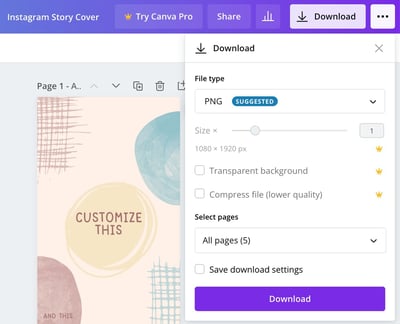
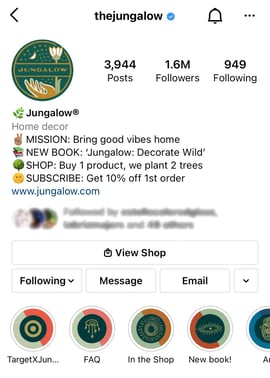 Image Source

No comments:
Post a Comment