When it comes to building a memorable brand, it's all about consistency. Like when you're shopping for your favorite cereal or coffee at the grocery store, you want to be able to spot it from a mile away.
The best brands stick in our brains because their presence is defined by the repetition of the same logo, fonts, colors, and images. Once we see them enough, they become instantly recognizable, bringing us a clear sense of reliability and security.
Developing a consistent brand starts with creating a brand style guide. These branding rule books help graphic designers, marketers, web developers, community managers, and even product packaging departments all stay on the same page, and present a unified vision of the brand to the public.
In this article, we’ll go over what brand guidelines are, elements of a style guide, and some amazing examples of them in action to use as inspiration for your next branding project or website redesign.
What are brand guidelines?
Brand guidelines, also known as a brand style guide, govern the composition, design, and general look-and-feel of a company's branding. Brand guidelines can dictate the content of a logo, blog, website, advertisement, and similar marketing collateral.
Picture the most recognizable brands you can think of. Chances are, you've learned to recognize them because of the consistency across the messaging — written or visual — these brands broadcast. The same brand colors are reflected across them. The language sounds familiar. It's all very organized and, while not rigid, it's cohesive.
Here are a few types of guidelines you'd find in a brand style guide and which parts of a brand they can influence.
Download our free resource on how to create your own style guide with brand guidelines templates to follow. Creating a consistent style guide isn’t easy, but with these tools you can build an unforgettable one with ease.
The Elements of a Brand Style Guide
A brand style guide encompasses much more than just a logo. It visually encompasses everything your brand is about — down to your business’ purpose. Here are some key elements that make or break a brand style guide.
- Mission Statement: Your mission statement is the compass of your brand style guide. It ensures that all your content is working toward the same goal. This statement can guide your blog and paid content, ad copy, visual media and slogan.
- Buyer Persona: A buyer persona is the fictional representation of your ideal customer. It includes details on your customer’s job title, age, gender and professional challenges — therefore stipulating for whom your brand publishes content. Your buyer persona guides you blog content, ad copy, and visual media.
- Color Palette: Your color palette is a group of colors your company uses to design its brand, guiding every piece of visual content created. These color combinations often follow HEX or RGB color codes, and govern your logo, web design, printed ads and event collateral.
- Editorial Style Guide: The job of an editorial style guide is to commit an editorial stylebook on how to phrase certain products, list topics the brand can and cannot write about, and other companies it can mention. Your editorial style guide can guide your blog content, video scripts, website and landing page copy, PR talking points and knowledge base articles.
- Typography: Typography is a visual element of your brand style guide that goes beyond the font you use in your company logo. It supports your blog design down to the links and copy on your website — even your tagline.
As you can see, the purpose of the brand style guide is to form and maintain all of the various elements of a company that, when combined, spell out the entire brand as it's recognized.
Intrigued? Check out 21 of the best ones we could find.
1. Medium
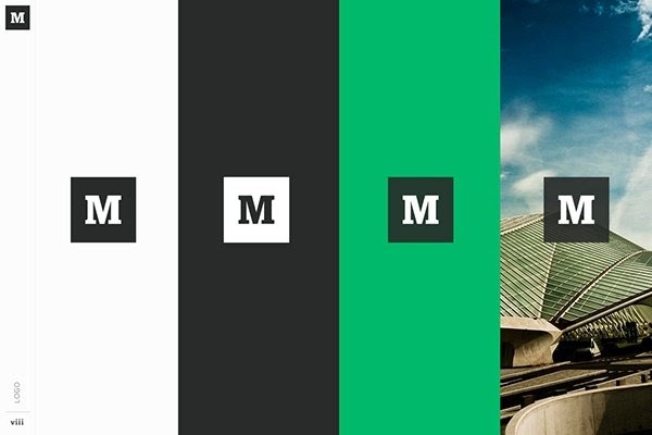
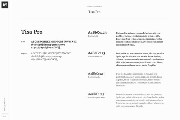
Medium emphasizes both typography and color in its brand style guide. Its guide also includes details related to the company's "Purpose" and "Product Principles."
See the full brand guide here.
2. Wolf Circus Jewelry
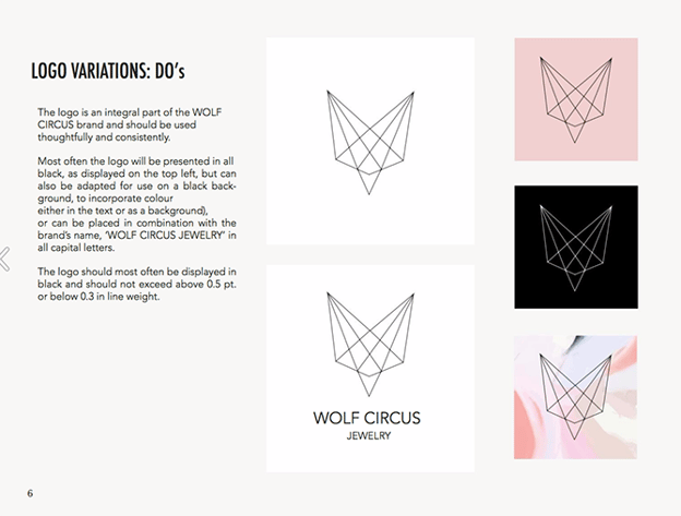
Wolf Circus Jewelry's product is all about appearance. Naturally, the company's style guide is too. The brand's style guide includes the company's mission statement, product details, typeface, logo variations, a color palette, and a separate set of guidelines just for advertisements.
See the full brand guide here.
3. Ollo
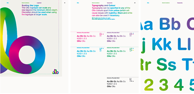
Ollo is so into color and typography, it turned its style guide into a game. Click the link below to see how much you can manipulate the brand. It's the perfect way to show content creators how creative they can get but also still adhere to Ollo's specific typeface and color codes.
See the full brand guide here.
4. Skype
Everyone's favorite video chat platform also has a squeaky-clean style guide for its brand. Skype, now owned by Microsoft, focuses primarily on its product phrasing and logo placement.
See the full brand guide here.
5. Barre & Soul
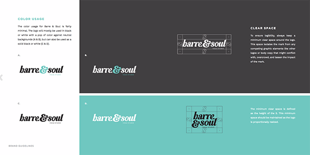
Barre & Soul's brand style guide includes variations of its logo, logo spacing, secondary logos, supporting imagery, and a five-color color palette.
See the full brand guide here.
6. Spotify
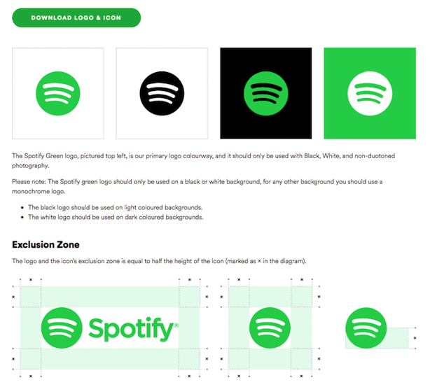
Spotify's style guide might appear simple and green, but there's more to the brand than just a lime green circle. Spotify's color palette includes three color codes, while the rest of the company's branding guidelines focus heavily on logo variation and album artwork. The style guide even allows you to download an icon version of its logo, making it easier to represent the company without manually recreating it.
See the full brand guide here.
7. Jamie Oliver
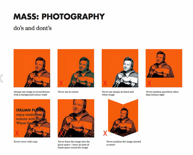
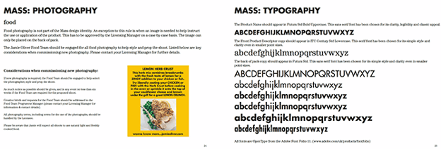
Jamie Oliver has an extremely thorough brand style guide, covering logo placement across all of its kitchenware products. The company also includes a large color palette with each color sorted by the product it should be shown on.
See the full brand guide here.
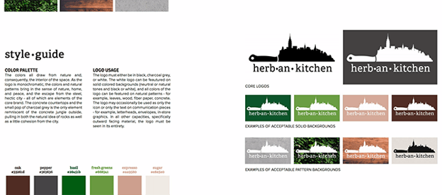
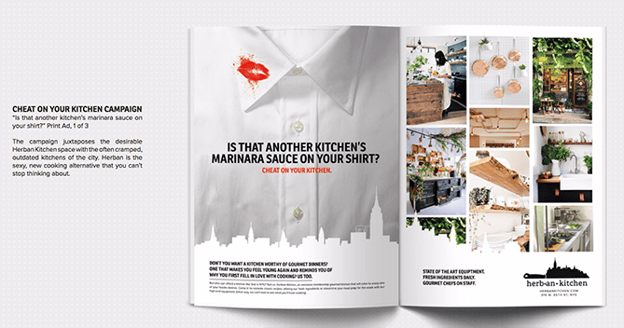
8. Herban Kitchen
Herban Kitchen has both a color and texture palette in its style guide. These guidelines help to show not just how the brand's logo will appear, but how the company's various storefronts will look from the outside to potential customers.
See the full brand guide here.
9. Urban Outfitters
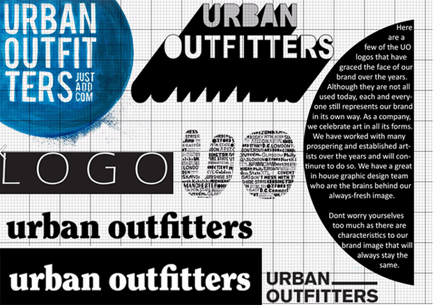
Photography, color, and even tone of voice appear in Urban Outfitters' California-inspired brand guidelines. However, the company isn't shy to include information about its ideal consumer and what the brand believes in, as well.
See the full brand guide here.
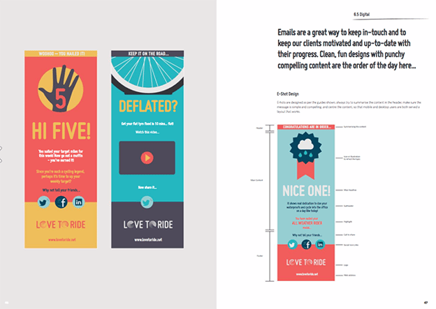
10. Love to Ride
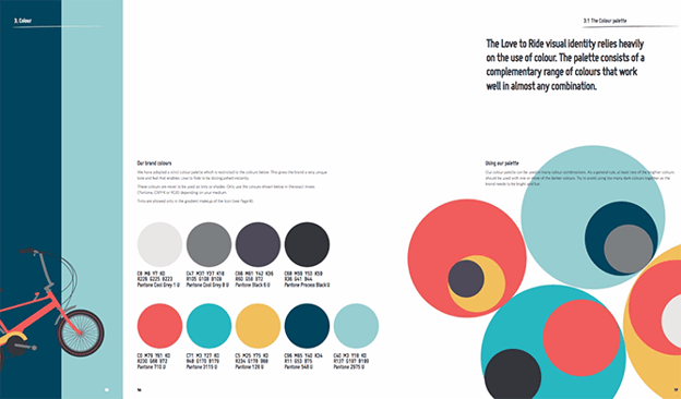
Love to Ride, a cycling company, is all about color variety in its visually pleasing style guide. The company's brand guidelines include nine color codes and tons of detail about its secondary logos and imagery.
See the full brand guide here.
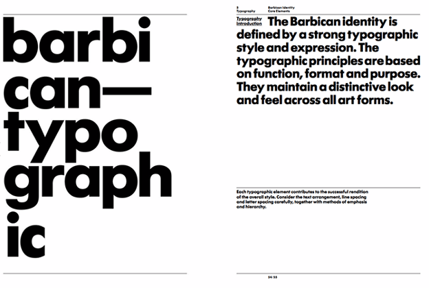
11. Barbican
Barbican, an art and learning center in the United Kingdom, sports a loud yet simple style guide focusing heavily on its logo and supporting typefaces.
See the full brand guide here.
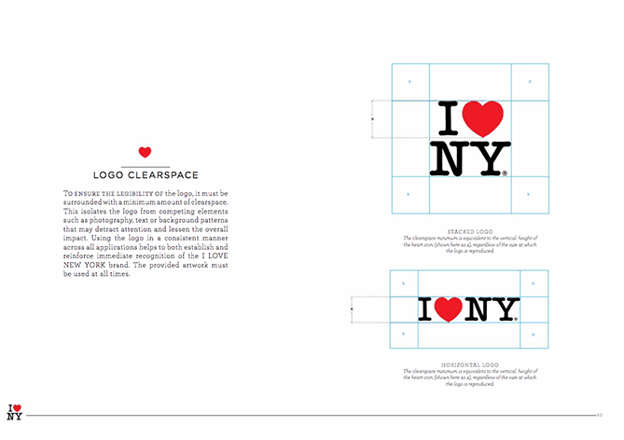
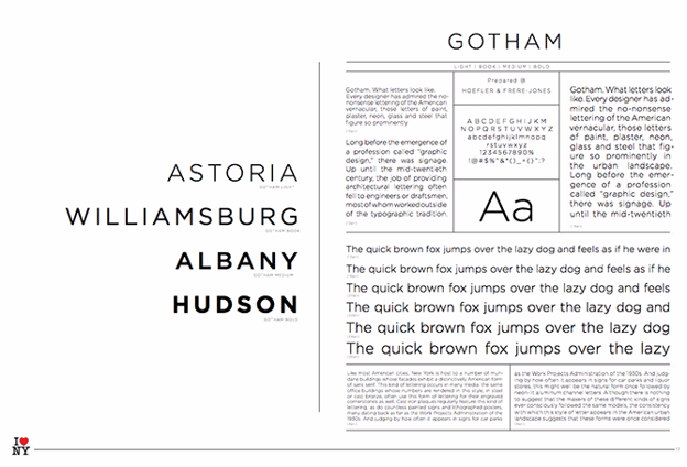
12. I Love New York
Despite its famously simple t-shirts, I Love New York has a brand style guide. The company begins its guidelines with a thorough explanation of its mission, vision, story, target audience, and tone of voice. Only then does the style guide delve into its logo positioning on various merchandise.
See the full brand guide here.
13. Cisco
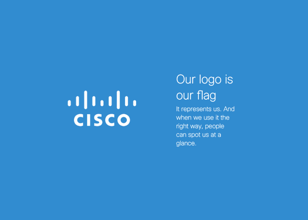
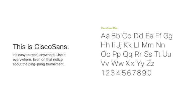
Cisco's style guide isn't just a guide — it's an interactive brand book. The company takes website visitors page by page through its brand's vision, mission, strategy, and even its promise before showing users their logo and allowing them to actually type using their proprietary typeface, "CiscoSans." Where's Cisco's color palette, you ask? The business has a separate webpage for just that.
See the full brand guide here.
14. University of the Arts Helsinki
The style guide of the University of the Arts Helsinki is more of a creative branding album than a traditional marketing guide. It shows you dozens of contexts in which you'd see this school's provocative logo, including animations.
See the full brand guide here.

15. NJORD
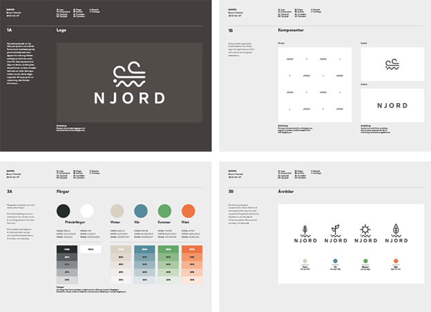
NJORD's minimalist style guide gives you everything you'd need to know to design using the brand's logo and color palette for both web and print.
See the full brand guide here.
16. Espacio Cultural
This cultural center in Argentina has a color palette that's as elaborate as the artistic workshops it hosts. Nonetheless, the brand does a fantastic job of breaking down every last color code and logo placement you can find — from the building itself to the advertisements promoting it.
See the full brand guide here.
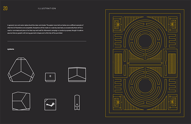
17. Alienware
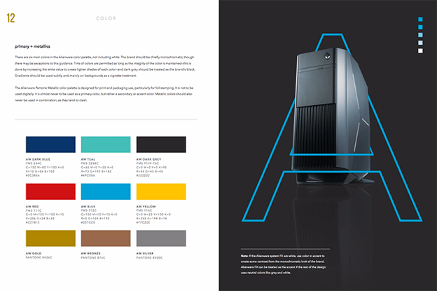
Video gamers know Alienware from its game-friendly computers, but the rest of the world knows it by the brand's sleek aesthetic. The company organizes its brand style guide into four basic parts: voice, design, photography, and partner. The latter describes (and shows) how the brand interacts with partner brands, such as Star Wars.
See the full brand guide here.
18. Netflix
As far as its public brand assets are concerned, Netflix is focused primarily on the treatment of its logo. The company offers a simple set of rules governing the size, spacing, and placement of its famous capitalized typeface, as well as a single color code for its classic red logo.
See the full brand guide here.
19. Scrimshaw Coffee
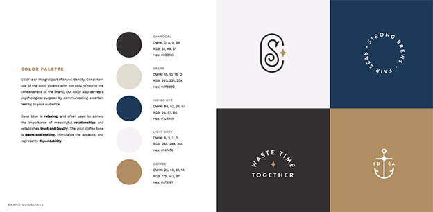
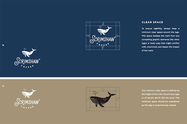
Featuring a five-code color palette, this "laid back," "friendly," and "modern" brand has a number of secondary logos it embraces in various situations.
See the full brand guide here.
20. NASA
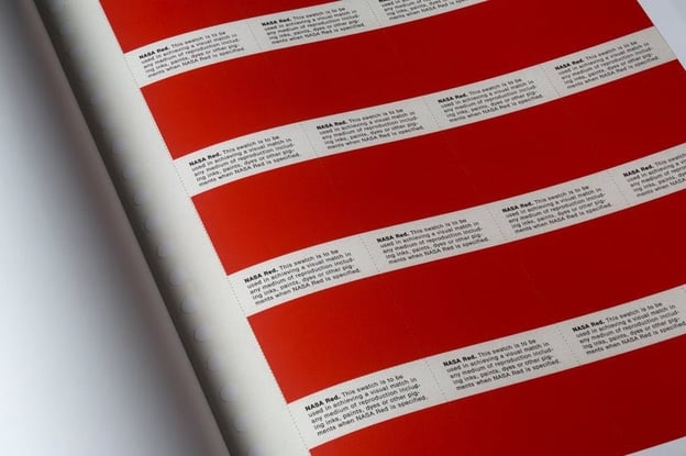
NASA's "Graphics Standards Manual" is as official and complex as you think it is. At 220 pages, the guide describes countless logo placements, color uses, and supporting designs. And yes, NASA's space shuttles have their own branding rules.
See the full brand guide here.

21. New York City Transit Authority
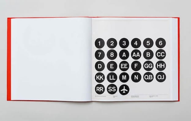
Like NASA, the NYCTA has its own Graphics Standards Manual, and it includes some fascinating typography rules for the numbers, arrows, and public transit symbols the average commuter takes for granted every day.
See the full brand guide here.

Build a Memorable Style Guide of Your Own
Once you build your unique brand style guide, customers will recognize your brand and associate it with all the visual cues you want them to. We hope you were inspired by our list of amazing brand style guides and wish you luck in creating a timeless style of your own.
21 Brand Style Guide Examples for Visual Inspiration was originally posted by Local Sign Company Irvine, Ca. https://goo.gl/4NmUQV https://goo.gl/bQ1zHR http://www.pearltrees.com/anaheimsigns
![Free Download: How to Create a Style Guide [+ Free Templates]](https://no-cache.hubspot.com/cta/default/53/76520ae5-1a3b-4055-9e8e-95e150b90965.png)
No comments:
Post a Comment