If you really think about it, the content formats we rely on today have an uncanny resemblance to the content formats we relied on yesterday — our blog posts look like print articles, our offers look like books, and our slide decks look like look presentations.
Relying on the content formats we used yesterday to educate and entertain our audience today is fine: Our audience is ultimately used to these mediums. At the same time, “fine” is not exceptional, and we’ve missed a huge opportunity to engage them at record levels because we glossed over the fact that screens and computers are so much more than just digital pieces of paper and printing presses.
Fortunately, the interactive marketing movement is charging along, and their early adopters have proven that if marketers want to cut through the noise, they can’t just do what they've always been doing. They need to refresh their work.
Common Types of Interactive Marketing Strategies
- Interactive videos: Using video is a great way to explain a topic or entertain viewers. Savvy marketers have found new ways to engage viewers by adding CTAs in videos prompting them to subscribe or participate in the conversation in real time. Some videos allow viewers to answer questions by clicking a set of multiple choice answers right on the screen. Other formats immerse the viewer in beautiful landscapes, which is becoming more popular as the use of 360-degree video becomes more prevalent.
- Quizzes, surveys, and polls: Quizzes and polls are a fun way to get visitors to interact with your site and you can create them for just about any topic. Buzzfeed has excelled in this area, but it’s not uncommon to see them used for travel, home search, and interior design sites. They are popular tools for social media marketing as well.
- Personalized content: From addressing customers by name in email to curating specific ads targeted at their individual needs, adding a personal touch gives the impression that you are speaking directly to them. Ever abandoned an item in your cart and received an email reminder about it later? That’s personalized marketing at work.
- Interactive storytelling: It can be difficult to keep readers engaged with a long-form article. Interactive storytelling uses infographics, gifs, video, clickable maps, charts, and other visual aids to help break up text and keep readers from getting fatigued.
- Calculators: While calculators don’t sound super interesting, they are incredibly useful for organizations that want to showcase data. Looking for a home? You’ve probably used a mortgage calculator to get a ballpark estimate of your monthly payment.
Interactive Marketing Examples
Capturing attention sounds great in theory, but you may be unsure of how to incorporate interactive marketing into your strategy. To get some great ideas, learn from some of these great examples of interactive marketing:
1. Interactive Series | Sweet Digs by Eko and Refinery29
Why we like it:
- This series gets viewers directly involved with the show by having them choose furniture or answer questions in real time.
- Additionally, it builds on Refinery29's already successful content.
If you’ve ever watched a house hunting or interior design show and either found yourself talking to the TV or gawking at the owner’s decor choices, Refinery29’s Sweet Digs is for you. They partnered with Eko, a platform known for creating interactive shows, to bring viewers inside the coolest and quirkiest homes — with a twist.
Instead of merely being a voyeur, viewers are prompted to interact with homeowners and renters. From recommending how they should redecorate to guessing how much certain furniture items cost, viewers can get in on the action. Even more satisfying, you’ll get to see if they chose the items you suggested at the end. It’s HGTV on steroids.
The best part is, Refinery29 didn’t need to create a new marketing idea from scratch. Instead they took a concept they already did well, and improved upon it using Eko’s interactive tools. This new content gives viewers a sense of agency in the content they’re consuming while also leveling up engagement.
2. Vimeo Virtual Courses That Get You Moving | Y7
Why we like it:
- Adding details like a studio playlist helped Y7 patrons create the studio atmosphere at home.
- Creating an online community not only helped the studio stay afloat, it provided patrons a sense of normalcy in uncertain times.
Pandemic restrictions shuttered many businesses that required in-person interaction, like gyms and fitness studios. Those that survived adapted their offerings for the virtual market. But let’s face it, working out at home just isn’t the same as getting a boutique fitness experience.
Trendy Yoga studio Y7, rose to the occasion. Using Vimeo OTT, the brand known for its candlelit classes and trap soundtrack moved instruction for all 15 studios online. They then kicked the online experience up a notch by helping their students create the studio vibe at home, complete with an in video QR code to access the class playlist.
All the little details paid off. These improvements in virtual teaching kept students coming back for more, enabling Y7 to stay in business and retain their loyal fanbase.
3. The Structure of Stand-Up Comedy | The Pudding
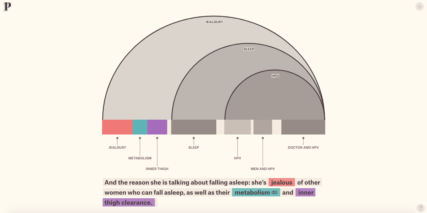
Why we like it:
- The visuals and diagrams dissecting Wong’s routine are like taking a class on performance and creative writing at the same time.
- It leaves the audience with a deeper understanding of not only how Wong crafts her routine, but also allows them to connect with her in an empathetic way.
Stand-up comedians might seem like the lucky wisecrackers who are blessed with the talent to improvise some of the funniest jokes and bits you’ve ever heard, but in reality, they polish their performance with painstaking precision.
To crack their audiences up as much as possible, they make sure their routines’ stories seamlessly flow from one to the other. However, some comedians like Ali Wong take their stand-up preparation to an entirely different level.
In their interactive slideshow about how Ali Wong structured her Netflix special Baby Cobra, The Pudding, a digital publication that crafts visual essays about culture and entertainment, describes how she sculpts her routine into a narrative instead of just telling a bunch of separate jokes.
By visually outlining her entire routine, The Pudding reveals how Ali Wong weaved all her bits into a story, building her world and perception of life in a way that her audience can truly understand, which left them with a deeper feeling of empathy, meaning, and ultimately humor.
4. Conversational Marketing | HubSpot
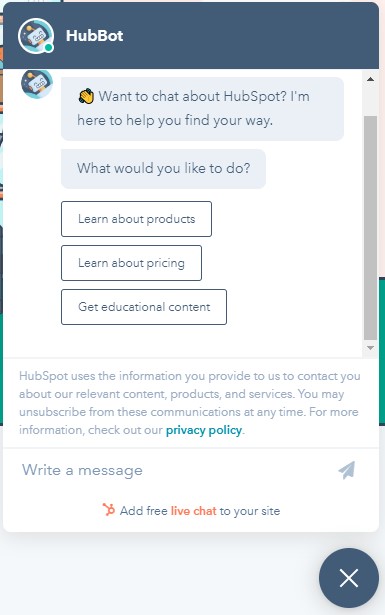
Why we like it:
- The chat bot’s prompts allow users to customize their own experience on the site, ensuring that they quickly get the information they are looking for.
- Since the user is dictating their experience on the site, it eliminates any sales pressure, providing a better overall user experience.
We rely on messaging apps to interact with friends and family, so it only makes sense that brands should incorporate them for communication to reduce friction in the buying journey. Despite this, marketers have been sluggish to adopt conversational marketing — using chatbots, live chat, Facebook Messenger, and other chat features — into their inbound marketing strategies. In fact, according to Business 2 Community, only 36% of companies have adopted these tactics. At HubSpot, we hope to change that by offering new messaging tools that can integrate with your entire marketing suite and database.
We double down on this idea by using our own conversational marketing software on our homepage. Website visitors are asked a question and given several choices of potential answers. This allows the prospect to engage in website content almost like a "choose your own adventure" story. This improves the overall site experience and ensures that the site is serving up the content (or actions) that will benefit them the most... without any sales pressure.
5. A Personal Thank You with Vidyard | Amnesty International Canada
Why we like it:
- Giving donors a visual representation of how their donation aided Amnesty International’s various causes builds trust and establishes a personal connection.
- Donors will most-likely share the video with friends and family, which could lead to an increase donations.
In social settings, getting too personal too quickly is intrusive. However, when it comes to marketing, getting a little personal can go a long way in building brand loyalty.
Take this carefully crafted thank you video created by Amnesty International Canada using Vidyard’s platform. Personalized videos like the one above were sent to all of the organization’s donors. After reviewing their metrics, the organization reported higher donor satisfaction and retention from the use of these videos.
Sending a thank you card or email is nice, but adding a personal touch in the form of a video really won their donors over. When customers are happy with your product or service, they will inevitably share it with their network, providing you with valuable word of mouth promotion and credibility
6. Interactive Infographic| Family Fun in Scottsdale by Marriott
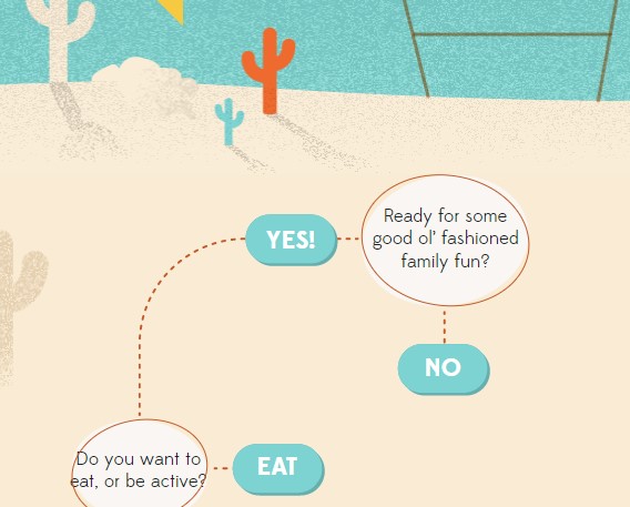
Why we like it:
-
This interactive ad is a fun take on vacation planning.
-
The clickable flowchart acts as a tool to help viewers customize their vacation activities to the parameters they set (e.g., interests, age)
Marriott Hotels manages to make vacation planning even more fun while positioning their brand in front of potential customers with an interactive infographic. Vacationers who are headed to Scottsdale are able to take a customized path through the flowchart to receive destination advice. Just a little bit of animation goes a long way, and it adds a touch of personalization that normal infographics don't.
The beauty of this is that infographics are a great visual tool that have a ton of utility. By using lemonly.com, Marriott pushes the envelope just a step further, which provides unexpected delight.
7. Interactive Virtual Events | Built to Last by Wistia
Why we like it:
-
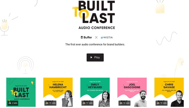
By having an audio conference instead of a traditional virtual one, Wistia freed up their audience to attend whenever was convenient for them (while running errands, at the gym, etc).
-
Visitors could attend any session in whatever order they liked instead of being forced into a rigid schedule, making the event more accessible.
By now we’re all used to virtual events, but meeting and video fatigue is real. How do you keep guests engaged? By mixing it up. That’s what Buffer and Wistia set out to do when they created the first ever audio conference for brand builders.
That’s right, no staring at the screen or being stuck at a desk. The audio format allowed listeners to join in from wherever they were, be it during their commute or while taking an afternoon stroll by connecting to a podcast player.
Each session ranged in length from roughly 25-35 minutes, and gave listeners the option to “choose their own adventure” by simply selecting the sessions they wanted to attend. This reduced friction as listeners were free to attend only the sessions relevant to their interests instead of committing several hours of their time.
8. Interactive Slide Show | The New Media Message by Velocity Partners
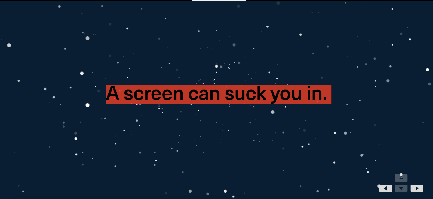
Why we like it:
-
This slideshow beautifully illustrates the importance of showing rather than telling audiences why they should care about a particular topic.
-
The build-up from the basic slides walks us through the progression of how using more interactive and attention grabbing graphics changes the audience's experience in real time.
In their interactive slideshow, which honestly looks like it belongs in Tron, Velocity Partners, a B2B marketing agency, explains why innovative marketers need to leverage new content formats in order to tell more refreshing stories.
Velocity Partners shows, not tells, how their interactive slideshow can captivate an audience. This is in stark contrast to how marketers have churned out so many blog posts, ebooks, and SlideShares that they’ve become dull and predictable. The end result of this message hammers home the point that the most engaging and surprising mediums are the best at delivering the most engaging and surprising stories.
9. Interactive Article | The Big Gronkowski by Ceros
Why we like it:
-
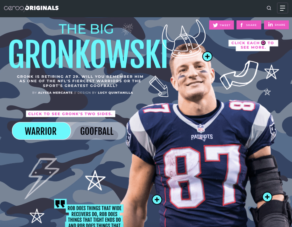
Ceros’ take on a visual representation of the article instead of traditional text is fresh, and immediately draws readers in.
-
Bucking the norms of article structure, readers can quickly toggle to the information they want to know first, rather than having it dictated to them.
When Rob Gronkowski temporarily retired in 2019 , Ceros, an experiential content creation platform, decided to create an interactive article that spotlights the two things Gronk will always be remembered for — his athletic prowess and goofy attitude.
When you visit their interactive article, you can toggle between Gronk’s “Warrior” and “Goofball” side, clicking on hotspots that reveal his impressive achievements, his laundry list of injuries, and some of the funniest things he’s ever done. Once you finish interacting with the article, you’ll truly understand how Rob Gronkowski is just as athletic as he is goofy.
10. Immersive Video | Scotland From the Sky by BBC Scotland
Why we like it:
- This 360-degree video nails the art of showing rather than telling.
- Using Scotland’s immersive landscapes as the backdrop, the viewer is made to feel like they are exploring Glen Coe with the filmmaker.
In 2019, Rough Guides, a renowned travel guidebook, named Scotland the most beautiful country in the world.
And a big reason why it’s such a spectacle is that Glen Coe, a Scottish valley that cuts through the ruins of an ancient supervolcano, is one of the most striking landscapes in the world.
With their immersive, 360-degree video of Glen Coe, BBC Scotland can grip viewers because they’re able to experience the landscape from an intimate point of view at every possible angle, making them feel like they’re actually there.
11. Playable Video Game Ad | Narcos: Cartel Wars

Why we like it:
-
The ability for people to go from just viewing the game to participating in it is a great way to draw them in.
-
Allowing potential customers to play the game before buying eliminates sales pressure and puts the customer in control of their experience.
In the past, video game apps had to use video or gif demos to advertise gameplay in hopes to attract new players and increase app downloads. The thing about watching videos, though, is that it's a passive activity. The visuals of the game may be enough to attract prospective players' attention, but it may fall short of giving them enough inertia to actually engage and play.
FTX Games found their way around this by partnering with Glispa for their game Narcos: Cartel Wars. Prospects are immediately drawn into the action of the game with the ability to try it before buying it. Rockets and explosions abound for a few rounds before the demo prompts the player to install the app and continue their game.
The good news is that this type of functionality is about to become much more mainstream with Facebook offering playable video ads on their platform. Much like the Cartel Wars example, these playable ads are composed of:
- A short video preview
- A playable demo to get people hooked on the gameplay
- A call-to-action to get the users to take the next step
12. Interactive Voice Ad on Pandora | Doritos
Why we like it:
-
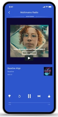
Doritos found a creative way to take the audience from passive to active listeners, complete with crunching chip sounds to get folks salivating.
-
The ad serves up questions to the audience and then uses AI to tailor their experience based on their answers.
Pandora for Brands has recently begun testing a new interactive ad functionality on their platform that allows users to verbally engage with the ad. Doritos is one of the first brands utilizing this new interactive format on Pandora. The audio uses the distinctive Doritos crunch and then prompts the user to answer a yes or no question. Using artificial intelligence, the ad can then serve up a personalized experience based on how the listener answered.
This is exciting for the same reason as the playable video game ads are: They disrupt passive listening in an attempt to get the listener to engage and actually process the information being conveyed to them. Plus, by being able to respond hands-free, there is less friction in order to learn more.
Applying Interactive Marketing to Your Campaigns
The campaigns in this article should give you a few takeaways to apply to your own marketing. As you create great content, you should also be thinking about:
- How to disrupt expectation to earn attention, engagement, and interest
- How to best personalize the experience for each individual prospect
- How to reduce friction as much as possible to increase momentum
By putting concepts these concepts in action, you'll be in a position to generate buzz, make your content stickier, enhance the experience, and fuel your flywheel.
This article was originally posted April 3, 2020 and has been updated for comprehensiveness.
12 of the Most Inventive Interactive Marketing Examples We've Ever Seen was originally posted by Local Sign Company Irvine, Ca. https://goo.gl/4NmUQV https://goo.gl/bQ1zHR http://www.pearltrees.com/anaheimsigns
![Download Now: 150+ Content Creation Templates [Free Kit]](https://no-cache.hubspot.com/cta/default/53/5478fa12-4cc3-4140-ba96-bc103eeb873e.png)



No comments:
Post a Comment