If you've been on the internet, chances are you've come across stark, simple websites or ad creative. In fact, this design sensibility — known as minimalist design — has been rising in popularity, though it's far from a passing trend.
What is minimalist design?
Minimalism is a design aesthetic that embodies the phrase "less is more." With minimalist design, you push an idea by stripping it down to essential (sometimes bare) elements, using clean, modern, and minimal aesthetic, font, and color choices.
Whether you're curating an Instagram feed or designing a web page, there are plenty of advantages to minimalist design.
Minimalist Graphic Design
Rather than bogging your audience down with vibrant patterns or paragraphs of text, a minimalist approach allows you to focus on a few key components of your brand you feel are truly important.
However, minimalist isn't as simple as white space. To avoid creating boring or uninspiring designs in your attempt to become minimalist, it's critical you take a look at some successful examples of minimal design, ranging from posters to logos, to kickstart your creative process.
1. Braga Da Cruz
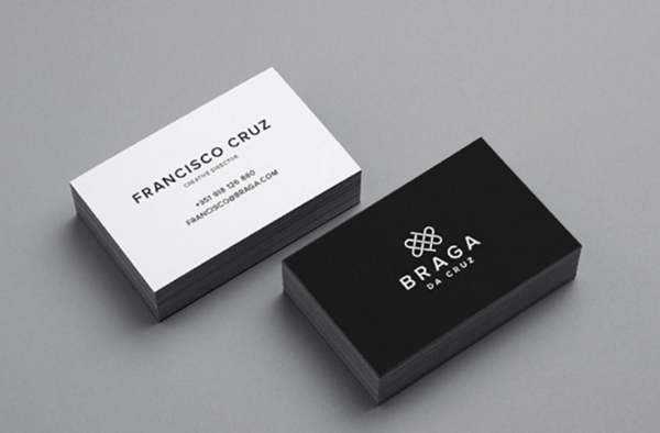
These Braga Da Cruz jewelry store business cards, designed by Luke Halota, are a good example of how minimalism can help brand name stand out on the page. Halota uses grids to center the company name on one side, with a small, unobtrusive logo placed above. On the back, he makes sure to use simple white space to make Francisco Cruz the focal point.
2. Visme
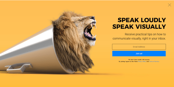
Minimalism doesn't have to be boring. Here, Visme created a pop-up ad where the primary focus remains on the "Join us!" blue button, which contrasts nicely against the orange background. Additionally, to grab the viewer's attention, Visme placed a large lion's head image on the left side of the ad.
3. Heather Shaw Book Design
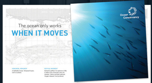
Heather Shaw ensures true simplicity in her Ocean Conservancy book, which grabs the reader's attention with minimal text and colors. The information is plainly outlined and easy-to-follow. Additionally, there's a lightly outlined sketch of an ocean behind the text -- while not overbearing, it adds texture to the design.
4. Helix Sleep by Stefanie Brückler
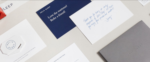
These Helix Sleep referral cards look both sleek and helpful. Stefanie Brückler uses contrasting colors and clean font to ensure the cards can do their jobs without seeming unoriginal.
5. Pixite by Peter Komierowski
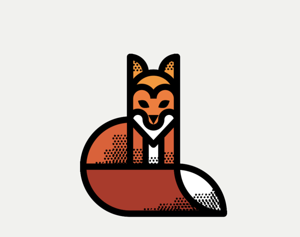
On his page, Komierowski explains, "I was asked by Pixite to create a set of nature-inspired shapes for their app Fragment." Ultimately, his design is aesthetically-pleasing and fun, with simple, cohesive lines that form the shape of a fox.
6. Mastercard by Pentagram
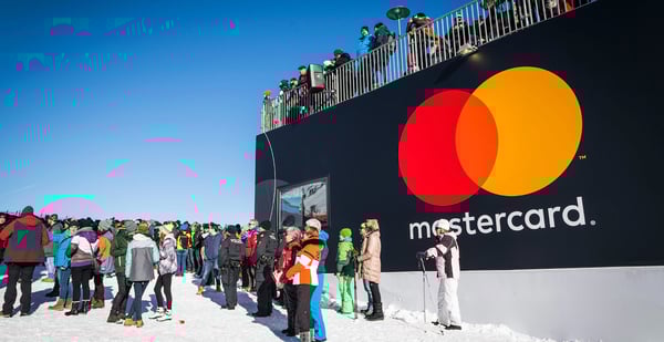
One of the most iconic minimalist designs, Mastercard's financial design is undoubtedly a staple of the brand. The simple red and orange circles signify connectedness and seamlessness. The circles are recognizable enough that Mastercard can use the icon in place of any brand text, and still convey its ownership.
Minimalist Web Design
You can take the tenets of minimalist design and apply them to brand websites, resulting in clean interfaces that guide users where you need them to go. Here are great examples of minimalism used on the web:
1. Huge Inc.
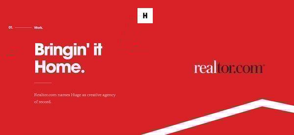
Huge Inc.'s homepage is clean and polished, with minimal text to ensure a new viewer doesn't feel overwhelmed by the page. Additionally, the small details -- like the black that appears in the logo as well as the second half of realtor.com, and the small jagged line in the bottom right corner -- signify a sense of cohesiveness.
2. Bedow
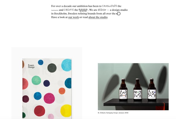
Bedow, a Stockholm-based design studio, knows its viewers priorities, and thus doesn't waste time with a busy homepage -- instead, they include a short blurb about their studio, and then leave a section of white space before displaying some of their designs.
3. Reducing the Obvious
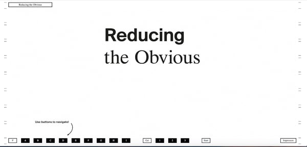
One of the more simple designs in the list, Reducing the Obvious's design is compelling and mysterious, with little information displayed on the homepage. However, the page is still helpful and inviting, with a small "Use buttons to navigate!" command in the bottom left.
4. Jorgeriera Flores
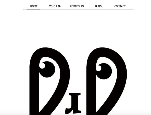
Jorgeriera Flores' page is fun and inviting, with a blinking, life-like design and a clean navigation bar. Additionally, the creature's nose serves as a "J", demonstrating Flores' attention-to-detail.
5. Design Co.
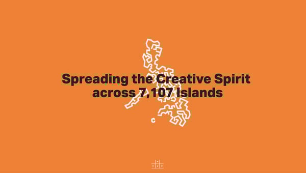
Oftentimes, minimalist design enables a brand to convey its purpose more powerfully than it could with a busier page. Design Co., for instance, is able to capture the viewer's attention with its compelling message -- spreading the creative spirit across 7,107 islands -- by ensuring its background, while colorful, is devoid of distracting add-ons. Additionally, the small white logo serves to reinforce their main point.
6. Evoulve

It's impossible to see a page like this and not find yourself curious to explore further. Evoulve does a good job expressing a sense of innovation and sleekness -- with its world-icon and bright, futuristic design -- without needing any additional text or imagery to compel the user to explore further.
7. Tim Brack
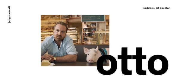
Brack's use of white space and overlapping elements serves to create a clean and inviting homepage. Additionally, the photo of himself with a pig highlights a sense of playfulness and humor, and you're able to obtain most relevant information -- including Tim's title as art director -- instantly, without any distraction.
8. Tinker
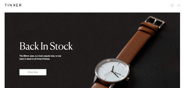
Minimalism is often accomplished best when a brand knows exactly why a visitor might come across their website. In this case, Tinker understands its viewers are looking to browse and potentially purchase a watch, so it aims its design-elements to drive attention toward that single purpose.
9. ETQ Amsterdam
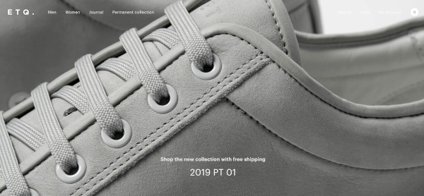
The close-up of the shoe offers a new viewpoint, making ETQ's homepage intriguing and original even in its simplicity. Additionally, the small white font looks simple and clean against the photo background.
Minimalist Logo Design
The logo is one of your most important elements in your design arsenal. You don't want a beautiful minimalist design to be supported by a clunky and overdone logo. These brands used minimal logos to support the feel of the rest of their brand:
1. UBAR
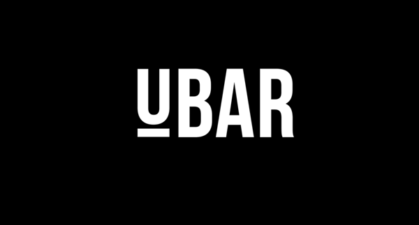
The bold block text and black-and-white contrast lends itself well to Simon McWhinnie's UBAR design. The simplicity allows the text to dominate the logo and evokes a sense of power and strength.
2. Cloud Bed by Michael Spitz
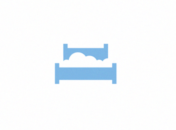
If you have one product you sell well, why complicate it? This logo, designed by Michael Spitz, communicates the brand's product -- bedding -- without text. Additionally, it's clean and calming, particularly with the use of light blue and white, which ensures a sense of calmness for the viewer.
3. Varnom Ross by Bibliothèque
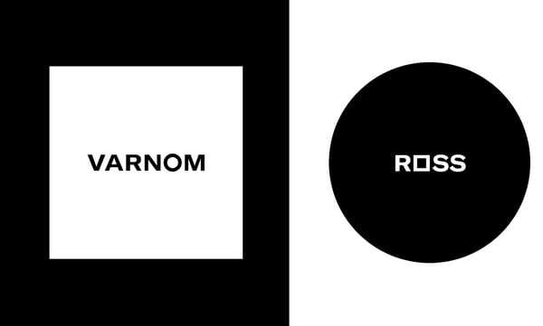
Varnom Ross's logo is bold, powerful, and striking. Additionally, the replicated box shape around the Varnom, used again as the "o" in Ross, signifies a sense of cohesiveness.
4. The Row Apartment Homes by PurdyLogo
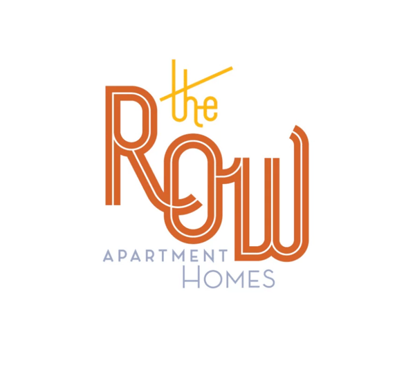
This logo looks retro and funky, but it uses plenty of white space, as well as white lines within the letters, to maintain simplicity. Additionally, the colors work well together, ensuring "Row" stands out most prominently in the logo.
Minimalist Poster Design
Posters need to say a lot in a finite amount of space. That's why minimalism works so well in poster design. Here are some great examples that support this idea:
1. Miselu
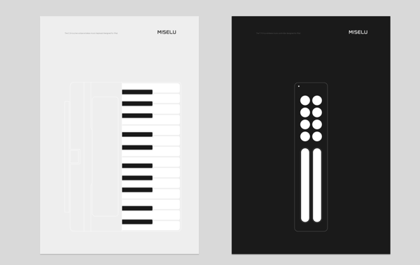
Miselu's graphic design undoubtedly supports the notion that less is more. On their page, Miselu explains the design as "simultaneously edgy, approachable, and clearly expresses our core business: music". Ultimately, these posters, along with their other designs, reinforce their core products while remaining simple enough to be adaptable as their brand changes over time.
2. Ilmars Rumpeters
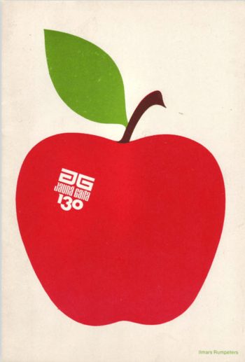
Ilmars Rumpeters created multiple simple covers for Jauna Gaita magazine, and this one in particular stands out as attention-grabbing and bold, with its vibrant colors and intriguing font. With minimalism, you want your focus to be on one or two elements -- in this case, Rumpeters succeeded in drawing primary attention to the apple, and then to the magazine title itself.
3. Paul Rand
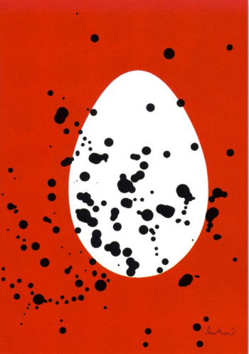
Paul Rand, a famous logo creator and graphic designer, created this poster to advertise the International Design Conference in Aspen, 1966. Ultimately, the piece is intriguing and complex even in its minimalism, causing viewers to likely pause and wonder over the significance of the black splatters or egg-shape in the background.
Minimalist Text Design
You'll notice in each of the designs above, the text is chosen intentionally and displayed in a way that adds rather than detracts from the visual elements. With a minimalist design, one of the first things you'll want to consider is the font choices used throughout the website or marketing collateral. You'll want to choose fonts that are:
- Crisp
- Clear
- Legible
- Easy to read (even at small sizes)
- Simple
- Consistent
- Geometrical
Here are some examples of fonts used in minimalist design:
1. Open Sans
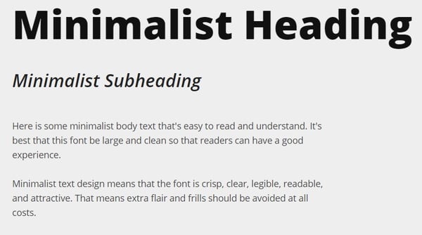
Because serifs can be more difficult to read, especially on the web, minimalist designs often use sans-serif fonts. Open Sans is the quintessential sans-serif font (except perhaps Arial) and is easy-to-read and modern. The body text in particular is particularly crisp, making it ideal for long-form text in a minimalist setting (like a blog).
2. Libre Baskerville
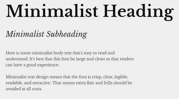
Even though sans-serif fonts are a staple of minimalist design, serifs still have their place. Libre Baskerville does a great job of providing an air of elegance and class without sacrificing readability. The body text is just as easy on the eyes as Open Sans, and even the italicized subeading text is legible (though you wouldn't want to rely on it too much).
3. Montserrat
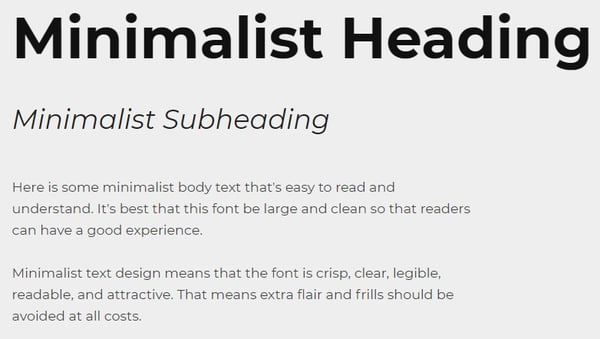 Montserrat has some lovely rounded lines, making the letter shapes easily recognizable, and the italicized subheading provides a more dynamic look when paired with the bold headers and clean body font.
4. Poppins
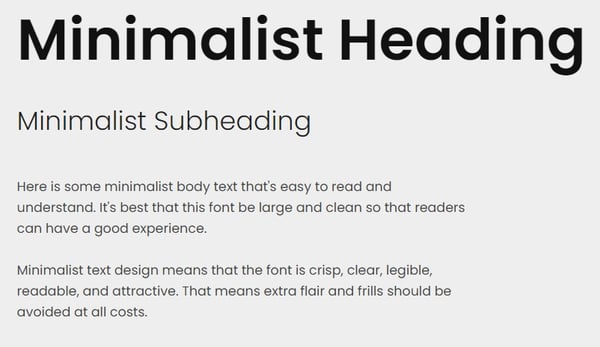
Minimalist text design certainly doesn't mean devoid of personality, as you can see from the graphic, web, and poster designs above. Poppins is a great font family that adds a bit of fun to the minimalist style with overly rounded and almost cartoonish letters. At the same time, it looks modern and professional.
5. Overpass
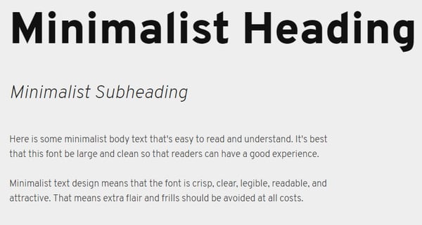
Overpass provides a more industrial look with its narrow letter shapes and sharp corners.
Now that you've seen several iterations of what minimalist design looks like in action, you can begin to create your visual marketing strategy and design marketing materials that supports your brand in a clean and modern but still attractive way.
Editor's note: This post was originally published in February 2019 and has been updated for comprehensiveness.
27 Striking Examples of Minimal Design That'll Kickstart Your Creative Process was originally posted by Local Sign Company Irvine, Ca. https://goo.gl/4NmUQV https://goo.gl/bQ1zHR http://www.pearltrees.com/anaheimsigns
No comments:
Post a Comment